



About this collection
An infographic does one job: it replaces a paragraph nobody finishes with a shape anybody understands in two seconds. This collection gathers layouts built to do exactly that — process chains, comparison splits, timelines, stat callouts, and data charts — across business, education, marketing, and technical subjects.
One practical difference from a poster collection: the formats here are mixed on purpose. There are wide landscape layouts for slide decks and article headers, squares for social feeds, and tall portrait layouts for print and story placements. Choose by looking at the individual image rather than assuming a shape.
Choosing the shape before the chart
The most common mistake is picking a chart type because it looks impressive, then hunting for data to justify it. Work the other way round:
- Comparing a few items → horizontal bars. Ranked, readable, and no legend required.
- Change over time → a line chart, or a timeline when the milestones matter more than the exact values.
- Parts of a whole → a stacked bar or a percentage block. Pie charts stop working past about three slices.
- A process or sequence → numbered steps with connecting arrows. That is a diagram, not a chart.
- One number that carries the whole point → a stat callout. A single large figure with one line of context beats a chart that buries it.
Making it readable at a glance
- One message per graphic. If the takeaway cannot be stated in one sentence, the layout is carrying too much.
- Label directly. Put labels beside the marks instead of in a legend; a legend costs the reader an extra lookup.
- Five to seven data points, maximum. Beyond that, the graphic is a table with decoration.
- Let the whitespace breathe. Crowding every corner loses a reader faster than a sparse layout loses information.
Common questions
Are the numbers in these graphics real data?
No, and this matters before you publish one. The figures inside a generated chart are illustrative placeholders chosen to make the layout look right — they are not measured from any source. Replace them with your own verified numbers before anything goes public, and be especially careful with financial, medical, or performance claims.
What size are these infographics?
The collection is genuinely mixed — wide landscape, square and tall portrait layouts all appear. Check the individual image before designing around it, because a portrait layout will fight a wide banner slot.
Can I edit the data or the text after generating?
Not in place. The text and figures are rendered into the image, so there is no dataset or text layer underneath to edit. Download the file and open it in your own editor, or use the "Use as Template" option to regenerate it from a different brief.
What is the difference between a chart and a diagram?
A chart encodes numbers — position, length, or area mapped to values. A diagram encodes structure — steps, relationships, hierarchy. Most infographics mix the two, which works fine provided the numbers stay accurate and the structure stays simple enough to follow without instructions.
How much information should one infographic carry?
One takeaway and five to seven supporting data points. If you need more than that, split it into a series: three clear graphics actually get read, whereas one dense graphic gets scrolled past.


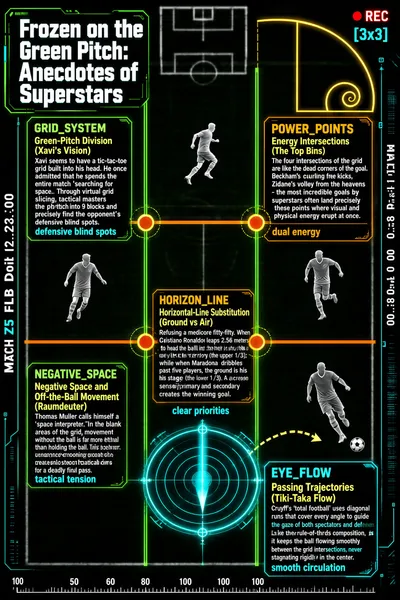
![This infographic takes "Frozen on the Green Pitch: Anecdotes of Superstars" as its title and uses a dark, high-tech interface design that mimics a video-surveillance or tactical analysis system; the overall style closely resembles military or sports tactical-analysis software. The background is a blurred black-and-white image of a football pitch, overlaid with high-contrast lines and shapes in green, orange, yellow, cyan, and so on, creating visual guidance and a layered data effect. In the upper right there is a red "REC" recording indicator and a "[3x3]" grid marker; along the right edge a match timeline is displayed vertically (MATCH 1:45 03:39:08, 00:8.0 Domt 19:38:00), while the left edge displays "MATCH Z5 FLB Doit 12:23:00"; at the bottom there is a ruler scale with a "100" marker, enhancing the technological and data-driven atmosphere. The main body of the infographic is a virtual 3x3 grid system (GRID_SYSTEM) overlaid on the football pitch, dividing the field into nine zones in order to analyze players' spatial awareness and tactical positioning. The grid is formed by green vertical lines and orange horizontal lines, with key positions marked by circles of different colors at the intersections. In the upper right, a golden spiral curve (Fibonacci spiral) is also embedded, symbolizing the embodiment of aesthetics and natural proportion in sport. The infographic contains six core modules, each with an English label, a Chinese title, detailed explanatory text, and a keyword summary: 1. **GRID_SYSTEM: God's-Eye View of the Pitch** - Chinese title: Green-Pitch Division (Xavi's Vision) - Content: "Xavi seems to have a tic-tac-toe grid built into his head. He once admitted that he spends the entire match 'searching for space.' Through virtual grid slicing, tactical masters divide the pitch into 9 blocks and precisely find the opponent's defensive blind spots." - Keyword: "defensive blind spots" 2. **POWER_POINTS: The Deadly Top Corner** - Chinese title: Energy Intersections (The Top Bins) - Content: "The four intersections of the grid are like the dead corners of the goal. Beckham's curling free kicks, Zidane's volley from the heavens - the most incredible goals by superstars often land precisely on these points where visual and physical energy erupt at once." - Keyword: "dual energy" 3. **HORIZON_LINE: The Law of the Ground-Air Contest** - Chinese title: Horizontal-Line Substitution (Ground vs Air) - Content: "Refusing a mediocre fifty-fifty. When Cristiano Ronaldo leaps 2.56 meters to head the ball into the net, the sky is his territory (the upper 1/3); while when Maradona dribbles past five players, the ground is his stage (the lower 1/3). A clear sense of primary and secondary creates the winning goal." - Keyword: "clear priorities" 4. **NEGATIVE_SPACE: The Space Reader** - Chinese title: Negative Space and Off-the-Ball Movement (Raumdeuter) - Content: "Thomas Muller calls himself a 'space interpreter.' In the blank areas of the grid, movement without the ball is far more lethal than holding the ball. This seemingly unbalanced positioning creates enormous tactical tension for a deadly final pass." - Keyword: "tactical tension" 5. **EYE_FLOW: Guiding the Eye Through Passes and Runs** - Chinese title: Passing Trajectories (Tiki-Taka Flow) - Content: "Cruyff's 'total football' uses diagonal runs that cover every angle to guide the gaze of both spectators and defenders. Like the rule-of-thirds composition, it keeps the ball flowing smoothly between the grid intersections, never stagnating rigidly in the center." - Keyword: "smooth circulation" 6. **Additional Visual Elements** - There is a cyan radar scanning ring at the center-lower part of the football pitch, pointing toward the goal, symbolizing detection and positioning. - In the lower right there is a dashed arrow extending from a player's foot and pointing toward the ball, indicating a passing or shooting path. - Multiple player silhouettes are distributed across different zones, reinforcing the realism of the scene. The overall structure is clear, with the grid as the core framework and the six modules distributed around the grid intersections, forming a radial information architecture. The text combines specific player cases (Xavi, Cristiano Ronaldo, Maradona, Beckham, Zidane, Thomas Muller, Cruyff) with tactical terminology to explain, in an accessible yet profound way, advanced tactical concepts in football such as spatial strategy, points of energy eruption, the ground-air contest, off-the-ball movement, and passing-and-moving combinations. The design language fuses technology, geometry, and sports aesthetics to make abstract tactics concrete and visualized.](https://files.posterlet.com/assets/generated/md/eo5wq5eyma0r.webp)


