
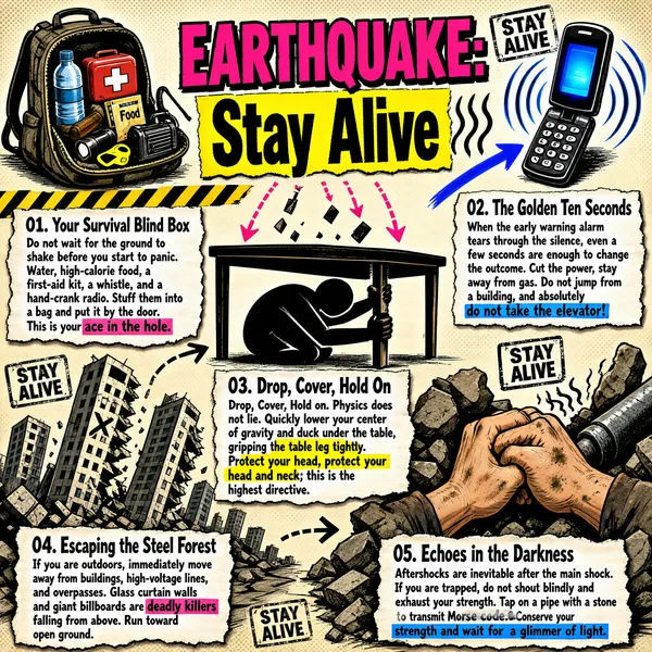
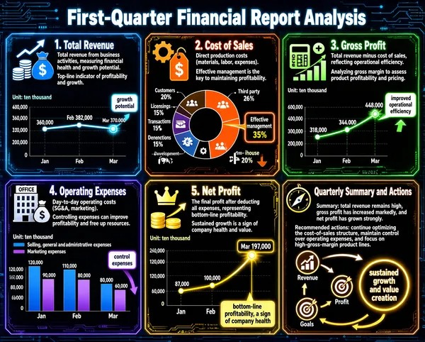
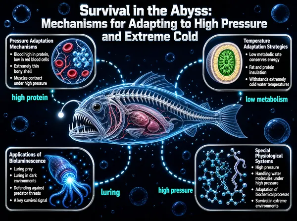
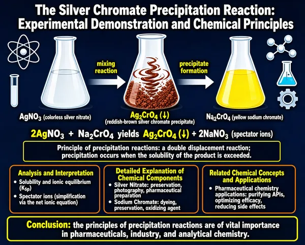


About this collection
An infographic does one job: it replaces a paragraph nobody finishes with a shape anybody understands in two seconds. This collection gathers layouts built to do exactly that — process chains, comparison splits, timelines, stat callouts, and data charts — across business, education, marketing, and technical subjects.
One practical difference from a poster collection: the formats here are mixed on purpose. There are wide landscape layouts for slide decks and article headers, squares for social feeds, and tall portrait layouts for print and story placements. Choose by looking at the individual image rather than assuming a shape.
Choosing the shape before the chart
The most common mistake is picking a chart type because it looks impressive, then hunting for data to justify it. Work the other way round:
- Comparing a few items → horizontal bars. Ranked, readable, and no legend required.
- Change over time → a line chart, or a timeline when the milestones matter more than the exact values.
- Parts of a whole → a stacked bar or a percentage block. Pie charts stop working past about three slices.
- A process or sequence → numbered steps with connecting arrows. That is a diagram, not a chart.
- One number that carries the whole point → a stat callout. A single large figure with one line of context beats a chart that buries it.
Making it readable at a glance
- One message per graphic. If the takeaway cannot be stated in one sentence, the layout is carrying too much.
- Label directly. Put labels beside the marks instead of in a legend; a legend costs the reader an extra lookup.
- Five to seven data points, maximum. Beyond that, the graphic is a table with decoration.
- Let the whitespace breathe. Crowding every corner loses a reader faster than a sparse layout loses information.
Common questions
Are the numbers in these graphics real data?
No, and this matters before you publish one. The figures inside a generated chart are illustrative placeholders chosen to make the layout look right — they are not measured from any source. Replace them with your own verified numbers before anything goes public, and be especially careful with financial, medical, or performance claims.
What size are these infographics?
The collection is genuinely mixed — wide landscape, square and tall portrait layouts all appear. Check the individual image before designing around it, because a portrait layout will fight a wide banner slot.
Can I edit the data or the text after generating?
Not in place. The text and figures are rendered into the image, so there is no dataset or text layer underneath to edit. Download the file and open it in your own editor, or use the "Use as Template" option to regenerate it from a different brief.
What is the difference between a chart and a diagram?
A chart encodes numbers — position, length, or area mapped to values. A diagram encodes structure — steps, relationships, hierarchy. Most infographics mix the two, which works fine provided the numbers stay accurate and the structure stays simple enough to follow without instructions.
How much information should one infographic carry?
One takeaway and five to seven supporting data points. If you need more than that, split it into a series: three clear graphics actually get read, whereas one dense graphic gets scrolled past.
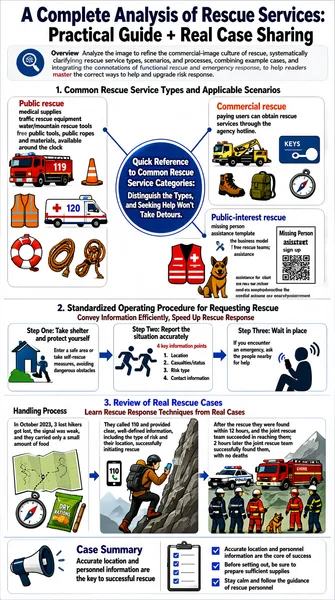
![This infographic is titled "A Complete Analysis of Rescue Services: Practical Guide + Real Case Sharing." It aims to systematically explain the types of rescue services, their applicable scenarios, and the operating procedures, and through real cases to help the public master the correct ways to seek help and improve risk-response capability. The overall layout is clear, using a block structure divided into four main parts: "Overview," "1. Common Rescue Service Types and Applicable Scenarios," "2. Standardized Operating Procedure for Requesting Rescue," and "3. Review of Real Rescue Cases," supplemented with icons, illustrations, and explanatory text. The style is concise and clear, with rich visual elements and a color scheme based mainly on a gray-white background, with accent colors such as red, orange, and blue to highlight key content. **Overview Section**, located at the top, briefly states the purpose of the image: "Analyze the image to refine the commercial-image culture of rescue, systematically clarifying rescue service types, scenarios, and processes, combining example cases, and integrating the connotations of functional rescue and emergency response, to help [readers] master the correct ways to help and upgrade risk response." (Note: the original text contains obvious typographical errors, such as a garbled phrase that should be "brand image" or something similar, and another that may mean "the connotations of integrating functional rescue with emergency response"; the original text is preserved here.) **Part One: Common Rescue Service Types and Applicable Scenarios.** At the center is a circular title box reading "Quick Reference to Common Rescue Service Categories: Distinguish the Types, and Seeking Help Won't Take Detours." Three major categories radiate outward from the center: - **Public rescue**: includes icons of a fire truck (marked "119"), an ambulance (marked "120"), traffic cones, reflective vests, roadblocks, life rings, ropes, and drones, corresponding to "medical supplies," "traffic rescue equipment," and "water/mountain rescue tools," and noting "free public tools, public ropes and materials, available around the clock" (the original wording is unclear, possibly meaning "free public tools, public ropes and other materials, usable around the clock"). - **Commercial rescue**: includes icons of a tow truck, keys, a membership card, hiking boots, a backpack, and a compass, explaining that "paying users can obtain rescue services through the agency hotline." - **Public-interest rescue**: includes a Red Cross vest, a search-and-rescue dog, and a missing-person notice poster (marked "missing person assistance template," "sign up," and a QR code), explaining that "the business model of free rescue teams; assistance for adult incidents can be sought through the official account or emergency departments" (the original wording is confusing, possibly meaning "the business model of free rescue teams; help for adult incidents can be obtained through the official WeChat public account or emergency departments"). **Part Two: Standardized Operating Procedure for Requesting Rescue.** The title is "Convey Information Efficiently, Speed Up Rescue Response," divided into three steps arranged horizontally: - **Step One: Take shelter and protect yourself**: the icon is two green running figures; the text reads "Enter a safe area or take self-rescue measures, avoiding dangerous obstacles" (the original text is erroneous; it should read "enter a safe area or take self-rescue measures and avoid dangerous obstacles"). - **Step Two: Report the situation accurately**: the icon is a phone call; it lists "4 key information points": 1. Location; 2. Casualties/status; 3. Risk type; 4. Contact information (the original repeats the word for "contact" twice; it should be "contact details"). - **Step Three: Wait in place**: the icon is a person sitting and looking at a phone with signal ripples; the text reads "If you encounter an emergency, ask the people nearby for help" (the original is erroneous and should read "in case of emergency, please seek help from the people nearby"). **Part Three: Review of Real Rescue Cases.** The title is "Learn Rescue Response Techniques from Real Cases," with "Handling Process" and "Case Summary" below. - **Handling process**: on the left, survival supplies such as a map, compass, and dry rations are displayed, with the text: "In October 2023, 3 lost hikers got lost, the signal was weak, and they carried only a small amount of food" (the original contains multiple typos; it should read "in October 2023, three lost hikers lost their way in the mountains, the signal was weak, and they carried only a small amount of food"). In the middle, an illustration shows a climber rock-climbing while using a phone, with the explanation: "They called 110 and provided clear, well-defined information, including the type of risk and their location, successfully initiating rescue" (the original is erroneous and should read "they dialed 110, providing clear and unambiguous information including risk type and location, and successfully initiated rescue"). On the right, police cars, fire trucks, search-and-rescue dogs, and rescue teams are shown, with the text: "After the rescue they were found within 12 hours, and the joint rescue team succeeded in reaching them; 2 hours [later] the joint rescue team successfully found them, with no deaths" (the original is erroneous and should read "they were found by the rescue team within 12 hours, of which 2 hours involved the joint rescue team successfully carrying out the rescue; no one died"). - **Case summary**: on the left is a megaphone icon, with the text: "Accurate location and personnel information are the key to successful rescue" (the original is erroneous). On the right is a clipboard icon listing three bullet points with checkboxes: - Accurate location and personnel information are the core of success - Before setting out, be sure to](https://files.posterlet.com/assets/generated/md/suamzro6ibek.webp)


