Generate
Create images with AI
Q1 Financial Report Infographic
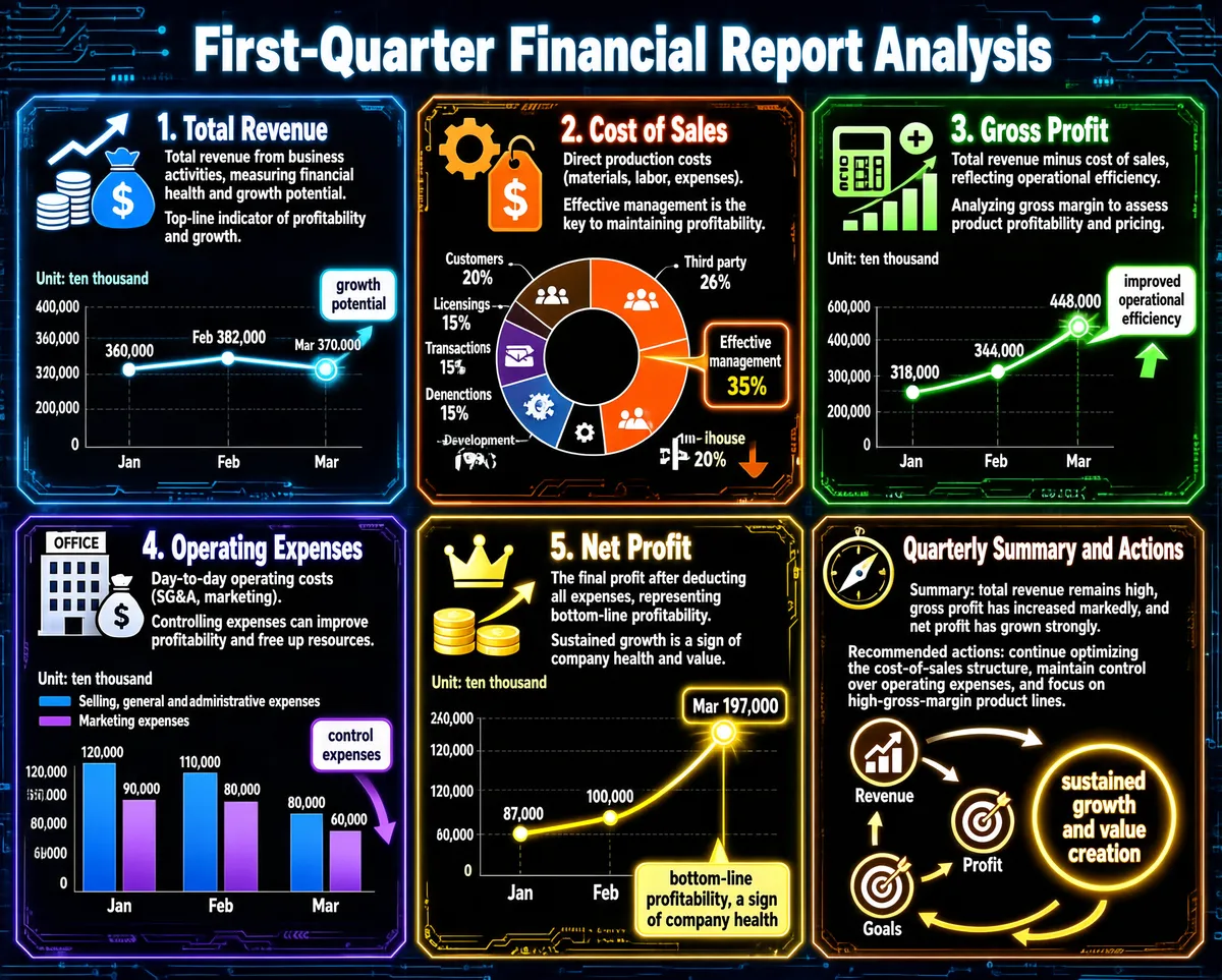
This infographic is titled "First-Quarter Financial Report Analysis," uses a deep blue technological background with circuit-board textures, and its overall layout is divided into six colored modules arranged in a 2x3 grid. Each module uses a different dominant color (blue, orange, green, purple, gold, brown) to distinguish its theme, and contains an icon, title, concept explanation, importance/impact description, chart, and data labels, with a modern and professional visual style. --- **Module 1: Total Revenue (blue)** - **Title**: 1. Total Revenue - **Icon**: an upward arrow with stacked coins and a money bag symbol - **Concept**: total revenue from business activities, measuring financial health and growth potential. - **Importance**: the top-line indicator of profitability and growth. - **Chart type**: line chart, X-axis showing months (Jan, Feb, Mar), Y-axis showing amounts (unit: ten thousand) - **Data points**: - Jan: 360,000 - Feb: 382,000 - Mar: 370,000 - **Label**: beside the Mar data point is a "growth potential" label pointing to an upward arrow. --- **Module 2: Cost of Sales (orange)** - **Title**: 2. Cost of Sales - **Icon**: a set of gears with a dollar tag bearing a downward arrow - **Concept**: direct production costs (materials, labor, expenses). - **Impact**: effective management is the key to maintaining profitability. - **Chart type**: donut chart with a black center, the outer ring divided into segments showing cost composition - **Data composition** (clockwise direction): - Third party: 26% (icon: document plus dollar sign) - In-house: 20% (icon: human figure plus plus sign) - Effective management: 35% (highlighted, no specific icon, but a callout box points to it) - Development: 9% (icon: document plus pen) - Licensing fees: 15% (icon: document plus dollar sign) - Transactions: 15% (icon: hand holding a dollar sign) - Customers: 20% (icon: human figure) - **Note**: the percentages of the parts sum to 130%, which may indicate that "effective management" is an optimization goal rather than an actual share of costs, or that there is data overlap or overlapping categories. --- **Module 3: Gross Profit (green)** - **Title**: 3. Gross Profit - **Icon**: a calculator plus a plus sign, and a rising bar chart - **Concept**: total revenue minus cost of sales, reflecting operational efficiency. - **Practical application**: analyzing gross margin to assess product profitability and pricing. - **Chart type**: line chart, X-axis showing months (Jan, Feb, Mar), Y-axis showing amounts (unit: ten thousand) - **Data points**: - Jan: 318,000 - Feb: 344,000 - Mar: 448,000 - **Label**: beside the Mar data point is an "improved operational efficiency" label pointing to an upward arrow. --- **Module 4: Operating Expenses (purple)** - **Title**: 4. Operating Expenses - **Icon**: an office building (marked OFFICE) and a money bag with a minus sign - **Concept**: day-to-day operating costs (SG&A, marketing). - **Importance**: controlling expenses can improve profitability and free up resources. - **Chart type**: grouped bar chart, X-axis showing months (Jan, Feb, Mar), Y-axis showing amounts (unit: ten thousand) - **Legend**: - Blue: selling, general and administrative expenses - Purple: marketing expenses - **Data points** (estimated values based on the relative proportion of bar heights): - Jan: - Selling, general and administrative expenses: about 120,000 - Marketing expenses: about 90,000 - Feb: - Selling, general and administrative expenses: about 110,000 - Marketing expenses: about 80,000 - Mar: - Selling, general and administrative expenses: about 80,000 - Marketing expenses: about 60,000 - **Label**: above the Mar bars is a "control expenses" label pointing to the downward trend. --- **Module 5: Net Profit (gold)** - **Title**: 5. Net Profit - **Icon**: a crown, stacked gold coins, and an upward arrow - **Concept**: the final profit after deducting all expenses, representing bottom-line profitability. - **Conclusion**: sustained growth is a sign of company health and value. - **Chart type**: line chart, X-axis showing months (Jan, Feb, Mar), Y-axis showing amounts (unit: ten thousand) - **Data points**: - Jan: 87,000 - Feb: 100,000 - Mar: 197,000 - **Label**: beside the Mar data point is a "bottom-line profitability, a sign of company health" label pointing to a glowing data point. --- **Module 6: Quarterly Summary and Actions (brown)** - **Title**: Quarterly Summary and Actions - **Icon**: a compass and a bullseye - **Text content**: - **Summary**: total revenue remains high, gross profit has increased markedly, and net profit has grown strongly. - **Recommended actions**: continue optimizing the cost-of-sales structure, maintain control over operating expenses, and focus on high-gross-margin product lines. - **Flowchart**: three circular icons (corresponding to revenue, profit, and goals respectively) are connected by arrows to a large circle on the right, "sustained growth and value creation," forming a closed-loop feedback path. --- **Overall design features**: - A unified dark background with bright borders is used to enhance contrast. - Each module has a number and title at the top, giving a clear structure. - All charts are equipped with explicit axis labels and data-point values. - The text layout is concise, with key information highlighted in label boxes. - The color scheme is tied to the themes (for example, green for growth and purple for expense control).
Tags
More Images