Generate
Create images with AI
Age Discrimination in the Workplace Infographic
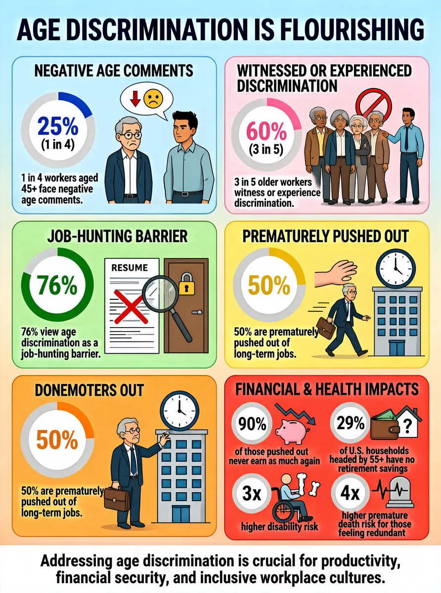
The infographic titled "AGE DISCRIMINATION IS FLOURISHING" presents a comprehensive overview of age discrimination in the workforce, using a clean, colorful, and segmented layout with six distinct sections arranged in two columns. The background features a soft gradient from light blue at the top to pale peach at the bottom, enhancing readability and visual appeal. Each section is enclosed in a rounded rectangle with a unique color—light blue, pink, green, yellow, orange, and red—helping to distinguish different themes. At the top, the title "AGE DISCRIMINATION IS FLOURISHING" is displayed in bold, dark blue uppercase letters, immediately establishing the central theme. The first section, titled "NEGATIVE AGE COMMENTS" (light blue background), features a circular chart with a blue arc representing 25% (1 in 4). Accompanying text states: "1 in 4 workers aged 45+ face negative age comments." An illustration depicts an older man with glasses and a younger man, with a speech bubble containing a downward arrow and a sad face emoji, visually symbolizing negative remarks. The second section, "WITNESSED OR EXPERIENCED DISCRIMINATION" (pink background), shows a circular chart with a pink arc indicating 60% (3 in 5). The text reads: "3 in 5 older workers witness or experience discrimination." The illustration includes four diverse older individuals being pointed at by a younger person with a prohibition sign, emphasizing exclusion. The third section, "JOB-HUNTING BARRIER" (green background), displays a circular chart with a green arc for 76%. The accompanying text says: "76% view age discrimination as a job-hunting barrier." The illustration shows a magnifying glass over a resume with a red X, next to a locked door, symbolizing blocked opportunities. The fourth section, "PREMATURELY PUSHED OUT" (yellow background), contains a circular chart with a yellow arc for 50%. The text states: "50% are prematurely pushed out of long-term jobs." The illustration depicts an older worker holding a briefcase, standing before a building with a large hand pushing him away and a clock above, suggesting forced early exit. The fifth section, "DONEMOTERS OUT" (orange background), mirrors the previous section with a circular chart showing 50% and identical text: "50% are prematurely pushed out of long-term jobs." The illustration is similar but shows the older worker placing his hand on the building’s clock, reinforcing the theme of time-based dismissal. The sixth and final section, "FINANCIAL & HEALTH IMPACTS" (red background), presents four smaller circular charts with corresponding data points and icons: - A red arc for 90% with text: "of those pushed out never earn as much again," accompanied by a piggy bank with a downward trend graph. - A gray arc for 29% with text: "of U.S. households headed by 55+ have no retirement savings," illustrated with a wallet and house with a question mark. - A red arc for 3x with text: "higher disability risk," shown with a person in a wheelchair holding a bone. - A red arc for 4x with text: "higher premature death risk for those feeling redundant," depicted with a tombstone and heartbeat monitor. At the bottom, a white banner with dark blue text concludes: "Addressing age discrimination is crucial for productivity, financial security, and inclusive workplace cultures." All data points are clearly labeled, and visual metaphors effectively communicate the emotional and practical consequences of age discrimination. The infographic uses consistent typography, iconography, and color-coding to ensure clarity and impact.
Tags
More Images