


About this collection
Every Fiverr gig lives or dies by a single image. Each cover here respects the real constraints of a gig image - one banner-shaped canvas, high-contrast text, and no clutter that would collapse at small sizes.
These are starting points, not finished listings. Every cover here is built around one idea: a single service promise, set in type large enough to survive being shrunk into Fiverr's search grid. The collection spans roughly thirty service areas — software and app development, design and branding, writing and translation, marketing, audio, data, and business consulting — so you can usually find a layout close to what you sell and adapt it.
Nothing here is a layered design file. Each one is a flat generated image, which is exactly what makes it quick: pick a layout, swap the headline, palette, and icons for your own service, and you have a listing image in a few minutes rather than an afternoon.
What a gig cover actually has to do
A buyer scanning search results sees your cover as a thumbnail no wider than a postage stamp, sitting next to a dozen competitors. That single constraint decides almost everything else:
- One promise, not a service list. "I will fix your WordPress site in 24 hours" reads at thumbnail size. "WordPress | SEO | Speed | Security | Maintenance" turns to mush.
- High contrast between text and background. Thin light type on a pale panel is the first thing to disappear when the image shrinks.
- Three to six words in the headline. Long headlines force small type, and small type is what becomes unreadable first.
- The service visible before reading a word. A layout cue — a device frame, a waveform, a chart, a colour swatch — tells the buyer the category instantly.
Resizing and export
Fiverr publishes its own requirements in the uploader, and they change - check them there rather than trusting a number quoted in a blog post. What does not change is the direction of the resize: always scale down from the download. Never upscale a smaller image to reach the uploader's width, because the text edges go soft, and soft type is exactly what a thumbnail cannot afford.
When you trim to match the uploader's proportions, do it symmetrically and keep the headline centred, so the crop does not eat one side of the promise.
Three things worth doing before you upload
- Judge the thumbnail, not the full-size file. Shrink the preview down to search-result size, or just squint. If the promise still reads, the cover works. 2. Keep a colour system across your gigs. Buyers skim a grid of near-identical covers; a consistent accent colour makes your listings recognisable among strangers. 3. Leave the outer margin clear. Gig images get cropped slightly differently across placements, so keep text away from the outer edge of the canvas.
Common questions
Will the downloaded cover meet Fiverr's upload requirements?
Check the uploader: Fiverr shows its current accepted format, file limit and recommended image spec there, and those are the platform's requirements, not ours. What matters on this side is direction — start from the downloaded cover and scale down to fit, never up from a smaller file.
Will the text still be readable in the search grid?
Shrink it to search-result size before uploading. That is close to what buyers actually see when comparing gigs, and it is where most covers fail — usually because the headline was set too small or the contrast was too low to begin with.
How many images should one gig have?
Fiverr's gallery takes up to three images and two videos. Lead with the strongest cover, then spend the remaining slots on a work sample, a before-and-after, or a deliverable preview rather than more headline art.
Can I use the same cover on several gigs?
No. Buyers often see two or three of your gigs together, and identical covers make them look like one listing repeated. Change the headline, the accent colour, and the main visual so each gig reads as its own service.
Can I change the text or colours after generating?
Not in place. The wording is baked into the image, so there is no text layer to retype. Download it and edit it in your own tool, or use the "Use as Template" option to regenerate it with different copy.
Why do the covers in this collection look so different from each other?
Because the range is deliberately broad. Each cover was written around the specific service it advertises, so a logo animation cover and a translation cover share a job — selling one service at thumbnail size — but not a visual style. That variety is what lets you give every gig a distinct look.
![[Format]
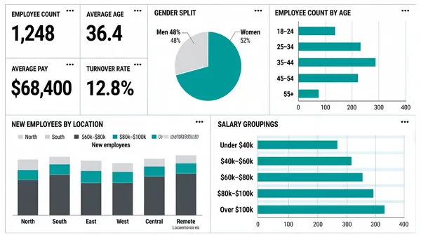
Landscape 16:9 gig cover, plain flat dashboard-UI screenshot. Minimal chrome, white field, thin grey rules, no shadows. No watermark, no personal names.
[Layout]
Edge-to-edge screenshot, no device frame, no top bar. The canvas is a simple two-row grid with even gutters and hairline separators. Upper row, left to right: a cluster of four small white stat tiles arranged two-by-two, each with a tiny title, a kebab dot pair at its top-right and one big dark number or price; then a tall white panel containing a single large two-slice pie chart with two leader lines; then a wide white panel holding a horizontal bar chart with a category list down its left edge and a baseline scale. Lower row: a wide white panel with a grouped stacked column chart of about six category groups plus a small legend and a location row; and a second wide white panel with a horizontal bar chart of five banded rows with long axis labels. Everything is separated by light grey rules with plenty of white space.
[Subject]
None — UI only.
[Headline]
All copy is small grey sentence-case tile titles and labels, except the four stat values, which are very large and light-weight dark figures. Each panel's chart title sits at its top-left in small grey caps, describing employee counts, ages, gender split, average pay, turnover rate, new employees by location and salary groupings. Render all wording as neutral placeholder copy in the same positions, sizes and weights.
[Badges]
None — the only marks are tiny three-dot kebab glyphs at the top-right corner of each panel.
[Mood]
Essentially white with dark-grey type and a single teal accent repeated across every chart. Quiet, plain, wireframe-clean; the big numbers in the four tiles are the only thing that reads at thumbnail scale.](https://files.posterlet.com/assets/generated/md/cg13hc2sthqt.webp)
![[Format]
Landscape 16:9 gig cover, ultra-minimal centred text card. Flat dark field, no imagery. No watermark, no personal names.
[Layout]
A flat very dark navy-teal field fills the frame with a barely-perceptible radial lift behind the centre. Everything is centred on the vertical and horizontal axes in a tight three-band stack occupying only the middle third of the height: a letterspaced headline line, a smaller subline, and a small square mark below it with a soft glow. There is no device frame, no chart and no figure — the composition is pure typography plus one small icon, with very large empty margins all round.
[Subject]
None — typographic and icon only.
[Headline]
Centre, line one: "POWER BI EXPERT" in heavy white uppercase with very wide letter-spacing, the largest element. Line two, directly beneath and much smaller: a light white sans line reading "Raw Data >> Dashboard" with monospaced spacing and double angle brackets between the phrases.
[Badges]
Below the text, a small white rounded-square tile carrying the Power BI logo — three ascending rounded bars in graduated amber-to-gold, the shortest at the left; the tile has a soft outer glow. Draw the brand mark itself, with no lettering.
[Mood]
Near-black navy-teal with white type and one warm gold glyph. Extremely restrained, quiet and premium; the single gold mark and the wide-tracked white headline do all the thumbnail work.](https://files.posterlet.com/assets/generated/md/ozxgycjozmr4.webp)
![[Format]
Landscape 16:9 gig cover, minimal flat icon-and-type layout. Two-colour restraint, clean vector shapes. No watermark, no personal names.
[Layout]
A single flat deep-navy field with a very subtle vertical gradient. Two-column split roughly 50/50 on a common centre line. Left column: a centred-left text stack of three lines, optically aligned to the vertical middle of the frame. Right column: two stacked shapes — above, the Power BI logo, a large bright-yellow rounded square with a small tail at its lower-left so it reads as a speech bubble, holding a dark three-bar ascending chart glyph; below and overlapping it, a large dark navy panel with a soft border containing a small white line chart with dots, a small pie glyph and three short horizontal rule lines standing in for text. The yellow shape is much the largest element in the frame.
[Subject]
None — typographic and icon only.
[Headline]
Left column, three lines in a clean geometric sans: "BUSINESS" and "INTELLIGENCE" in heavy white uppercase on two lines with tight leading, forming the dominant text; then a smaller, lighter white title-case line reading "with Power BI".
[Badges]
The large yellow rounded-square bubble is the Power BI logo: three dark rounded bars of increasing height, ascending left to right. The dark panel below holds a simple white polyline with circular nodes, a small quartered pie circle, and three pale rule lines. Draw the Power BI mark as the real logo rather than an anonymous shape.
[Mood]
Only deep navy and vivid yellow, plus white linework. Very sparse and poster-like; the oversized yellow bubble against navy is the entire thumbnail read.](https://files.posterlet.com/assets/generated/md/yw9khdwa7tg5.webp)
![[Format]
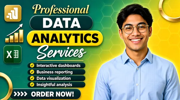
Landscape 16:9 gig cover, playful flat banner with a photographic cut-out. Bright, glossy, rounded shapes. No watermark, no personal names.
[Layout]
Full-bleed diagonal gradient from teal-green at the top-left to warm yellow at the bottom-right, overlaid with a faint hexagon honeycomb pattern and a couple of cropped circular rings. Vertical split roughly 55/45. Left side, stacked: the Power BI logo, a small 3D gold bar glyph, at the top-left, then four headline lines of markedly different treatments, then a chevron-accented strapline, a column of four bullet rows, and a solid pill button at the bottom; the Microsoft Excel icon (a small green tile with a white cross over a spreadsheet grid) and a gold ascending-bar growth icon float at the left edge. Right side: the person cut-out, filling the right half from about the shoulders down to the bottom edge, overlapping the gradient.
[Subject]
A man in his mid-twenties, dark hair, round metal glasses, light blue button-up shirt, arms relaxed, waist-up, smiling at camera; placed on the right, cleanly cut out with a soft edge glow.
[Headline]
Four-line headline stack, top to bottom: the word "Professional" in a gold serif or script, title case; "DATA" in heavy white uppercase on a dark-teal rounded pill; "ANALYTICS" in heavy black uppercase on a bright yellow rounded pill, this being the largest element; the word "Services" in a white script face. Underneath, four bullet rows each beginning with a yellow circular tick on a dark pill, followed by white bold sentence-case copy. Bottom: a dark-teal pill with white uppercase "ORDER NOW!" preceded by a row of white chevrons.
[Badges]
Two small square app tiles at the left margin: the Power BI logo (a gold rounded square with white ascending bars) and the Microsoft Excel icon (a dark-green rounded square with a white cross glyph beside a spreadsheet grid). Also a small gold ascending-bar growth icon and a thin white arrow. Render the Excel and Power BI marks as the real logos.
[Mood]
Teal-green to sunny yellow gradient with gold, white and black type. Cheerful, friendly, high-clarity; the giant yellow "ANALYTICS" pill is the thumbnail's focal point.](https://files.posterlet.com/assets/generated/md/2ikoj1r654y3.webp)
![[Format]
Landscape 16:9 gig cover, dense dark-marketplace banner with a device mockup and a cut-out. High contrast, layered, promo energy. No watermark, no personal names.
[Layout]
Full-bleed dark navy-black background with a faint radial light behind the subject. The frame is packed nearly edge to edge. Left half, top to bottom: a small gold uppercase kicker, a two-line giant headline, an outlined white pill strapline, a row of five dark square tiles with icons and labels, then a horizontal group with a red target icon and two lines of copy beside four green check rows; the bottom edge carries three icon-plus-label items separated by thin dividers. Right half: a large desktop monitor mockup tilted slightly, its screen filled with a light Power BI dashboard; a man's cut-out stands in front of it, overlapping the monitor's lower-left, cropped at the waist by the bottom edge. A tall green ribbon badge sits top-centre straddling the two halves. A white Microsoft certification badge is pasted over the lower-right, and a bright yellow action bar with an arrow glyph occupies the bottom-right corner.
[Subject]
A man in his early thirties, dark hair and short beard, navy suit, white shirt and dark-blue tie, chest-up, looking directly at camera; positioned centre-right, cut out and layered over the monitor and the yellow bar.
[Headline]
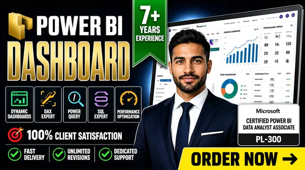
Left stack: a small gold uppercase word; then "POWER BI" enormous in heavy white uppercase beside the gold 3D Power BI bar logo; then "DASHBOARD" in even larger gold uppercase with a white stroke. A white pill strapline reads two short slogans joined by a dot. Tile labels read "DYNAMIC DASHBOARDS", "DAX EXPERT", "POWER QUERY", "SQL EXPERT", "PERFORMANCE OPTIMIZATION". Beside the target icon a line reads "100% CLIENT SATISFACTION". Four green check rows list short promises. The bottom row reads "FAST DELIVERY", "UNLIMITED REVISIONS", "DEDICATED SUPPORT". The yellow bottom-right bar reads "ORDER NOW" in heavy black uppercase with a small kicker line beneath.
[Badges]
The green ribbon badge reads "7+ YEARS EXPERIENCE". The lower-right badge is the Microsoft certification badge: the four-colour Microsoft logo over the "Microsoft" wordmark and a bold "CERTIFIED POWER BI DATA ANALYST ASSOCIATE" line with a small "PL-300" shield. The five tiles below the headline use flat coloured line icons.
[Mood]
Near-black navy with white, gold and one green ribbon plus a yellow action bar. Dense, aggressive, everything-at-once marketplace styling; the giant gold word and the yellow bar guarantee thumbnail legibility.](https://files.posterlet.com/assets/generated/md/a9x9lu9a9dzr.webp)
![[Format]
Landscape 16:9 gig cover, flat glassmorphism dashboard-UI screenshot. Soft shadows, translucent white cards, gentle gradients. No watermark, no personal names.
[Layout]
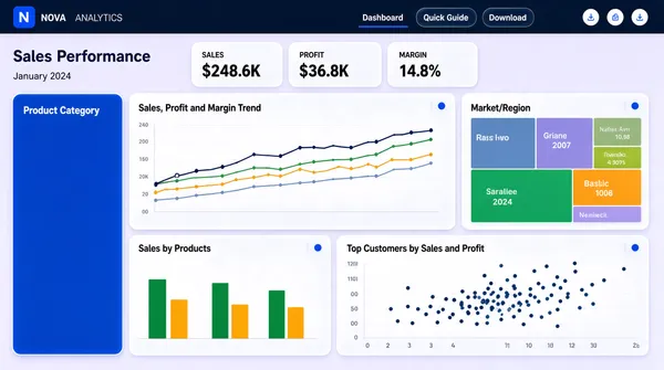
Edge-to-edge dashboard, no device frame. A slim dark navy top bar spans the full width with a title at the left, a small logo mark, a pair of date pills and three small circular icon buttons at the right. Below the bar a page title and a small date line sit at the left margin. The canvas is then a three-row mosaic: a row of three compact KPI cards at the top-centre-left; beneath, a large four-column band where a tall solid-blue panel sits at the far left (dark-on-light contrast), a wide line-chart panel next to it, and a treemap panel at the right; and a bottom band with a grouped column chart on the left and a scatter-plot panel spanning the rest. Cards are white and slightly translucent with rounded corners and soft shadows over a pale lavender field.
[Subject]
None — UI only.
[Headline]
The top bar carries a two-part site and design-style name in light text — one private site's own name, kept as neutral placeholder wording; the page heading is "Sales Performance" in large dark navy with a small grey date line under it. The three KPI cards are labelled with a short metric word and a large dark figure each. Panel titles read "Sales, Profit and Margin Trend", "Market/Region", "Sales by Products", "Top Customers by Sales and Profit" and "Product Category". Small tab labels reading "Dashboard", "Quick Guide" and "Download" sit at the top-right. Render all copy as neutral placeholder wording in the same positions and weights.
[Badges]
The top-left logo is a small flat rounded-square mark in solid blue carrying the private site's own glyph; the top-right cluster is three tiny circular icon buttons. Keep the site name and its mark neutral.
[Mood]
Pale lavender canvas with white translucent cards, a solid cobalt panel and a punch of green and amber. Airy, modern, SaaS-polish; the big blue card gives the eye an anchor at thumbnail size.](https://files.posterlet.com/assets/generated/md/7emcj641guqp.webp)
![[Format]
Landscape 16:9 gig cover, bold flat graphic with a photographic cut-out. Bright, minimal, high contrast. No watermark, no personal names.
[Layout]
A white field with one dominant graphic shape: a very thick bright-green arc forming a large open ring that occupies the entire right and bottom-right of the frame, its two ends cut by the top and bottom edges. A person's photograph is nested inside the upper part of the arc, cropped by the arc's inner curve so the ring appears to frame her. The left half is a clean text column. The top-left corner holds a separate thick green quarter-circle corner mark that bleeds off the frame edge. The lower-left carries a green pill button with a row of four small square app tiles beside it, sitting on one baseline.
[Subject]
A woman in her late twenties to thirties, long light-brown hair, wearing a light jacket over a white top and a thin necklace, head-and-shoulders, neutral friendly expression, centred within the green arc's upper opening; cropped at the chest by the arc.
[Headline]
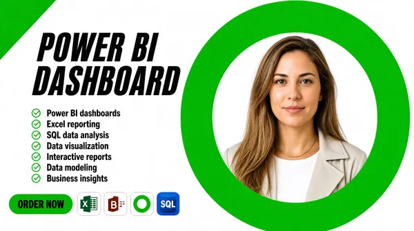
Left column, top: a two-line headline in a heavy black italic uppercase condensed face with a slight rightward slant — a shorter first line over a longer second line, reading "POWER BI DASHBOARD". Below it, seven stacked bullet rows, each a small green circular outline with a white tick inside, followed by bold black sentence-case text naming data services and skills. Bottom-left: a solid green pill with bold black uppercase "ORDER NOW".
[Badges]
Beside the pill, four small square app tiles in a row: the Microsoft Excel icon (a green rounded square with a white cross glyph), the Power BI logo (a gold rounded square with white ascending bars), a white tile bearing a green open-ring outline, and a blue rounded cylinder captioned "SQL". Draw the Excel and Power BI marks as the real logos.
[Mood]
Pure white with a large saturated green shape and black type, plus small gold and blue tile accents. Loud, confident, high-clarity; the giant green arc makes a strong thumbnail silhouette.](https://files.posterlet.com/assets/generated/md/i6u3ddosgc91.webp)
![[Format]
Landscape 16:9 gig cover, editorial split-background banner with tilted screenshot cards. Clean, print-like. No watermark, no personal names.
[Layout]
Two flat colour fields split the frame down the middle with a ragged, hand-torn zigzag seam running top to bottom at roughly the centre, the left field in dark slate blue and the right in mint green; a faint world-map silhouette is ghosted into the dark left half. Top-centre, straddling the seam, sits a white circular badge. Top-right, inside the mint field, a white rounded rectangle holds the Power BI logo (a small dark mark of three ascending bars) with the "Power BI" wordmark beside it. Left half: a left-aligned typographic stack in four lines. Bottom-left: two gold line icons each beside a bold label, separated by a thin gold rule. Right half: two white Power BI dashboard screenshot cards, both rotated slightly (about 6 degrees) and overlapping in a loose vertical stack, each with a title bar and small charts — the upper card wider than the lower.
[Subject]
None — typographic and UI only.
[Headline]
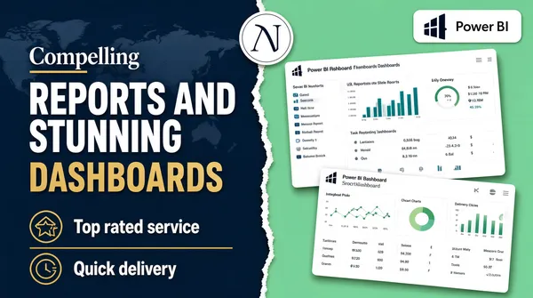
Left stack, in order: a small white serif word "Compelling" with a short gold underline; then a large heavy white uppercase "REPORTS AND" over "STUNNING"; then "DASHBOARDS" in gold, uppercase, with very wide letter-spacing. Bottom-left labels read "Top rated service" and "Quick delivery" in bold white sentence case beside the gold icons.
[Badges]
Top-centre a white circular badge carrying a private two-letter monogram (a seller or consultancy mark) inside a thin ring — keep it neutral, no name. Top-right a white rounded rectangle containing the Power BI logo mark and the "Power BI" wordmark.
[Mood]
Dark slate blue against fresh mint green with a single gold accent. Crisp, trustworthy, consulting-deck feel; the torn seam and the tilted white cards read well even small.](https://files.posterlet.com/assets/generated/md/7ehgc5vouif6.webp)
![[Format]
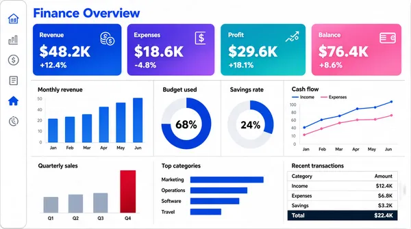
Landscape 16:9 gig cover, flat dashboard-UI screenshot. Light theme, thin grey rules, pastel gradients. No watermark, no personal names.
[Layout]
Edge-to-edge light-grey application canvas with no device frame. A slim white vertical rail runs the full height at the far left with a small stack of line icons, one of them highlighted in solid blue. The canvas is then a three-tier grid with even gutters. Top tier: a section title at the top-left, then a single row of four equal-width KPI cards, each filled with a soft two-colour gradient and carrying a small label and a large white figure. Middle tier: four equal panels across — a small column chart with labelled bars, a large donut with a bold centre percentage, a second smaller donut, and a wide dual-line chart with a legend. Bottom tier: three panels — a sparse column chart with a tall crimson final bar, a horizontal bar chart with a category list, and a compact data table with a total row.
[Subject]
None — UI only.
[Headline]
The page title at the top-left reads a two-word finance-dashboard heading in bold blue. The four KPI cards carry short labels with large currency-style figures and small percentage deltas beneath. Panel titles are small grey sentence-case strings. The donut centres show large percentages. Render all wording as generic placeholder copy in the same positions and weights.
[Badges]
None.
[Mood]
Off-white canvas, a blue rail, and four candy-gradient KPI cards in cobalt, violet, teal and pink. Bright, clean, finance-dashboard polish; the four gradient cards are the thumbnail's colour anchor.](https://files.posterlet.com/assets/generated/md/1a59haryadp7.webp)
![[Format]
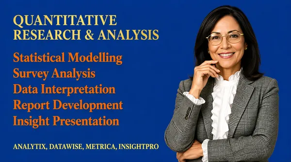
Landscape 16:9 gig cover, plain corporate text banner with a photographic cut-out. Simple, no gradients, flat colour field. No watermark, no personal names.
[Layout]
A flat mid-blue field fills the whole frame with no gradient or texture. The layout is a simple two-column split, roughly 60/40. The left column holds a pure text stack, all left-aligned on a common margin: a heading line at the top, then five evenly spaced list lines with generous leading, then a final line sitting lower with a wider gap above it. The right column is entirely occupied by a person cut-out, positioned so her head sits around the upper third and she is cropped at about the waist by the bottom edge; she slightly overlaps the right ends of the lower list lines.
[Subject]
A woman in her forties, shoulder-length dark hair, gold-rimmed glasses, wearing a grey plaid blazer over a white ruffled blouse, one hand lifted toward her chin and the other arm folded, waist-up, smiling warmly at camera; cut out cleanly and placed on the right side.
[Headline]
Top-left, in a gold serif with small-caps styling and wide tracking: "QUANTITATIVE RESEARCH & ANALYSIS". Below it, five left-aligned lines in an orange serif, title case, with generous line spacing, naming a series of analysis and reporting topics — render every tool name as a neutral placeholder of similar length. Bottom-left, in gold serif small caps, a single line listing four uppercase tool names separated by commas, again as neutral placeholders.
[Badges]
None — no icons, badges or logos anywhere.
[Mood]
One flat royal-blue field with gold and burnt-orange serif type and a single white accent. Plain, academic, listing-style; the warm orange list on blue is the thumbnail's only hook.](https://files.posterlet.com/assets/generated/md/9jfypce0ntdz.webp)
![[Format]
Landscape 16:9 gig cover, ultra-minimal centred title card. Flat black field with one 3D icon. No watermark, no personal names.
[Layout]
The frame is essentially one small black rounded rectangle floating on an even darker black field — a slim margin of slightly lighter black surrounds it, with rounded corners. Everything inside is centred on the vertical axis and stacked in four bands with generous empty space above and below: a two-word heading, a large standalone 3D icon, a three-part strap line, and a final short tagline. There is no device, no chart panel and no human figure — the composition is deliberately sparse, with the whole stack occupying the middle third of the height.
[Subject]
None — typographic and icon only.
[Headline]
Top: "Power BI Dashboard" in a gold serif, title case, centred, the widest text on the card. Below the icon: "Sales - Revenue - KPI" in a slightly smaller orange-gold serif with hyphen separators. Bottom: "Make Better Decisions" in a smaller, thinner pale-cream serif, centred, sentence case. All three lines share the same centred axis and similar letter-spacing.
[Badges]
A single large centred 3D Power BI logo: three ascending rounded bars in graduated amber-to-gold, the shortest at the left, with a soft inner gloss and a faint drop shadow — the brand mark itself, with no lettering.
[Mood]
Pure black with amber, gold and cream type. Extremely restrained, premium and quiet; the single glowing gold icon on black is what carries the thumbnail.](https://files.posterlet.com/assets/generated/md/14rpbw6pw575.webp)
![[Format]
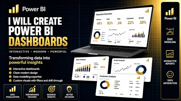
Landscape 16:9 gig cover, dark tech banner with device mockups. Crisp, layered, subtle perspective. No watermark, no personal names.
[Layout]
Full-bleed deep navy with a faint grid texture and a soft gold glow bleeding in from the right. Vertical split roughly 45/55. Left half: a stacked text column — the Power BI logo, a small 3D gold bar glyph of three ascending bars, then a three-line headline, a thin gold rule, a gold strapline, a two-line sentence, four check-bullet rows, and a bottom row of four dark tiles each with a gold icon and a short label. Right half: a large tilted laptop mockup occupying the upper right, its screen filled with a white Power BI dashboard grid, seen from slightly below so the base curves toward the viewer; below and in front of it three smaller white dashboard cards overlap in a loose offset stack, each with its own mini charts; a narrow dark vertical rail at the extreme right edge holds a stack of small gold icon-plus-label items.
[Subject]
None — typographic and UI only.
[Headline]
Left column, stacked: small white uppercase "I WILL CREATE"; then heavy condensed uppercase "POWER BI" in white; then "DASHBOARDS" in bright gold, with a thin gold rule beneath. A gold uppercase strapline reading three adjectives separated by dots. A two-line sentence-case line about transforming data into powerful insights, with a gold highlight. Four white check rows covering interactive dashboards, clean modern design, data modelling expertise, and custom visuals with filters and drill-through. Bottom tiles read "DATA VISUALIZATION", "PERFORMANCE TRACKING", "BUSINESS INSIGHTS", "BETTER DECISIONS". The big screen header reads "Executive Overview" with five KPI labels; the three small cards are titled "Sales Analysis", "Profit Analysis" and "Customer Analysis". The narrow right-hand rail is headed by the "Power BI" wordmark above small gold icon-plus-label items reading "DAX", "DATA MODELING", "INTERACTIVE REPORTS" and "100% SATISFACTION".
[Badges]
The top-left mark is the Power BI logo (three ascending 3D gold bars). The right-hand vertical rail is a column of small gold line icons under the "Power BI" wordmark. Keep the Power BI brand mark and wordmark intact.
[Mood]
Deep navy-black with a single gold accent family and clean white dashboard surfaces. Premium, professional, layered; the tilted device and stacked cards give real depth at thumbnail size.](https://files.posterlet.com/assets/generated/md/daoa13pt6wzf.webp)
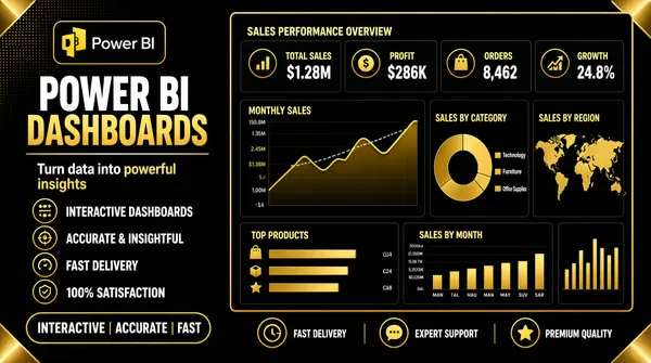
![[Format]
Landscape 16:9 gig cover, premium dark-gold banner, flat vector over a dark ground. Rich metallic accents, subtle glow. No watermark, no personal names.
[Layout]
Full-bleed near-black background with a faint dotted texture at the top-left and a few cropped gold panel corners glinting at the edges. Vertical split roughly 40/60. The left column stacks downward: the Power BI logo — a small gold outline bar-chart glyph of three ascending bars — then a two-line headline, a strapline, a vertical list of four circular gold icons each with a bold label, and a gold-stroked pill at the bottom. The right side is one large dark Power BI dashboard panel with a bright gold hairline border and a soft outer glow; inside it a top row of four KPI mini-cards each with a small circular icon, a gold area line chart with a dashed benchmark, a gold donut and legend list, a world map panel in gold-on-dark, a horizontal bar list panel, a gold bar-by-month chart and a small vertical bar strip. Underneath the panel a dark strip holds three gold icons with short labels.
[Subject]
None — typographic and UI only.
[Headline]
Left column: heavy condensed uppercase "POWER BI" in white over "DASHBOARDS" in bright gold, with a thin gold rule under the pair. Below, a two-line white sentence-case strapline about turning data into powerful insights, with a gold highlight on the last two words. The four bullet labels read "INTERACTIVE DASHBOARDS", "ACCURATE & INSIGHTFUL", "FAST DELIVERY", "100% SATISFACTION". The gold pill at the bottom reads a three-part service promise separated by vertical bars. The panel title reads "SALES PERFORMANCE OVERVIEW" with four KPI labels above their big figures.
[Badges]
Top-left the Power BI logo: a small gold outline bar-chart glyph of three ascending bars in a rounded frame. The bottom strip holds three small gold circular icons (a clock, a speech mark and a star). Draw the Power BI mark as the real logo.
[Mood]
Black and near-black with rich metallic gold throughout in a single accent family. Luxurious, premium, dark-mode dashboards; gold-on-black gives very strong thumbnail contrast.](https://files.posterlet.com/assets/generated/md/b2f8bs5yll3q.webp)
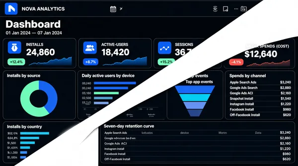
![[Format]
Landscape 16:9 gig cover, flat analytics-UI screenshot with a hard diagonal cut. Crisp dark theme, thin light rules. No watermark, no personal names.
[Layout]
Edge-to-edge dark dashboard, no bezel. The defining geometry is a single wide white diagonal wedge that slices the frame from the lower-left toward the upper-right, cutting off a triangular portion of the UI at the top-right and bottom-left so the interface appears to be revealed behind a peeling surface. Behind the wedge the dark canvas is tiled with rounded dark panels in a masonry grid of different sizes: a top bar with the app title, a date-range pill pair and a small badge at the far right; a heading row; then a mosaic — a row of four KPI panels each with an icon square, a label pair and a mini area sparkline; below that a large donut panel, a horizontal bar panel, a funnel panel and a vertical spend list; a wide retention table panel spans the lower row; a small country bar panel sits bottom-left.
[Subject]
None — UI only.
[Headline]
The top bar title reads a two-part app and product-analytics name in light grey with a small square logo mark at its left (an individual product's own name — keep it as neutral placeholder wording); below it a large white "Dashboard" heading with a smaller date line. KPI labels read "INSTALLS", "ACTIVE-USERS", "SESSIONS" and "MEDIA SPENDS (COST)" with large white figures and small coloured delta chips. Tile titles include installs-by-source, daily-active-users-by-device, top-app-events, spends-by-channel, installs-by-country and a seven-day retention curve; the spends-by-channel column is a stack of small rows labelled Apple Search Ads, Google Ads Search, Google Ads ACI, Snapchat Install, Instagram Install, Facebook Install and Off-Facebook Install, each with a coloured bar and a value.
[Badges]
Top-left a tiny flat rounded-square mark in solid blue with a white glyph — the app's own private logo, drawn as the small blue mark it appears as, with no invented name. Bottom-right corner shows a faint dark watermark strip; omit it.
[Mood]
Near-black navy canvas with mint-green and electric-blue data accents against a hard white diagonal cut. Sleek, modern, high-tech; the diagonal wedge gives the thumbnail an unusual, memorable silhouette.](https://files.posterlet.com/assets/generated/md/n49tp5rziihe.webp)
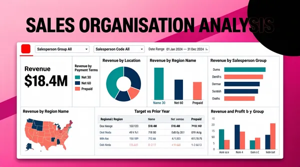
![[Format]
Landscape 16:9 gig cover, presentation-slide style with a screenshot panel on a gradient ground. Clean, minimal chrome. No watermark, no personal names.
[Layout]
Full-bleed pink-to-magenta gradient background with a subtle diagonal band across the frame and a soft dark circle bleeding off the top-right corner. A single large white dashboard panel sits centred and slightly low, occupying about 85% of the width and 75% of the height, with a crisp thin border and a soft shadow lifting it off the gradient. Inside the panel a dense three-column grid of report tiles: a top filter strip with a date range spine and two dropdown fields, then a tall numeric KPI tile and a legend list on the left, a donut chart and a regional bar chart at centre, a grouped horizontal bar panel at right, a small choropleth map bottom-left, a wide data table at bottom-centre, and a grouped column chart bottom-right — all separated by thin pale-grey rules.
[Subject]
None — screenshot only.
[Headline]
Across the top of the frame, outside the panel, an enormous heavy black uppercase headline centred with wide tracking: "SALES ORGANISATION ANALYSIS". Inside the panel the small tile titles include revenue-by-payment-terms, revenue-by-location, revenue-by-salesperson-group, revenue-by-region-name, revenue-and-profit-by-group and a target-versus-prior-year comparison; the tall KPI tile shows a large black figure over the word "Revenue"; the filter fields are labelled with salesperson-group and salesperson-code captions.
[Badges]
The panel's top-left corner holds one small solid-red square mark (blurred in the reference) — keep it as a small flat saturated-red rounded square standing in for the panel's own obscured header mark. Add a thin red rule under it.
[Mood]
Candy-pink to deep magenta ground against a clean white report panel, with teal, navy and coral data colours. Modern slide-deck brightness; the black all-caps headline punches out at thumbnail size.](https://files.posterlet.com/assets/generated/md/qpcg465a0wlp.webp)
![[Format]
Landscape 16:9 gig cover, slick tech-gradient banner with a photographic cut-out. Glossy, high contrast, subtle circuit linework. No watermark, no personal names.
[Layout]
Vertical split roughly 55/45. The left portion is a dark blue gradient with faint diagonal circuit traces and light streaks. The right portion is anchored by a tall bright cyan rectangle running from the top to the bottom edge, sitting behind the person like a colour panel; the person's cut-out overlaps its left edge. On the left the content stacks downward: headline, an outlined pill row, three green-check bullet lines, a row of four small white rounded tiles with captions, a two-part strapline with thin flanking rules, and a yellow call-to-action button with an arrow glyph at the bottom.
[Subject]
A man in his early thirties, dark hair and short beard, navy blue suit with a light blue patterned tie and white shirt, chest-up, looking directly at camera with a neutral confident expression; occupies the right side, cleanly cut out and layered over the bright cyan panel.
[Headline]
Large heavy uppercase in a bright cyan-to-white gradient: "DATA SCIENCE" over "& ANALYSIS". Below, a white-outlined pill with cyan uppercase text reading "POWER BI • TABLEAU • EXCEL", three tool names separated by bullet dots. Then three small green circular check icons each beside a white bold line of feature copy. Bottom-left a two-part strapline: white uppercase text, then a cyan highlight phrase, with thin horizontal rules on both sides. Finally a yellow rounded-pill button with dark bold uppercase call-to-action copy and a small arrow.
[Badges]
The four small white rounded tiles each carry a flat brand mark: the Power BI logo (a yellow rounded-square with a white stacked-bar glyph), the Tableau mark (a pale multicolour dot-cluster), the Microsoft Excel icon (a green rounded-square with a white cross glyph), and the Python mark (a blue-and-yellow two-tone interlocking-snake glyph). Small grey caption labels under each read "Power BI", "Tableau", "Excel" and "Python".
[Mood]
Deep navy with electric cyan and a single yellow accent, plus green check ticks. Sharp, tech-forward, sales-page energy; the cyan panel and the gradient headline dominate the thumbnail.](https://files.posterlet.com/assets/generated/md/vocodg752zys.webp)
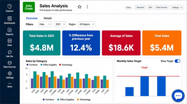
![[Format]
Landscape 16:9 gig cover, flat screenshot of the Zoho Analytics application window. Crisp business-software look, thin grey rules, small labels. No watermark, no personal names.
[Layout]
Edge-to-edge application window with no device frame. A dark navy vertical toolbar hugs the left edge full-height, holding a stacked column of small line icons with tiny labels. Across the top a single-row ribbon holds a menu band, a document title with star and kebab icons, and a right-aligned cluster of pill buttons. Below, a report canvas splits into three bands: a filter band on the left, a highlight row of four wide KPI tiles spanning the width, and beneath it two side-by-side white chart panels. The left chart panel is taller with many coloured columns on a diagonal category axis plus a legend row; the right panel holds a small three-bar chart with a horizontal red threshold line and a toggle control.
[Subject]
None — UI only. A small circular chat bubble sits at the bottom-right corner as a floating widget.
[Headline]
The app title bar reads a two-word report name in bold dark text with a light subtitle describing a full analysis. Inside, a filter group is labelled with a date field and a region field, each a small dropdown; a small tab group sits above them; the four KPI tiles read "Total Sales in 2021", "% Difference from previous year", "Average of Sales" and "Total Sales" — each a solid saturated colour block with white type and a large figure.
[Badges]
None beyond the app's own chrome. The left toolbar's line icons are labelled Explorer, Dashboards, Reports, Data, Ask Zia, Data Sources, Settings and More; the control at the very top-left of the ribbon is the green Zoho "Create" square, the product's own button rather than a separate badge.
[Mood]
White canvas with a dark navy rail and saturated teal, cobalt, crimson and orange KPI blocks. Corporate reporting tone; the four-colour stat ribbon gives the cover its punch at thumbnail size.](https://files.posterlet.com/assets/generated/md/8ryi1z1t4yuu.webp)
![[Format]
Landscape 16:9 gig cover, flat product-UI screenshot style. Clean, modern, fully legible layout blocks, generous whitespace. No watermark, no personal names.
[Layout]
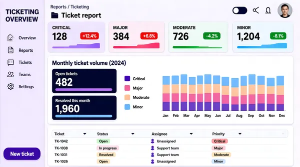
The entire frame is one full-bleed dashboard interface, no device bezel. A narrow left rail runs the full height with a stack of small line icons and a few short labels, and a pill-shaped primary button at its base. The main canvas to the right is divided by two thin horizontal rules into three tiers. Top tier: a small breadcrumb row, then a section title, then four equal-width pastel gradient KPI cards in a row, each with a number, a delta chip and a tiny bar sparkline. Middle tier: a large white panel holding a three-column group — two rows of big-number stat cards with thick colour progress bars, a legend list, and a stacked-colour column chart of twelve months. Bottom tier: a white data table panel with a header row of small filter dropdowns and four data rows carrying status chips and small avatar dots.
[Subject]
None — UI only. The only human element is a small circular avatar photograph in the top-right header cluster; ignore its identity.
[Headline]
Top-left of the rail carries a two-line dark-violet title, a ticketing-overview phrase. The page header reads a two-word report title in mid-weight dark grey with a small folder glyph. The main section heading in bold dark navy reads a monthly ticket-volume phrase with a parenthetical. KPI card labels in small caps read "Critical", "Major", "Moderate", "Minor" with big numeric values and green or red delta pills.
[Badges]
None. The top-right cluster is only a dark-mode toggle, two line icons and a circular avatar dot.
[Mood]
Soft lilac-to-white canvas with violet, pink, peach and sky-blue pastel accents. Friendly enterprise analytics feel, dense but airy; the four colour-block KPI cards are the thumbnail's hook.](https://files.posterlet.com/assets/generated/md/vda0ldvc48c9.webp)
![[Format]
Landscape 16:9 gig cover, editorial infographic style with a photographic cut-out. Bright, airy, flat vector shapes over white. No watermark, no personal names.
[Layout]
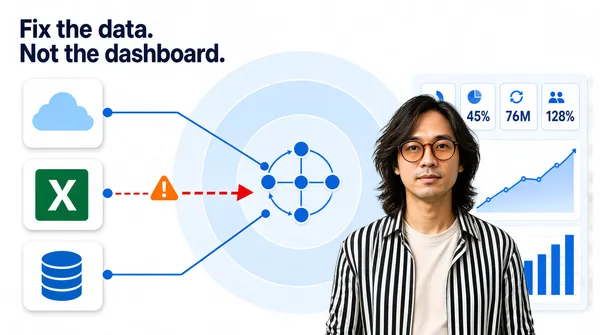
Near-white seamless background. The top-left corner holds a two-line dark headline. Down the left edge, three white rounded-square tiles stack vertically at even spacing, each with a soft shadow and one simple flat icon inside. From each tile a thin blue connector line runs right with a node dot, converging on a large pale-blue concentric-circle diagram at dead centre, which holds a small four-node hub inside. The middle connector is interrupted by a red dashed arrow with a small orange warning triangle, visually the odd one out. A person cut-out sits centre-right, overlapping the circle diagram's right edge and the dashboard panel behind it. The right side carries a pale dashboard panel with a row of four small stat modules, a rising line chart and a column chart in blues.
[Subject]
A person in their thirties, medium-length layered hair, round tinted glasses, wearing an open black-and-white vertically striped shirt over a pale tee, chest-up, looking straight at camera; positioned centre-right, cropped at mid-torso, cleanly cut out and layered over the diagram and the panel.
[Headline]
Top-left, two short lines in a bold dark-blue geometric sans: "Fix the data." then "Not the dashboard." — sentence case, tight leading, small relative to the frame.
[Badges]
None beyond the three source tiles. The three icon tiles down the left edge are the only marks: a pale-blue cloud silhouette, the Microsoft Excel icon (a green rounded square with a white "X" glyph), and a blue stacked-disc database cylinder. Keep their flat geometry, size and spacing exactly as drawn.
[Mood]
Almost-white field with a single saturated blue family plus one red warning accent and one green tile. Calm, consulting-clean, diagram-led; the headline and the single red accent carry the thumbnail read.](https://files.posterlet.com/assets/generated/md/7zxpvxl47nub.webp)
![[Format]
Landscape 16:9 gig cover, cinematic tech style with a photographic cut-out. Polished, high contrast, slight glow. No watermark, no personal names.
[Layout]
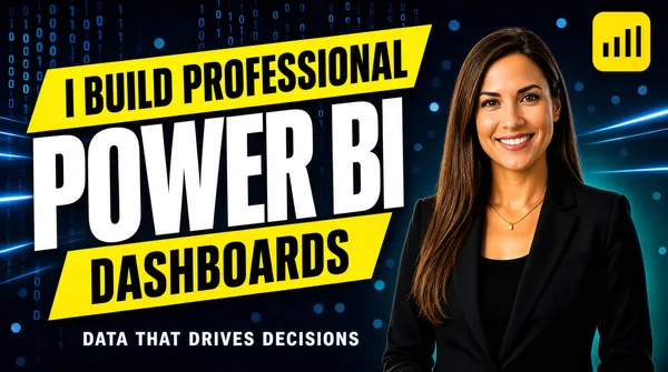
Full-bleed dark blue-teal tech background: faint falling binary digits, soft bokeh circles and thin light streaks across the whole frame. The composition splits roughly 55/45 — the left side is a stack of alternating yellow and white typographic bands, the right side is occupied by the person cut-out. The yellow label plates are rotated slightly (about -4 degrees) and overlap the large white word in the middle, so the stack reads as three ribbons. The Power BI logo — a small flat yellow rounded-square mark containing three ascending bars of increasing height — sits near the top-right corner above the person's shoulder. A thin white sub-line sits low-centre-left under the stack.
[Subject]
A woman in her early thirties, long straight brown hair, black blazer over a black top, thin gold necklace, head-and-shoulders down to waist-up, warm smile at camera; she fills the right third and is cut out cleanly against the background, lit with a soft key from her left.
[Headline]
Ink-black condensed uppercase on the yellow plates: "I BUILD PROFESSIONAL" on the upper plate and "DASHBOARDS" on the lower plate. Between them, "POWER BI" set enormous in heavy white condensed uppercase, centred over the yellow bands. Below the stack, a small white uppercase tracking-wide line reading a short delivery promise.
[Badges]
Top-right the Power BI logo: a small flat rounded-square mark in solid yellow containing three ascending bars of increasing height. Faint scattered glow dots elsewhere are background texture only.
[Mood]
Deep navy-teal with electric blue highlights and saturated lemon-yellow plates. Modern corporate-tech energy; the yellow ribbons and the giant white word pull the eye instantly at thumbnail scale.](https://files.posterlet.com/assets/generated/md/gtv9l7o35myf.webp)
![[Format]
Landscape 16:9 gig cover, flat corporate graphic style with a photographic cut-out. Clean vector edges, high contrast, crisp. No watermark, no personal names.
[Layout]
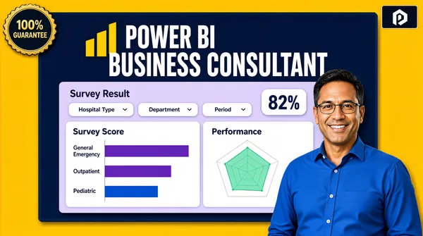
Full-bleed mustard-yellow background. A large deep navy rectangle sits inset from the frame edges, occupying roughly the upper two-thirds and centred, with slightly darker navy border lines top and bottom. Inside that rectangle the top band carries the big headline, and directly below it a wide light-lavender dashboard card floats with a soft drop shadow, holding a filter row and two chart panels. A photographic cut-out of a man overlaps the lower-right corner of the navy rectangle, breaking its edge and sitting in front of the yellow background. A small circular gold seal sits at the top-left corner of the frame, and a small dark inset badge at the top-right corner.
[Subject]
A man in his forties, short dark hair, thin-rimmed glasses, wearing a bright blue button-up shirt, waist-up, smiling at camera, positioned bottom-right, cropped by the frame's bottom edge; he overlaps the navy panel and reads as a clean-edged cut-out.
[Headline]
Two-line centred headline on the navy panel: first line "POWER BI" in heavy white uppercase with tight tracking, beside the yellow ascending-column Power BI logo mark; second line "BUSINESS CONSULTANT" in larger heavy white uppercase. Inside the dashboard card, a smaller white title "Survey Result" top-left, three pale pill-shaped dropdown filter fields below it, a rounded stat chip at top-right, then two white chart panels: a horizontal bar chart with purple and blue bars labelled with hospital-sounding categories, and a radar chart in mint green.
[Badges]
Top-left a dark circular seal with a gold serrated border and gold stacked text lines (a 100%-guarantee style ribbon). Top-right a small dark rectangle holding a white abstract monogram.
[Mood]
Mustard yellow and deep navy with lavender-white dashboard panels and a mint-green accent. Bright, corporate, high-contrast; it reads clearly as a BI-consultant banner even at thumbnail size.](https://files.posterlet.com/assets/generated/md/ppd460up5feb.webp)
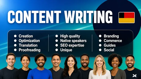
![[Format]
Landscape 16:9 gig cover, corporate team composite. Clean, modern, lightly graphic finish. No watermark, no personal names.
[Layout]
A blue-to-teal gradient ground carries a large dark navy circle entering from the upper-right and sitting behind the middle of the frame, plus faint diagonal light streaks. A single wide headline spans the top of the frame, left-aligned, with a small flag plate beside its right end. Below the headline, a full-width translucent dark rounded panel holds a three-column bulleted list, evenly spaced with generous leading. Along the bottom edge a row of nine photographic head-and-shoulders cut-outs sits flush to the frame, overlapping the gradient so the group reads as a team line-up running the full width.
[Subject]
A team line-up of nine adults standing shoulder to shoulder across the bottom of the frame, spanning a range of ages, genders and ethnic backgrounds, each cropped at the chest so only head and shoulders show, all facing camera with friendly smiles. Mixed casual and smart-casual clothing in dark, neutral and one bright blue tone. Bright, evenly balanced lighting across the whole row; each figure is cut out cleanly against the gradient with no border or card.
[Headline]
Across the top, left-aligned, in a very heavy white uppercase sans-serif occupying most of the frame width: "CONTENT WRITING", set as a single line roughly a quarter of the frame height. Beside its right end sits a small rounded rectangle showing a plain horizontal tricolour of black over red over gold. Inside the translucent panel, three evenly spaced columns of bulleted white regular sans-serif lines, each with a round white bullet: column one "Creation", "Optimization", "Translation", "Proofreading"; column two "High quality", "Native speakers", "SEO expertise", "Unique"; column three "Branding", "Commerce", "Guides", "Social".
[Badges]
One small rounded flag plate beside the headline showing a plain black-red-gold horizontal tricolour. On one team member's dark tee a small white wordmark appears, described generically as a small white logo on the shirt.
[Mood]
Corporate, trustworthy and human. Palette: blue and teal gradient, deep navy, white, plus the muted tones of the team row. At thumbnail size the big white headline and the three-column list read as a capability sheet, while the nine smiling faces along the bottom give the cover an approachable, full-team feel.](https://files.posterlet.com/assets/generated/md/8ith6ndgjlmi.webp)
![[Format]
Landscape 16:9 gig cover, split photographic composite with stacked logo plates. Clean, corporate, high-contrast finish. No watermark, no personal names.
[Layout]
The frame splits on a soft diagonal: the left ~50% is a flat crimson-red field, and the right ~50% is a bright office photograph in which a man sits at a laptop, with a deep-focus blurred interior and a second blurred person behind him. The left column stacks three plates vertically, left-aligned: a dark charcoal plate holding the headline, a white plate holding a logo lockup, and a rounded charcoal plate holding a bulleted list. The photograph runs to the top, right and bottom frame edges, and the two halves meet along a clean diagonal seam.
[Subject]
A man in his thirties, short brown hair, well-trimmed beard, dark-framed round glasses, a dark denim or chambray shirt worn open over a light tee. Seated at a light desk with an open silver laptop, both hands resting near the keyboard, head lifted and turned to camera with a bright open smile showing teeth. Bright natural window light from the right.
[Headline]
On the top charcoal plate, left-aligned: "SEO FRIENDLY" in very heavy white uppercase on the first line, and "ARTICLE WRITING" beneath it in the same heavy white uppercase but slightly smaller. On the white plate below, the Surfer SEO logo lockup: a small rounded-square mark with a soft orange-to-pink gradient and a thin outlined chart-with-arrows inner symbol, beside the bold black uppercase wordmark "SURFER". Lower down, on a rounded charcoal plate, four left-aligned bullet lines in white bold italic uppercase with small white round bullets: "EASY GOOGLE RANKING", "ENGAGING & COMPELLING", "85+ SURFER SEO SCORE", "100% PLAGIARISM FREE".
[Badges]
One logo lockup on the white plate — the Surfer SEO logo: a small gradient square mark with an inner outlined glyph beside the bold black wordmark "SURFER".
[Mood]
Clean, confident and results-oriented. Palette: crimson red, charcoal, white, plus the bright whites and blues of the office photograph. At thumbnail size the white headline on the charcoal plate and the white logo plate read instantly against the red, with the smiling man supplying warmth.](https://files.posterlet.com/assets/generated/md/a88ca9f9qpsi.webp)
![[Format]
Landscape 16:9 gig cover, gradient tech composite with a photographic cut-out. Bright, energetic finish with diagonal light streaks. No watermark, no personal names.
[Layout]
A cyan-to-blue gradient ground is crossed by diagonal translucent light streaks, and rows of white outlined chevron arrows pointing left run along the top-right, mid-right and lower-right edges. The left ~40% holds a photographic cut-out of a man from the thigh up, extending off the bottom and left edges. Floating in the centre-left, between the man and the headline, is a large multicolour wordmark built from three fat rounded letters with a small rocket illustration worked into the last one. The right ~50% carries the stacked headline. In the lower-right corner a gold coin sits at a slight angle, partially overlapping the chevrons.
[Subject]
A man in his thirties, short light-brown hair, light stubble, wearing a light blue denim shirt. Standing, crop at the thigh, holding a silver laptop flat against his chest with both hands so one edge angles toward camera. Body angled slightly toward the right, face to camera with a calm closed-mouth smile. Bright even studio lighting.
[Headline]
Right side, stacked left-aligned: "CRYPTO" then "EXPERT" in very heavy black uppercase, each line roughly a sixth of frame height; beneath them a full black bar holds "WRITER" in very heavy white uppercase, the bar spanning the full column width. To the left of the headline block floats the large multicolour wordmark — three fat rounded letters, the first green, the second orange-gold and the third red, with a small rocket graphic built into the last letter.
[Badges]
The multicolour three-letter "SEO" wordmark with its built-in rocket graphic; a gold Bitcoin coin at the lower-right, its rim ringed with the embossed words "BITCOIN" and "DECENTRALIZED PEER TO PEER" around the central double-stroked Bitcoin B; rows of white outlined chevron arrows along the right edge. On the silver laptop lid, a round decal showing the Canadian flag, red bars with a centred maple leaf.
[Mood]
Bright, techy and forward-leaning. Palette: cyan, blue, black, white, with green/orange/red from the wordmark and gold from the coin. At thumbnail size the heavy black CRYPTO EXPERT and the white-on-black WRITER bar dominate, while the coloured wordmark and gold coin add niche flavour.](https://files.posterlet.com/assets/generated/md/zorfi2ctqk1d.webp)