Generate
Create images with AI
Monthly Ticket Volume Analytics Dashboard
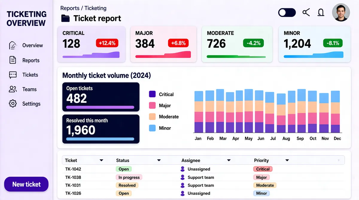
[Format] Landscape 16:9 gig cover, flat product-UI screenshot style. Clean, modern, fully legible layout blocks, generous whitespace. No watermark, no personal names. [Layout] The entire frame is one full-bleed dashboard interface, no device bezel. A narrow left rail runs the full height with a stack of small line icons and a few short labels, and a pill-shaped primary button at its base. The main canvas to the right is divided by two thin horizontal rules into three tiers. Top tier: a small breadcrumb row, then a section title, then four equal-width pastel gradient KPI cards in a row, each with a number, a delta chip and a tiny bar sparkline. Middle tier: a large white panel holding a three-column group — two rows of big-number stat cards with thick colour progress bars, a legend list, and a stacked-colour column chart of twelve months. Bottom tier: a white data table panel with a header row of small filter dropdowns and four data rows carrying status chips and small avatar dots. [Subject] None — UI only. The only human element is a small circular avatar photograph in the top-right header cluster; ignore its identity. [Headline] Top-left of the rail carries a two-line dark-violet title, a ticketing-overview phrase. The page header reads a two-word report title in mid-weight dark grey with a small folder glyph. The main section heading in bold dark navy reads a monthly ticket-volume phrase with a parenthetical. KPI card labels in small caps read "Critical", "Major", "Moderate", "Minor" with big numeric values and green or red delta pills. [Badges] None. The top-right cluster is only a dark-mode toggle, two line icons and a circular avatar dot. [Mood] Soft lilac-to-white canvas with violet, pink, peach and sky-blue pastel accents. Friendly enterprise analytics feel, dense but airy; the four colour-block KPI cards are the thumbnail's hook.
Tags
More Images