Generate
Create images with AI
Sales Organisation Analysis Dashboard
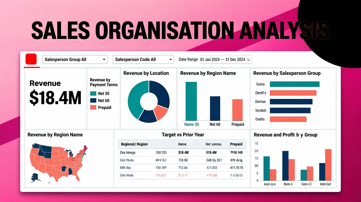
[Format] Landscape 16:9 gig cover, presentation-slide style with a screenshot panel on a gradient ground. Clean, minimal chrome. No watermark, no personal names. [Layout] Full-bleed pink-to-magenta gradient background with a subtle diagonal band across the frame and a soft dark circle bleeding off the top-right corner. A single large white dashboard panel sits centred and slightly low, occupying about 85% of the width and 75% of the height, with a crisp thin border and a soft shadow lifting it off the gradient. Inside the panel a dense three-column grid of report tiles: a top filter strip with a date range spine and two dropdown fields, then a tall numeric KPI tile and a legend list on the left, a donut chart and a regional bar chart at centre, a grouped horizontal bar panel at right, a small choropleth map bottom-left, a wide data table at bottom-centre, and a grouped column chart bottom-right — all separated by thin pale-grey rules. [Subject] None — screenshot only. [Headline] Across the top of the frame, outside the panel, an enormous heavy black uppercase headline centred with wide tracking: "SALES ORGANISATION ANALYSIS". Inside the panel the small tile titles include revenue-by-payment-terms, revenue-by-location, revenue-by-salesperson-group, revenue-by-region-name, revenue-and-profit-by-group and a target-versus-prior-year comparison; the tall KPI tile shows a large black figure over the word "Revenue"; the filter fields are labelled with salesperson-group and salesperson-code captions. [Badges] The panel's top-left corner holds one small solid-red square mark (blurred in the reference) — keep it as a small flat saturated-red rounded square standing in for the panel's own obscured header mark. Add a thin red rule under it. [Mood] Candy-pink to deep magenta ground against a clean white report panel, with teal, navy and coral data colours. Modern slide-deck brightness; the black all-caps headline punches out at thumbnail size.
Tags
More Images