




About this collection
Every Fiverr gig lives or dies by a single image. Each cover here respects the real constraints of a gig image - one banner-shaped canvas, high-contrast text, and no clutter that would collapse at small sizes.
These are starting points, not finished listings. Every cover here is built around one idea: a single service promise, set in type large enough to survive being shrunk into Fiverr's search grid. The collection spans roughly thirty service areas — software and app development, design and branding, writing and translation, marketing, audio, data, and business consulting — so you can usually find a layout close to what you sell and adapt it.
Nothing here is a layered design file. Each one is a flat generated image, which is exactly what makes it quick: pick a layout, swap the headline, palette, and icons for your own service, and you have a listing image in a few minutes rather than an afternoon.
What a gig cover actually has to do
A buyer scanning search results sees your cover as a thumbnail no wider than a postage stamp, sitting next to a dozen competitors. That single constraint decides almost everything else:
- One promise, not a service list. "I will fix your WordPress site in 24 hours" reads at thumbnail size. "WordPress | SEO | Speed | Security | Maintenance" turns to mush.
- High contrast between text and background. Thin light type on a pale panel is the first thing to disappear when the image shrinks.
- Three to six words in the headline. Long headlines force small type, and small type is what becomes unreadable first.
- The service visible before reading a word. A layout cue — a device frame, a waveform, a chart, a colour swatch — tells the buyer the category instantly.
Resizing and export
Fiverr publishes its own requirements in the uploader, and they change - check them there rather than trusting a number quoted in a blog post. What does not change is the direction of the resize: always scale down from the download. Never upscale a smaller image to reach the uploader's width, because the text edges go soft, and soft type is exactly what a thumbnail cannot afford.
When you trim to match the uploader's proportions, do it symmetrically and keep the headline centred, so the crop does not eat one side of the promise.
Three things worth doing before you upload
- Judge the thumbnail, not the full-size file. Shrink the preview down to search-result size, or just squint. If the promise still reads, the cover works. 2. Keep a colour system across your gigs. Buyers skim a grid of near-identical covers; a consistent accent colour makes your listings recognisable among strangers. 3. Leave the outer margin clear. Gig images get cropped slightly differently across placements, so keep text away from the outer edge of the canvas.
Common questions
Will the downloaded cover meet Fiverr's upload requirements?
Check the uploader: Fiverr shows its current accepted format, file limit and recommended image spec there, and those are the platform's requirements, not ours. What matters on this side is direction — start from the downloaded cover and scale down to fit, never up from a smaller file.
Will the text still be readable in the search grid?
Shrink it to search-result size before uploading. That is close to what buyers actually see when comparing gigs, and it is where most covers fail — usually because the headline was set too small or the contrast was too low to begin with.
How many images should one gig have?
Fiverr's gallery takes up to three images and two videos. Lead with the strongest cover, then spend the remaining slots on a work sample, a before-and-after, or a deliverable preview rather than more headline art.
Can I use the same cover on several gigs?
No. Buyers often see two or three of your gigs together, and identical covers make them look like one listing repeated. Change the headline, the accent colour, and the main visual so each gig reads as its own service.
Can I change the text or colours after generating?
Not in place. The wording is baked into the image, so there is no text layer to retype. Download it and edit it in your own tool, or use the "Use as Template" option to regenerate it with different copy.
Why do the covers in this collection look so different from each other?
Because the range is deliberately broad. Each cover was written around the specific service it advertises, so a logo animation cover and a translation cover share a job — selling one service at thumbnail size — but not a visual style. That variety is what lets you give every gig a distinct look.
![[Format]
Landscape 16:9 gig cover, flat line-art illustration style over a white background with a purple base band. Clean vector finish with a soft organic colour blob. No watermark, no personal names.
[Layout]
A white field fills the frame. The left ~40% stacks a text block starting near the top: a small kicker line, then a two-line giant headline, then a two-line sub-line, and beneath it, near the bottom-left, a software logo. The right ~55% holds a large lavender-purple organic blob shape on which a flat illustration scene plays out: three business figures jointly lifting a giant purple growth arrow that bends from lower-left up to the upper-right where a second arrowhead points at a doodle target with an arrow in the bullseye; doodle clouds, outline gears and small plant sprigs decorate the scene. A solid purple band runs the full width of the bottom edge, with a small pink double-chevron arrow at its right end.
[Subject]
Three flat-illustrated office characters — a woman in a purple jacket and a man in shirt and tie holding the arrow's tail on the left and centre, and a man in a purple jacket pushing the arrow's head on the right — rendered in a minimal line-art style with dark hair and simple faces; no photo cut-outs.
[Headline]
Left block, reading order: "Build a solid" in small-to-medium black sans; "Financial Model" in a very large black bold condensed sans across two lines, the dominant text; "for your new or existing business" beneath in a medium black sans over two lines. No headline sits in the purple band.
[Badges]
The Microsoft Excel logo bottom-left: a green square tile with a white "X" joined to a green-outlined spreadsheet grid tile, drawn in the official flat style.
[Mood]
White, lavender purple and green — light, friendly, startup-illustration energy. At thumbnail size the huge black words and the purple arrow scene stay legible.](https://files.posterlet.com/assets/generated/md/klz1s8h244h8.webp)
![[Format]
Landscape 16:9 gig cover, modern minimal corporate promo on a saturated yellow field with a flat colour band. Clean studio cut-out composite, crisp flat vector plates. No watermark, no personal names.
[Layout]
The upper ~78% of the frame is a flat bright yellow field; the bottom ~22% is a solid indigo-purple horizontal band running the full width. The left ~60% stacks the message: a small indigo rounded plate at the top holding a short kicker, then a huge two-line black headline, then a second indigo rounded plate with a delivery promise. The right ~40% holds a chest-up photo cut-out of the seller in a suit whose body bleeds off the bottom edge and slightly off the right, with the purple band passing behind his lower half. Flat colour blocks, no gradients, no textures.
[Subject]
A clean-shaven young man with styled dark hair, wearing a dark navy suit, white shirt and navy tie, chest-up, facing camera with a soft smile, bright even studio lighting, occupying the right third.
[Headline]
Reading order: "Get your custom" in white bold title-case sans on the small indigo plate; "INVESTOR-GRADE FINANCIAL MODEL" in very large black bold uppercase sans across two lines on the yellow field, the dominant element; "In 24-48 Hours" in white bold sans on the second indigo plate; and in the purple bottom band "From Ex-KPMG Consultant" in white bold sans, left-aligned.
[Badges]
none
[Mood]
Bright yellow, indigo purple, black and white — sharp, modern, consultancy-grade confidence. At thumbnail size the black headline on yellow and the purple band read instantly.](https://files.posterlet.com/assets/generated/md/bfetri2zy6qm.webp)
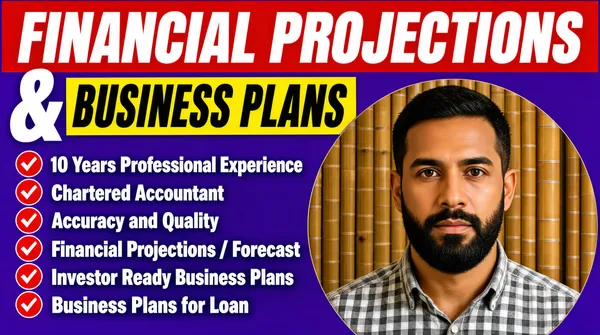
![[Format]
Landscape 16:9 gig cover, bold flat-design promo on a saturated violet background. High-contrast sticker-plate typography with a circular photo cut-out. No watermark, no personal names.
[Layout]
A flat vivid violet-purple field fills the frame. The top two-thirds of the left side stacks two full-width colour plates holding the headline: a wide red plate at the very top edge, and beneath it a shorter yellow plate offset left with a large white ampersand hanging to its left. Below the plates runs a six-row bullet list in white bold text, each row prefixed by a small red circular check icon. The bottom-right quadrant holds a large circular photo cut-out of the seller that bleeds slightly off the bottom-right edge, its rim touching the bullet list.
[Subject]
A bearded man in his thirties wearing a grey-and-white checked shirt, photographed indoors against a bamboo-blinds backdrop, head-and-shoulders inside the large circle at bottom-right, looking at camera with a serious expression, warm indoor lighting.
[Headline]
Reading order: "FINANCIAL PROJECTIONS" in huge white bold italic uppercase condensed sans across the red plate at the top; below it a very large white "&" beside "BUSINESS PLANS" in black bold italic uppercase condensed sans on the yellow plate. Then six bullet rows in white bold sans, each with a red check circle: "10 Years Professional Experience", "Chartered Accountant", "Accuracy and Quality", "Financial Projections / Forecast", "Investor Ready Business Plans", "Business Plans for Loan".
[Badges]
Six small red circular check-mark icons, one per bullet row.
[Mood]
Violet, red and yellow — loud, confident, marketplace-style urgency. At thumbnail size the red and yellow plates and the big circular portrait make it pop instantly.](https://files.posterlet.com/assets/generated/md/mw6l897syxru.webp)
![[Format]
Landscape 16:9 gig cover, modern flat design over a rich green gradient background with outlined geometric accents. Clean cut-out composite finish. No watermark, no personal names.
[Layout]
The background is a diagonal gradient from deep black-green at the corners to vivid emerald green at the centre, decorated with thin outlined square frames — a small double-square motif top-left, a large overlapping pair of square outlines behind the figure top-right, and a small double square bottom-centre — plus a dashed light-green swirl line curling between the text and the figure. The left half carries the headline block vertically centred and a call-to-action lockup near the bottom. The right half holds a waist-up photo cut-out of the seller, feet cropped by the bottom edge, standing in front of the large square outlines.
[Subject]
A heavy-bearded man wearing glasses and a dark prayer cap, dressed in a dark buttoned kurta-style coat, waist-up, facing camera with a calm neutral expression, soft even lighting, occupying the right third and overlapping the outlined squares.
[Headline]
Left block, reading order: "FINANCIAL" in very large bold white uppercase condensed sans; "PROJECTIONS" beneath it in the same style with a thin white underline; "Plans & Models" below in bright light-green bold title case. Bottom-left: a call-to-action lockup — a dark rectangular plate holding "LET'S" in white bold uppercase and "START" in green bold uppercase, framed by a thin white bracket outline offset around it.
[Badges]
none — only decorative outlined squares and a dashed swirl line.
[Mood]
Emerald green, black and white — fresh, focused, professional with a tech feel. At thumbnail size the huge white words and the green-glow centre carry the composition.](https://files.posterlet.com/assets/generated/md/kfh1834dd2e5.webp)
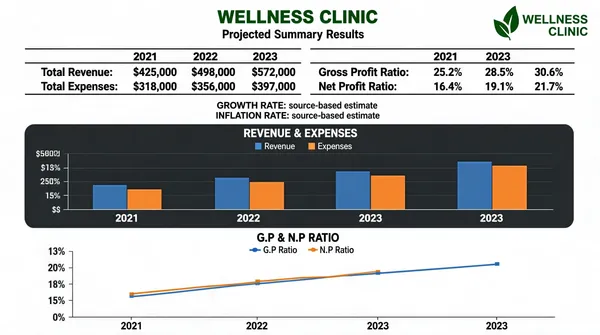
![[Format]
Landscape 16:9 gig cover presented as a full-bleed screenshot of a spreadsheet financial summary report. Clean document finish: white paper, black text, thin rules, two chart panels. No watermark, no personal names.
[Layout]
A white report page fills the frame edge to edge. The top strip holds a centred two-line client title with a small green clinic-style logo lockup at the top-right corner, closed by a thin horizontal rule. The upper half holds two compact financial tables, each with year columns 2021 / 2022 / 2023 separated by black horizontal rules and left-hand row labels. The lower half holds a dark grey rounded panel with a clustered blue-and-orange bar chart, and beneath it a white panel with a flat blue-and-orange line chart. Vertical rhythm is dense and report-like; no photography anywhere.
[Subject]
none — pure document mockup.
[Headline]
Top-centre: a wellness-clinic client name in dark green bold text above "Projected Summary Results" in smaller black text. Table rows read, in order: "Total Revenue:" with dollar figures, "Total Expenses:" with dollar figures, then a second table with "Gross Profit Ratio:" and "Net Profit Ratio:" percentages, all right-aligned under the 2021/2022/2023 headers. Two small grey source-URL lines follow, labelled "GROWTH RATE:" and "INFLATION RATE:". The chart panels are titled "REVENUE & EXPENSES" in white caps on the dark panel and "G.P & N.P RATIO" in grey caps on the white panel, each with a small legend.
[Badges]
A small green leaf-and-text clinic logo lockup at the top-right, generic in style.
[Mood]
White and black with green accents and blue-and-orange Excel-style charts — dry, credible, accountant-grade. At thumbnail size it reads unmistakably as a real financial-model excerpt.](https://files.posterlet.com/assets/generated/md/g42wlbqybui2.webp)
![[Format]
Landscape 16:9 gig cover, high-impact dark tech design with a photographic cut-out. Glossy layered finish with glowing golden circuit accents and hexagon frame corners. No watermark, no personal names.
[Layout]
A near-black brown background textured with glowing golden circuit-board traces; angular hexagon-corner frames sit at the top-right and bottom-left edges, and a large golden Bitcoin coin glows on the mid-left edge, half cropped by the frame. The left ~55% carries a centre-aligned stacked headline block whose final line sits on a yellow rectangular plate, followed by a small pill label, three checkbox bullet lines, and a call-to-action pill near the bottom. The right ~40% holds a waist-up photo cut-out of the seller finished with a thick white sticker-style outline, overlapping the background; behind his shoulder glows a large dark golden circular emblem with a coin-and-cross motif.
[Subject]
A dark-haired bearded man in his thirties, wearing a grey check suit jacket over an open dark patterned shirt with a brown pocket square, waist-up, facing camera with a slight smile, warm golden rim lighting, occupying the right third of the frame.
[Headline]
Reading order on the left block: "BUSINESS PLAN &" in yellow bold uppercase sans; "FINANCIAL MODEL FOR" in white bold uppercase; "CRYPTO & BLOCKCHAIN" in very large yellow bold uppercase; "COMPANIES" in black bold uppercase on a yellow rectangular plate. Below, a small yellow pill reading "SPECIALITIES" in dark text. Then three white uppercase bullet lines, each prefixed by a yellow tick-in-square checkbox: "WORKED WITH OVER 10 CRYPTO & BLOCKCHAIN COMPANIES", "HIGHEST RAISE OF OVER $30M IN SEED-ROUND FOR CRYPTO COMPANY", "WHITEPAPER & PITCH DECK ALSO OFFERED". Bottom: a yellow pill reading "ORDER NOW" in dark bold uppercase.
[Badges]
A large glowing golden Bitcoin coin with its famous encircled "B" mark on the mid-left edge, plus circuit-trace decorations across the dark background.
[Mood]
Black, gold and yellow — premium crypto-tech energy with hot contrast. At thumbnail size the giant yellow headline, the glowing Bitcoin coin and the white-outlined portrait dominate.](https://files.posterlet.com/assets/generated/md/lv4js5dpfxxa.webp)
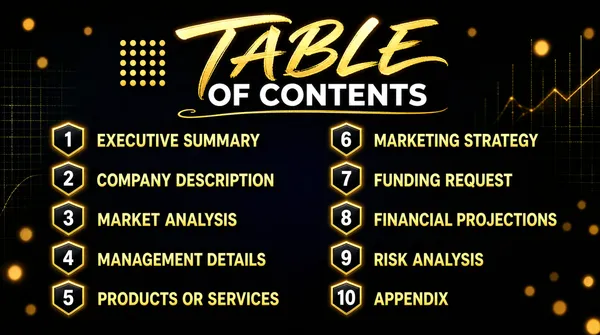
![[Format]
Landscape 16:9 gig cover, a luxurious dark presentation slide with a golden glow. Premium cinematic finish with bokeh particles and subtle texture. No watermark, no personal names.
[Layout]
A full-bleed midnight navy-to-black gradient background scattered with warm golden bokeh dots and faint out-of-focus chart and grid motifs near the edges. Top-centre sits an ornate headline lockup with a small golden dotted-grid motif on its left and a hand-drawn golden swash underline beneath. The body of the frame is divided into two symmetric numbered-list columns: the left column holds items 1–5, the right column holds items 6–10, each row evenly spaced and composed of a small dark hexagon-shield badge containing a numeral, followed by a golden uppercase label. Nothing overlaps; the layout is a clean centred table of contents.
[Subject]
none — typographic and badge-driven only.
[Headline]
Top-centre: "TABLE" in large glowing golden brush-script lettering, followed by "OF CONTENTS" in white bold uppercase sans, with a thin golden swash underlining the lockup. Left column rows, in order: "EXECUTIVE SUMMARY", "COMPANY DESCRIPTION", "MARKET ANALYSIS", "MANAGEMENT DETAILS", "PRODUCTS OR SERVICES". Right column rows, in order: "MARKETING STRATEGY", "FUNDING REQUEST", "FINANCIAL PROJECTIONS", "RISK ANALYSIS", "APPENDIX" — all in golden uppercase sans, one line each.
[Badges]
Ten small golden hexagon/shield badges with rounded points, one per list row, each holding a white numeral 1 through 10 with a faint golden rim glow.
[Mood]
Midnight navy-black with metallic gold — premium, cinematic, investor-grade elegance. At thumbnail size the glowing golden script title and the two tidy golden columns remain readable.](https://files.posterlet.com/assets/generated/md/hv8msw0vcsag.webp)
![[Format]
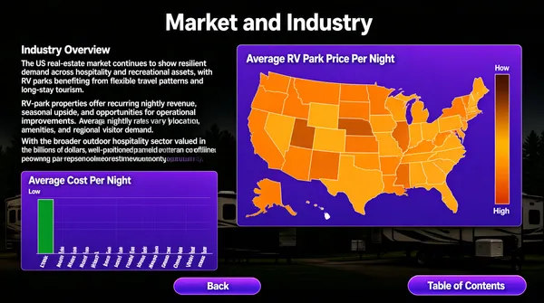
Landscape 16:9 gig cover presented as a full-bleed screenshot of a business-plan presentation slide, edge to edge. Clean report finish: dark photographic backdrop, white body text, saturated purple chart panels. No watermark, no personal names.
[Layout]
The background is a dark, dimmed photographic scene (an outdoor RV-park setting) under a black overlay, so all content floats on top. Top-centre holds the slide title. The left ~55% column carries a bold section label followed by three paragraphs of white body copy. The right ~40% holds a large purple rectangular panel containing a choropleth map of the United States shaded in orange and brown tones, with a small colour legend column stacked on the map's right side. The bottom-left third holds a second purple panel with a tall green vertical bar chart and dozens of tiny state labels rotated along the baseline. Along the bottom edge sit two purple gradient pill buttons: one lower-left-of-centre, one bottom-right.
[Subject]
none — the cover is a slide excerpt; the only imagery is the map panel and the bar-chart panel.
[Headline]
Top-centre: "Market and Industry" in a large white title-case sans. Left column: a bold white "Industry Overview" heading followed by three justified white paragraphs of dense body copy about the US real-estate and RV-park market, with dollar figures inline. The map panel is titled "Average RV Park Price Per Night" in small white text; the chart panel is titled "Average Cost Per Night". The two bottom buttons read "Back" and "Table of Contents" in white on purple.
[Badges]
none
[Mood]
Charcoal black with vivid purple panels and orange map shading — analytic, data-heavy, report-like credibility. At thumbnail size it reads as a genuine slide excerpt with two glowing purple data blocks.](https://files.posterlet.com/assets/generated/md/u5jqvkmz2k3o.webp)
![[Format]
Landscape 16:9 gig cover, minimal clean corporate layout on a pure white background. Flat vector-and-photo finish with generous whitespace. No watermark, no personal names.
[Layout]
A flat white frame divided roughly into two halves. The left half carries a stacked three-line headline block vertically centred, starting about 6% in from the left edge. The right half holds a circular portrait medallion built from concentric rings — a wide pale-blue outer ring, a mid-blue ring, and a dark blue inner ring — with a photo cut-out inside; the outer ring bleeds slightly toward the right edge. Nothing sits behind the text: no photo, no panel, pure white space, so the type and the medallion carry the whole composition.
[Subject]
A clean-shaven man in his late twenties, short brown hair, wearing a dark navy suit, pale blue shirt and a dotted navy tie, chest-up inside the blue medallion, smiling at camera with bright, even studio lighting.
[Headline]
Left, in reading order: "BUSINESS" in a very large bold blue uppercase rounded sans with a subtle drop shadow; below it "PLAN" in the same style, followed on the same line by "From" in a thin dark handwritten script; beneath that "A Strategy Consultant" in a tall condensed dark-navy sans in title case, nearly as wide as the blue words above.
[Badges]
none
[Mood]
White, royal blue and navy — trustworthy, calm, consultant-grade professionalism. At thumbnail size the two fat blue words and the blue circular portrait read instantly against the white field.](https://files.posterlet.com/assets/generated/md/e89isln8vj3z.webp)
![[Format]
Landscape 16:9 gig cover, bold corporate promo design over a darkened photo. Clean layered vector-on-photo finish, crisp edges. No watermark, no personal names.
[Layout]
The frame is split vertically. The right ~45% is dominated by one huge solid orange disc that bleeds off the top, right and bottom edges; inside it sits a circular portrait with a thin white ring. The left ~55% is a dark business-meeting photo (people with laptops and documents around a table) dimmed under a heavy black overlay. The left edge carries a small orange rounded tab bleeding in at mid-height. The headline block sits top-left, a three-row bullet list sits mid-left, and a call-to-action pill sits bottom-left. Depth comes from the flat orange disc overlapping the dark photo.
[Subject]
A dark-haired bearded man in his early thirties, wearing a grey plaid suit jacket over an open dark patterned shirt with a brown pocket square, chest-up, facing camera with a confident expression, warm key light, placed inside the orange disc on the right side of the frame.
[Headline]
Top-left, stacked: "INVESTOR GRADE" in bold white uppercase sans; "BUSINESS" below it in a very large bold uppercase sans with an orange-to-yellow gradient, the biggest word on the cover; "Plan" overlapping its lower right in a white brush script with a dark outline. Below, a bullet list of three rows, each prefixed by a white-and-orange double-chevron arrow: "Business Plan", "Financial Projections", "Pitch Deck" in white semibold title case. Bottom-left: a rounded pill button with a yellow-to-orange gradient reading "ORDER NOW" in black bold uppercase, with a white cursor-hand icon at its right edge.
[Badges]
none
[Mood]
Black, orange and yellow — high-contrast, energetic, salesy corporate. At thumbnail size the giant orange disc, the huge gradient word and the white script pop instantly.](https://files.posterlet.com/assets/generated/md/28ypwkpyo2o9.webp)
![[Format]
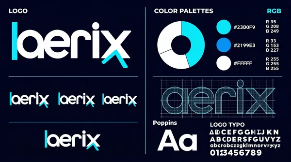
Landscape 16:9 gig cover, brand-guidelines presentation sheet on a flat deep-navy field. Flat vector graphics and grid diagrams, no photography. No watermark, no personal names.
[Layout]
One navy page split into two columns by a single thin vertical hairline at the exact centre, with wide outer margins. The left column stacks three blocks down a shared left margin, separated by thin cyan rules: a tiny section label at the top, then the primary wordmark large, then a row of three logo lockups of different sizes, then the wordmark repeated smaller. The right column stacks two blocks: the colour system at the top — a small section header with a right-aligned mode label, a donut chart split into white and cyan thirds, three swatch circles in a vertical column with hex captions beside them, and a two-column numeric data block at the right edge — and below it the typography system: a wireframe construction grid with an oversized ghosted wordmark laid over it, and beneath that a specimen block with a typeface name, a large pair of letterforms, and a full alphabet plus numerals.
[Subject]
None — flat graphic sheet only, no people and no product photography.
[Headline]
Top-left, the section label LOGO in small wide-tracked white caps. The primary wordmark is a five-letter geometric lowercase-style name in white with a solid cyan left-bracket stroke over its first letter and a cyan diagonal accent on its descender. The right column carries COLOR PALETTES and a right-aligned RGB label, hex captions #23D0F9, #2199E3 and #FFFFFF, three small R-G-B value groups, then the typeface name Poppins above a large Aa specimen, and the label LOGO TYPO over a full uppercase alphabet, lowercase alphabet and numeral run on three lines.
[Badges]
None.
[Mood]
Deep midnight navy with electric cyan and pure white accents; technical, systematic, spec-sheet cool. At thumbnail size the cyan-on-navy wordmark on the left and the donut chart on the right read as a guidelines page even when small.](https://files.posterlet.com/assets/generated/md/bz33vn8o6h4n.webp)
![[Format]
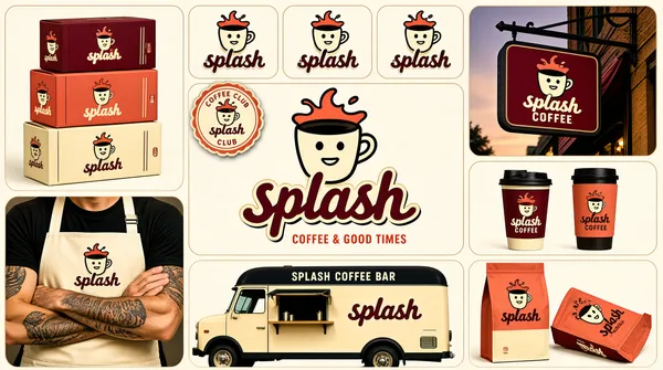
Landscape 16:9 gig cover, coffee-brand identity moodboard on a cream page. Retro illustrated character artwork mixed with printed packaging and vehicle mockups. No watermark, no personal names.
[Layout]
A mosaic of rounded tiles on a cream ground with a narrow gutter, arranged in roughly three bands. Top band: a large packaging tile on the left shows three stacked printed boxes; then a row of three small square logo tiles each showing the character mark alone, white-on-maroon, black-on-coral and maroon-on-cream; then a tall tile on the right shows a hanging storefront sign on a building corner at dusk. A small round scalloped badge sticker overlaps the gutter near the top-left of the centre. Middle band: the centre is one large cream tile holding the full lockup — a cup character wearing a splash crown above a rounded script-style wordmark, with a short caps tagline beneath; to its right a tile shows two takeaway vessels, one lidded cup and one tumbler, split coral and cream. Bottom band: a tile on the left shows a man in a cream work apron printed with the lockup, forearms crossed and cropped at the shoulders; a wide centre tile shows a cream coffee truck with a dark roof and a service hatch, the roundel badge on its door and the wordmark along its side; a right tile shows two printed coffee bags, one standing and one toppled, carrying the wordmark and a small character illustration.
[Subject]
One cropped human figure: bottom-left, a man's chest and folded tattooed forearms in a cream work apron printed with the character mark and wordmark over a dark shirt, no face in frame, lit flat and evenly.
[Headline]
The centre tile's lockup sets the splash-crowned cup character above a two-syllable rounded lowercase-style wordmark in maroon with an outlined offset shadow, and a short coral all-caps tagline beneath. Small lockups repeat across the boxes, cups, apron, truck and bags; the truck carries a small all-caps bar-name line above its side panel.
[Badges]
A round scalloped sticker badge sits near the centre-top, carrying a tiny circular legend. No ratings or platform marks.
[Mood]
Maroon, burnt coral and warm cream with near-black outlines; warm, playful, retro-diner energy. At thumbnail size the coral splash character and the stacked boxes read instantly as a packaged coffee identity.](https://files.posterlet.com/assets/generated/md/zb7xfjh422ew.webp)
![[Format]
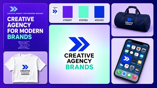
Landscape 16:9 gig cover, staggered tile wall of brand mockups on a violet gradient page. Flat vector marks beside soft studio photographs. No watermark, no personal names.
[Layout]
A rounded-tile mosaic filling the frame on a violet-to-indigo gradient, with an even gutter throughout. A tall narrow tile runs down the left edge and another tall narrow tile runs down the right edge; between them the centre splits into a top strip of three small tiles and one large tile beneath. Reading order: the top-left tile is flat violet, carrying a small mark and one-line wordmark at the top, a four-line headline in the middle with the last word in mint, and a faint outlined geometric mark in the lower left. The top-centre tile is pale lavender with a white rounded-square app tile inset, holding the blue arrow-like mark. The next tile to the right holds three vertical colour swatches — purple, mint and royal blue — with tiny hex labels. The far-right top tile is a photograph of a navy duffel bag printed with the lockup. Beneath the left tile sits a photograph of a white T-shirt printed with the mark and a two-line wordmark. The large centre tile holds a soft mint-to-lavender radial gradient with the mark and a two-line black wordmark centred. The bottom-right tile is a tilted phone showing an Apple iOS home screen.
[Subject]
None — no people. The duffel and the T-shirt are flat-lay garment mockups on lavender grounds.
[Headline]
The top-left tile carries a small one-line wordmark, then a four-line headline in bold white caps reading CREATIVE AGENCY FOR MODERN BRANDS with the final word in mint. The centre tile sets a two-line black wordmark beside the blue mark. The colour tile carries tiny hex labels reading #7B4DFF, #55F0E6 and #0554ED. The phone shows Apple iOS icons including the brand's own blue app tile, Calendar marked MON 6, and Mail.
[Badges]
An Apple iOS home screen in the bottom-right tile, showing the brand's app icon among Apple system icons. No ratings or trust seals.
[Mood]
Electric violet and royal blue with mint highlights on a soft lilac ground; youthful, digital, energetic. At thumbnail size the big gradient centre tile with its black wordmark and the violet margin give an easy brand-sheet read.](https://files.posterlet.com/assets/generated/md/5nx0bgrksvkj.webp)
![[Format]
Landscape 16:9 gig cover, corporate identity moodboard on a white page, mixing flat logo tiles with photographic stationery and garment mockups. Even soft daylight. No watermark, no personal names.
[Layout]
Two bands. The top band is two large tiles: a deep navy square on the left holding the primary lockup, and a bright royal-blue tile on the right holding the stationery set — a yellow folder behind a navy one, a letterhead carrying the logo, a pair of navy business cards, a navy envelope, and three pencils and two paperclips scattered across the blue ground. The bottom band is a strip of four tiles of slightly different widths divided by thin white gutters: a photograph of a man's torso in a white T-shirt carrying the logo, a column of four tall thin vertical colour panels in green, teal, orange and navy with small repeated white text, a photograph of two hands holding a navy brand book against a teal ground, and a photograph of a phone showing an Apple iOS home screen.
[Subject]
Two human subjects, both cropped so no face is visible. Bottom-left, a man's chest and folded arms in a white v-neck tee printed with a small badge on the left breast. Bottom-centre, two hands gripping the navy cover of a brand book, arms cropped at the wrist. Both lit evenly from the front.
[Headline]
The navy tile's lockup pairs a rosette mark — a ring of coloured petals around a white shield shape — with a two-word white wordmark stacked on two lines. The letterhead and folders repeat the lockup small; the brand book reads Brand Book in white across its navy cover. The phone screen shows Apple iOS system icons — Safari, Calendar marked WED 7, Photos and Mail — with the brand's own app icon sitting in the grid.
[Badges]
An Apple iOS home screen appears in the bottom-right tile, with the Safari, Calendar, Photos and Mail icons visible alongside the brand's own app tile. No ratings or trust seals.
[Mood]
Deep navy and royal blue with citrus green, teal and amber accents over white; corporate, systematic, friendly. At thumbnail scale the colour-strip tile and the blue stationery tile give an immediate identity-kit read.](https://files.posterlet.com/assets/generated/md/4gce3ijob2l4.webp)
![[Format]
Landscape 16:9 gig cover, dense brand-identity moodboard of rounded tiles on a white page. Dark, high-contrast product renders with glossy reflections. No watermark, no personal names.
[Layout]
Three stacked bands of rounded tiles separated by an even white gutter, the whole block filling the frame. Top band: two large wide tiles side by side — the left a black tile holding the full lockup, a red-and-white folded-ribbon monogram beside a white wordmark with its last syllable in red; the right a dark photographic tile of a laptop and mug on a desk lit by red rim light. Middle band: a light tile showing the lockup in dark on white beside a matching black tile showing the lockup reversed, then a tile holding four app-icon rounded squares in white, navy, red and near-black, then a colour-palette tile of five vertical swatch bars with small hex labels beneath. Bottom band: three equal wide tiles — a phone showing the logo on a dark screen, a black box tied with a glossy red ribbon carrying the mark, and a dark red tile with a three-line stacked headline and a large sweeping red ribbon graphic.
[Subject]
None — no people; every cell is flat artwork or a product render.
[Headline]
In the top-right photo tile, a small kicker reading BUILDING sits above a three-line sentence-case headline with the last word in red, then two short supporting lines. In the bottom-right tile, a three-line stacked headline runs in white with its middle word in red, over a thin rule and a two-line strapline. Small hex labels reading #E21B23, #FF4B4B, #F1F1F1 and #1A1A1A sit beneath the palette swatches.
[Badges]
None.
[Mood]
Black, crimson red and white over a cool grey photographic cast; bold, tech-forward and glossy. At thumbnail size the red ribbon monogram and the deep red bottom tile anchor an otherwise near-black spread.](https://files.posterlet.com/assets/generated/md/tqusct6oen9v.webp)
![[Format]
Landscape 16:9 gig cover, logo-identity moodboard on a clean white page. Flat vector tile artwork mixed with mockup photographs, sharp even gutters, flat daylight in the photos. No watermark, no personal names.
[Layout]
A two-column by three-row grid of square-ish tiles on a thin white gutter, every tile rounded at the corners and the block filling the frame edge to edge. Row one: the left tile is a flat deep-navy panel carrying the primary lockup; the right tile is an outdoor photograph of a round logo decal mounted on a dark steel grid, with greenery and a hanging pendant lamp behind it. Row two: the left tile is a mockup of a dark navy tiled wall on which the same logo appears at several sizes inside frames and once as a bare roundel; the right tile is a brand-guidelines panel — two horizontal colour bars, orange over navy, each fading out into a strip of tints, with a typeface name above a hairline rule and a wide-tracked alphabet set across two lines below. Row three: the left tile is a graphite pencil sketch of the roundel over a dotted construction grid with thin guide lines; the right tile is a flat orange panel showing two app-style rounded-square tiles, one navy with an orange mark, one cream with an orange mark.
[Subject]
None — no people. The only photographic elements are the mounted decal and the tiled wall, both lit evenly and flat-on.
[Headline]
In the top-left navy tile, a three-letter wordmark in very heavy white caps with its middle letter swapped for an orange circular animal mark, and beneath it a two-word orange all-caps strapline. Row two's right tile carries the typeface name Montserrat in sentence case above the alphabet A to Z in letterspaced caps. Row three's left tile carries a small vertical label. No other headline copy.
[Badges]
None beyond the repeated illustrated animal roundel, which stands in for the brand mark itself across all six tiles.
[Mood]
Navy and burnt orange over crisp white, with faint green and warm lamp tones inside the photograph; tidy, systematic, portfolio-like. The alternating flat and photographed tiles give a recognisable checker rhythm at thumbnail size.](https://files.posterlet.com/assets/generated/md/8rbkyab4kco2.webp)
![[Format]
Landscape 16:9 gig cover, split editorial brand-identity cover, half type-led and half photographic. Crisp, high-key, advertising-grade finish. No watermark, no personal names.
[Layout]
A straight vertical split at the exact mid-line. The left half is a flat warm off-white field carrying all the type, with a soft grey shadow of foliage drifting across its upper right; the right half is a full-bleed photographic set. On the left, elements stack down one left margin with generous air: a small letterspaced kicker line at the top, a hairline rule beneath it, a two-line headline in very heavy condensed black caps filling the middle, a solid olive-green horizontal bar under it, a four-column icon strip, and a letterspaced strapline at the very bottom. The right half shows a hand entering from the lower right holding a dark olive pump bottle, with a matching dark olive box standing behind it to the right and a sprig of olive leaves laid in front on a cool grey stone surface.
[Subject]
A cropped human hand and forearm, no face, entering from the bottom-right corner of the photographic half, fingers wrapped around a matte dark-olive pump bottle with a black pump head; lit softly from the upper left so the bottle reads crisply against the pale blurred background. A small gold botanical crest and a tiny two-line wordmark sit on the bottle and again on the box face.
[Headline]
Left half, top to bottom: a wide-tracked small-caps kicker reading STRATEGY • VISION • IDENTITY; a hairline rule; then the headline ART DIRECTION set on two lines in ultra-bold condensed black capitals, the two words stacked flush left and filling roughly half the panel; below it a solid olive bar carrying white all-caps condensed text reading LUXURY BRAND IDENTITY SYSTEMS; then four thin-line icons each above a two-line black caps label — a target, three overlapping circles, an open book, a monitor-and-phone — and a bottom wide-tracked strapline reading STRATEGIC THINKING. TIMELESS BRANDS.
[Badges]
None.
[Mood]
Warm bone white and near-black against deep olive green with a whisper of stone grey; calm, premium, apothecary-clean. At thumbnail size the giant black headline and the olive bar on the left half carry the cover.](https://files.posterlet.com/assets/generated/md/ad3vuihmczp8.webp)
![[Format]
Landscape 16:9 gig cover, one-product hero render on a flat colour field. Clean 3D studio realism, soft directional light, gentle drop shadow. No watermark, no personal names.
[Layout]
A single saturated marigold-yellow field fills the entire frame. One matte black hardcover book is the only object, floating near the centre-left and tilted roughly twenty degrees counter-clockwise so its spine runs up the left edge, the front cover facing the viewer and the page block just visible along the bottom lip. A soft grey shadow pools beneath the book's lower-right corner and anchors it to the plane. No border, no other element; the vast empty yellow above and to the right of the book is deliberate negative space. The cover face itself divides into three bands — a two-line white title block at the top, a large flat yellow glyph filling the middle, and a small white web-address line at the bottom right.
[Subject]
None — object only. The book sits raised off the ground plane by its shadow, giving a mild sense of levitation.
[Headline]
Top-left of the cover, a two-word title stacked on two lines: the first word in heavy white sans caps, the second directly below in a thin light white sans at the same size, flush left. Across the lower half a huge flat yellow mark — an angular bracket-like monogram built from thick vertical and horizontal bars with rounded corners — bleeds to both side edges. Bottom right, a tiny white lowercase web address; the spine carries a small vertical white wordmark.
[Badges]
None.
[Mood]
A single vivid marigold-yellow field against matte black; graphic, confident, poster-simple. At thumbnail scale the yellow frame holding one tilted black book still reads instantly at forty pixels.](https://files.posterlet.com/assets/generated/md/446pgoxov3tk.webp)
![[Format]
Landscape 16:9 gig cover, high-end fragrance identity presentation on a deep burgundy ground. Soft studio light, fine paper texture, shallow depth of field on the product shot. No watermark, no personal names.
[Layout]
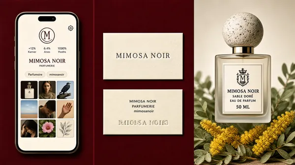
Three vertical columns divided by wide burgundy gutters, unequal in width: the left column of roughly 30 percent holds one tall phone-screen mockup with softly rounded corners, the centre column of roughly 22 percent holds two stacked cream business cards with a generous gap, and the right column of roughly 48 percent is a single edge-to-edge photographic product panel. The phone screen is a light social-profile page: a top bar with a small round avatar and a gear icon, a circular monogram, a three-figure stats row, a two-word brand line, a pair of pill buttons, a row of three flower thumbnails with tiny labels, then a 3x3 grid of square image tiles — perfume bottle, close-up face, bird in flight, sky, a hand over sand, a bowed head, leaves, a pink bloom and a scribbled sketch. The two cream cards sit level with the middle of the phone, the upper one embossed with a wordmark, the lower one carrying three small centred lines of placeholder contact type above an upside-down embossed wordmark.
[Subject]
None — no people in the frame. The right panel is a frosted-glass perfume flacon with a speckled pale-stone spherical cap, floating above dried mimosa sprigs and soft green foliage, lit from the left with a faint shadow falling right. A small embossed crest and a tiny wordmark sit on the flacon label.
[Headline]
On the phone, a short two-word brand name in spaced serif caps sits above the buttons. On the flacon label, a short serif wordmark, then a two-word scent name, then EAU DE PARFUM and a small volume line, all centred. Card type is small, centred and grey.
[Badges]
None.
[Mood]
Oxblood burgundy, cream and soft sage with a bright mimosa-yellow accent; quiet, editorial and expensive. At thumbnail size the dark ground and the three-column rhythm read as a calm luxury perfume case study.](https://files.posterlet.com/assets/generated/md/y09sga1g91cf.webp)
![[Format]
Landscape 16:9 gig cover, premium identity moodboard composite of product mockups on a deep navy page. Crisp studio-render finish, sharp edges, soft contact shadows. No watermark, no personal names.
[Layout]
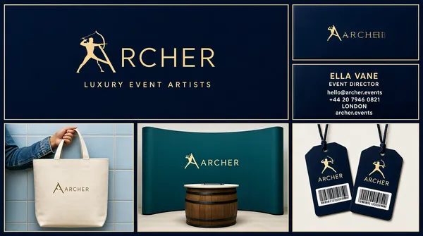
Two-tier grid with an even light gutter on a dark navy ground. The top tier spans the full width and splits into a wide left panel of about 62 percent holding one large logo banner, and a narrow right column of about 38 percent holding two stacked business-card mockups of equal height, a front card above and a contact card below. The bottom tier is a three-cell strip of equal-width photographic mockups separated by the same gutter: a canvas tote held against a pale blue tiled wall on the left, a large curved fabric display wall with a small barrel counter in the centre, and a pair of navy bag tags with barcodes on the right. Every cell is shot flat-on to its own surface with no overlap between cells.
[Subject]
None — product mockups only. The bottom-left cell crops a forearm in a denim jacket carrying a cream canvas tote; the bottom-right cell shows two fanned navy tags. No faces appear anywhere in the frame.
[Headline]
Inside the top-left panel, a two-word luxury wordmark in thin outlined antique-gold capitals with the first initial replaced by a drawn archer silhouette drawing a bow, roughly a third of the panel width, centred; beneath it a wide-tracked gold all-caps line reading LUXURY EVENT ARTISTS in light weight. The upper business card repeats the wordmark small on navy; the card beneath carries a short two-word personal name in gold caps, a small job title, and four rows of placeholder contact details in light gold. The tote, display wall and tags repeat the same wordmark small.
[Badges]
None — no rating, seal or platform marks appear.
[Mood]
Deep navy and antique gold read as an understated luxury-events identity; the pale tile, cream canvas and teal wall in the lower strip break the dark with quiet neutrals. At thumbnail scale the gold wordmark and the three-cell mockup strip carry the cover instantly.](https://files.posterlet.com/assets/generated/md/rlcbfz566dp7.webp)
![[Format] Landscape 16:9 gig cover, fitness-brand identity mosaic of rounded tiles on a cool gray gradient background. Mixed photographic and vector finish with soft shadows. No watermark, no personal names.
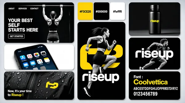
[Layout] A mosaic of rounded tiles (radius about 20px, gutters about 16px) in three loose columns. Left column, top to bottom: a wide dark website-hero mockup tile, a photo tile of a smartphone screen close-up, and a dark apparel close-up tile. Center column: a three-panel color-palette tile on top and a very tall black tile below it — the visual anchor — with an athlete in front of a giant logo mark. Right column: a black product-shot tile with a bottle, a black wordmark tile with a runner behind the type, and a black font-specimen tile at the bottom.
[Subject] Hero tile: a woman doing pull-ups on a bar photographed from behind, grayscale. Center tile: an athletic woman with a dark ponytail, black sports bra and shorts, jumping mid-air with one knee raised, black-and-white cutout overlapping a huge yellow geometric logo mark behind her. Runner tile: a grayscale sprinter mid-stride behind the wordmark. Phone tile: a tilted close-up of a home screen with colorful app icons. Jacket tile: rain-dotted black fabric with a small yellow chest logo. No large faces.
[Headline] Hero tile: tiny nav reading ABOUT SERVICES CONTACT, then YOUR BEST SELF STARTS HERE in white bold caps on two lines, and a small outlined GET STARTED button. Palette tile: three panels printing #F3CE20, #000000 and #ffffff on their own colors. Center tile: the brand lockup is a bold lowercase sans wordmark for a fitness brand preceded by a yellow abstract letter mark. Font tile: Font : with Coolvetica in yellow, above white alphabet and numeral rows. Jacket tile: Now, It's your time to Riseup ! in small white and yellow text.
[Badges] The phone tile shows an iPhone home screen with recognizable app tiles including the blue App Store letter A icon and a mail icon, with the brand's yellow app icon among them. none besides.
[Mood] Black, white and taxi-cab yellow on cool gray; punchy athletic energy, high contrast. The yellow marks snap instantly even at thumbnail size.](https://files.posterlet.com/assets/generated/md/kae8olyumc13.webp)
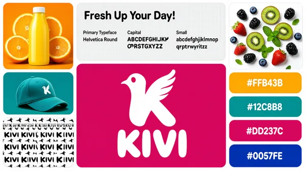
![[Format] Landscape 16:9 gig cover, playful juice-brand style-guide board of rounded tiles on a white background. Bright flat-photographic mix with crisp soft shadows. No watermark, no personal names.
[Layout] White canvas, rounded tiles with about 14px gutters. Top row, three tiles: a square orange product-photo tile at left, a very wide light-gray typography tile in the middle, and a white fruit-photo tile at right. Below, the middle of the canvas is dominated by a large magenta brand tile about a third of the frame wide, flanked left by a teal cap-mockup tile over a white pattern tile, and flanked right by a vertical stack of four full-width rounded color-swatch tiles.
[Subject] Products and food only: a glossy yellow juice bottle with an orange slice and halved oranges behind it; a teal baseball cap floating over a teal backdrop; strawberries, blackberries, blueberries, kiwi slices and mint scattered on white; a repeating tone-on-tone pattern of the brand's bird mark. No people.
[Headline] Gray typography tile: Fresh Up Your Day! in large dark rounded sans, and beneath it three specimen columns with tiny gray labels Primary Typeface, Capital and Small — the first reading Helvetica Round in dark text, then an uppercase alphabet column and a lowercase alphabet column. Magenta center tile: a big white bird-inside-a-letter-K logo above a two-line white bubble-letter wordmark for a juice brand. Pattern tile repeats the wordmark in black. Swatch tiles print #FFB43B, #12C8B8, #DD237C and #0057FE in white on their own colors.
[Badges] none beyond the described logo marks and hex swatches.
[Mood] Saturated candy palette — tangerine, magenta, teal and cobalt on white; energetic grocery-shelf-fresh energy. The magenta center tile anchors the layout instantly at thumbnail size.](https://files.posterlet.com/assets/generated/md/h3seqvy296ao.webp)
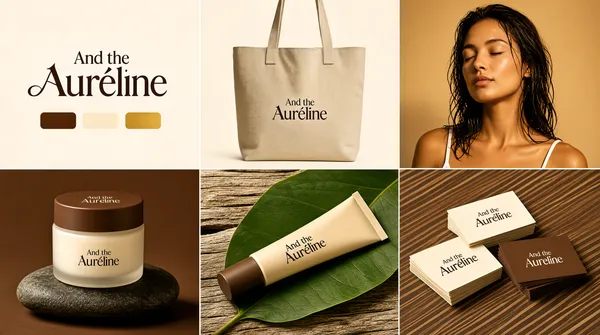
![[Format] Landscape 16:9 gig cover, beauty-brand moodboard as an exact 3x2 grid of full-bleed square cells separated only by hairline seams, no visible gutter. Warm photographic finish. No watermark, no personal names.
[Layout] Six equal cells in a strict 3x2 grid with thin seams. Top-left: a cream cell holding the logo lockup with three color-swatch pills beneath. Top-center: a brown cell with a canvas tote-bag mockup. Top-right: a golden-lit portrait cell. Bottom-left: a brown cell with a cream jar resting on a stone. Bottom-center: a wood-and-leaf cell with a cosmetic tube. Bottom-right: a diagonally striped brown cell with stacks of business cards.
[Subject] Top-right cell: a woman in her late twenties with damp shoulder-length hair, eyes closed, serene expression, bare shoulders with a white tank strap, cropped square from crown to chest, warm golden key light on a tan background. Other cells hold products only: a beige canvas tote with long handles; a frosted cream jar with a brown lid standing on a dark river stone; a beige cosmetic tube with a brown cap lying across a large green leaf on weathered wood; neat stacks of cream and brown business cards.
[Headline] Logo cell: And the in small elegant serif above a large high-contrast fashion-serif wordmark for a beauty brand — a single capitalized word with a stylized swash letter — and three horizontal color pills in brown, cream and gold beneath. The same lockup repeats small on the tote, the jar, the tube and the business cards, always in the same serif. No other copy anywhere.
[Badges] none.
[Mood] Cocoa brown, cream and warm gold with one shot of leaf-green; calm spa-like luxury, softly lit. The repeated serif lockup ties all six cells together at thumbnail size.](https://files.posterlet.com/assets/generated/md/k9zukivp7hgu.webp)
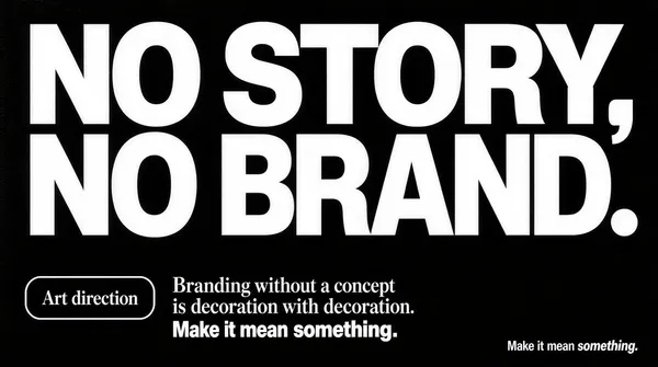
![[Format] Landscape 16:9 gig cover, pure typographic manifesto poster on a near-black textured background. Ultra-crisp vector type over subtle paper grain. No watermark, no personal names.
[Layout] A single full-bleed panel, no tiles and no imagery. The top two-thirds is dominated by one giant two-line headline set edge to edge: the first line reads NO STORY, and the second NO BRAND., both stretched across the full width so the comma and the period hang at the right margin. Letters are extra-bold geometric sans caps, white, tightly tracked, cap height about a quarter of the frame. The lower third holds one small two-line statement block set center-left, and a tiny sign-off line in the bottom-right corner. Everything sits on the flat dark field; the empty lower-left and lower-right corners give the block room to breathe.
[Subject] none — typographic only.
[Headline] NO STORY, NO BRAND. in massive white extra-bold sans caps across two justified lines, by far the largest type in the frame. Below, a small outlined pill reading Art direction in white serif sits left of a two-line statement: Branding without a concept in white serif, and is decoration. with decoration. in heavy bold sans. Bottom-right corner: Make it mean something. in small white sans with something. in italic serif.
[Badges] none.
[Mood] Monochrome — ink black and paper white only; blunt, confident, design-studio-manifesto energy. The giant white caps carry the whole composition even at thumbnail size.](https://files.posterlet.com/assets/generated/md/h9su6wji4a7o.webp)