Generate
Create images with AI
Navy and Orange Brand Identity Moodboard
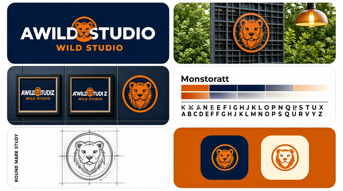
[Format] Landscape 16:9 gig cover, logo-identity moodboard on a clean white page. Flat vector tile artwork mixed with mockup photographs, sharp even gutters, flat daylight in the photos. No watermark, no personal names. [Layout] A two-column by three-row grid of square-ish tiles on a thin white gutter, every tile rounded at the corners and the block filling the frame edge to edge. Row one: the left tile is a flat deep-navy panel carrying the primary lockup; the right tile is an outdoor photograph of a round logo decal mounted on a dark steel grid, with greenery and a hanging pendant lamp behind it. Row two: the left tile is a mockup of a dark navy tiled wall on which the same logo appears at several sizes inside frames and once as a bare roundel; the right tile is a brand-guidelines panel — two horizontal colour bars, orange over navy, each fading out into a strip of tints, with a typeface name above a hairline rule and a wide-tracked alphabet set across two lines below. Row three: the left tile is a graphite pencil sketch of the roundel over a dotted construction grid with thin guide lines; the right tile is a flat orange panel showing two app-style rounded-square tiles, one navy with an orange mark, one cream with an orange mark. [Subject] None — no people. The only photographic elements are the mounted decal and the tiled wall, both lit evenly and flat-on. [Headline] In the top-left navy tile, a three-letter wordmark in very heavy white caps with its middle letter swapped for an orange circular animal mark, and beneath it a two-word orange all-caps strapline. Row two's right tile carries the typeface name Montserrat in sentence case above the alphabet A to Z in letterspaced caps. Row three's left tile carries a small vertical label. No other headline copy. [Badges] None beyond the repeated illustrated animal roundel, which stands in for the brand mark itself across all six tiles. [Mood] Navy and burnt orange over crisp white, with faint green and warm lamp tones inside the photograph; tidy, systematic, portfolio-like. The alternating flat and photographed tiles give a recognisable checker rhythm at thumbnail size.
Tags
More Images