




About this collection
Every Fiverr gig lives or dies by a single image. Each cover here respects the real constraints of a gig image - one banner-shaped canvas, high-contrast text, and no clutter that would collapse at small sizes.
These are starting points, not finished listings. Every cover here is built around one idea: a single service promise, set in type large enough to survive being shrunk into Fiverr's search grid. The collection spans roughly thirty service areas — software and app development, design and branding, writing and translation, marketing, audio, data, and business consulting — so you can usually find a layout close to what you sell and adapt it.
Nothing here is a layered design file. Each one is a flat generated image, which is exactly what makes it quick: pick a layout, swap the headline, palette, and icons for your own service, and you have a listing image in a few minutes rather than an afternoon.
What a gig cover actually has to do
A buyer scanning search results sees your cover as a thumbnail no wider than a postage stamp, sitting next to a dozen competitors. That single constraint decides almost everything else:
- One promise, not a service list. "I will fix your WordPress site in 24 hours" reads at thumbnail size. "WordPress | SEO | Speed | Security | Maintenance" turns to mush.
- High contrast between text and background. Thin light type on a pale panel is the first thing to disappear when the image shrinks.
- Three to six words in the headline. Long headlines force small type, and small type is what becomes unreadable first.
- The service visible before reading a word. A layout cue — a device frame, a waveform, a chart, a colour swatch — tells the buyer the category instantly.
Resizing and export
Fiverr publishes its own requirements in the uploader, and they change - check them there rather than trusting a number quoted in a blog post. What does not change is the direction of the resize: always scale down from the download. Never upscale a smaller image to reach the uploader's width, because the text edges go soft, and soft type is exactly what a thumbnail cannot afford.
When you trim to match the uploader's proportions, do it symmetrically and keep the headline centred, so the crop does not eat one side of the promise.
Three things worth doing before you upload
- Judge the thumbnail, not the full-size file. Shrink the preview down to search-result size, or just squint. If the promise still reads, the cover works. 2. Keep a colour system across your gigs. Buyers skim a grid of near-identical covers; a consistent accent colour makes your listings recognisable among strangers. 3. Leave the outer margin clear. Gig images get cropped slightly differently across placements, so keep text away from the outer edge of the canvas.
Common questions
Will the downloaded cover meet Fiverr's upload requirements?
Check the uploader: Fiverr shows its current accepted format, file limit and recommended image spec there, and those are the platform's requirements, not ours. What matters on this side is direction — start from the downloaded cover and scale down to fit, never up from a smaller file.
Will the text still be readable in the search grid?
Shrink it to search-result size before uploading. That is close to what buyers actually see when comparing gigs, and it is where most covers fail — usually because the headline was set too small or the contrast was too low to begin with.
How many images should one gig have?
Fiverr's gallery takes up to three images and two videos. Lead with the strongest cover, then spend the remaining slots on a work sample, a before-and-after, or a deliverable preview rather than more headline art.
Can I use the same cover on several gigs?
No. Buyers often see two or three of your gigs together, and identical covers make them look like one listing repeated. Change the headline, the accent colour, and the main visual so each gig reads as its own service.
Can I change the text or colours after generating?
Not in place. The wording is baked into the image, so there is no text layer to retype. Download it and edit it in your own tool, or use the "Use as Template" option to regenerate it with different copy.
Why do the covers in this collection look so different from each other?
Because the range is deliberately broad. Each cover was written around the specific service it advertises, so a logo animation cover and a translation cover share a job — selling one service at thumbnail size — but not a visual style. That variety is what lets you give every gig a distinct look.
![[Format]
Landscape 16:9 gig cover, portfolio wall of nine finished client logos on alternating light and dark tiles. Mixed flat and dimensional-vector finish. No watermark, no personal names.
[Layout]
A 3x3 grid of equal tiles with no visible gutter between some and thin seams elsewhere; tile backgrounds alternate warm paper-white, dark slate and textured grey. Reading order: an orange circle holding palm-tree silhouettes over a two-line dark serif and orange script tagline on paper tile; dark tile with overlapping house roofs in orange and grey, a two-line serif wordmark and a small pill-shaped url bar; paper tile with a magenta-navy abstract monogram in an orange ring, magenta two-tone caps word and small red caps tagline; black tile with a gold microphone beside a big gold numeral, gold caps word and blue tagline; white tile with a teal leaf between brown dumbbells, teal spaced caps word and grey caps sub-line; black tile with an ornate gold script double-letter monogram under a gold crown, gold serif wordmark; paper tile with cleaning tools in pink and blue beside magenta script lettering and small caps suffix; dark tile with a blue circle and check over a bar-chart, white caps word and spaced blue sub-line; paper tile with a red microphone flanked by audio sliders, red bold caps word and small black caps tagline.
[Subject]
None — logos only.
[Headline]
Every cell is a different invented business lockup (placeholder copy, no real brands): icon plus a one-or-two-word name plus a short tagline, in the per-cell styles above.
[Badges]
None.
[Mood]
Alternating warm paper and dark slate tiles with gold, magenta, teal and orange pops; versatile agency-showcase energy. The light-dark rhythm keeps each logo readable at thumbnail size.](https://files.posterlet.com/assets/generated/md/6zmc2ul8s7cf.webp)
![[Format]
Landscape 16:9 gig cover, cartoon mascot logo centred on a bright flat field. Clean vector-cartoon finish with bold outlines and soft cel shading. No watermark, no personal names.
[Layout]
A flat lemon-yellow panel fills the frame. The mascot lockup sits centre-left: a cheerful astronaut in a white suit walking right while pushing a two-wheeled cart that carries a towering burger with melting cheese; a thin dark double line runs under the figures as ground; tiny sparkles and dots float around. Beneath the ground line, a heavy spaced sans caps wordmark in near-black, and under it a handwritten script tagline. Along the right edge, a large ghosted single-colour duplicate of the mascot is cropped by the frame as a background echo.
[Subject]
None human — the astronaut mascot is the character.
[Headline]
Wordmark: two heavy sans caps words with wide word spacing in near-black (placeholder copy); beneath it a casual script tagline of four generic words in the same near-black.
[Badges]
None.
[Mood]
Lemon yellow, white and charcoal with small red and green food accents; fun, appetising, family-friendly energy. Bright yellow plus a big dark wordmark keeps the thumbnail punchy.](https://files.posterlet.com/assets/generated/md/8cnhmbv6duat.webp)
![[Format]
Landscape 16:9 gig cover, single flat vector logo centred on a solid saturated field. Clean flat-print finish, no gradients or mockups. No watermark, no personal names.
[Layout]
One flat vivid-yellow panel filling the frame edge to edge. The lockup sits dead centre: a charcoal-black animal mark formed from three or four bold solid shapes — a rounded dome body, a leaf-shaped head with a negative-space eye, a straight tusk stroke and a curled spiral trunk that curls into the body — with the wordmark beneath in heavy geometric caps and a letter-spaced lighter caps descriptor under that. Huge even margins of pure yellow surround everything; no other elements anywhere.
[Subject]
None — mark and typography only.
[Headline]
Placeholder wordmark: five heavy geometric sans caps in charcoal (placeholder copy) with wide tracking, and beneath it a smaller widely letter-spaced caps descriptor of two generic words in the same charcoal.
[Badges]
None.
[Mood]
Saturated marigold yellow with charcoal black; bold, playful, modern-minimal. The two-tone contrast reads instantly even at the smallest thumbnail size.](https://files.posterlet.com/assets/generated/md/a93kv74cywwk.webp)
![[Format]
Landscape 16:9 gig cover, single vintage hand-drawn logo centred on a flat cream field. Engraved-etching illustration finish, flat print look. No watermark, no personal names.
[Layout]
One flat cream panel, no borders. The emblem sits centred and occupies about 70 percent of the frame: a finely hatched blue engraving of a hummingbird in flight, wings swept back, piercing a large tilted oval ring; two small four-point sparkles float in the upper opening of the ring and one below. Beneath the emblem, a small serif caps founding line — an abbreviation on the left and a year on the right — flanks the wordmark; below that a wide coral-red display wordmark in a chunky retro serif with playful mixed letterforms, and under it a small blue letter-spaced retro serif descriptor line with a dot on each side.
[Subject]
None — illustration and typography only.
[Headline]
Placeholder wordmark: a bold coral retro-display serif word of seven letters (placeholder copy); beneath it a small blue letter-spaced caps-style descriptor of two generic words with flanking dots; above it the tiny founding line Est. and a year in blue serif.
[Badges]
None.
[Mood]
Ink blue and coral red on warm cream; nostalgic, artisanal, tavern-label charm. The two-colour engraving style stays crisp and legible at thumbnail size.](https://files.posterlet.com/assets/generated/md/byheb2w5313p.webp)
![[Format]
Landscape 16:9 gig cover, portfolio wall of nine colourful 3D-styled business logos on a black leather texture. Glossy extruded-vector finish with soft drop shadows. No watermark, no personal names.
[Layout]
A dark textured black ground with a 3x3 grid of nine finished logos, evenly spaced and centred per cell. Reading order: a pink-to-magenta swirl disc with a face profile and a bold caps word plus small caps sub-line; a chrome shield with red accents over a stylised car silhouette, arched caps text inside and a red banner strip below; a blue gear ring with a robotic arm, bold spaced caps word and a small blue caps tagline; a turquoise swoosh around a rooftop-and-city icon, glossy caps word with a small caps strapline; a lime-and-yellow skyline inside a black arch with palm trees, bold green caps word and a yellow caps tagline; a purple heraldic crest with a skull in a rasta hat flanked by bones, stacked green-and-purple bubble caps; a red computer monitor with glasses and circuit nodes, red italic caps over white caps; an orange pipe-letter monogram over white caps and spaced letter sub-line; a blue head silhouette with a leaf-tree brain, light-blue caps word and a small green script tagline.
[Subject]
None — logos only.
[Headline]
Every cell is a different invented business lockup (placeholder copy, no real brands): each pairs a mascot or icon with one bold caps word, most with a short caps sub-line, in the styles listed above.
[Badges]
None.
[Mood]
Saturated pink, red, blue, lime and orange on black leather; loud, versatile agency energy. Nine colour pops on dark guarantee thumbnail visibility.](https://files.posterlet.com/assets/generated/md/hugbc4umu89a.webp)
![[Format]
Landscape 16:9 gig cover, warm bento-grid brand-kit board of six rounded tiles on a black ground. Rich gradient-and-photo finish. No watermark, no personal names.
[Layout]
A bento collage: top-left, the widest tile, a deep burnt-orange gradient panel with faint network lines, holding a white-and-yellow mark of an umbrella over two abstract figures in a swirl, beside a two-line lowercase wordmark — the first line in yellow script-leaning bold, the second in white bold. Top-right: a golden-yellow tile with a duotone portrait of a man, the mark ghosted behind his head and again at small scale on his shirt. Bottom row of four tiles: a wrist wearing a smartwatch showing the mark on its face; a colour-swatch tile with three stacked rounded bands in orange, yellow and white; a grey fabric tile with two tilted business cards, one orange one yellow, each printed with the mark and wordmark; a deep-orange typography card with a small caps label, a large bold-italic font name, a thin rule with a count note, and three oversized italic character samples at the base.
[Subject]
The top-right tile holds a generic young man with short hair and glasses, crew-neck tee, waist-up, looking at camera, rendered in yellow-and-grey duotone.
[Headline]
Wordmark: two stacked lowercase words in heavy rounded sans, first line yellow, second white (placeholder copy). Typography card: small caps label reading typography, a big bold-italic font name (generic placeholder), and giant italic letter samples.
[Badges]
The umbrella-over-figures swirl mark recurs on shirt, watch face and cards.
[Mood]
Burnt orange, marigold yellow and warm brown; friendly, energetic, community-service warmth. The yellow hero tile and orange field keep the thumbnail lively.](https://files.posterlet.com/assets/generated/md/4bwevicqcsa3.webp)
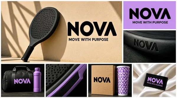
![[Format]
Landscape 16:9 gig cover, sporty brand-identity mosaic of seven photographic and flat tiles. Sunlit editorial-photography finish with hard shadows. No watermark, no personal names.
[Layout]
An irregular mosaic with white gutters. Top-left, the largest tile: a black paddle racket leaning on a sand-coloured court wall with lattice shadows, a big black chunky wordmark with a rounded letter and tagline set to its right on the wall. Top-right: a lilac flat tile with the same black wordmark centred and a small sans tagline beneath. Middle-right, below it: a dark close-up of the racket edge with the wordmark debossed small. Bottom row of four equal tiles: a black duffel bag and purple bottle on dark ground with a lilac wordmark; a macro of the racket frame in black and lilac; a kraft product box standing beside a lilac patterned sleeve, wordmark printed on the box; a close-up of a white satin garment with a black woven label carrying the lilac wordmark and tagline.
[Subject]
None — product mockups only.
[Headline]
Placeholder wordmark: four ultra-bold geometric caps with one rounded counter, black or lilac depending on the tile (placeholder copy); beneath it a small sans tagline of four generic words repeated across tiles.
[Badges]
None.
[Mood]
Sand beige, lilac purple and black; athletic, fresh, contemporary. Sunny shadows give energy; the repeated chunky wordmark ties the grid together at thumbnail size.](https://files.posterlet.com/assets/generated/md/85kxh3uml3nz.webp)
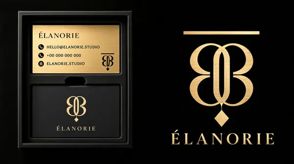
![[Format]
Landscape 16:9 gig cover, dark luxury stationery presentation beside a hero monogram. Matte black finish with champagne-gold accents, soft studio light. No watermark, no personal names.
[Layout]
Near-black background split visually in two. Left half: a black rigid presentation box photographed square-on, its lid off; inside the upper half sits a brushed-gold business card with a serif caps wordmark top-left, a column of three small icon-plus-text contact lines beneath, and a small monogram bottom-right; below it, separated by a thumb-notch cut in a black insert, lies a charcoal card with the monogram centred above a letter-spaced serif caps wordmark. Right half: the hero lockup floats on the bare black field — a large art-deco monogram built from symmetrical curved strokes with a diamond drop and a floating bar above, in champagne gold, with a wide-spaced serif caps wordmark centred beneath it.
[Subject]
None — stationery and mark only.
[Headline]
Placeholder wordmark: eight letter-spaced elegant serif caps in champagne gold (placeholder copy) under the monogram; card text is generic placeholder contact copy with tiny circular icons.
[Badges]
The art-deco interlocking-curve monogram with a bar and diamond motif is the sole badge.
[Mood]
Black and champagne gold; quiet luxury, high-end boutique energy. At thumbnail size the gold monogram on black is the focal read.](https://files.posterlet.com/assets/generated/md/lztevhpg4rbt.webp)
![[Format]
Landscape 16:9 gig cover, five illustrated embroidered-style military patches arranged on a dark camouflage texture. Rich vector-illustration finish with embroidered edge detailing. No watermark, no personal names.
[Layout]
A dark blue-grey digital-camo background with five patches scattered in a loose quincunx: top-left a round tan patch with an arched serif caps inscription over a cartoon figure riding a fighter jet and small unit text below; centre, the largest, a shield-shaped patch with a lozenge-pattern field, an anthropomorphic panda in tactical gear holding a rifle, and a curved ribbon banner across its base carrying arched caps text; top-right a round patch with a purple-and-tan scene of a soldier refuelling, ringed by bold caps text top and bottom; bottom-left a white die-cut patch of a yeti in a beanie holding a rocket amid peaks, with curved text following the outline; bottom-right a round patch with a yellow scorpion over a map, unit text on a yellow banner along its lower rim. Bottom-centre between patches: grey caps caption text, a row of three stars between dashes, and the word PATCH beneath.
[Subject]
None — illustrated mascots only, no humans from real life.
[Headline]
All patch inscriptions are invented unit-style placeholder copy: arched bold caps around each rim plus a short alphanumeric unit line; keep them generic. Bottom caption reads MILITARY - TACTICAL - ARMY, then three stars, then PATCH in grey caps.
[Badges]
The five patches themselves are the badges; each carries embroidered merrowed edges.
[Mood]
Olive, tan, gunmetal and muted purple on dark camo; rugged, military, collectible. The five bright patches pop against the dark ground at thumbnail size.](https://files.posterlet.com/assets/generated/md/cdeuoh85slkm.webp)
![[Format]
Landscape 16:9 gig cover, single centred logo lockup on an atmospheric blurred background. Soft-focus glow finish, no mockups. No watermark, no personal names.
[Layout]
One full-bleed panel: a vivid cobalt-blue background blurred into horizontal bands of light and dark blue, brighter toward the centre. A soft rectangular white glow blooms behind the lockup at dead centre. The lockup sits on the glow: a white geometric mark of stacked offset parallelogram slabs forming a stepped S-like shape on the left, a large white humanist sans word of one syllable beside it, and a smaller regular-weight second word beneath the first, right-aligned to the same block. Everything else is empty atmosphere.
[Subject]
None — typographic only.
[Headline]
Placeholder wordmark: two lines — a large light-to-regular humanist sans word (placeholder copy) and a smaller regular sans word under it, both pure white; the mark is white slab shapes with diagonal cuts suggesting stacked layers.
[Badges]
None.
[Mood]
Cobalt and royal blue with white glow; corporate, calm, dependable. Massive whitespace and one bright lockup make it read perfectly even at thumbnail size.](https://files.posterlet.com/assets/generated/md/p6sjvvccm1go.webp)
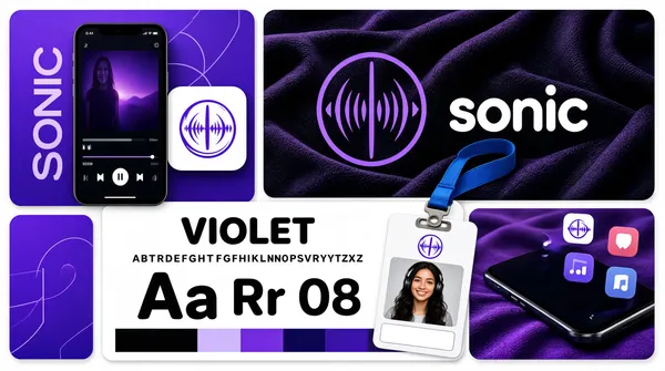
![[Format]
Landscape 16:9 gig cover, modern bento-grid brand board mixing flat tiles, UI screens and photo mockups. Glossy product-design finish. No watermark, no personal names.
[Layout]
A bento collage of rounded tiles on white with even gutters. Top-right: the largest tile, near-black with soft purple fabric folds, holding a violet circular sound-wave monogram and a lowercase wordmark in white beside it. Top-left: a violet abstract tile with thin geometric line art, partially overlapped by a floating app-icon card and a smartphone standing in front showing a dark music-player interface with a large cover image and vertical oversized typography. Bottom-middle: a white typography-specimen card with a large font name at top, an alphabet line, big character samples, and a colour-block footer; an ID badge on a blue lanyard clip overlaps its right side, the badge photo showing a smiling woman with headphones, name strip below. Bottom-right: a close-up tile of a phone corner on violet fabric with app icons floating above the screen, one icon repeating the mark. Small violet tiles fill the corners.
[Subject]
The ID badge holds a generic young woman with long wavy hair and headphones, smiling, waist-up, soft light — drop any name; use a blank name strip.
[Headline]
Wordmark: lowercase rounded sans in white beside the monogram (placeholder copy). Specimen card: a bold sans font name at top with alphabet and character samples; generic placeholder text throughout.
[Badges]
The violet circular sound-wave monogram recurs as app icon and badge emblem.
[Mood]
Violet, indigo and near-black with white cards; tech-audio, youthful, polished. At thumbnail size the big dark hero tile and violet accents read clearly.](https://files.posterlet.com/assets/generated/md/c81hmtbk95pp.webp)
![[Format]
Landscape 16:9 gig cover, flat two-column logo presentation with a warm gradient hero and a black concept column. Clean vector finish. No watermark, no personal names.
[Layout]
Vertical split with no gutter. Left two-thirds: an orange-to-red gradient panel with a faint ghosted mountain photograph blended in; a small letter-spaced caps kicker line at the very top, the primary lockup centred — a white rounded video-camera icon whose body is pierced by a mountain-peak silhouette — above a wide-spaced white caps wordmark, and a small letter-spaced caps strapline with dot separators along the bottom. Right third: a black column split in two stacked zones; the upper zone repeats the icon large in white on black; the lower zone shows the concept breakdown — the camera icon and the mountain icon drawn separately side by side with a plus sign between them and a small caps label under each.
[Subject]
None — icons and typography only.
[Headline]
Top kicker: small letter-spaced sans caps reading a generic service line (placeholder copy). Wordmark: wide-spaced modern sans caps in white (placeholder copy). Bottom strapline: three adjectives separated by middle dots in letter-spaced caps.
[Badges]
None.
[Mood]
Burnt orange, crimson and black with crisp white icons; adventurous, modern, clean. The white icon on hot gradient carries the thumbnail at small sizes.](https://files.posterlet.com/assets/generated/md/hl4qrxlidyf5.webp)
![[Format]
Landscape 16:9 gig cover, moody brand-identity mosaic of four photographic panels. Cinematic dark finish with deep shadows. No watermark, no personal names.
[Layout]
A four-panel mosaic with thin white gutters. Left half, full height: a dark aerial cityscape at dusk with a white animal-head mark formed of bold stripes inside a broken circle, a wide-spaced sans caps wordmark beneath, and a small letter-spaced tagline under that. Top-middle: a natural canvas tote bag resting on a burgundy armchair, the same lockup printed in black on the bag. Top-right: two vertical swing tags lying on olive-green fabric, one cream and one near-black, each with the circular mark, the wordmark and a small block of body text, joined by black cords. Bottom-right, spanning the right half: a close photograph of two real striped animals in near-monochrome with a large ghosted white copy of the circular mark overlaid at centre.
[Subject]
None — products and environments only; the striped animals are photographic texture, not subjects.
[Headline]
Placeholder wordmark: wide-spaced geometric sans caps in white over the city panel (placeholder copy), with a small letter-spaced caps tagline of four generic words beneath. Tag text on the swing tags is generic placeholder body copy.
[Badges]
The circular striped animal-head mark is the recurring badge; no ratings or seals.
[Mood]
Charcoal, black-and-white photography with one burgundy and olive accent; urban, premium, mysterious. The white mark over the dark city reads instantly at thumbnail size.](https://files.posterlet.com/assets/generated/md/97ps1fbdhb6b.webp)
![[Format]
Landscape 16:9 gig cover, one hero photographic band over two flat variant tiles. Elegant beauty-brand presentation, soft matte finish. No watermark, no personal names.
[Layout]
Horizontal split: the top two-thirds is a moody photographic band of dark jungle leaves with the white primary lockup centred slightly left of middle, tagline directly beneath it. The bottom third splits into two equal flat tiles: the left tile pale sage-grey with the same lockup in deep green; the right tile deep forest green with the lockup in off-white. A faint oversized ghost copy of the bird mark in near-white opacity spans the seam between the two bottom tiles, tying them together.
[Subject]
None — foliage and typography only.
[Headline]
Placeholder wordmark: a high-contrast fashion-serif word of six letters whose capital letter merges into a line-art bird with a swept wing; below it, a letter-spaced sans caps tagline of three generic words (placeholder copy).
[Badges]
None.
[Mood]
Deep forest green, black-leaf shadow and bone white; botanical, serene, premium-skincare energy. The white-on-dark hero band carries the thumbnail while the two variant tiles demonstrate colour flexibility.](https://files.posterlet.com/assets/generated/md/qev4xkkokw2w.webp)
![[Format]
Landscape 16:9 gig cover, three-panel photo mockup collage framed by a thin black border. Realistic environmental photography finish, natural light. No watermark, no personal names.
[Layout]
A thin black frame surrounds three photo tiles separated by narrow black gutters. Left half: a large architectural photo of a building entrance where a dark cube sign hangs beneath a wooden slat canopy, the brand mark glowing blue on the cube face, tiled wall and shadow play around it. Right column, top tile: a close-up of a silver laptop palm rest with a white die-cut sticker of the mark placed beside the trackpad, on a blue desk surface. Right column, bottom tile: a blue baseball cap with black brim floating on a blue background, the mark embroidered small in white on the front panel.
[Subject]
None — signage and products only.
[Headline]
No headline text; the mark is the only identity element. Placeholder mark description: four petal-like chevron blades arranged in an x-formation, outlined ribbon style, drawn in a single sky blue.
[Badges]
None.
[Mood]
Steel grey, warm wood and sky blue; corporate-tech yet approachable. The same blue mark repeated across three real environments signals brand consistency and reads clearly at thumbnail size.](https://files.posterlet.com/assets/generated/md/edoloq7x34lu.webp)
![[Format]
Landscape 16:9 gig cover, flat black poster-style showcase of nine streetwear lettering logos. Pure vector finish, no mockups, no photography. No watermark, no personal names.
[Layout]
A solid black field with a 3x3 grid of nine lettering logos evenly spaced, each centred in its cell with generous black margins. Reading order: tall condensed white caps with mirrored letterforms; mint-green bubbly warped caps stacked over a small letter-spaced caps sub-line; white chrome-style italic caps over a wireframe globe; electric-blue graffiti tag over a small caps sub-line; white varsity script badge with a star and arched caps above the main word; red marker-script caps with three x-strokes trailing after it; white dripping bubble letters with an offset outline and a small sub-line; orange retro inline serif caps with a script word overlaid; white cartoon bubble lettering shaped like an open mouth with small caps set inside. A tiny footer credit line sits bottom-centre.
[Subject]
None — lettering only.
[Headline]
Every cell is a different made-up streetwear lockup (placeholder copy, do not reuse real brand names): keep each invented word short, one or two syllables, so nine visually distinct marks fill the grid in the styles listed above.
[Badges]
None beyond the tiny white footer credit line of generic text.
[Mood]
Black ground with white, mint, blue and red pops; street, grungy, high-energy. At thumbnail size the nine bright marks read as a busy portfolio wall.](https://files.posterlet.com/assets/generated/md/xcpqmv7z0gjr.webp)
![[Format]
Landscape 16:9 gig cover, luxury business-card mockup photograph. Matte textured cardstock with gold-foil stamping, soft studio shadow under each card. No watermark, no personal names.
[Layout]
The backdrop is split into two vertical texture bands: charcoal black felt on the left third and brick-red suede on the right two-thirds. Two vertical business cards stand side by side just either side of centre, showing front and back of the same design. Left card: near-black, with a gold geometric monogram centred in the upper half and a gold letter-spaced caps wordmark below it, plus a small gold url line near the bottom edge. Right card: blush pink, with the same gold monogram placed higher, a gold caps wordmark with a small sub-word beneath, then a thin gold rule, a small centred block of address lines, another thin rule, and three short contact rows at the bottom.
[Subject]
None — stationery only.
[Headline]
Placeholder wordmark: six letter-spaced refined caps in gold foil (placeholder copy) with a two-syllable sub-line beneath in smaller tracking; all other card text is generic placeholder contact copy.
[Badges]
The monogram badge: a sharp-angled shield-like capital letter built from chevron cuts, with a small four-point star floating above it, rendered in gradient gold.
[Mood]
Charcoal black, blush pink, brick red and metallic gold; opulent real-estate luxury. The strong value contrast between the two cards keeps both legible at thumbnail size.](https://files.posterlet.com/assets/generated/md/yk5i12po45h7.webp)
![[Format]
Landscape 16:9 gig cover, flat split-panel logo presentation with one photographic mockup. Crisp vector-on-flat finish, hard panel edges. No watermark, no personal names.
[Layout]
The frame splits vertically with no gutters: the left 60 percent is a single deep navy panel with the primary lockup centred, mark above wordmark. The right 40 percent stacks two panels: the top half is a vivid periwinkle-violet panel with the mark alone in white, centred; the bottom half is a light grey photographic panel with a navy padded instrument case lying diagonally, the lockup printed small on the case body near its wide end. Panel colour blocks do the layout work; nothing overlaps the seams.
[Subject]
None — the padded case is the only object.
[Headline]
Placeholder wordmark: lowercase rounded display letters in a pink-to-magenta gradient sitting under the mark, with playful mixed letter heights. No other copy anywhere in the frame.
[Badges]
None.
[Mood]
Midnight navy, violet purple and hot-pink gradient; music-tech, youthful energy. The bright colour blocking against dark navy makes the left lockup pop at thumbnail size.](https://files.posterlet.com/assets/generated/md/gwt2i1btfbw6.webp)
![[Format]
Landscape 16:9 gig cover, black-and-white architectural photograph with a mounted billboard as the logo stage. High-contrast monochrome finish with slight film grain. No watermark, no personal names.
[Layout]
A modern concrete-and-glass building corner fills the frame in greyscale, with a dramatic streaked-cloud sky above. A huge blank white billboard panel is bolted to the facade, tilted in perspective, occupying the centre-left two-thirds of the frame; the circular logo lockup is centred on the panel with generous white margin all around. Steel columns and dark glazing recede to the right edge, giving depth; a second building edge frames the far right.
[Subject]
None — architecture and logo only.
[Headline]
Placeholder lockup on the billboard: bold condensed all-caps letters arched over the top of a circular emblem, a thin line-art bird head forming a tall monogram letter in the middle of the circle, and letter-spaced all-caps text curving along the bottom of the circle, all in black on white.
[Badges]
Small bolt heads at the billboard corners are the only detail marks; no ratings or seals.
[Mood]
Monochrome black, white and concrete grey; bold, editorial, timeless. The lone black circular emblem on the vast white panel reads clearly even at thumbnail size.](https://files.posterlet.com/assets/generated/md/n4xuma72r9md.webp)
![[Format]
Landscape 16:9 gig cover, modern brand-identity board mixing one 3D render with flat tiles on a light grey ground. Matte studio finish, crisp edges. No watermark, no personal names.
[Layout]
A mosaic grid on pale grey with thin white gutters. Top-left: an extra-wide rounded panel with a soft grey-gradient backdrop holding a 3D render of five lowercase geometric letters standing in a row like dark polished rings, one small orange sphere nested inside the third letter. Top-right: a column of two stacked rounded cards — the upper card near-black with a white ring-and-dot mark centred over a faint red construction grid; the lower card off-white showing a colour-palette row of three donut circles in black, white and orange with tiny hex and rgb caption lines under each. Bottom row of three equal tiles: a near-black rounded tile with the white lowercase wordmark, an orange dot inside the first letter; a pale grey tile with the wordmark drawn as a construction guide with measurement marks and guide circles; a photographic tile of a natural canvas tote bag against an orange-brown backdrop with the wordmark printed large in black.
[Subject]
None — typographic and object mockups only.
[Headline]
Placeholder wordmark: five lowercase letters in a custom geometric rounded face, the first letter drawn as a bold ring whose counter is replaced by a small orange dot. No other copy in the frame.
[Badges]
The palette card with three colour chips and tiny spec captions is the only informational element.
[Mood]
Charcoal black, paper white and vivid orange on soft greys; playful yet engineered, museum-clean. The single orange dot accent keeps the thumbnail lively against the monochrome field.](https://files.posterlet.com/assets/generated/md/igyx30eg2kae.webp)
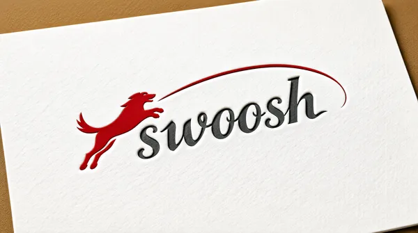
![[Format]
Landscape 16:9 gig cover, single logo-on-paper mockup photograph. Embossed print finish on textured white card, warm vignette lighting. No watermark, no personal names.
[Layout]
One full-bleed scene: a large white textured paper sheet fills nearly the whole frame, rotated a few degrees clockwise so its top edge cuts a soft diagonal; a warm tan-brown backdrop shows in the upper corners. The logo sits centred, slightly above the vertical middle, spanning about 70 percent of the frame width, embossed into the paper so it catches subtle shadow. Nothing else on the sheet — no headline plate, no buttons, no badges.
[Subject]
None — mark and wordmark only.
[Headline]
Placeholder wordmark: a flowing lowercase script word of six letters (placeholder copy), charcoal grey with a debossed finish; its first letter is replaced by a red leaping-animal silhouette drawn as one continuous swoosh, and the same red ribbon throws a long thin arc over the remaining letters, sweeping from left to right above the word.
[Badges]
None.
[Mood]
Crimson red on paper white with charcoal grey accents; classic, energetic, craftsmanlike. One strong red mark on white keeps the cover instantly readable at very small sizes.](https://files.posterlet.com/assets/generated/md/uv47s8sm7ql7.webp)
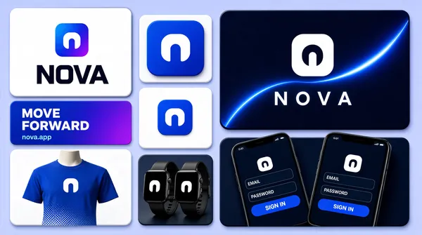
![[Format]
Landscape 16:9 gig cover, clean 3D tech-brand presentation board on a pale periwinkle field. Glossy UI-mockup finish with soft realistic shadows. No watermark, no personal names.
[Layout]
An asymmetric bento collage of rounded-corner tiles on a light blue-lavender ground. Left column, top: a large white rounded card with a faint 3D panel behind it, holding a blue gradient app mark above a heavy black wordmark. Left column, middle: a horizontal gradient banner tile in royal blue and violet with white slogan text and a small url line at its lower left. Left column, bottom: a royal-blue t-shirt on a headless torso, chest print of the white mark, halftone dots fading at the hem. Centre column, three stacked tiles: a blue rounded-square app icon with the white mark; a white tile with a smaller version of the icon; a dark tile with two black smartwatches angled together showing the mark on their faces. Right column, top: a large near-black navy panel with a glowing blue light-swoosh arcing across it and a large white rounded-square mark over a wide-spaced white wordmark. Right column, bottom: two dark smartphones in perspective showing a dark sign-in screen with two rounded input fields and a blue pill button.
[Subject]
None — only a headless torso wears the t-shirt; typographic and object led.
[Headline]
The wordmark is placeholder copy: heavy geometric sans caps in near-black on the white card, and wide-spaced white sans caps on the navy panel. Banner copy kept generic: two short bold white slogan lines, then a small light-blue url beneath.
[Badges]
The rounded-square app-icon tile acts as the mark badge; no ratings or trust seals.
[Mood]
Electric royal blue, indigo violet and white on near-black navy; confident SaaS energy. High contrast makes the glowing navy panel anchor the thumbnail.](https://files.posterlet.com/assets/generated/md/7juwxxd4cdwi.webp)
![[Format]
Landscape 16:9 gig cover, photorealistic branding-moodboard collage of six product mockups. Premium studio-photography finish, soft directional light, shallow depth of field. No watermark, no personal names.
[Layout]
A strict 3x2 grid of six equal rectangular cells separated by thin white gutters about 2 percent of the frame width. Reading order: cell 1 top-left, a flat cream panel carrying an elegant serif brand lockup centred, with three small colour-swatch pills in brown, cream and sand beneath it; cell 2 top-centre, a natural canvas tote bag hanging on a deep chocolate-brown wall with the lockup printed small on the bag front; cell 3 top-right, a white cosmetic jar with a dark-brown lid standing on a smooth grey river stone, lockup on the jar face; cell 4 bottom-left, a stack of cream business cards with two loose cards fanned in front on a dark ribbed surface, one loose card in dark brown; cell 5 bottom-centre, a beauty portrait panel of a woman against beige geometric wall panels; cell 6 bottom-right, a cream cosmetic tube lying diagonally across large green leaves on pale wood.
[Subject]
Cell 5 holds a young woman with wet-look slicked-back hair, bare shoulders, calm expression, looking straight at camera, head-and-shoulders crop, soft warm light; generic face, no identity. No other human subjects.
[Headline]
The lockup repeats on every mockup and is placeholder copy: a small letter-spaced serif all-caps word on the top line, a large high-contrast fashion-serif word with a long swash ligature in the middle line, and a small letter-spaced caps word beneath, all in chocolate brown on cream.
[Badges]
None.
[Mood]
Warm organic palette of cream, latte beige, chocolate brown with deep-leaf-green accents. Calm, spa-premium, feminine energy; at thumbnail size the six-cell rhythm and the brown-on-cream lockups read instantly.](https://files.posterlet.com/assets/generated/md/ck5x5gat02gn.webp)
![[Format]
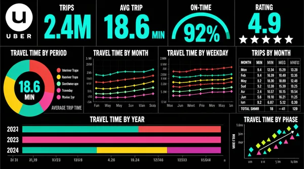
Landscape 16:9 gig cover, flat dark-themed dashboard-UI screenshot. Bold data-journalism look, big coloured numerals on black. No watermark, no personal names.
[Layout]
Edge-to-edge black dashboard, no device frame. The frame is a strict mosaic of unframed panels separated only by thin dark gridlines and white section captions, giving the feel of a printed data page. Along the top a four-across band of headline metrics sits with very large coloured numerals, a small unit and a small grey caption under each; the third cell holds a semicircular gauge arc, and the fourth holds a row of five stars. Beneath them, a caption row of small white uppercase chart titles runs across the full width, and then the lower two-thirds is a grid of six panels of unequal size: a donut with a centre figure and a legend to its right; a wide five-series line chart; a legend row of coloured dots; a second wide multi-series line chart; a compact numeric table with twelve month rows and four value columns plus a totals row; a wide stacked horizontal bar band split by year; and a small scatter panel of diamond and triangle markers along diagonal axes. A single grey caption sits beside the donut.
[Subject]
None — UI only.
[Headline]
Top-left the Uber logo — a white circular badge holding the black Uber glyph — with the letter-spaced uppercase "UBER" wordmark beneath it. The four top metrics are labelled with short two-or-three-word captions and shown as very large teal numerals with smaller units. All panel and axis titles are small white uppercase strings, including six chart captions describing travel time by period, by month, by weekday, by year and by phase, plus a trips table caption.
[Badges]
The single top-left mark is the Uber logo — a white circular badge holding the black Uber glyph, with the "UBER" wordmark beneath it. The five-star rating row in the fourth top cell is a generic rating graphic.
[Mood]
Pure black with bright teal numerals, plus red, yellow, mint and magenta series colours. Bold, editorial, data-journalism energy; the oversized teal figures on black give very strong thumbnail contrast.](https://files.posterlet.com/assets/generated/md/1anmznvpqcs7.webp)