Generate
Create images with AI
Uber Analytics Dashboard UI
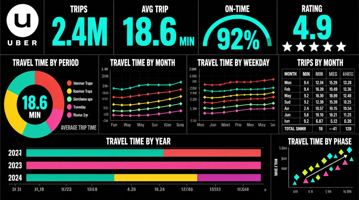
[Format] Landscape 16:9 gig cover, flat dark-themed dashboard-UI screenshot. Bold data-journalism look, big coloured numerals on black. No watermark, no personal names. [Layout] Edge-to-edge black dashboard, no device frame. The frame is a strict mosaic of unframed panels separated only by thin dark gridlines and white section captions, giving the feel of a printed data page. Along the top a four-across band of headline metrics sits with very large coloured numerals, a small unit and a small grey caption under each; the third cell holds a semicircular gauge arc, and the fourth holds a row of five stars. Beneath them, a caption row of small white uppercase chart titles runs across the full width, and then the lower two-thirds is a grid of six panels of unequal size: a donut with a centre figure and a legend to its right; a wide five-series line chart; a legend row of coloured dots; a second wide multi-series line chart; a compact numeric table with twelve month rows and four value columns plus a totals row; a wide stacked horizontal bar band split by year; and a small scatter panel of diamond and triangle markers along diagonal axes. A single grey caption sits beside the donut. [Subject] None — UI only. [Headline] Top-left the Uber logo — a white circular badge holding the black Uber glyph — with the letter-spaced uppercase "UBER" wordmark beneath it. The four top metrics are labelled with short two-or-three-word captions and shown as very large teal numerals with smaller units. All panel and axis titles are small white uppercase strings, including six chart captions describing travel time by period, by month, by weekday, by year and by phase, plus a trips table caption. [Badges] The single top-left mark is the Uber logo — a white circular badge holding the black Uber glyph, with the "UBER" wordmark beneath it. The five-star rating row in the fourth top cell is a generic rating graphic. [Mood] Pure black with bright teal numerals, plus red, yellow, mint and magenta series colours. Bold, editorial, data-journalism energy; the oversized teal figures on black give very strong thumbnail contrast.
More Images