Generate
Create images with AI
Variability and Standard Deviation in Management Accounting
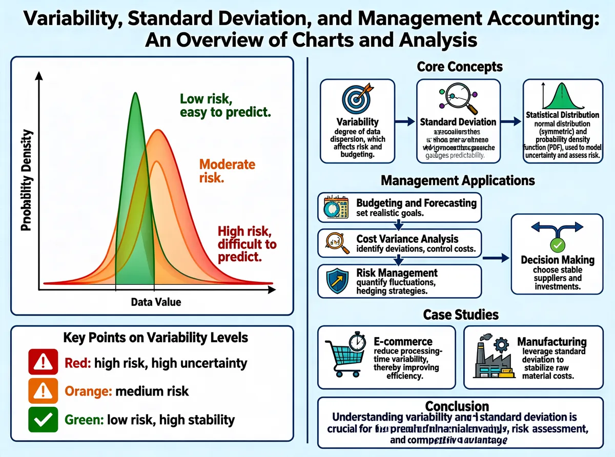
This infographic is titled "Variability, Standard Deviation, and Management Accounting: An Overview of Charts and Analysis" and uses a clear two-column layout: the left side focuses on data visualization and explanations of key points, while the right side systematically presents core concepts, management applications, case studies, and conclusions. The overall design style is clean and professional, using a light blue background with dark text, supplemented by colorful graphic elements to enhance readability. **Left Section: Variability Levels and Probability Distribution** - **Main Chart**: a probability density function (PDF) curve chart, with the horizontal axis labeled "Data Value" and the vertical axis labeled "Probability Density." The chart contains three bell-shaped curves of different forms, representing high, medium, and low levels of variability. - **Green curve**: the sharpest and most concentrated, representing "low variability," with an arrow pointing to the label on the right, "Low risk, easy to predict." - **Orange curve**: medium width, representing "medium variability," with an arrow pointing to "Moderate risk." - **Red curve**: the widest and flattest, representing "high variability," with an arrow pointing to "High risk, difficult to predict." - **Supplementary box below: "Key Points on Variability Levels"** - Red icon (warning): "Red: high risk, high uncertainty" - Orange icon (warning): "Orange: medium risk" - Green icon (check): "Green: low risk, high stability" **Right Section: Core Concepts and Management Applications** - **Core Concepts** (three-step flowchart, from left to right) 1. **Variability**: the accompanying illustration shows a scatter plot with a trend line, and the text reads "degree of data dispersion, which affects risk and budgeting." 2. **Standard Deviation**: the illustration shows a ruler measuring the width of a normal distribution curve, and the text reads "a measure of the average distance from the mean, which gauges predictability." 3. **Statistical Distribution**: the illustration shows a normal distribution curve with a portion filled in green, and the text reads "normal distribution (symmetric) and probability density function (PDF), used to model uncertainty and assess risk." - **Management Applications** (four-step flowchart, from top to bottom and then to the right) 1. **Budgeting and Forecasting**: the icon is a bullseye with an arrow, and the text reads "set realistic goals." 2. **Cost Variance Analysis**: the icon is a magnifying glass with connecting points, and the text reads "identify deviations, control costs." 3. **Risk Management**: the icon is a shield with an arrow, and the text reads "quantify fluctuations, hedging strategies." 4. **Decision Making**: the icon is a forking path with a checkmark, and the text reads "choose stable suppliers and investments." - **Case Studies** (two side-by-side modules) - **E-commerce**: the icon is a shopping cart with a timer, and the text reads "reduce processing-time variability, thereby improving efficiency." - **Manufacturing**: the icon is a factory with gears, and the text reads "leverage standard deviation to stabilize raw material costs." - **Conclusion** (summary box at the bottom) "Understanding variability and standard deviation is crucial for precise financial analysis, risk assessment, and competitive advantage." **Visual and Structural Relationships** - The probability distribution chart on the left intuitively shows the inverse relationship between variability and risk, and the color coding (red equals high risk, green equals low risk) runs throughout the whole image, creating visual consistency. - The core concepts on the right are linked by arrows in a logical progression; the management applications section uses vertical and horizontal arrows to build a flow from fundamentals to practice. - The overall information flow moves from theory (variability, then standard deviation, then statistical distribution) to application (budgeting, cost, risk, and decision making), and finally ends with industry cases and a conclusion, giving it a complete structure with clearly defined layers.
Tags
More Images