Generate
Create images with AI
Staffing Analysis Dashboard UI
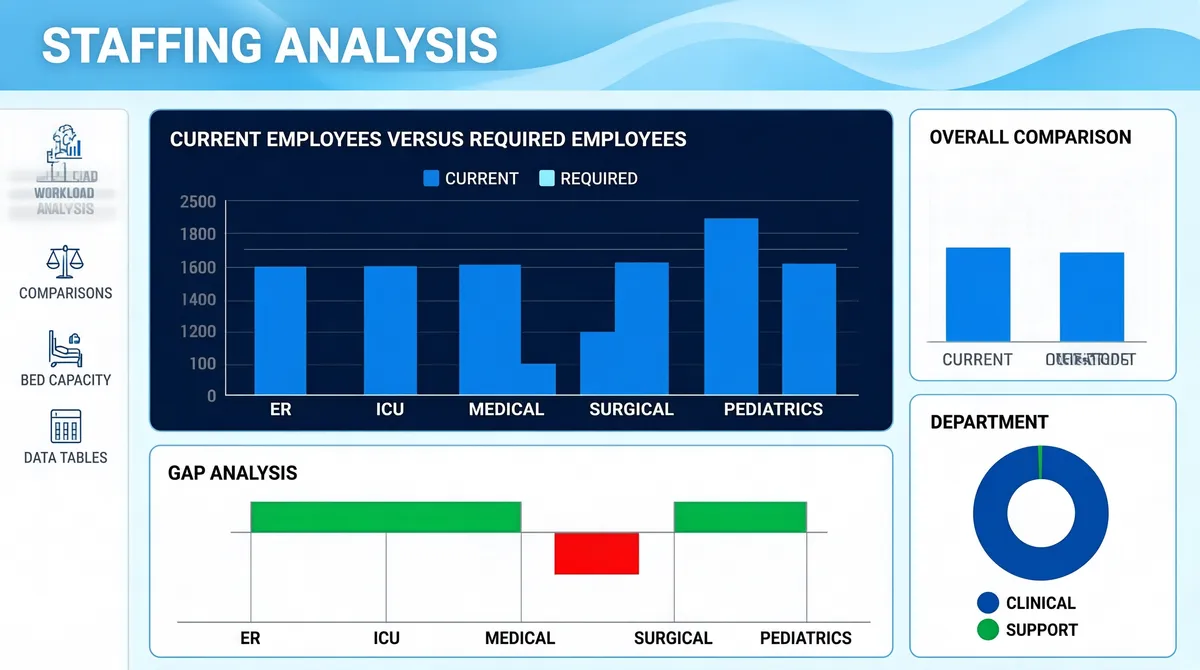
[Format] Landscape 16:9 gig cover, flat dashboard-UI screenshot on a light field. Thin outlined panels, blue accent, airy. No watermark, no personal names. [Layout] Edge-to-edge dashboard, no device frame. The top of the canvas carries a decorative header band: a pale blue ground with soft flowing wave lines and a deeper blue swell sweeping across it, with a page title at the upper-left. A slim white vertical rail runs down the left edge from below the header, holding an icon-and-label stack. The main canvas is a loose grid of white panels with thin light-blue outlines and modest rounding: a wide dark navy panel occupies the upper-centre with a grouped column chart inside it and a small legend above; a narrower white panel sits to its right with a second grouped column chart; and below, a broad white panel spans the left two-thirds with a diverging bar chart that has both upward bars and a couple of downward bars in contrasting colours, while at the bottom-right a white donut panel with a two-entry legend completes the grid. [Subject] None — UI only. [Headline] The page title at the top-left of the header band reads a two-word staffing-analysis heading in white bold. The left rail entries read short section names such as workload analysis, comparisons, bed capacity and data tables, in small grey caps beside tiny line icons. Panel titles in small grey caps read "Current Employees Versus Required Employees", "Overall Comparison", "Gap Analysis" and "Department". Axis labels and category names appear beneath each chart in tiny grey type. [Badges] None. [Mood] Pale blue-white canvas with a softly waved blue header, one dark navy chart panel and red/green diverging accents. Clean, clinical, capacity-planning feel; the dark centre panel gives the thumbnail its contrast anchor.
Tags
More Images