Generate
Create images with AI
The Art of Strategic Reporting Infographic
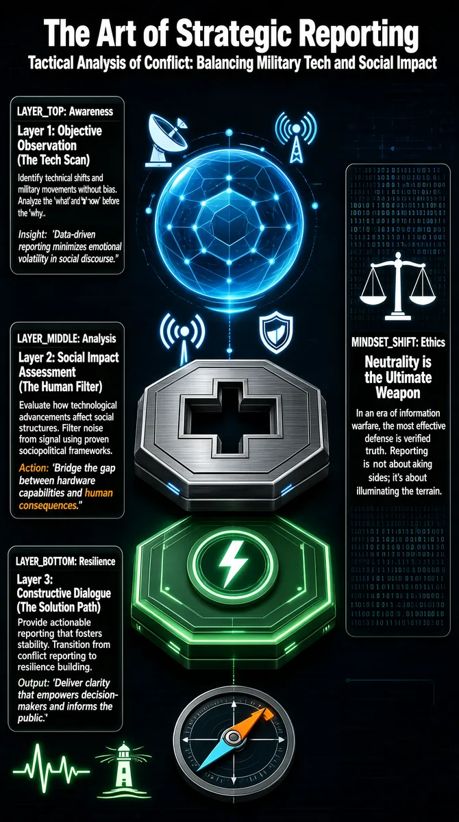
The infographic titled **"The Art of Strategic Reporting"** with the subtitle **"Tactical Analysis of Conflict: Balancing Military Tech and Social Impact"** presents a structured, futuristic visual model for strategic conflict reporting. The overall layout is vertically organized into three primary layers, labeled as LAYER_TOP, LAYER_MIDDLE, and LAYER_BOTTOM, arranged in a descending stack that visually represents a process flow from observation to action. A fourth element, MINDSET_SHIFT: Ethics, is positioned separately to the right, emphasizing its foundational role across all layers. The design employs a dark, high-tech aesthetic with a deep blue-gray background, accented by glowing neon blue and green elements, giving it a sci-fi or digital interface appearance. Central to the composition is a 3D-rendered stack of three geometric platforms, each representing one of the three layers. The top platform is a translucent blue sphere with hexagonal patterns and data nodes, symbolizing global surveillance or awareness. Below it sits a metallic gray octagonal plate with a cross-shaped cutout, representing analysis. The bottom platform glows with a soft green light and features a circular icon resembling a lightning bolt, symbolizing resilience or actionable energy. Beneath this stack, a small compass-like dial points toward the lower-right, suggesting direction or navigation. Each layer is accompanied by a text box with a dark gray background, rounded corners, and white sans-serif font, containing detailed descriptions. The boxes are labeled with capitalized identifiers (e.g., LAYER_TOP) and include subheadings, explanations, insights, and actions. --- ### Structural Breakdown: #### **LAYER_TOP: Awareness** - **Layer 1: Objective Observation (The Tech Scan)** - Description: Identify technical shifts and military movements without bias. Analyze the 'what' and 'how' before the 'why.' - Insight: *'Data-driven reporting minimizes emotional volatility in social discourse.'* - Visual Elements: Positioned above the blue sphere, with icons of a satellite dish and wireless signals floating nearby, reinforcing themes of surveillance and data collection. #### **LAYER_MIDDLE: Analysis** - **Layer 2: Social Impact Assessment (The Human Filter)** - Description: Evaluate how technological advancements affect social structures. Filter noise from signal using proven sociopolitical frameworks. - Action: *'Bridge the gap between hardware capabilities and human consequences.'* (with "human consequences" highlighted in orange) - Visual Elements: Adjacent to the metallic middle platform, with a wireless signal icon and a shield icon partially overlapping the sphere, symbolizing protection and filtering. #### **LAYER_BOTTOM: Resilience** - **Layer 3: Constructive Dialogue (The Solution Path)** - Description: Provide actionable reporting that fosters stability. Transition from conflict reporting to resilience building. - Output: *'Deliver clarity that empowers decision-makers and informs the public.'* - Visual Elements: Positioned below the green platform, with icons of a heartbeat waveform and a lighthouse, symbolizing vitality and guidance. #### **MINDSET_SHIFT: Ethics** - **Title:** *Neutrality is the Ultimate Weapon* - **Description:** In an era of information warfare, the most effective defense is verified truth. Reporting is not about taking sides; it's about illuminating the terrain. - Visual Elements: Placed to the right of the central stack, with a balance scale icon and binary code in the background, reinforcing themes of fairness, objectivity, and digital context. --- ### Chart Type & Data Encoding: This is not a traditional chart but a conceptual diagram using spatial hierarchy and symbolic visualization. The vertical stacking encodes progression: Awareness → Analysis → Resilience. Color encoding distinguishes layers (blue for top, gray for middle, green for bottom), while icons serve as metaphors for each layer’s function. Textual content is presented in clear, segmented blocks with consistent formatting for headings, body text, and italicized quotes. The infographic uses no numerical data or quantitative scales but relies on qualitative concepts and principles. All textual content is in English, with consistent terminology and phrasing that suggests a professional, analytical tone aimed at journalists, policymakers, or military strategists. The overall message emphasizes a shift from reactive, emotionally charged reporting to a methodical, ethically grounded approach that integrates technological insight with human-centered analysis to build societal resilience.
Tags
More Images