






About winter sale posters and cold-season promo designs
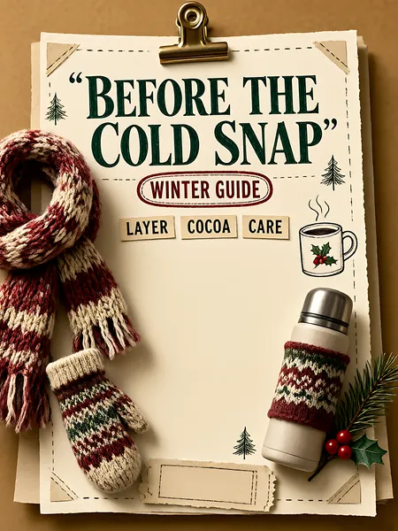
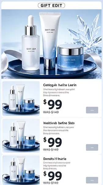
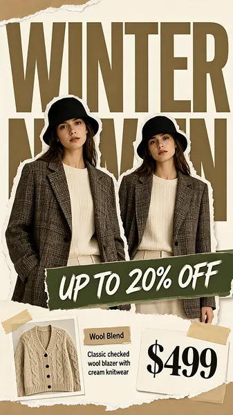
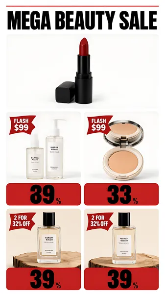
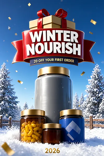
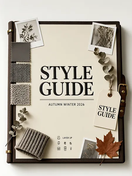
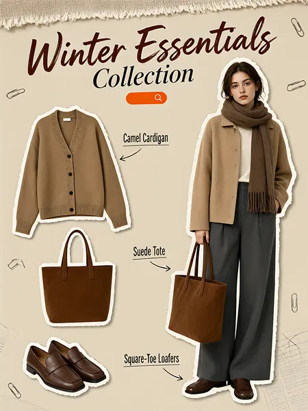
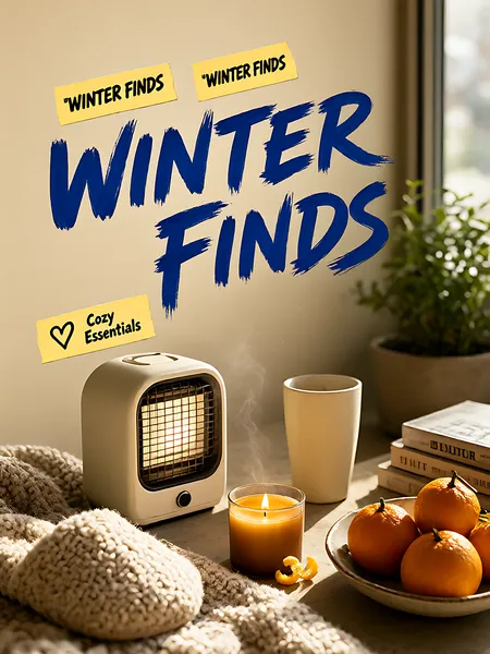
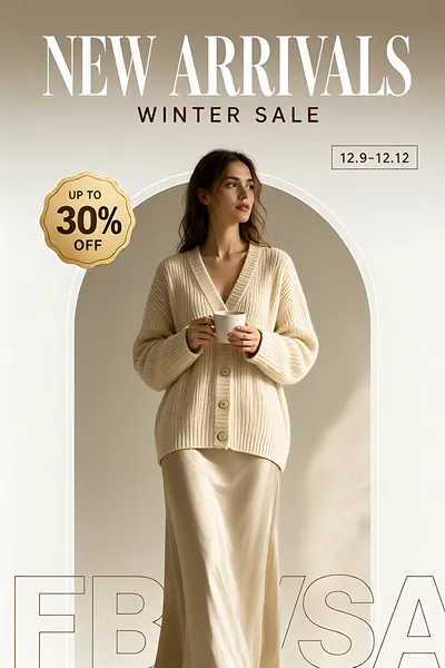
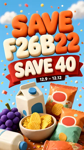
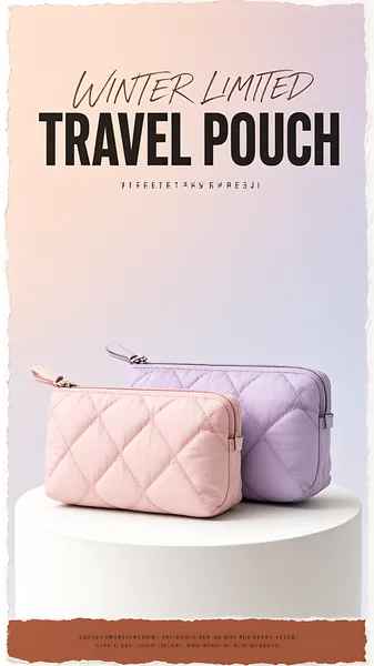
Winter promotions fail in a predictable way: the snow is beautiful and the offer has nowhere to sit, so the discount ends up pasted over the prettiest part of the image. These designs separate the two jobs. The seasonal mood stays in the field - ice blue, snow drift, frosted glass, folded wool - and the commercial message gets a built-in zone of its own: an offer strip, a row of blank countdown tiles, a ribboned gift box, a plate that already owns its corner.
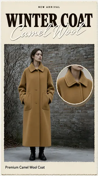
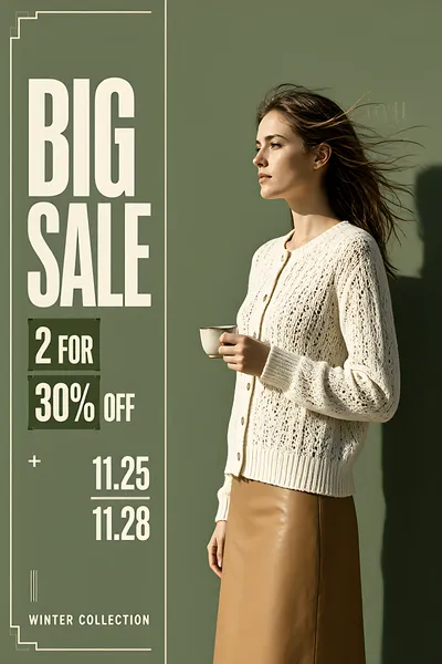
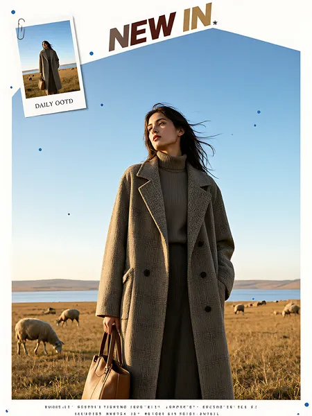
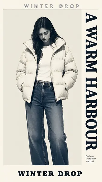
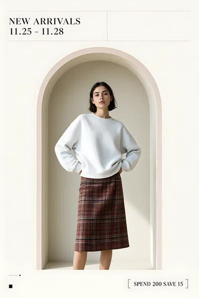
The collection runs two registers. Frost is the cold end: pale ice fields, a single product standing in hard winter light, midnight fields with snow dust in the air. It suits skincare, drinks, electronics and anything sold on the promise of freshness or performance in low temperatures. Thaw is the warm end: oatmeal and cream fields, stacked knitwear, gift boxes, oxblood type for deadlines. It suits apparel, home, gifting and food.
What size should a winter sale banner be?
It depends on the placement, and the two common ones are very different. A wide web banner or a marketplace hero is usually 16:9 or wider; a feed post or a story crop is vertical. Check the individual image rather than assuming one size - this collection mixes landscape and near-square frames on purpose, because a campaign needs both.
Where should the discount go on a winter sale poster?
On a solid plate, never straight onto the artwork. Snow, bokeh, frost texture and knitted patterns all destroy contrast at thumbnail size, and a discount nobody can read is a discount nobody acts on. Every design here already has that plate, strip or tile row in the composition - drop the number in and leave the rest alone.
Can I reuse these for Black Friday, Christmas or Boxing Day?
Yes, and that is the point of keeping the motifs generic. The frost layouts carry no tree, no Santa and no gift, so the same frame works for Black Friday, Cyber Monday, Boxing Day, end-of-season clearance and New Year promotions - swap the headline and the deadline. The gift-led layouts lean Christmas; the countdown layout leans flash sale. If you are running a full December calendar, pair this collection with the Black Friday sale posters for the launch weekend and the Christmas sale and event designs for the gifting weeks - the palettes are built to sit next to each other.
Do these work for services as well as products?
Yes. The layouts without a physical object - the offer strip and the countdown row in particular - read as a promotion rather than a product shot, so a gym membership, a course, a repair booking or a restaurant set menu drops in without looking borrowed from a retail campaign.
How do I stop a winter palette from looking cold and cheap?
Keep the value range narrow and let one warm accent do the work. Ice blue next to pure white reads expensive; ice blue next to a saturated cyan reads like a discount flyer. In this collection the warm note is either oxblood type or a camel knit, never a second bright colour on top of the frost.