




About this collection
Every Fiverr gig lives or dies by a single image. Each cover here respects the real constraints of a gig image - one banner-shaped canvas, high-contrast text, and no clutter that would collapse at small sizes.
These are starting points, not finished listings. Every cover here is built around one idea: a single service promise, set in type large enough to survive being shrunk into Fiverr's search grid. The collection spans roughly thirty service areas — software and app development, design and branding, writing and translation, marketing, audio, data, and business consulting — so you can usually find a layout close to what you sell and adapt it.
Nothing here is a layered design file. Each one is a flat generated image, which is exactly what makes it quick: pick a layout, swap the headline, palette, and icons for your own service, and you have a listing image in a few minutes rather than an afternoon.
What a gig cover actually has to do
A buyer scanning search results sees your cover as a thumbnail no wider than a postage stamp, sitting next to a dozen competitors. That single constraint decides almost everything else:
- One promise, not a service list. "I will fix your WordPress site in 24 hours" reads at thumbnail size. "WordPress | SEO | Speed | Security | Maintenance" turns to mush.
- High contrast between text and background. Thin light type on a pale panel is the first thing to disappear when the image shrinks.
- Three to six words in the headline. Long headlines force small type, and small type is what becomes unreadable first.
- The service visible before reading a word. A layout cue — a device frame, a waveform, a chart, a colour swatch — tells the buyer the category instantly.
Resizing and export
Fiverr publishes its own requirements in the uploader, and they change - check them there rather than trusting a number quoted in a blog post. What does not change is the direction of the resize: always scale down from the download. Never upscale a smaller image to reach the uploader's width, because the text edges go soft, and soft type is exactly what a thumbnail cannot afford.
When you trim to match the uploader's proportions, do it symmetrically and keep the headline centred, so the crop does not eat one side of the promise.
Three things worth doing before you upload
- Judge the thumbnail, not the full-size file. Shrink the preview down to search-result size, or just squint. If the promise still reads, the cover works. 2. Keep a colour system across your gigs. Buyers skim a grid of near-identical covers; a consistent accent colour makes your listings recognisable among strangers. 3. Leave the outer margin clear. Gig images get cropped slightly differently across placements, so keep text away from the outer edge of the canvas.
Common questions
Will the downloaded cover meet Fiverr's upload requirements?
Check the uploader: Fiverr shows its current accepted format, file limit and recommended image spec there, and those are the platform's requirements, not ours. What matters on this side is direction — start from the downloaded cover and scale down to fit, never up from a smaller file.
Will the text still be readable in the search grid?
Shrink it to search-result size before uploading. That is close to what buyers actually see when comparing gigs, and it is where most covers fail — usually because the headline was set too small or the contrast was too low to begin with.
How many images should one gig have?
Fiverr's gallery takes up to three images and two videos. Lead with the strongest cover, then spend the remaining slots on a work sample, a before-and-after, or a deliverable preview rather than more headline art.
Can I use the same cover on several gigs?
No. Buyers often see two or three of your gigs together, and identical covers make them look like one listing repeated. Change the headline, the accent colour, and the main visual so each gig reads as its own service.
Can I change the text or colours after generating?
Not in place. The wording is baked into the image, so there is no text layer to retype. Download it and edit it in your own tool, or use the "Use as Template" option to regenerate it with different copy.
Why do the covers in this collection look so different from each other?
Because the range is deliberately broad. Each cover was written around the specific service it advertises, so a logo animation cover and a translation cover share a job — selling one service at thumbnail size — but not a visual style. That variety is what lets you give every gig a distinct look.
![[Format]
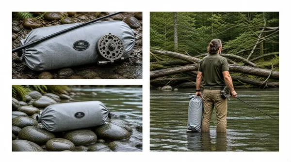
Landscape 16:9 gig cover, outdoor lifestyle adventure photo collage. Natural-light documentary finish, deep greens, soft overcast grade. No watermark, no personal names.
[Layout]
A three-photo collage on a plain white background, with the photos floating inside generous white margins rather than bleeding to the frame edge. The left fifty percent holds two stacked horizontal panels separated by a clean white gutter: the top panel is a tight macro of a grey roll-top dry bag lying on a wet riverbank with a fly-fishing rod and a perforated reel resting across it, and the panel beneath it shows the same bag alone on smooth river stones at the water's edge, shot from a low angle. The right fifty percent is one tall panel that spans the full height of the two stacked panels, showing a man standing thigh-deep in a slow river with his back to camera, holding the same dry bag in his right hand and a fly rod in his left, with a tangle of fallen branches and dense forest filling the background. The white outer margin is roughly equal on all four sides, and the right-hand panel's bottom edge aligns exactly with the lower panel's bottom edge.
[Subject]
One human subject: a man in his forties with wavy shoulder-length hair tied back, seen from behind so no face is visible, wearing a dark olive short-sleeve shirt, khaki trousers and a black watch on his left wrist, a fly reel tucked at his hip. He stands in three-quarter back view in the right panel, taking up about a third of that panel's height, cropped at mid-thigh by the water line. The two left-hand panels have no human subject at all, only the bag, the rod and the stones.
[Headline]
None - the collage carries no typography of any kind.
[Badges]
None. Each bag shows a small dark oval emblem with a line of tiny illegible lettering and a shorter second word beneath it on its front face - render it as a generic unreadable outdoor-gear badge, never as a real brand, and keep its small size and centred placement.
[Mood]
Cool river green and stone grey: silver-grey coated fabric, moss, fern, wet slate and dark timber. Quiet, authentic and gear-catalogue calm; at thumbnail size the white gutters turn the three photos into a clean asymmetric window on the outdoors rather than a busy moodboard.](https://files.posterlet.com/assets/generated/md/qz69x65hh8uh.webp)
![[Format]
Landscape 16:9 gig cover, dark corporate studio-service advert with a photographic portrait. Bold flat graphic shapes layered over a low-key studio photo. No watermark, no personal names.
[Layout]
The frame divides into a left type column and a right portrait column, bound together by two large curved graphic shapes. A big teal panel with a rounded right-hand bulge sits behind the left two thirds, and a large dark circle is centred behind the man's head and shoulders on the right, darkening toward its edges. At the bottom, a wide yellow-orange ribbon sweeps across the full width in a shallow arc, rising at the right, and overlaps the base of both the portrait and the teal panel; a second smaller dark crescent curls under its left end. The left column is stacked top to bottom: two huge headline lines, a thin white sub-line, then five evenly spaced checklist rows running down to the yellow ribbon. A faint dotted halftone grid textures the teal field behind the checklist.
[Subject]
One human subject: a bearded man in his thirties with short dark hair, wearing a dark collared shirt, photographed chest-up and slightly turned toward camera, holding a large black DSLR camera with a long lens up at his right shoulder, hands on the body. He occupies the right third of the frame, lit with a cool teal rim from behind and a soft key on the face, eyes calm and level at the lens.
[Headline]
Top-left, two massive lines of heavy condensed uppercase type in amber-orange: "YOUR COMPLETE" over "MARKETPLACE SOLUTION", the two lines filling about half the frame width and stacked tight with almost no leading. Beneath them a single smaller white uppercase line, "LISTING IMAGES, A+/PREMIUM CONTENT & PRODUCT VIDEO". Then five checklist rows, each a white outlined circle containing a white tick on the left and a heavy white uppercase label to its right: "PHOTOGRAPHY", "HEAVY RETOUCHING", "INFOGRAPHIC DESIGN", "VIDEOGRAPHY", "3D RENDERING". Inside the bottom yellow ribbon sits one black heavy uppercase line, "MARKETPLACE PRODUCT PHOTOGRAPHY & VIDEO", with a small black curved swoosh arrow dropping beneath its centre.
[Badges]
Top-right, two white circular badges in a row: the left one holds a line icon of a camera on a tripod with the stacked small-type caption "2000ft2 STUDIO"; the right one is a circular flag roundel in blue, white and red whose pattern reads as crossing vertical, horizontal and diagonal bars, with the caption "UK BASED" set beside it. Render both as generic icon roundels - no real corporate identity.
[Mood]
Dark studio teal, amber-orange and safety yellow against near-black, with white type and warm skin tones. Confident, industrial and agency-grade; at thumbnail size the amber headline block and the yellow ribbon bracket the man's face, so the portrait and the offer read in a single glance.](https://files.posterlet.com/assets/generated/md/lxcxrtgkyj1t.webp)
![[Format]
Landscape 16:9 gig cover, bright winter fashion-lifestyle portrait with overlaid display type. Clean commercial retouch, cool daylight grade, shallow depth of field. No watermark, no personal names.
[Layout]
A single full-bleed photograph rather than a grid. A snow-covered mountain range recedes across the whole frame, softly out of focus, with a pale sky at the top and a bright snowfield sweeping diagonally from lower-left to mid-right. The right forty percent of the frame is occupied by a woman standing in the snow at three-quarter turn, framed from mid-thigh up and pushed to the right edge so her shoulder almost touches the frame border; she is the only in-focus element and everything behind her falls away into blue-white bokeh. The left half of the frame is empty snow and mountain haze, reserved for the headline stack, with the type starting about a tenth of the frame in from the left edge and centred vertically.
[Subject]
One human subject: a young woman in her late twenties with light skin and dark eyes, wearing a voluminous white faux-fur hat that sits low on her brow and a heavy cream wool coat with a high funnel collar, no visible accessories. She faces almost square to camera, chin slightly down, expression cool and closed, eyes meeting the lens. Head-and-shoulders to mid-thigh framing, lit by soft overcast daylight with a cool rim from the snow at her left.
[Headline]
Four stacked lines of display type on the left, left-aligned into a ragged block and slightly stepped so the block is wider at the top. Line one, "Boost sales with", is set in a bold italic outline face - white fill with a heavy black contour and a soft outer glow. Lines two and three, "Scroll-Stopping" and "Product Photos", are the dominant mass: very heavy black geometric sans, title case, tightly leaded, together filling about two thirds of the left half. Line four, "without a shoot", is indented right under the block in the same outlined italic face as line one, at about half the size of the heavy lines.
[Badges]
None.
[Mood]
Cool alpine minimalism: snow white, ice blue, slate grey mountains and soft cream wool, with pure white and black type the only high-contrast elements. Calm, premium and editorial; at thumbnail size the heavy black "Scroll-Stopping Product Photos" block reads first and the white-hatted figure gives an instant human anchor on the right.](https://files.posterlet.com/assets/generated/md/k9j7vhb5y06g.webp)
![[Format]
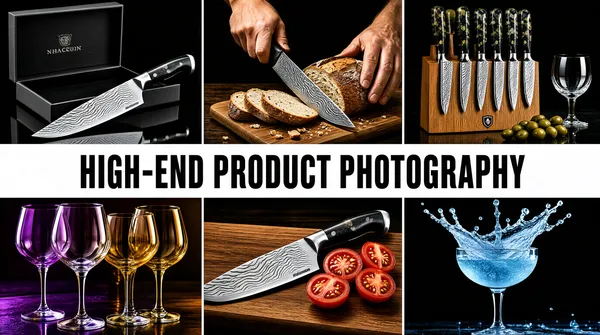
Landscape 16:9 gig cover, dark luxury still-life mosaic with a solid headline bar. High-contrast editorial retouch, deep blacks, glossy specular highlights. No watermark, no personal names.
[Layout]
A six-tile mosaic - three columns across two rows of equal panels - is interrupted at its exact vertical middle by a solid white horizontal bar that spans the full width edge to edge and occupies roughly a sixth of the frame height, so the top row of three photos sits directly above it and the bottom row of three directly below. The tiles butt together with no visible gutter on the sides but a clean white seam where the band meets them. Top-left tile: a glossy chef's knife with a wavy patterned blade lying diagonally in front of an open black presentation box on a dark reflective surface. Top-centre tile: a hand gripping a patterned-blade knife mid-cut through a rustic loaf on a wooden board, crumbs and cut slices scattered forward. Top-right tile: a wooden knife block holding a full row of knives with mottled resin handles, shot on a warm dark table with olives and a glass at the right. Bottom-left tile: a cluster of stemmed glasses photographed through coloured light so the bowls glow purple and amber. Bottom-centre tile: the patterned blade laid across a wooden board with halved cherry tomatoes beside it. Bottom-right tile: a coupe glass with a mid-air splash, lit in icy blue against black.
[Subject]
No full human subject. Only one partial figure appears - a pair of hands at the top of the centre-top tile, holding the knife through the bread, softly lit and cropped at the wrists. Everything else is object-only, each item staged on a dark surface or board with a single hard key light.
[Headline]
One line of type only, centred inside the white band and occupying about seventy percent of the frame width: "HIGH-END PRODUCT PHOTOGRAPHY" in a heavy condensed grotesque, all-caps, solid black, with wide even letter-spacing and generous side padding inside the white bar. The bar has no border, rule or shadow.
[Badges]
None. Small illegible engraved wordmarks appear on the knife blades, the presentation box lid and the side of the wooden block, plus a tiny shield emblazoned on the block face - render all of these as generic unreadable lettering details, never as a real brand.
[Mood]
Chiaroscuro and expensive: carbon black, oxblood, warm oak, patterned steel silver, plus two small injections of purple and icy blue. Confident, culinary and premium; at thumbnail size the white band slices the frame into two dark strips of three photos each, giving the cover a shelf-like symmetry.](https://files.posterlet.com/assets/generated/md/1c2tbxn4kjrg.webp)
![[Format]
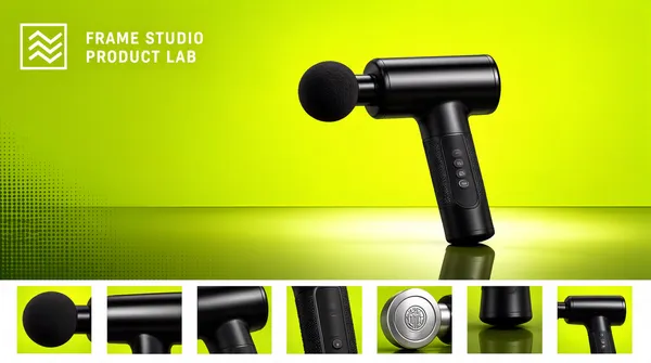
Landscape 16:9 gig cover, studio product hero on a coloured seamless sweep, with a detail-thumbnail strip along the base. Sharp commercial retouch, glossy highlights, gradient studio lighting. No watermark, no personal names.
[Layout]
The frame splits horizontally into a tall main stage and a thin bottom strip. The main stage takes the upper eighty-eight percent: a lime-green seamless sweep that brightens from a hot chartreuse at the top edge to a deeper olive-green at the floor line, with a soft horizontal light pool where wall meets floor and a faint, vertically stretched reflection under the product. A single black percussion massager stands upright in the centre-right of the stage, occupying roughly a third of the frame height, tilted a few degrees clockwise with its round foam head pointing left, its handle running down toward the floor line. The upper-left quadrant of the green field is left completely empty apart from one small logo lock-up. The bottom strip is a clean white band about one tenth of the frame height, holding seven square product thumbnails in an even row with narrow white gutters between them. A very light dotted halftone texture breathes at the bottom left of the green wall.
[Subject]
No human subject. The product is a matte-black handheld percussion massage gun with a textured grip, a slim control panel of three small buttons on the handle, a polished cylindrical barrel and a fitted ball-shaped head, shown at a three-quarter angle with soft studio reflections on the barrel and a mirror-like contact reflection beneath the base.
[Headline]
The only type is the top-left lock-up: a thin white outlined square, inside it a solid light-green glyph of three stacked chevrons, and to the right of the square two lines of small white uppercase sans-serif wordmark, generously letter-spaced, reading a neutral two-word studio placeholder such as "FRAME STUDIO" over "PRODUCT LAB". It sits at about one third frame height on the left, occupying roughly a fifth of the width. The seven thumbnails below are unlabelled.
[Badges]
The outlined-square plus chevron glyph described above is the only mark, drawn in white outline with a light-green fill - treat it as a generic geometric studio mark, never a real identity. Thumbnail four contains a small circular embossed emblem on a silver attachment; render it as an illegible generic engraved detail.
[Mood]
Electric green and black: hot chartreuse, olive, crisp white and deep matte black. Bright, techy and gym-adjacent, with a catalogue clarity; at thumbnail size the lime field and black product punch out hard, and the white detail ribbon along the bottom reads as a filmstrip of close-ups.](https://files.posterlet.com/assets/generated/md/r8z6gh62dro6.webp)
![[Format]
Landscape 16:9 gig cover, high-contrast selective-colour beauty portrait. Near-monochrome black-and-white treatment with a single isolated colour accent, luminous skin retouch. No watermark, no personal names.
[Layout]
An extreme close crop of one face fills the whole frame with no background visible. The right two thirds hold the visible half of the face - brow, eye, nose, lips and jaw - with long straight hair falling down the right edge and running out of frame top and bottom. A large flat white card is held up across the left third, covering the other half of the head; its edge is a clean near-vertical diagonal running from the top-left corner down to the lower centre, and it is the brightest element in the picture, close to blown-out white. Fingers grip the card's left edge at the lower left, softly out of focus. The crop is tight, almost square, with the eye sitting near the upper-right third intersection.
[Subject]
One human subject: a young woman's face, cropped so only half of it is visible, holding a blank white card flat against her cheek and covering the left side of her head. Her expression is calm and neutral, lips relaxed, gaze aimed just past the lens. Skin is desaturated to near-greyscale with fine pore texture retained, lashes heavily defined. The only colour in the entire frame is a single iris rendered in vivid green with an amber inner ring.
[Headline]
None - the cover carries no typography.
[Badges]
None.
[Mood]
Monochrome studio restraint: graphite grey, soft silver and a near-white card, broken by one saturated emerald-and-amber eye. Quiet, striking and high-fashion; at thumbnail size the white card splitting a greyscale face stays legible even at a hundred and twenty pixels wide.](https://files.posterlet.com/assets/generated/md/72m0y6uo2tw4.webp)
![[Format]
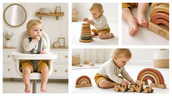
Landscape 16:9 gig cover, soft-focus nursery lifestyle photo collage. Airy pastel natural-light finish, slightly matte film look. No watermark, no personal names.
[Layout]
An asymmetric four-photo collage on a clean white gutter grid. One tall panel occupies the full height of the left fifty-five percent of the frame - a toddler seated in a white highchair in a pale nursery, shot at eye level, with a wooden wall shelf, a round mirror and a low white dresser behind. The right forty-five percent splits into two horizontal bands at roughly sixty-forty height. The upper band holds two side-by-side square panels: first a toddler in a speckled white top playing with a stacked wooden ring tower on a white floor, second an extreme close-up of bare baby feet and legs beside a wooden rainbow stacker. The lower band holds one wide landscape panel of the same toddler seated on the floor playing with a wooden train and rainbow arches. Gutters are an even white about six pixels wide, with no borders, frames or drop shadows, so the tiles float flat.
[Subject]
One recurring subject across all four tiles: a fair-haired toddler about one year old, barefoot, in a speckled cream long-sleeve top and mustard-yellow shorts. In the tall left panel the child sits in a white highchair wearing an unpadded grey harness, one hand near the mouth, gazing slightly off-camera. In the three right-hand tiles the child is seated on the floor absorbed in the wooden toys, framed from waist-up to full body. Light is soft, diffused and even, with gentle falloff and no hard shadows.
[Headline]
None - there is no typography anywhere on the collage.
[Badges]
None. A small illegible tonal wordmark is printed on the base of the wooden rainbow toy - render it as a generic engraved lettering detail, never as readable brand text.
[Mood]
Warm neutral nursery palette: cream, oatmeal, soft oak, mustard and muted terracotta rainbow arcs against white walls. Calm, tender and editorial-parenting; at thumbnail size it reads as a soft beige lattice of four quiet moments rather than a hard-sell advert.](https://files.posterlet.com/assets/generated/md/eqs8xmhdx8c8.webp)
![[Format]
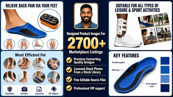
Landscape 16:9 gig cover, dense e-commerce infographic sheet. Flat vector-and-photo hybrid, very high information density, navy and gold palette. No watermark, no personal names.
[Layout]
The frame divides into three vertical zones. Zone A, the left third, stacks two white rounded-rectangle infographic cards: the top card is a blue-tinted product hero showing a foot wearing a blue-and-black arch-support insole with a circular inset detail of the insole, a small orange-and-black foot-massage device at the corner, a horizontal row of four small circular injury diagrams and a four-column caption strip along its base; the lower card is a pale-blue grid of circular photos of feet and legs around a centred heading, with a four-icon benefit strip beneath. Zone B, the middle third, is a solid deep-navy panel: a small rounded-square framed photo of a smiling man in a denim shirt sits at the top centre, three centred lines of type follow, then a vertical stack of four bullet rows each led by a bold gold check mark. Zone C, the right third, stacks two more cards: the upper one pairs a photo of a white trainer and a braced leg with a diagonal collage of four small lifestyle photos; the lower one is a blue product render of the insole with thin leader lines to four callout labels and a column of rotated blue colour swatches.
[Subject]
One small human subject: a young bearded man with dark skin and a denim shirt, smiling at camera, head-and-shoulders, cropped into a rounded square about one tenth of the frame width at the top of the navy middle column. Incidental partial figures - feet, legs, a seated person - appear inside the circular insets.
[Headline]
Reading order: card headings set in a condensed white or navy sans - "RELIEVE BACK PAIN VIA YOUR FEET", "Most Efficient For", "SUITABLE FOR ALL TYPES OF LEISURE & SPORT ACTIVITIES", "KEY FEATURES". A short lowercase two-tone wordmark sits in a white capsule at the top-left of the upper-left card and is repeated on the other cards. The centre column carries the main headline: "Designed Product Images For" in light amber sans, then "2700+" as a very large bold gold numeral about a third of the column wide, then "Marketplace Listings" in amber, the three lines centred and stacked. Four white sans bullet lines follow: "Premium Converting Quality Designs", "Licensed Stock Photos From a Stock Library", "Free Editable Source Files", "Professional VIP support".
[Badges]
One recurring mark: a short lowercase grey wordmark in a white rounded capsule roughly one eighth of the card width, its final letter replaced by a small blue kite-shaped glyph - describe generically, no readable brand. Also present: four gold check marks, four small circular anatomy icons and a four-icon benefits strip.
[Mood]
Corporate blue-and-gold: deep navy, cornflower blue, white cards, amber and gold accents. Busy and sales-floor loud; at thumbnail size the navy spine of type reads first, flanked by two columns of white cards.](https://files.posterlet.com/assets/generated/md/qecdsexqtbf0.webp)
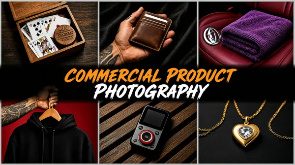
![[Format]
Landscape 16:9 gig cover, dark moody commercial product-photography contact sheet. Cinematic low-key finish, richly saturated, slight film grain. No watermark, no personal names.
[Layout]
A six-tile mosaic - three columns by two rows of equal square-ish photos - divided by thin light-grey gutters about eight pixels wide that run the full width and full height of the frame. Top-left tile: playing cards and a round wooden marker inside an open wooden box, shot top-down on dark timber. Top-centre tile: a tattooed hand holding a brown leather card wallet against dark draped fabric. Top-right tile: a folded purple towel on a deep-red car seat with a chrome emblem at its left. Bottom-left tile: a black hooded sweatshirt on a wooden hanger held by a tattooed forearm against a crimson backdrop. Bottom-centre tile: a small handheld media player with a screen and a red-ringed dial resting on dark wooden slats. Bottom-right tile: a gold heart-shaped pendant with a clear stone on a fine chain against matte black. A semi-transparent near-black horizontal band runs across the exact mid-height of the frame, overlapping the row seam and covering roughly the middle third of the tile height, opaque at its core and feathered where it meets the photos.
[Subject]
No human subject cut-out. Only partial body fragments appear inside tiles - a tattooed hand and forearm cradling the wallet and gripping the hanger. Every tile is lit against a dark, textured surface with a single hard key and deep falloff.
[Headline]
Two lines of heavy brush-script display type, centred inside the dark band and set tight with no leading. Line one reads "COMMERCIAL PRODUCT" in warm amber-orange; line two reads "PHOTOGRAPHY" in pure white. Both use the same bold italic marker-stroke face with slightly distressed edges, all-caps, sized so the pair fills about seventy percent of the band width. A soft drop shadow lifts the letters off the dark plate.
[Badges]
None. A single illegible tonal wordmark is engraved in the round wooden marker in the top-left tile - render it as a generic lettering detail, never as a readable brand. No ratings or trust seals.
[Mood]
Low-key and editorial: charcoal, oxblood red, deep purple, warm timber brown and amber type with one gold highlight. Premium, slightly masculine and cinematic; at thumbnail size the six dark squares read as a checkerboard split by one bright orange-and-white headline stripe.](https://files.posterlet.com/assets/generated/md/x165jd1x4i2f.webp)
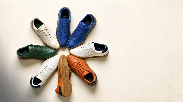
![[Format]
Landscape 16:9 gig cover, clean top-down e-commerce flatlay still-life photograph. High-key commercial finish, crisp leather and rubber texture, true-to-life colour. No watermark, no personal names.
[Layout]
A plain off-white seamless paper sweep fills the entire frame edge to edge, with no horizon line and no reflection. Seven low-top court sneakers are arranged top-down in a loose radial pinwheel centred slightly left of frame centre, each toe pointing inward so the group reads as a rough starburst about two thirds of the frame width. The cluster is rotated a few degrees clockwise, leaving wider empty paper along the right and lower edges and a soft grey vignette of cast shadow in the lower-left corner. Soft-edged contact shadows sit directly beneath every shoe and anchor the fan to the paper. A faint patch of paper texture and a few dust specks are visible low in the right third so the sweep never reads as flat vector white. Nothing overlaps the shoe group and there is no crop cut into the frame edges.
[Subject]
No human subject. The subject is the product only: a fan of low-top leather trainers laid on their sides and soles so both uppers and a couple of gum-rubber outsoles face the camera. The set includes two off-white pairs, one deep green pair, one royal blue pair, one burnt-orange pair and one white pair with a dark navy heel tab. All are laced and shot at a consistent scale.
[Headline]
None - the cover carries no typography at all, image only.
[Badges]
Each shoe carries one small tonal wordmark stamped on the outer quarter panel and again on the heel: a slim lowercase italic lettering block in black or white ink roughly six percent of the shoe's length, aligned parallel to the lace panel. Render it as an illegible generic lettering block, never as readable brand text. No other marks, ratings or trust seals appear anywhere in the frame.
[Mood]
High-key minimalism: warm off-white paper, cream, forest green, royal blue and burnt orange, with almost no other colour present. Calm, premium and catalogue-clean; at thumbnail size the pinwheel of colourful shoes reads instantly as a spoke pattern on an empty white field.](https://files.posterlet.com/assets/generated/md/pttv6ltqboic.webp)
![[Format]
Landscape 16:9 gig cover, high-saturation product triptych, glossy editorial lighting. No watermark, no personal names.
[Layout]
Three tall vertical panels, equal width, separated by thin white lines. Each panel is a different color field: warm peach, deep red, and golden yellow. The products are centered in each panel.
[Subject]
Left: a clear glass bottle with golden liquid and sliced figs on a reflective amber surface. Center: a close-up of a red beverage can covered in water droplets with a yellow fruit graphic. Right: a rectangular perfume bottle with amber liquid on a reflective gold surface.
[Headline]
No headline.
[Badges]
A small white circular badge on the center can reads "Low Sugar." Generic labels in stylized sans and serif appear on bottles; do not reproduce exact words.
[Mood]
Amber, red, and gold palette; luxurious, juicy, and bold, with strong thumbnail contrast.](https://files.posterlet.com/assets/generated/md/nkfv3i3q34qb.webp)
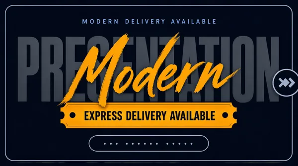
![[Format]
Landscape 16:9 gig cover, minimal dark typographic title card with a thin inset keyline. Completely flat, no photography, no devices, no mockups, no gradients beyond a whisper of vignette. No watermark, no personal names.
[Layout]
A solid dark slate-navy field fills the frame. A thin light-grey rounded-rectangle keyline is inset evenly on all four sides, roughly a few percent in from each edge, framing everything like a bordered card. All content sits in a single centred vertical column: a small letterspaced eyebrow line in the upper quarter, the ghost word across the middle, a horizontal banner immediately below it, and a small outlined pill near the lower quarter. On the right-hand edge, overlapping the keyline by half, a small circular outline holds two small chevron arrows. No imagery, no grid, no panels and no photographic element anywhere in the frame.
[Subject]
None - typographic only. There is no human figure, product, device or mockup in the frame.
[Headline]
Centre of the frame: the word PRESENTATION set extremely large in a heavy condensed grotesque sans, all caps, in a dark grey only one or two shades lighter than the background so it reads as a ghost word spanning most of the frame width. Overlapping that word in the middle, and rising slightly above its cap height, the word Modern is written in a thick warm-amber brush script with a dry, slightly rough edge. Above both, a small letterspaced sans line in muted blue-grey acts as an eyebrow. Below the ghost word, on an amber ticket-shaped banner with notched left and right ends and a single tiny round bullet dot near each notch, an all-caps letterspaced dark-navy line reads EXPRESS DELIVERY AVAILABLE. Near the bottom, a small rounded outline pill in muted grey holds a short lowercase placeholder handle - render it as unreadable placeholder text with no real name.
[Badges]
The only shapes beyond the type are the amber notched ticket banner, the small grey outline pill near the bottom, and the circular outline with two chevron arrows clipped onto the right edge of the keyline.
[Mood]
Charcoal-navy monochrome with a single hot amber accent; restrained, premium, poster-like and quiet. At thumbnail size the amber script word and the amber ticket banner are the only saturated elements, so the eye lands on them immediately and the ghost word stays as texture.](https://files.posterlet.com/assets/generated/md/z0z35uvseuud.webp)
![[Format]
Landscape 16:9 gig cover, full-bleed photographic mockup of a scattered deck of slide pages with a giant type overlay. Slight top-down perspective, soft studio shadows, muted blue cast. No watermark, no personal names.
[Layout]
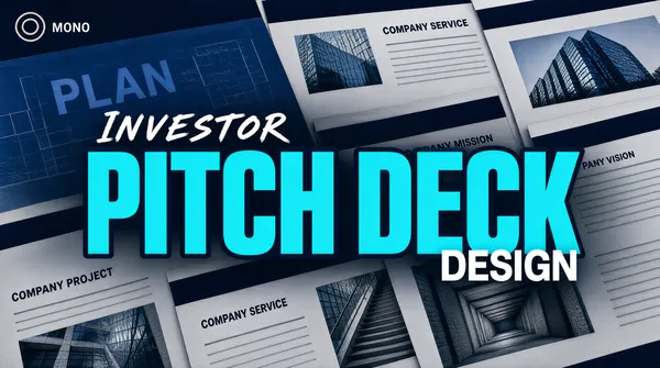
The whole frame is filled edge to edge with a fanned pile of presentation slide pages photographed from above at a shallow angle, so the pages overlap in a layered diagonal that runs from the lower-left up to the upper-right and beyond all four edges. The individual pages are pale grey-white with dark-navy heading bars, thin grey body lines and inset photographs of glass office towers and stairwells; their small titles read as short generic group headings such as company service, company mission, company project and company vision, and one larger blue page near the top-left carries a bigger plan title. The whole deck is desaturated and darkened so it reads as texture rather than information, with a subtle vignette and a cool blue wash laid over everything. A large overlay text lock-up floats centred across the middle of the frame, clearly above the pages, with the pages continuing to show behind and through it.
[Subject]
None - no person appears anywhere on the cover. The only subjects are the photographed slide pages and the architectural photographs embedded inside them.
[Headline]
A three-part centred lock-up dominating the middle of the frame. First, the word INVESTOR rendered in a white hand-brushed brush script, small, wide-tracked and set above and left of the main line. Second, the words PITCH DECK in enormous heavy condensed caps in a bright cyan-turquoise, with a soft dark outline, spanning nearly the full frame width as the single dominant element. Third, the word DESIGN in bold white sans caps, much smaller, tucked to the lower right just under the cyan line. The whole lock-up is centred horizontally and sits slightly above the vertical middle.
[Badges]
One tiny mark on a page in the top-left corner: a small circular outline glyph with a couple of tiny lines of text beside it - describe it generically as a neutral circular monogram with a short wordmark, never as a real company mark. No ratings, seals or app tiles anywhere.
[Mood]
Deep navy-blue photographic cast over desaturated grey-white pages, broken by one piercing cyan headline; confident, financial, fundraise-grade. At thumbnail size the giant cyan PITCH DECK carries the entire cover while the page texture stays as background noise.](https://files.posterlet.com/assets/generated/md/cjg1djkvmlgt.webp)
![[Format]
Landscape 16:9 gig cover, flat pastel studio portrait with a clean subject cut-out. Minimal editorial finish, even exposure, no props, no grain.
[Layout]
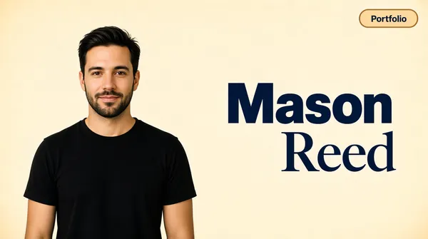
One flat warm cream background fills the entire frame with no horizon line, no gradient band and no props, only the faintest vignette at the corners. The composition is split into two halves. The photographic subject occupies the left portion, roughly the left 40 percent, standing from the upper third down and cropping at the bottom edge, leaving air above his head. The text block occupies the right half, vertically centred in the frame and right-aligned so it hugs the right margin. In the extreme top-right corner a single rounded pill capsule floats with clear space all around it. There is no border, panel, grid, mockup or device anywhere in the frame - the entirety of the layout is one figure and one text block on flat colour.
[Subject]
A man in his early thirties with short dark swept-back hair and a short beard, wearing a plain black crew-neck t-shirt, standing square to camera with arms relaxed at his sides, framed waist-up and cropped at the bottom edge. He looks straight into the lens with a slight closed-mouth smile. Even soft studio light from the front-left with a gentle falloff on the shaded side of his face, and no cast shadow on the background so the cut-out sits flat against the cream. He occupies the left half only and does not overlap the type.
[Headline]
Right half, two stacked lines, right-aligned: the first line in a heavy dark-navy grotesque sans, title case, very large; the second line beneath it in a lighter-weight dark-navy serif at the same size but shifted further right so the two lines form a stepped block. Together they fill the central band of the right half and are the only display type on the cover.
[Badges]
One small rounded pill capsule in the top-right corner, warm cream-tan fill with a slightly deeper tan outline, holding short dark title-case text. Nothing else appears in the frame.
[Mood]
Warm sand-cream ground, black wardrobe and deep-navy type; calm, human, portfolio-style and deliberately uncluttered. At thumbnail size the black silhouette of the man against the flat cream field pairs instantly with the bold navy stepped headline.](https://files.posterlet.com/assets/generated/md/fkhc2bhma09q.webp)
![[Format]
Landscape 16:9 gig cover, premium dark studio shot of an open laptop on a wooden desk with a slide collage on its screen. Photorealistic, cinematic, shallow depth of field, warm practical glow. No watermark, no personal names.
[Layout]
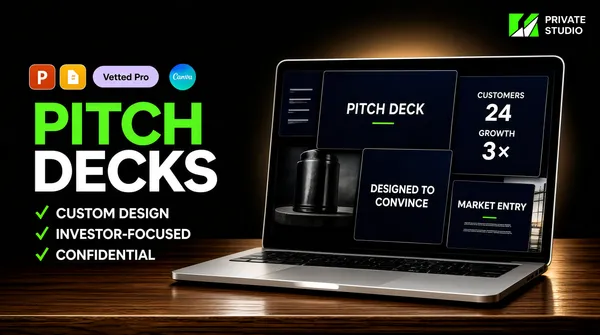
A near-black charcoal background fills the frame, warmed by a soft ambient glow behind the laptop. A walnut-toned wooden desk surface occupies the bottom third, its front edge running horizontally across the frame with visible grain and a soft sheen that carries a faint reflection of the screen. A slim silver laptop sits open on the desk, centred right of the frame midpoint and occupying roughly the right half of the canvas; its screen is angled slightly toward the viewer and filled with a dense collage of overlapping dark-navy slide thumbnails - a title slide with one centred line of white serif copy, a customers-focused slide with two stat blocks, a slide with a large product image and a centred statement, and a market-entry slide with a photographic panel. The laptop base and its soft shadow anchor the lower-right. The left half of the frame stays as clean dark negative space reserved for the type column.
[Subject]
None - no human figure. The laptop, its reflected sheen and the desk grain are the only objects, and the depth comes from the light falloff behind the machine.
[Headline]
Left column, upper-middle: an all-caps display wordmark on two lines, the first word in bright green and the second beneath it in white, both in a very heavy geometric sans, together filling roughly a third of the frame height and reading as the loudest element. Above the wordmark sits a small pale-lavender rounded pill badge reading 'Vetted Pro' in short dark title-case text. Beneath the wordmark, three evenly spaced rows, each opening with a bright green check glyph and continuing into a short all-caps white sans line: custom design, investor-focused, and a confidentiality claim.
[Badges]
Extreme top-right corner: a compact two-character geometric monogram in bright green with white, sitting immediately left of two stacked lines of small white sans text - a private studio lockup kept as an abstract angular monogram rather than a named identity. Immediately left of the headline pill, three tiny rounded-square app tiles in a row: the Microsoft PowerPoint tile in flat orange-red with a white 'P'; the Google Slides tile in amber-yellow with a white page glyph; and the Canva tile, a blue-teal gradient circle carrying the white Canva script.
[Mood]
Near-black, white and signal-green with warm wood browns; premium, confidential, high-ticket. At thumbnail size the green word of the wordmark and the lit laptop screen are the two brightest points, everything else receding into charcoal.](https://files.posterlet.com/assets/generated/md/1dl7grkz5o99.webp)
![[Format]
Landscape 16:9 gig cover, a strict modular grid of nine slide mockups on a saturated flat background. Crisp flat-design rendering, hard-edged panels, no perspective, no photographic depth. No watermark, no personal names.
[Layout]
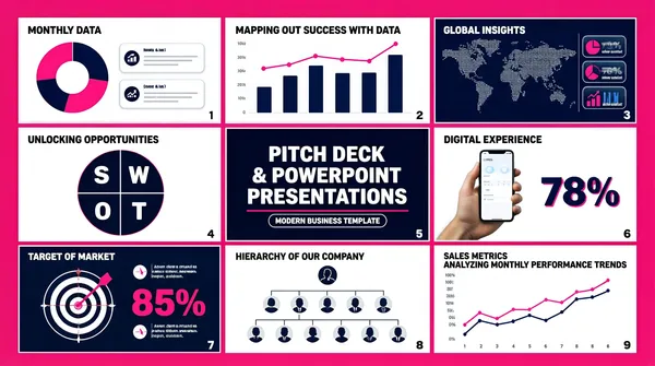
A vivid magenta-pink field carries an exact three-by-three grid of equal landscape slide cells, separated by thin white gutters and framed by a slightly wider white margin at the outer edge of the canvas. Cell order, reading left to right and top to bottom: cell one, a white slide with a monthly-data heading beside a large pink-and-navy donut chart and three small rounded stat cards; cell two, a white slide headed Mapping Out Success With Data with a combined bar-and-line chart across the lower half; cell three, a dark navy slide with a dotted world map and three stacked stat rows in a side panel. Cell four, a white slide headed Unlocking Opportunities with SWOT showing a four-segment circular diagram lettered S, W, O and T; cell five, the dark navy feature slide - a centred deck-title slide with a three-line white headline and a small outlined subtitle chip; cell six, a white slide with a photographic hand holding a phone showing a light app interface and a large percentage stat to its right. Cell seven, a dark navy slide headed Target of Market with a target-and-arrows diagram and three stat callouts; cell eight, a white slide headed Hierarchy of Our Company with a top-down org chart of circular avatar nodes on four levels; cell nine, a white slide headed Sales Metrics Analyzing Monthly Performance Trends with a pink and navy line chart. Each slide carries a tiny page numeral in its lower-right corner.
[Subject]
None as a standing cut-out. The only photographic human element is a hand holding a phone inside cell six, seen from the wrist down against the slide background.
[Headline]
There is no cover-level headline; the type lives inside the cells. The largest text is the three-line title in the navy centre cell - 'PITCH DECK' / '& POWERPOINT' / 'PRESENTATIONS' - set in heavy white sans, mixed caps and title case, with a thin pink rule beneath it. The loudest numerals across the sheet are the big percentage figures in cells six and seven, set in heavy navy or pink. All other headings are small white or navy sans lines, mixed case, with a heading at the top of every cell and rows of tiny grey placeholder body text beneath.
[Badges]
None.
[Mood]
Hot magenta ground with a checkerboard of white and deep navy slide panels and a pink-and-navy chart palette inside; energetic, portfolio-like, clearly showing many slides at once. At thumbnail size the grid reads as alternating white and navy rectangles on magenta.](https://files.posterlet.com/assets/generated/md/y3nrvoibynlt.webp)
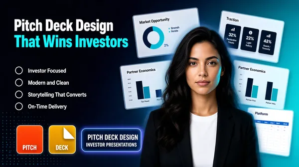
![[Format]
Landscape 16:9 gig cover, dark corporate presentation cover with a photographic portrait cut-out over floating slide mockups. High-end gradient lighting, clean retouch, subtle depth. No watermark, no personal names.
[Layout]
The background is a smooth diagonal gradient running from near-black navy at the left edge to a lighter teal-blue at the right, with a faint dotted grid pattern visible in the lower-left corner. Behind the portrait, five or six pale slide mockups float at slight independent tilts, semi-transparent and soft-edged, scattered on a loose diagonal that runs from the top-centre down to the bottom-right; the most legible are a market-opportunity slide with a ring chart, a traction slide with three dark stat boxes, a partner-economics slide with paired bar charts, and a platform slide with a light table at the bottom-right. The left third of the frame is kept clean for the text column. A large rounded-corner panel holding the portrait sits over the right-of-centre of the mockup cluster, its edges fading into the gradient so it reads as a soft cut-out rather than a hard-edged card.
[Subject]
A woman in her late twenties with long dark wavy hair, wearing a black blazer over a plain white top, framed from the chest up and cropping at the bottom edge. She faces camera squarely with a calm neutral expression, shoulders square, hands out of frame. She is centred slightly right of the frame midpoint and fills roughly the lower two-thirds. Cool rim light from the right, neutral key on the face, her hair and shoulder dissolving softly into the background gradient at the edges.
[Headline]
Left column, upper half: a three-line stacked headline. The first two lines read Pitch Deck Design in a very heavy geometric sans, title case, pure white. The third and fourth lines read That Wins Investors in the same heavy geometric sans but in bright cyan, slightly larger. Beneath the headline sits a vertical list of four items, evenly spaced: a thin white circular outline icon on the left of each and a white sans label to the right, reading Investor Focused, Modern and Clean, Storytelling That Converts, and On-Time Delivery.
[Badges]
Along the bottom edge, left of centre: two small rounded-square app tiles side by side, the left one flat orange-red and the right one amber-yellow with a white folded-corner glyph, each with a small white caption centred beneath it. To their right a rounded rectangle panel with a light blue keyline holds two short white text lines, a name over a role, sitting on a cool blue-violet gradient glow. No ratings, no seals, no third-party marks.
[Mood]
Deep navy, teal-blue and bright cyan with white type and a black-and-white wardrobe; confident, modern, consultancy-grade. At thumbnail size the cyan half of the headline and the lit face carry the eye, while the pale slides read as soft texture behind.](https://files.posterlet.com/assets/generated/md/g6gknpw35lvb.webp)
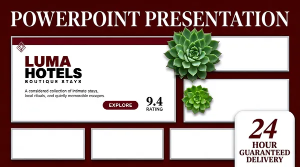
![[Format]
Landscape 16:9 gig cover, flat template-showcase collage of slide mockups on a solid colour field, crisp vector-grade mockups with soft drop shadows. Studio flat-lay finish, no grain. No watermark, no personal names.
[Layout]
A deep berry-maroon field fills the whole frame. A single line of large display type runs across the top fifth, edge to edge. Beneath it a dense collage of six slide mockups occupies the middle and lower two-thirds: one large landscape mockup at the top-left showing a title slide, one narrow mockup at the top-right, a second mid-right mockup set slightly lower, and three small landscape mockups in an even row along the bottom. Every mockup is a white slide with a thin grey hairline border, laid parallel with no tilt, separated by even maroon gutters so the layout reads as a deliberate grid rather than a scatter. A white rounded-top tab shape rises from the bottom-right corner and overlaps the collage. Two photographic succulent plants sit on top of the mockups as flat cut-outs, one large at the upper-right of centre and one smaller at the left of the mid-right mockup, each casting a tight soft shadow.
[Subject]
None - no human figure anywhere on the cover. The only organic elements are the two green succulent plants described in the layout, treated as decorative cut-outs.
[Headline]
Top line: POWERPOINT PRESENTATION set in a high-contrast display serif, all caps, white, generously letterspaced, spanning nearly the full frame width and reading as the single largest element. Inside the large top-left mockup: a two-word all-caps placeholder hotel wordmark in heavy condensed caps, first word deep maroon and second word near-black, with a much smaller letterspaced caps subtitle line under it; a short grey body paragraph follows; a small solid maroon rounded pill button sits at the lower right of that copy block with tiny white caps text, and a large numeral with a small rating label sits to its right. Inside the bottom-right tab: a big slanted maroon serif numeral pair (a number and a unit) with two lines of bold maroon serif caps beneath it.
[Badges]
The white rounded-top tab in the bottom-right corner, roughly one fifth of the frame width, carries the numeral and guaranteed-delivery caps copy described above. A tiny outlined diamond glyph heads the maroon strip inside the top-left mockup. No third-party brand marks, no rating stars or seals beyond the small rating figure inside the mockup.
[Mood]
Rich oxblood maroon and off-white with saturated green accents from the plants; premium, editorial, boutique-studio calm. At thumbnail size the wide white headline and the two bright plant shapes read first, then the checkerboard of white slide cards floats up out of the maroon.](https://files.posterlet.com/assets/generated/md/t04zstqddwin.webp)
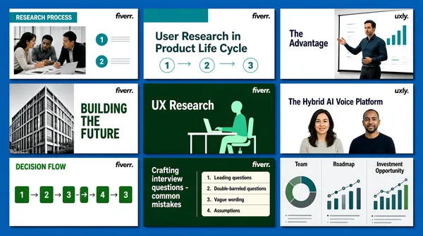
![[Format]
Landscape 16:9 gig cover, tidy three-by-three grid of slide thumbnails on a saturated blue field. Clean portfolio finish with crisp thin shadows. No watermark, no personal names.
[Layout]
A flat strong azure-blue background shows only as a uniform border and as narrow gutters. Nine landscape slide thumbnails sit in a strict three-column by three-row grid, every cell the same size, separated by an even blue gutter of roughly three percent of the frame width and inset from the cover edges by the same margin, so the blue reads as a mounting mat. Each thumbnail is a flat rectangle with square corners and a faint shadow. Row one is three light slides with teal headers and diagrams; row two is a light architectural slide, a dark green illustration slide and a light product slide; row three is a white calculation slide, a dark green list slide and a light grey chart slide. No cell is cropped by the frame.
[Subject]
No cut-out person. Human and object imagery lives inside the thumbnails: a group of people in an office, a presenter beside a chart, two colleagues in conversation, a person at a desk with a laptop, black-and-white building photography in one tile and a flat vector figure at a desk in another.
[Headline]
No cover-level headline; all type is inside the thumbnails, unreadably small and cropped nowhere. Cell by cell: (1) a white slide with a teal header bar, a two-line uppercase heading over a photograph and three numbered teal circles down the right; (2) a white slide headed 'User Research in Product Life Cycle' in dark teal above a row of teal outlined pills under five small circular steps and three mint highlight pills below; (3) a white slide with a small teal placeholder wordmark, the heading 'The Advantage', three numbered teal steps across the top and a photograph of a man presenting on the right; (4) a light slide with a large teal outlined two-line uppercase heading beside a black-and-white building photograph filling its left half; (5) a dark green tile with the small white 'fiverr.' wordmark top left and 'UX Research' in a white serif over a green illustration of a person at a desk; (6) a light tile with a small teal wordmark and the headline 'The Hybrid AI Voice Platform' in dark navy above two cut-out portraits; (7) a white slide with a green uppercase heading above a flow of green and grey arrows spanning the tile width; (8) a dark green tile with 'Crafting interview questions - common mistakes' in white on the left third and a numbered cream list on the right two thirds; (9) a light grey tile with three small panel headings, 'Team', 'Roadmap' and 'Investment Opportunity', above a donut chart and a timeline of connected dots.
[Badges]
Six of the nine tiles carry the Fiverr 'fiverr.' wordmark in a corner - dark on the white slides, white on the two dark-green tiles - while the right-hand column tiles instead carry a one-off teal product wordmark, kept neutralised as a short lowercase placeholder. The remaining marks are flat teal circles, teal rounded squares and one mint ring.
[Mood]
Saturated azure with a mounted grid of mostly white and dark-green slides. Orderly, portfolio-grade and information-dense; at thumbnail size the nine even cells read as a neat contact sheet.](https://files.posterlet.com/assets/generated/md/nd8xtcvruq66.webp)
![[Format]
Landscape 16:9 gig cover, centred headline over a blurred slide-wall backdrop behind a frosted overlay, with badge overlays. Corporate-geometric finish. No watermark, no personal names.
[Layout]
The whole background is a heavily blurred mosaic of dark navy presentation slides in a three-by-three arrangement, softened until it reads as blue-grey texture with faint chart and diagram ghosts, and a bright haze washes the top-right corner. Everything sits on a lighter, slightly milky overlay field that gives the cover a dusty-blue cast. The centre-left 60% holds a stacked headline block: a small gold line, a wide navy ribbon plate carrying the main line, a letter-spaced line below it, the app-tile row, and finally an orange call-to-action bar. The right 40% holds two stacked pieces: a large dark navy circular badge in the top-right quadrant and, below it, a right-aligned list of five short lines each ending in a small yellow arrow marker.
[Subject]
None — typographic and UI-mockup only. The only figures are faint blurred silhouettes inside the background slides and one small cut-out of a person at a desk inside a single background thumbnail, all unreadable.
[Headline]
Stacked and mostly flush left inside the left field. Line 1 in a light gold sans with a thin stroke: 'Professional | Pitch Deck'. Line 2 sits on a solid navy angular ribbon plate that is wider than the type: 'PRESENTATION' in heavy white uppercase, the largest text on the cover, with a soft shadow under the plate. Line 3 below the plate in widely letter-spaced white uppercase: 'D E S I G N'. Then the row of four rounded-square app tiles. Beneath them an orange-red rectangle bar with a thin white inner border carries the white bold uppercase copy 'CONTACT ME NOW'. Right column, white medium-weight title-case lines stacked with even leading, each followed by a small solid yellow cursor arrow: 'Investors', 'Entrepreneurs', 'Agencies', 'Startups', 'Business'.
[Badges]
Top right: a large dark navy circle containing one row of five orange-yellow five-pointed stars across its upper half and the white tight-tracked uppercase line 'Buyer's Choice' beneath them. Overlapping the right end of the orange bar: a gold outline circle with a check mark inside, then a small gold rosette medal with ribbon tails. The app-tile row holds a teal-to-blue gradient tile with a white letterform, a red-orange tile with a white letterform, a yellow tile with a white folded-page silhouette, and a near-black tile with a white letterform pair. Stars, seal and tiles are pure geometry and colour with no recognisable identity. No marketplace wordmarks.
[Mood]
Dusty blue-grey haze over a blurred navy slide wall, punctuated by a solid navy ribbon, gold accents and one orange bar. Professional but slightly glossy; at thumbnail size the white main word on its navy plate and the star badge on the right are the two anchors.](https://files.posterlet.com/assets/generated/md/qrhnhr36e51q.webp)
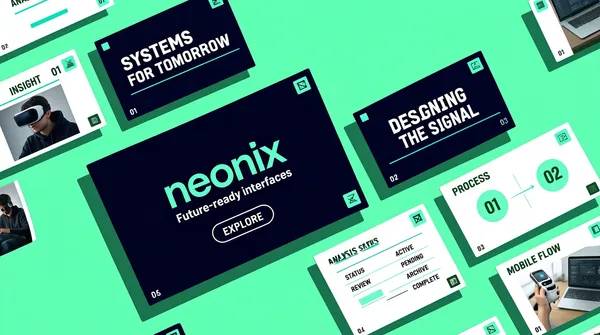
![[Format]
Landscape 16:9 gig cover, flat mint-green field with isometric slide mockups scattered across it. Crisp UI-mockup finish, hard drop shadows. No watermark, no personal names.
[Layout]
A uniform bright mint-green plane fills the frame edge to edge with no gradient. Across it about ten landscape slide mockups float in a loose diagonal lattice, all rotated roughly thirty degrees in the same isometric direction and each scaled slightly differently, so the arrangement reads as a tilted wall seen from the side. Slides cluster near the corners and the centre and leave two sparse pockets at the upper right and lower left. Five are cropped by the frame: top left, top right, left, bottom left and bottom right. The largest tile sits just left of centre and is the only one shown almost complete, a dark navy field carrying a single wordmark and a small tagline. Depth comes from long soft shadows cast down-left under every tile and from the uniform rotation, not from perspective convergence.
[Subject]
No person as a cut-out; human imagery appears only inside individual mockups and never leaves its tile: a person wearing a VR headset, a figure in a dark hoodie at a desk, a small white-and-black robot, a laptop on a desk and a hand holding a device.
[Headline]
No cover-level headline; all type lives inside the mockups. The centre hero tile carries a neon-mint lowercase placeholder wordmark of about seven characters with a thin white tagline beneath it and a tiny outlined pill button below that. Other tiles carry small dark-green uppercase headings on white pages, an analysis data sheet with a status table, a phone mock-up sheet and a two-panel infographic with numbered circles, while two dark tiles carry larger white headlines in a heavy sans with a thin teal rule beneath. Slide numbers and thin teal accent bars sit in the corners of several tiles. Every line is unreadably small at cover scale.
[Badges]
Each mockup has a tiny mint or white square mark in one corner, a small flat geometric tile with a simple abstract glyph inside.
[Mood]
A single flat mint-green field with navy-black cards and neon-mint accents. Fresh, techy and highly graphic; at thumbnail size the diagonal lattice of tilted cards reads as motion across a solid colour block.](https://files.posterlet.com/assets/generated/md/8gme8j344ssp.webp)
![[Format]
Landscape 16:9 gig cover, deep green field with a glowing centred headline and a fanned row of slide mockups along the bottom. Polished portfolio finish. No watermark, no personal names.
[Layout]
A flat deep forest green field with slightly darkened corners and a brighter centre behind the headline. A soft vertical light column runs down from the top edge through the middle of the headline. A pale-green rounded-square badge hangs from the very top edge, centred horizontally and cropped so only its lower two thirds show. The centred headline block sits in the upper middle, above a single horizontal row of four rounded-square app tiles at about 60% height. The bottom 40% is filled by four landscape slide thumbnails in a gentle fan: they overlap left to right, each rotated a few degrees, the two outermost bleeding off the left and right edges and all four cropped flat by the bottom edge. Each thumbnail has a thin light-green hairline border around a dark navy or deep green interior.
[Subject]
No person. The only human imagery sits inside the bottom thumbnails as small photographs: a dark group scene, hands holding phone mockups, and a coffee-bean close-up, each cropped hard by the tile edges and darkened toward the tile borders.
[Headline]
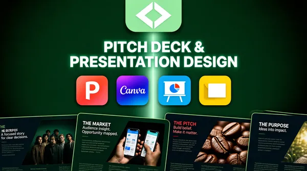
Centred, two lines, in a bright mint-white uppercase grotesque with generous letter spacing and a soft outer glow that bleeds the letters into the green: 'PITCH DECK &' then 'PRESENTATION DESIGN' slightly wider. Both lines are weighty but not condensed, set at roughly one fifth of the frame height, centred on the vertical axis with even leading. Inside the bottom slides, small white and crimson headings appear in light and heavy weights — 'THE PURPOSE', 'THE MARKET', 'THE PITCH' — each with two or three lines of tiny pale body text beneath, and on the leftmost and rightmost tiles the copy is cut off by the frame.
[Badges]
Top centre, the pale-green rounded-square tile holds a simple white angular glyph, a diamond outline with two stacked chevrons inside it. Below the headline, a row of four rounded-square app tiles: the Microsoft PowerPoint tile in a coral-to-red gradient with the white 'P'; the Canva tile in a violet-to-blue gradient with the white Canva script; a bright sky-blue tile carrying a white easel-style presentation board and a small pie chart; and the Google Slides tile, a warm yellow folded page with a white rectangle inset.
[Mood]
Deep forest green with luminous mint-white type and small saturated app-tile accents. Premium and slightly cinematic; at thumbnail size the glowing centred headline and the fan of dark slides below read as one shape.](https://files.posterlet.com/assets/generated/md/b2i5y728p00m.webp)
![[Format]
Landscape 16:9 gig cover, dark-teal studio mockup with a checklist column. Polished 3D product-render finish, soft studio shadows. No watermark, no personal names.
[Layout]
A very dark blue-green wall fills the frame and meets a pale lavender-grey floor plane along a soft horizontal seam about one fifth up from the bottom. The left 45% is a flush-left text column starting about one fifth down: a two-line headline, a thin horizontal underline rule, then a stack of four evenly spaced checklist rows. The right 55% holds a large open laptop in three-quarter view, its base on the lavender plane and its screen tilted back, occupying the upper right and turned about twenty degrees toward the viewer; the device is larger than life-size with its right edge running off frame. Behind it sit two flat geometric discs, a large teal circle cropped by the wall left of the device and a smaller lavender sphere behind its top-right corner. A long soft shadow falls to the lower left across the floor.
[Subject]
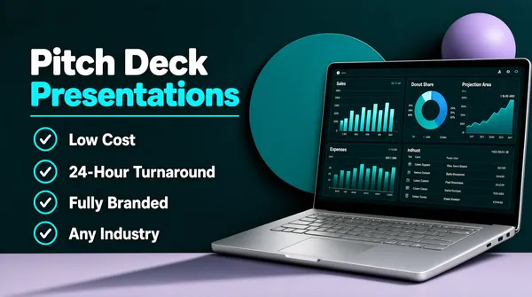
No person. The subject is the device: a silver-bodied clamshell laptop with a near-black bezel, a visible hinge and a keyboard sheared in perspective. Its screen carries a dense dark-teal analytics dashboard in a three-panel layout, a white sales bar chart at the top left, a donut share chart and a projection area chart on the right, and a small expenses chart and a scaffolded list panel along the bottom.
[Headline]
Left column, stacked. Line 1 'Pitch Deck' in a heavy white rounded grotesque, sentence case, the largest type in the frame. Line 2 'Presentations' at the same size but in bright cyan, with a thin cyan horizontal rule directly beneath it running the width of the type block. Then four checklist rows, each a cyan ring with a white check inside at the left and one line of white medium-weight sentence-case copy to the right, evenly spaced: 'Low Cost', '24-Hour Turnaround', 'Fully Branded', 'Any Industry'. All flush left with generous leading. Inside the laptop screen, small white dashboard headings in a light sans sit above tiny grey axis labels, all unreadably small.
[Badges]
None — no marks, no ratings, no seals anywhere on the cover.
[Mood]
Deep petrol-teal and charcoal with a lavender floor and cyan accents. Calm, data-driven and corporate; at thumbnail size the white-and-cyan title block and the glowing dashboard screen carry the entire read.](https://files.posterlet.com/assets/generated/md/ju4abeygv3ms.webp)
![[Format]
Landscape 16:9 gig cover, pure typographic hero over a soft gradient with one floating 3D object. High-gloss poster finish. No watermark, no personal names.
[Layout]
A full-bleed gradient field with no panels or frames: deep navy across the top-right quarter melting into violet at the centre, a hot coral-to-crimson glow in the bottom-left corner and a cooler blue wash along the left edge, so the light reads as coming from behind and below left. A single enormous two-line headline occupies the left 70% of the frame, starting just inside the left edge about one fifth down from the top; both lines are flush left and run past the vertical centre, the second very slightly wider than the first. Below the headline, tucked under the left end of the first line, sits one translucent rounded pill. In the bottom-right quadrant a white 3D object rises out of the corner, overlapping the gradient only, with a bright four-point sparkle at its highest point.
[Subject]
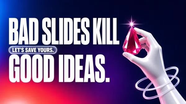
No person. The subject is an abstract glossy white 3D mannequin hand, featureless, smooth and slightly stylised, cropped at the wrist by the bottom-right corner, its index and middle fingers pinching a large faceted pear-shaped gem of saturated crimson-pink that throws the sparkle. Two thin translucent white rings loop loosely around the forearm below the hand and cross each other. Wet-looking highlights and soft subsurface pink shadows.
[Headline]
Two lines of enormous ultra-condensed white uppercase sans, tightly leaded and left-aligned: 'BAD SLIDES KILL' and 'GOOD IDEAS.' with a full stop. Together the two lines take about half the frame height; the stems are heavy but the widths narrow, so each line reads as a solid slab of white. Beneath the left end of the first line, a frosted translucent rounded rectangle with a faint light border holds one line of white bold uppercase at roughly one eighth of the headline size: 'LET'S SAVE YOURS.' No other text anywhere.
[Badges]
None.
[Mood]
Dusk navy, violet and a coral-to-crimson floor glow, cut by hard white type and a single hot pink gem. Confident and slightly dramatic; at thumbnail size only the two heavy white lines and the pink sparkle register.](https://files.posterlet.com/assets/generated/md/wyw9kxwtd8h7.webp)