




















About this collection
Every Fiverr gig lives or dies by a single image. Each cover here respects the real constraints of a gig image - one banner-shaped canvas, high-contrast text, and no clutter that would collapse at small sizes.
These are starting points, not finished listings. Every cover here is built around one idea: a single service promise, set in type large enough to survive being shrunk into Fiverr's search grid. The collection spans roughly thirty service areas — software and app development, design and branding, writing and translation, marketing, audio, data, and business consulting — so you can usually find a layout close to what you sell and adapt it.
Nothing here is a layered design file. Each one is a flat generated image, which is exactly what makes it quick: pick a layout, swap the headline, palette, and icons for your own service, and you have a listing image in a few minutes rather than an afternoon.
What a gig cover actually has to do
A buyer scanning search results sees your cover as a thumbnail no wider than a postage stamp, sitting next to a dozen competitors. That single constraint decides almost everything else:
- One promise, not a service list. "I will fix your WordPress site in 24 hours" reads at thumbnail size. "WordPress | SEO | Speed | Security | Maintenance" turns to mush.
- High contrast between text and background. Thin light type on a pale panel is the first thing to disappear when the image shrinks.
- Three to six words in the headline. Long headlines force small type, and small type is what becomes unreadable first.
- The service visible before reading a word. A layout cue — a device frame, a waveform, a chart, a colour swatch — tells the buyer the category instantly.
Resizing and export
Fiverr publishes its own requirements in the uploader, and they change - check them there rather than trusting a number quoted in a blog post. What does not change is the direction of the resize: always scale down from the download. Never upscale a smaller image to reach the uploader's width, because the text edges go soft, and soft type is exactly what a thumbnail cannot afford.
When you trim to match the uploader's proportions, do it symmetrically and keep the headline centred, so the crop does not eat one side of the promise.
Three things worth doing before you upload
- Judge the thumbnail, not the full-size file. Shrink the preview down to search-result size, or just squint. If the promise still reads, the cover works. 2. Keep a colour system across your gigs. Buyers skim a grid of near-identical covers; a consistent accent colour makes your listings recognisable among strangers. 3. Leave the outer margin clear. Gig images get cropped slightly differently across placements, so keep text away from the outer edge of the canvas.
Common questions
Will the downloaded cover meet Fiverr's upload requirements?
Check the uploader: Fiverr shows its current accepted format, file limit and recommended image spec there, and those are the platform's requirements, not ours. What matters on this side is direction — start from the downloaded cover and scale down to fit, never up from a smaller file.
Will the text still be readable in the search grid?
Shrink it to search-result size before uploading. That is close to what buyers actually see when comparing gigs, and it is where most covers fail — usually because the headline was set too small or the contrast was too low to begin with.
How many images should one gig have?
Fiverr's gallery takes up to three images and two videos. Lead with the strongest cover, then spend the remaining slots on a work sample, a before-and-after, or a deliverable preview rather than more headline art.
Can I use the same cover on several gigs?
No. Buyers often see two or three of your gigs together, and identical covers make them look like one listing repeated. Change the headline, the accent colour, and the main visual so each gig reads as its own service.
Can I change the text or colours after generating?
Not in place. The wording is baked into the image, so there is no text layer to retype. Download it and edit it in your own tool, or use the "Use as Template" option to regenerate it with different copy.
Why do the covers in this collection look so different from each other?
Because the range is deliberately broad. Each cover was written around the specific service it advertises, so a logo animation cover and a translation cover share a job — selling one service at thumbnail size — but not a visual style. That variety is what lets you give every gig a distinct look.
![[Format]
Landscape 16:9 gig cover, neon promo composite with a radial burst background and glowing outlined display type. Arcade-bright, high-saturation, no watermark, no personal names.
[Layout]
A magenta-to-purple radial burst fills the background, its rays fanning out from behind the person on the right and its centre brightening into a hot pink glow near the upper-right. A large concentric circular emblem — three thick nested rings in blue, white and green around a solid green core with a white notch — sits right of centre behind the person's shoulder, partially hidden by his body, acting as a target motif. The person is a cut-out on the right, cropped by the right and bottom edges and rising to the top edge. The left two-thirds carry three oversized display lines stacked flush left and tilted a few degrees, with a glowing pill button below them at the bottom-left. A bright white electrical arc and a few sparks streak across the bottom-right corner just above the button.
[Subject]
A man in his early thirties with short light-brown hair, a full trimmed beard, thin rectangular glasses and a fair complexion, wearing a plain heather-grey t-shirt. Framed from the waist up, arms folded across his chest, body angled slightly toward the viewer with a calm, slightly serious look straight at camera. A violet-magenta rim light traces his hair and shoulders from behind, separating him from the burst background; his face stays neutral in tone.
[Headline]
Three stacked lines in an ultra-heavy italic sans caps, each with a thick dark outline and a soft violet neon glow, tilted a few degrees counter-clockwise and filling the left column: “BEST SEO” in a pink-to-cyan vertical gradient, “SITE AUDITS” in white-to-silver, and a third line naming a marketplace platform in white with a magenta glow — substitute a neutral placeholder phrase of similar length so the line breaks still work. Beneath the stack, a white rounded pill with a blue inner shadow carries “ORDER NOW” in bold dark caps, with a small white cursor arrow glyph overlapping its right end.
[Badges]
The concentric ring-and-green-core emblem acts as the single graphic badge, drawn as a generic target or eye motif with no lettering. No rating stars and no software logos.
[Mood]
Hot magenta and violet with cyan, silver and neon-green accents and a glowing white arc. Loud and retro-arcade; at thumbnail size the neon gradient type and the big circular emblem fight for attention.](https://files.posterlet.com/assets/generated/md/0md6uiwqyx0v.webp)
![[Format]
Landscape 16:9 gig cover, flat white template with green geometric corner shapes and a circular photo portal. Presentation-slide clean, no watermark, no personal names.
[Layout]
The background is white with a slight warm grey wash, overlaid by large flat lime-green geometric wedges entering from the top-right and bottom-right corners at 45 degrees, plus a pale green wash along the far right edge. A few short thin green rules and a small green square sit in the top-left corner as decoration. On the right, a large solid green circle holds a photograph; it sits right of centre, its diameter about three-quarters of the frame height, overlapping the wedges so it reads as a portal cut into them. The left half carries a flush-left stack: a small hexagonal monogram mark beside a heavy display word at the top, a second oversized display line beneath, four white rounded pill rows with even gaps (each a small green magnifier glyph at its left plus a line of dark type), and a very small centred footer note under a thin rule at the bottom edge.
[Subject]
Inside the green circle, a photograph shows a bald man in his forties with black rectangular glasses and a light beard, wearing a pale grey suit jacket over a lilac shirt and tie, framed from the chest up and facing camera with a level expression. Behind him inside the circle is a wide open landscape of grey field and distant blue mountains under a bright sky, so the circle contains a full rectangular scene rather than a cut-out.
[Headline]
Top left, a small dark hexagonal monogram mark followed by “EXPERT” in a heavy black sans caps at moderate size. Directly beneath, the hero line “SEO AUDIT” is set in an ultra-heavy extended sans, all caps, with “SEO” in near-black and “AUDIT” in flat lime green so the two words read as one wide block filling the left column. The four pill rows each carry one line of dark title-case sans describing a competitor analysis, a technical audit, a free content plan and a free do-it-yourself blueprint. A tiny centred grey line sits at the bottom edge under a thin rule.
[Badges]
Four small green magnifier glyphs act as list bullets inside the pill rows, and the small hexagonal monogram stands in as a generic logo. No rating stars and no software logos.
[Mood]
Crisp white with two strong lime-green wedges, a green portrait circle and black-and-green display type. Fresh and orderly; at thumbnail size the big SEO AUDIT line and the green circle are the two landmarks.](https://files.posterlet.com/assets/generated/md/fkl390gaxbxr.webp)
![[Format]
Landscape 16:9 gig cover, three-dimensional vector render on a pale cyan-and-white gradient with soft glassy highlights. Clean product-render look, no photographic elements, no watermark, no personal names.
[Layout]
The right half is dominated by a single hero object group rendered in glossy three dimensions at a slight isometric angle: a dark blue browser window with a title bar and a row of pale blue bar charts inside, a large chrome-rimmed magnifier leaning across the front of the window so its lens magnifies part of the chart, a thick green-and-white arrow sweeping up and to the right behind and above the window, and a solid green circle with a fat white tick parked at the lower right of the group. The left half carries a flush-left text stack: three heavy display lines stacked tight at the top, then a narrow gold-on-navy ribbon banner, then a grey plate with a white caps line, and at the very bottom a full-width band of flat lime-yellow containing one centred navy caps line. The pale blue background has faint diagonal light sweeps and a soft vignette.
[Subject]
None — no people. The hero subject is the 3D object group: the browser window, the magnifier, the rising arrow and the green tick disc, all with consistent glossy plastic-and-chrome shading and a shared light source from the upper left.
[Headline]
Stacked flush left in an ultra-heavy condensed sans, all caps: “FULL SEO” in deep navy, then “AUDIT + FIX” in bright red-orange set the same size, then “RANKING BOOST” in deep navy set slightly smaller. Below the stack, a ribbon banner with notched ends carries a two-part numeral-and-words banner in gold on dark navy reading an experience figure. Under it, a flat grey plate holds “MANUAL OPTIMIZATION • NO BOTS” in white bold caps. The lime-yellow band across the bottom carries “ON-PAGE, TECHNICAL, OFF-PAGE, & LOCAL SEO” in heavy navy caps, centred.
[Badges]
One solid green disc with a bold white tick at the lower right of the object group acts as the only badge-like mark. No rating seals and no software logos.
[Mood]
Pale cyan and white with navy and red-orange type, plus one lime band and a glossy green tick. Bright and trustworthy; at thumbnail size the red AUDIT + FIX line and the green tick disc are the two focal points.](https://files.posterlet.com/assets/generated/md/th14psap0ow0.webp)
![[Format]
Landscape 16:9 gig cover, straightforward photo composite on a flat deep-red field with a small icon row. Simple, warm, low-decoration, no watermark, no personal names.
[Layout]
A flat deep crimson fills the entire background with no gradient or texture. The person is a cut-out on the left, cropped by the left and bottom edges, occupying about the left third and rising to the upper third. The right two-thirds carry a centred text block: two bold display lines at the top with a small square icon hanging off the right end of the second line, two lighter script-ish lines beneath, two thin widely spaced lines, and finally a horizontal row of three colourful icons along the bottom of the column, each on an implied baseline with a small decorative circuit pattern behind the centre icon.
[Subject]
A woman in her early thirties wearing a vivid violet hijab that drapes over her shoulders and is pinned at one side with a small jewelled brooch, paired with a white blouse printed with a delicate blue floral pattern. Framed from mid-chest up, body turned three-quarters toward the viewer, head slightly tilted, soft closed-mouth smile at the camera. Flat even lighting with minimal shadow; the purple headscarf is the most saturated object in the frame.
[Headline]
Upper right, two flush-right heavy sans caps lines in pure white, reading “SEO AUDIT” and “REPORT”, the second slightly wider, with a small black shopping-basket icon containing three white letters tucked to the right of the second line. Beneath them a centred two-line phrase in a rounded warm amber-gold display face, title case, spanning most of the column width and reading “Improve your ranking in Google”. Under that, two flush-left lines in a thin white face with wide letter spacing, each two words long, describing fast delivery and quick work. The icon row along the bottom has no lettering.
[Badges]
Three colourful flat icons sit in a row along the bottom of the column: a document-with-pencil glyph on a blue base, an orange price-tag shape with three dark letters inside, and a four-bar chart with a green upward arrow, plus the black basket icon at the top right. No rating seals.
[Mood]
One flat oxblood red with a violet hijab and a scatter of small bright icons. Warm and personal; at thumbnail size the red field and the white SEO AUDIT REPORT lines do the work.](https://files.posterlet.com/assets/generated/md/kxbm153hg44y.webp)
![[Format]
Landscape 16:9 gig cover, flat graphic composite built from large colour blocks with a photographic cut-out. Flat-design, poster-bright, no watermark, no personal names.
[Layout]
The background is a bright flat blue field filling almost the whole frame, with a small yellow rounded corner tab at the top-left and a larger yellow rounded shape at the bottom-right, both tucked partly off-canvas. Behind the person on the right sit two offset panels: a tall cyan rounded rectangle and, overlapping it to the right, a coral-red rounded rectangle that slides under the person's shoulder, so the portrait appears to be mounted on two stacked colour cards. The person is cut out and cropped by the right and bottom edges, sized so his head occupies the upper-right third. The left two-thirds carry a flush-left stack: two outlined white line-art icons side by side at the top, then three heavy display lines, then a single black rounded button at the bottom.
[Subject]
A man in his early thirties with short light-brown hair brushed forward, a full trimmed brown beard, and a fair complexion, wearing a plain dark charcoal crew-neck sweater. Framed from mid-chest up, shoulders square to the camera, head tilted very slightly, with a gentle closed-mouth smile. Even, soft, almost shadowless front light, typical of a clean studio headshot; the cut-out sits flat against the colour blocks with no background behind it.
[Headline]
Top left: two white outline line-art glyphs sit side by side — a magnifier with three letters set inside its lens, and a document with three letters set inside its cover plus a small circular tick seal at the corner; both drawn as thin single-weight strokes. Below them, three flush-left display lines in an ultra-heavy geometric sans caps: “TECHNICAL” in white, then “SEO” in flat yellow, then “AUDIT” in flat yellow set larger than the line above. At the bottom left, a solid black rounded button holds “ORDER NOW” in bold white caps with a small circular yellow arrow chip on its left end.
[Badges]
No rating seals or platform marks. The only marks are the two line-art glyphs at the top, which act as feature icons rather than brands, and the small yellow arrow chip in the button.
[Mood]
One big flat blue field cut by cyan, coral and yellow shapes, with white and yellow display type. Clean and modern; at thumbnail size the three-line type stack and the black ORDER NOW button are unmistakable.](https://files.posterlet.com/assets/generated/md/bndzbmt24148.webp)
![[Format]
Landscape 16:9 gig cover, dark UI-style composite with a circular photo portal and outlined chip rows. Techy, high-contrast, no watermark, no personal names.
[Layout]
The canvas is a deep navy-black field with faint dot grids in the top-right and bottom-right corners and a large white dotted ring arcing behind the right side. Inside that ring a perfect circle holds a photograph, positioned right of centre so it occupies about the upper-right third. The left half carries a flush-left type stack in the upper-middle: three display lines, then a row of three outlined chips side by side, then a single wide outlined panel spanning the bottom-left, divided internally by one vertical rule into two halves. White space is generous and nothing overlaps the circle.
[Subject]
A man in his late thirties with short dark hair, a trimmed dark beard and a light olive complexion, in a bright royal-blue blazer over an open white shirt. Shown waist-up inside the circular portal, arms crossed loosely, body angled slightly right, smiling warmly. Behind him inside the circle the background is a softly blurred bright office with monitors and a colleague out of focus, so the circle reads as a window rather than a cut-out.
[Headline]
Top left, three stacked flush-left lines in a very heavy condensed sans: “TECHNICAL” in white caps, then “SEO AUDIT” in bright lime green caps set larger, then “+ FIX” in white caps with the plus sign in lime. Beneath them, three outlined rounded chips sit in a row, each with a small square icon at its left and a short white caps label — the Google Search Console “GSC” chip with a colourful bar-chart mark, the SEMRUSH chip with an orange flame over the orange SEMRUSH wordmark, and a blue ring glyph labelled “CORE WEB VITALS”. The bottom outlined panel is split by a vertical rule: the left half holds a green star chip, five gold stars and a white caps review count; the right half a shield outline icon and a two-line white caps experience figure.
[Badges]
Five gold stars plus a green star chip form the review seal in the bottom panel; a shield outline serves as the credibility mark; the three outlined chips name Google Search Console, Semrush and Core Web Vitals.
[Mood]
Near-black navy with lime green and white type, one gold star row and a single blue blazer as the colour event. Confident and technical; at thumbnail size the lime SEO AUDIT and the blue portrait circle dominate.](https://files.posterlet.com/assets/generated/md/a1lfdzcoecee.webp)
![[Format]
Landscape 16:9 gig cover, layered promo composite on a green gradient with brush-stroke panels and badge shapes. Busy but organised, no watermark, no personal names.
[Layout]
The frame is a stack of overlapping plates rather than a grid. Top-left, a large angular green shape carries a first headline; immediately below, a black banner holds a second headline offset right, so the two shapes step down the frame. The middle-left is a big white brush-stroke panel with ragged edges, holding a large bordered square tool mark plus two lines of dark type. Below it sit a gold brush-stroke banner with black type and a short green plate with an icon. A circular green badge with a heavy white dashed rim floats over the middle-right between the panel and the person. A white circle with green text and a black pill beneath it occupy the top-right corner, four white tiles run along the bottom-left quarter, and a green plate with two white lines and a curved arrow closes the bottom right.
[Subject]
A woman in her early thirties with long straight dark-brown hair, wearing a fitted black blazer over a plain white top. Framed from the hip up, arms folded across her chest, body angled slightly toward the viewer with a confident open smile. Even studio light with a soft green cast, crisp clean cut-out.
[Headline]
The top green shape carries “FIX TECHNICAL SEO ISSUES” in heavy white caps with the middle word black on a lighter block. The black banner below carries “& IMPROVE INDEXING” in heavy white caps, the last word underlined in green. Inside the white brush-stroke panel, a green frog square mark sits beside “Screamingfrog SEO Spider Tool” in dark green-and-black sans, with the line “Audit Report + Web Analysis with Suggestions” beneath it. The gold banner reads two centred lines of heavy black caps about better rankings and more traffic; the green plate reads one line of white caps about growing the business. The circular badge carries a three-line white caps phrase, and the bottom green plate reads “ORDER NOW” in white caps.
[Badges]
Four white bottom tiles hold real tool wordmarks: the Screaming Frog frog icon above the word Screamingfrog, the SEMRUSH orange flame above the black word SEMRUSH, the multicolour Google Search Console wordmark, and the ahrefs wordmark in blue with an orange “a”.
[Mood]
Rich green gradient with white panels and gold brush accents. Busy but confident; the white brush panel and the gold banner are the two anchors at thumbnail size.](https://files.posterlet.com/assets/generated/md/2ks68yxscqx7.webp)
![[Format]
Landscape 16:9 gig cover, glossy promo composite on a magenta-violet gradient with diagonal light streaks and a thin inner frame. Energetic, high-saturation, no watermark, no personal names.
[Layout]
A thin white rounded-rectangle frame sits just inside the canvas edge, so the composition reads as a framed card. Behind it the background is a vivid magenta-to-violet gradient crossed by three broad diagonal streaks of lighter mauve running from lower-left to upper-right. The person is a cut-out on the right, cropped by the right and bottom edges, occupying roughly the right third and rising to the upper third. The left two-thirds carry a flush-left type stack that steps diagonally: a small italic line high up, the largest word below it, a second display line pushed right, a script word overlapping the bottom of that line, then two pill rows, and finally a short italic line at the bottom. Nothing is centred; the stack leans into the diagonal movement.
[Subject]
A young man in his mid twenties with short black hair swept up, thin gold wire-rimmed glasses, a light moustache and stubble, warm complexion, in a plain black hoodie with the drawstrings hanging loose. Framed from chest to crown, body angled slightly left, soft friendly closed-mouth smile at the camera. Cool magenta rim light on shoulders and hair, brighter key on the face, with the black hoodie separated from the dark background.
[Headline]
Top left, “PROFESSIONAL” in heavy italic white caps. Beneath it the largest element, “WEBSITES” in an ultra-heavy condensed face in flat yellow, tilted a few degrees. Under it “SEO AUDIT” in heavy white caps, pushed right and slightly overlapped by the script line below. Then “Report” in a large loose white hand-written script overlapping the base of that line. Below, two rows each built from a yellow circular play-arrow chip plus a white-outlined plate of white bold italic caps: “ANALYSIS OF ON-PAGE SEO” and “AUDIT REPORT WITH SPECIFIC FIXES”. At the bottom, “ORDER NOW!” in yellow bold italic caps.
[Badges]
Two yellow play-arrow chips act as list bullets, and a faint large leaf-like silhouette sits low in the background behind the person as decoration. No rating seals and no software logos.
[Mood]
Hot magenta and violet with yellow punches and white italic type across diagonal streaks. Brisk and self-assured; at thumbnail size the yellow WEBSITES and the two play-chip rows carry it.](https://files.posterlet.com/assets/generated/md/uy3oq88en3z9.webp)
![[Format]
Landscape 16:9 gig cover, clean photo composite split by a hard diagonal into a white field and a flat orange field. Corporate, crisp, no watermark, no personal names.
[Layout]
A straight diagonal edge runs from the top edge just right of centre down to the bottom edge left of centre, dividing the cover into an off-white left field and a flat saturated orange right field. The person is a cut-out placed on the orange side, cropped by the right and bottom edges, sized so his head sits in the upper third and his shoulders span the lower half, overlapping the diagonal at his left shoulder. All type sits in the white left field as a flush-left stack: a thin outlined label plate at the top, then two oversized words stacked, then a dark plate holding a three-word phrase, and finally a wide outlined pill containing a row of small tool marks along the bottom. A soft pale shadow trails the diagonal edge on the white side, giving the orange field a shallow cut-out depth.
[Subject]
A man in his early thirties with neat dark hair, a full dark beard and moustache, and a medium complexion, wearing a navy suit over a white shirt with a bright red patterned tie. He is framed from mid-chest up, shoulders square to camera with a slight turn to his right, expression calm and neutral with a very slight smile. Clean studio light from the front-left, sharp suit detail, cut out with no visible halo.
[Headline]
Top left, inside a thin orange-outlined plate, “AUDIT + ACTION PLAN” in bold black caps, small. Beneath it the hero stack: “SEO” in an ultra-heavy rounded sans, all caps, flat orange, filling roughly a third of the frame width; then “AUDIT” in the same face in deep navy, set at a matching scale. Below that, on a solid dark navy plate, “IDENTIFY • PRIORITIZE • FIX” in bold white caps with bullet separators. Along the bottom, inside a wide orange-outlined rounded pill, a row of four small square tool marks stands evenly spaced.
[Badges]
The bottom pill holds four real software chips separated by thin divider lines: a green Screaming Frog frog-silhouette mark, the four-colour Google “G” letterform, a circular blue-and-white WordPress badge, and a green Shopify shopping-bag glyph. No rating stars.
[Mood]
Warm orange against cool white, anchored by a navy plate and a red tie. Simple and commercial; at thumbnail size the split diagonal, the big orange SEO and the dark phrase plate read instantly.](https://files.posterlet.com/assets/generated/md/9ym6b3jdfoll.webp)
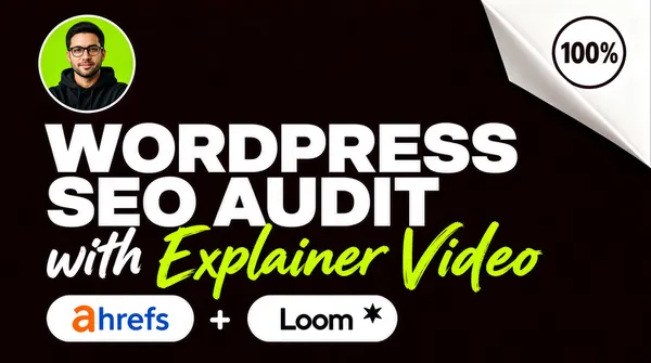
![[Format]
Landscape 16:9 gig cover, purely typographic layout on a flat dark aubergine field with a small photo avatar. Minimal, high-contrast, no watermark, no personal names.
[Layout]
Almost entirely centred and typographic. A very heavy two-line headline spans the middle of the frame, filling about 70% of the width and stacked flush left within that block. A small circular photo avatar, its diameter about a fifth of the frame height, is docked just above and left of the headline so it overlaps only the background. Directly beneath the headline a horizontal row of white rounded pill chips runs left to right, interleaved with two small plus symbols, with a green script phrase flowing right past the row's right margin. The top-right corner of the background folds back like a turned page corner, revealing white paper with a circular stamp badge sitting on it.
[Subject]
No hero person. One small circular avatar photograph sits above the headline: a waist-up portrait of a man with short dark hair, a light beard and glasses, arms folded, in a dark hooded top shot against a bright green circular ground. Treat it as a generic avatar, not an identity.
[Headline]
Two lines in an ultra-heavy geometric sans, all caps, pure white, stacked flush left and centred in the frame: “WORDPRESS” on the first line and “SEO AUDIT” on the second, the second slightly narrower so the block steps in. Beneath them, in a loose white hand-written brush script with the last two words in bright lime green, the phrase “with Explainer Video”.
[Badges]
Two white rounded pill chips each hold a real tool wordmark — the first the ahrefs wordmark in rounded lowercase, orange-and-blue, the second the Loom wordmark with its small dark asterisk-star glyph — separated by a small white plus sign. On the folded white page corner in the top-right sits a circular outline stamp with curved rim lettering and a bold “100%”, rendered as a generic satisfaction guarantee seal. No rating stars.
[Mood]
Near-black aubergine with pure white display type, a lime script flourish and two small colourful wordmarks. Clean and confident; at thumbnail size the two-line white headline and the bright script line dominate.](https://files.posterlet.com/assets/generated/md/gdqm0l8oxfwc.webp)
![[Format]
Landscape 16:9 gig cover, flat vector illustration on a warm coral field with a sketch-style document backdrop. Clean cartoon finish, no photographic elements, no watermark, no personal names.
[Layout]
A pale coral or salmon background fills the frame. Centred along the top quarter are two stacked headline plates, the upper one shorter and the lower one wider, both set on solid green rectangles and slightly offset so they step outward. Behind and below them, spanning the middle band, a loose fan of sketch-style documents, charts and a large magnifier is drawn in pale pink and white outlines, tilted at different angles and overlapping, reading as a light watermark layer. Down the left half, three green ribbon banners with arrow-shaped right ends are stacked with even gaps, each tilting a degree and each protruding progressively further right than the one above. On the right, a wide flat-illustration panel in bright blue is framed by a thin green outline tilted a few degrees, and a soft dark drop shape sits behind it for depth.
[Subject]
None — no people. The right panel instead contains a flat vector scene: a white-and-blue rocket lifting off from a yellow-and-orange exhaust plume at the left of the panel, and beside it a small cartoon figure with a dark beard and moustache, a tall red pointed hat, a red-and-blue outfit and a staff, holding a white rectangular sign with two lines of small dark caps text. Both are drawn as simple, bright, toy-like shapes with flat shading.
[Headline]
The two top plates read, in heavy white sans caps with a soft dark drop shadow: “SEO Audit” on the upper plate, and on the wider lower plate “Fix All Audit Issues”, both in title case and centred. Each of the three left ribbons carries one flush-left white bold caps line: “On-Page SEO Audit”, “Off-Page SEO Audit”, “Technical SEO Audit”, with the ribbon tail tapering to a point at the right. The sign inside the right panel repeats a two-word caps label in small dark type.
[Badges]
No rating seals or software logos. The only repeated marks are the three green arrow-tailed ribbons and the small sign held by the illustrated figure.
[Mood]
Warm coral with fresh green ribbons and a single bright blue panel for contrast. Friendly, servicey and easy — at thumbnail size the green ribbons and the rocket panel do all the work.](https://files.posterlet.com/assets/generated/md/l2c3fbsmfx9m.webp)
![[Format]
Landscape 16:9 gig cover, flat vector illustration of oversized letters filled with a collage of small objects, on a graded blue field. Playful and clean, no photographic elements, no watermark, no personal names.
[Layout]
The frame is dominated by three enormous letterforms — an S, an E and an O — sitting side by side across the middle of the frame, together spanning about 85% of the width and standing roughly half the frame height. The letters are solid shapes whose surfaces are entirely filled with a dense, evenly distributed mosaic of small flat-illustration objects, so the letterforms read as textured silhouettes rather than plain type. Behind them the background is a smooth blue gradient, darker at the edges, overlaid with a few wide diagonal stripes in pink, green and yellow that pass behind the letters at a shallow angle and act as a colour wash. A thin white rule and a solid black bar run across the bottom quarter, and the top-right corner carries a small logo lockup with a tiny abstract mark.
[Subject]
None — no people. Instead the letterform interiors contain a flat-illustration collage: in the S, gears, clouds, a magnifier, a folder of charts, a laptop, a clipboard, a speech bubble and a stack of coins; in the E, a dartboard with an arrow, a folder, an envelope, a rocket, a laptop and small cards; in the O, a magnifier, a laptop, a shopping basket, a coffee cup, a calendar, a pencil, a map and an anchor. All drawn in the same flat style with a single consistent light direction.
[Headline]
Along the bottom, inside a solid black bar that spans most of the width, “ON SITE SEO AUDIT” is set in a light geometric sans, all caps, widely letterspaced, in white — the only plain type on the cover. A very small wordmark and mark sit in the top-right corner; render as a neutral placeholder lockup.
[Badges]
No rating seals. The top-right placeholder lockup is the only brand-like element; the rest of the iconography lives inside the letterforms as illustration.
[Mood]
Deep blue ground with pastel diagonal stripes peeking through, and a rainbow of small flat objects packed inside three giant letters. Friendly and energetic; the three chunky letter shapes are instantly legible at thumbnail size even though the interior detail disappears.](https://files.posterlet.com/assets/generated/md/jovcpu49gscw.webp)
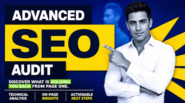
![[Format]
Landscape 16:9 gig cover, bold photo composite on a saturated blue field with angular yellow shapes and stacked colour plates. Graphic, editorial, no watermark, no personal names.
[Layout]
The left half is built from three stacked rectangular plates that step across each other: a dark navy plate at the top, an oversized bright yellow plate in the middle protruding furthest right, and a second dark navy plate below, inset back to the left. Under the plate stack sits a two-line supporting sentence at the same left margin, then a thin rule, then a three-column footer strip divided by short vertical rules. The person is a cut-out on the right, cropped by the right and bottom edges from the hip upward, overlapping the yellow plate and rising above the stack. The background is a deep blue gradient with large flat yellow polygons fanning out behind his shoulders and a faint blurred blue silhouette far behind.
[Subject]
A man in his early thirties with short dark styled hair and a clean-shaven olive complexion, wearing a white button-up shirt with the collar open, no jacket. Framed from the hip up, body angled toward the viewer, arms folded across the chest with one index finger lifted, pointing to his left toward the headline. A confident, slightly amused look straight at camera. The cut-out is desaturated and cool-toned, while the white shirt stays the brightest object.
[Headline]
Inside the top navy plate, “ADVANCED” in bold white caps, letterspaced. Inside the big yellow plate, “SEO” in huge ultra-heavy navy caps with a navy circle abutting the O containing a white arrow-like mark — a generic compass or speed glyph. Inside the bottom navy plate, “AUDIT” in heavy white caps. Below, two flush-left lines in heavy white sans: “DISCOVER WHAT IS HOLDING” and “YOU BACK FROM PAGE ONE.”, with “HOLDING” and “YOU BACK” on small bright green highlight blocks. Along the bottom, three flush-left columns of two-line white and yellow caps text separated by thin vertical rules.
[Badges]
No rating seals or platform logos. The only mark-like element is the small navy circle with a white glyph inside the yellow plate, treated as decoration.
[Mood]
Deep blue with two navy plates and one big yellow plate, plus green highlight blocks in the sentence. Bold and consultative; at thumbnail size the yellow SEO plate is the single strongest shape.](https://files.posterlet.com/assets/generated/md/cst8f9riojcg.webp)
![[Format]
Landscape 16:9 gig cover, straight photographic portrait with an overlaid outlined type stack, shallow depth of field. Video-thumbnail style, no watermark, no personal names.
[Layout]
The person sits just right of centre with the head in the upper third and the body spanning the lower half, so the left third of the frame stays open for type. Three lines of outlined display type are stacked flush left across the lower-middle of the frame, overlapping the subject's chest and left arm and sitting in front of him. A large thin white outline numeral is ghosted into the upper-right background at very low opacity, roughly a fifth of the frame height. The background is a blurred pale interior of an office or corridor with a doorway frame and a plant blurred on the right, over which a soft violet-to-purple gradient wash has been laid on the left half, so the picture is cool and mauve rather than neutral.
[Subject]
A bald man in his early fifties with pale blue eyes and a close-trimmed grey goatee and moustache, a fair ruddy complexion. He wears a charcoal-grey button-up shirt with the collar open and the sleeves out of frame. Framed from mid-chest up, body angled very slightly toward his left, arms folded low and mostly cropped, looking straight at the lens with a light, friendly closed-mouth smile. Soft even daylight, mild background blur, natural shadow under the brow.
[Headline]
Three flush-left lines of very heavy sans caps, each with a thick black outline and each roughly a third of the frame width, stacked with tight leading: “SEO” in flat amber-gold with a black outline and a slight bevel; “TECHNICAL” in white with a black outline, the widest line; and “AUDIT” in white with a black outline, matching the first line's width. Nothing else is lettered anywhere on the cover.
[Badges]
None. The only mark is the large translucent outline numeral in the upper-right, used as a series tag rather than branding.
[Mood]
Muted mauve-grey photography under three hard outlined type lines, with one amber accent. Understated and human; at thumbnail size the outlined black-edged words are the only high-contrast shapes.](https://files.posterlet.com/assets/generated/md/av8drb3xsjpq.webp)
![[Format]
Landscape 16:9 gig cover, two-panel photo composite: a soft photographic left half and a flat dark right panel with condensed display type. Editorial, restrained, no watermark, no personal names.
[Layout]
A hard vertical seam divides the frame at the 40% mark. The left panel is a photograph of the person against a heavily blurred outdoor background of foliage and pale architecture, the cut-out bleeding off the left and bottom edges. The right panel is a flat deep-navy field on which a four-line headline is set flush left and vertically centred, filling the panel almost edge to edge. A lower horizontal band, darker still and separated by a thin lighter rule, occupies the bottom eighth of the right panel and holds a small logo lockup at its left; the band breaks slightly past the seam onto the photograph, and the person's shoulder overlaps it. The panel navy sits several stops darker than the blurred greens behind the subject.
[Subject]
A man in his early thirties with short dark hair combed back, a neat dark beard and moustache, thin round metal-rimmed glasses and an olive complexion, wearing a pale oatmeal blazer over an open white dress shirt. Framed from mid-chest up, slightly turned toward his own left so the far shoulder drops away, with a subtle closed-lip smile. Soft overcast daylight, green-and-white bokeh behind him.
[Headline]
Four flush-left lines in a very heavy condensed grotesque, all caps, white, stacked with almost no leading, each line filling the width of the dark panel: “EXPERT”, then “SEO AUDIT”, then “TECHNICAL”, then “& ON-PAGE”, the last two sitting lower and overlapping the person's shoulder where the panel boundary runs. All four lines are uniform in size, giving a solid white block of text.
[Badges]
Inside the bottom band sits a small colourful abstract geometric mark — angular folded planes in blue, green, yellow and red — followed by a two-word brand-style wordmark and a smaller tagline beneath it; render the mark and lettering as a neutral placeholder lockup. No rating stars.
[Mood]
Desaturated green-and-grey photography against flat navy, with one small burst of primary colours in the logo mark. Serious and professional; the four-line white text block is unmistakable at thumbnail size.](https://files.posterlet.com/assets/generated/md/f97dg4kris16.webp)
![[Format]
Landscape 16:9 gig cover, clean corporate photo composite on a white rounded panel with a navy wave and a red button bar. Minimal, agency-polished, no watermark, no personal names.
[Layout]
The cover sits inside a white rounded rectangle with a thin margin of light background visible at the corners. The person is a cut-out on the left, cropped by the left and bottom edges, occupying about a third of the width and rising to the upper third, with very faint curved line-art arcs ghosted in the white space around his head. The right two-thirds carry a flush-left type block: a two-line display headline, then two subtitle lines on a thin rule, then a horizontal row of four icon circles with captions in a single band, and finally a red rounded button bar that spans the bottom right and tucks behind the subject's silhouette at its left end. A navy wave shape fills the very bottom-left corner beneath the person.
[Subject]
A man in his late fifties with a high receding hairline and grey hair at the sides, wearing thick black rectangular glasses, a navy blazer over a dark blue button-up shirt with the collar open. He is framed head-and-shoulders plus chest, turned three-quarters toward the viewer, with a warm closed-mouth smile. Soft, even, almost shadowless light, typical of a clean corporate headshot; cut-out has a small subtle shadow at the shoulder.
[Headline]
Top right, flush left: “SEO” in very heavy navy sans caps followed on the same line by a red “+ AI”, then beneath it “AUDIT” in the same heavy navy face set larger and wider. A thin horizontal rule separates that from two stacked subtitle lines in the same heavy sans: “OPTIMIZATION &” in navy and “ACTION PLAN” in red. Beneath those, four evenly spaced circle icons — a magnifier, a clipboard with tick lines, a bar-chart with a rising arrow, and a speech bubble with letters inside — each with a two-line small caps caption below it in navy. The bottom red bar carries a white target icon and the white bold caps line “PRIORITIZED FIXES THAT DRIVE RESULTS”.
[Badges]
Four round icon chips as feature markers, one white target glyph inside the red button bar. No rating seals, no software marks — the only strong accent is the flat red of the AI, the subtitle and the button.
[Mood]
White and pale grey with deep navy type and a single disciplined red accent. Calm, consultative and premium; at thumbnail size the navy AUDIT and the red action bar are the two anchors.](https://files.posterlet.com/assets/generated/md/o639bg47b7ca.webp)
![[Format]
Landscape 16:9 gig cover, glossy photo composite over a vivid gradient field with outlined display type. High-energy promo finish, no watermark, no personal names.
[Layout]
The left 60% of the frame is a flush-left stack of display lines that fills the height from just under the top edge down to the bottom banner row, each line as wide as the column. The person is a cut-out on the right 40%, cropped by the right and bottom edges, rising to just above the top edge of the type stack, so the words overlap his shoulder and chest. The background is a smooth vertical gradient running from blue-violet at the top left to hot magenta at the right, with a vertical ribbed stripe pattern occupying the extreme right edge. A small black pill badge floats in the top-right corner. A bottom row is split into two plates: a black bar occupying the lower left and a yellow plate occupying the lower right.
[Subject]
A man in his mid thirties with a short dark beard, dark rectangular glasses and a warm complexion, wearing a black suit with a black shirt and black tie. Framed from chest to crown, body angled slightly right, head tilted with one hand raised to his temple in a thinking gesture, and a broad open smile toward the camera. Raking light from the upper left gives a sheen on the glasses and beard; the cut-out is tight and saturated against the gradient.
[Headline]
Four stacked flush-left lines in a very heavy condensed sans caps, each with a thick black outline. Line one, the smallest, is “FIX” in flat yellow. Line two, “SEARCH”, is the biggest, in white. Line three, “CONSOLE”, matches it in white. Line four, “ERRORS”, is white and set at the same scale as line two, so the three white words dominate the frame. Bottom left, a black bar holds “SEARCH INDEXING ISSUES” in bold white caps. Bottom right, a yellow plate holds “ORDER NOW” in bold black caps followed by a double chevron glyph.
[Badges]
One small black rounded pill in the top-right corner containing a gold “1.5K+” figure with a row of five small yellow stars beneath it, plus a single decorative magenta-and-cyan outlined glyph used as an accent beside the type stack. No platform or tool logos.
[Mood]
Blue-violet melting into hot magenta, with outlined white display type and two flat yellow accents. Bright, punchy and loud; the three stacked white words and the yellow ORDER NOW plate carry it at thumbnail size.](https://files.posterlet.com/assets/generated/md/nahi9dsrf9bo.webp)
![[Format]
Landscape 16:9 gig cover, bold photo composite with a torn-paper panel and a glossy 3D type treatment. Punchy, high-saturation, no watermark, no personal names.
[Layout]
The frame splits into two colour fields: a saturated red panel on the left two-thirds and a bright blue panel on the right, separated by a ragged white torn-paper edge that runs vertically down the frame just left of centre and also tears across the lower-left corner in a diagonal. A bright green zigzag arrow rises from the lower left of the red panel toward the upper right, passing behind the main display type. The person is a cut-out on the right, cropped by the right edge at the hip, overlapping the blue panel and clipped along the torn edge. Two yellow banner strips are stacked in the red panel, one above and one below the display word, both tilted a few degrees. A small logo lockup sits at the bottom left of the red panel.
[Subject]
A woman in her late twenties with long straight dark-brown hair and a fair complexion, wearing a light blue denim shirt over a white t-shirt. She is framed from hip to crown, arms folded, body turned toward the viewer with her gaze up and to her left, one index finger raised and pointing toward the display type. She has a bright open smile and a neat pink lip. Even studio light with a clean cut-out, no cast shadow on the background.
[Headline]
In the red panel, a yellow banner tilted slightly counter-clockwise carries “ON PAGE” in heavy black condensed caps with a thin dark outline; beneath it the hero word “SEO” is rendered in a large glossy silver-white 3D serif-adjacent face with a bevel and cast shadow, with a grey-rimmed magnifier glass standing in for the letter O and the green zigzag arrow passing through its lens; below that a second yellow banner tilted the other way carries “REPORT” in the same black condensed caps. At the lower left, a white mark plus a two-word placeholder wordmark in white semi-bold with a small letterspaced caps word beneath it — render the mark and both words as a neutral stand-in lockup, not a real agency name.
[Badges]
One placeholder geometric logo lockup with a small two-line agency caption at the lower left of the red panel. No rating stars.
[Mood]
Scarlet red against cobalt blue with torn white paper, a chrome 3D headline and a neon-green arrow. Loud and upbeat; the glossy silver SEO and the diagonal green arrow are what register at thumbnail size.](https://files.posterlet.com/assets/generated/md/3y68a94v0y3u.webp)
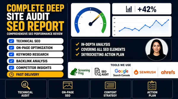
![[Format]
Landscape 16:9 gig cover, dense infographic report-mockup over a dark navy field. Flat UI cards, crisp vector icons, dashboard-screenshot aesthetic. No watermark, no personal names.
[Layout]
A rectangular infographic packed edge to edge. The left 45% holds a stacked text column: a three-line heavy headline, a one-line subtitle, five full-width white pill rows with even gaps (each a check chip, a label and a small icon at its right end), and one amber pill. The right 55% is a mosaic of white dashboard cards: a tall card at the upper left with a large semicircular gauge and a two-row legend; a stacked pair to its right — a small stat card with a green delta above a wide line-chart card with an axis and legend; then a dark navy panel holding three tick lines with a small circular portrait docked at its right edge. A full-width white band spans the lower quarter with a centred small caps label and a row of five tool marks, and a bottom strip of four dark tiles with icons and two-line captions closes the frame.
[Subject]
None — no person, apart from a small circular headshot of a dark-haired woman in a black top docked at the right edge of the dark analysis panel, used as an avatar, not a hero cut-out.
[Headline]
Top left, stacked flush left: “COMPLETE DEEP” in heavy amber caps, then “SITE AUDIT” in heavy white caps at the same size, then “SEO REPORT” in amber caps set larger. Beneath them a single small white caps subtitle line. The five pill rows are white with blue tick chips and black caps labels; the sixth is amber with a black clock icon. The dark panel carries three amber-tick lines in white bold caps: “IN-DEPTH ANALYSIS”, “COVERING ALL SEO ELEMENTS”, “SKYROCKETING ACTION PLAN”. The lower white band is labelled with a thin centred caps line in navy, and each bottom tile pairs a gold line icon with a two-line white caption.
[Badges]
Five tool marks sit in a row inside the lower white band: the Screaming Frog wordmark in dark green with its green frog mark, a dark document-with-magnifier glyph (keep it as a neutral stand-in with placeholder lettering), the multicolour Google wordmark with Google Search Console beneath it, the SEMRUSH wordmark in orange beside its orange flame-circle mark, and the lowercase orange ahrefs wordmark with its brushstroke 'a'.
[Mood]
Navy ground with white cards, gold-amber accents and one hit of green. Busy, evidence-heavy and credible; at thumbnail size it reads as a full report laid flat with a gauge and a chart as the hooks.](https://files.posterlet.com/assets/generated/md/32shjt2mvldu.webp)
![[Format]
Landscape 16:9 gig cover, straight photographic portrait with an overlaid type stack, soft-focus office background. Video-thumbnail energy, no watermark, no personal names.
[Layout]
The person is placed just right of centre, sized so that the head lands in the upper third and the body fills the lower half, overlapping the middle of the frame while leaving the left third clear for type. Three lines of outlined display type are stacked flush left across the middle of the frame, and they overlap the subject's chest and left shoulder, sitting in front of the person rather than behind. A large thin-outline numeral is ghosted into the upper-right background at about 15% opacity, roughly one fifth of the frame height. The background is a blurred interior — pale walls, a doorway, a suggestion of a plant on the right — with a soft purple-to-violet gradient wash over the left half of the image. Composition is loose, the headline and the face forming two competing focal points.
[Subject]
A bald man in his early fifties with light blue eyes and a close-cropped goatee and moustache, fair ruddy complexion. He wears a charcoal-grey button-up shirt with the collar open and a dark chest pocket, sleeves out of view. Framed from mid-chest up, body angled slightly to his left, arms crossed low in the frame, looking at the camera with a knowing, friendly half-smile. Soft available daylight, gentle shadow under the brow, slight background blur at f/2.8.
[Headline]
Three flush-left lines of very heavy sans caps, all slightly larger than the head, each with a thick black outline so they read against the photograph: “WEBSITE” in white with a black outline; “SEO AUDIT” in white with a black outline, the same size; then “FULL REVIEW” in warm amber-gold with a black outline, set a touch larger and dropped below the other two so the stack steps outward. Nothing else is lettered.
[Badges]
None. The only graphic mark is the large translucent outline numeral in the upper right, used as a series tag rather than a brand.
[Mood]
Muted violet-grey photography interrupted by three outlined type lines with one warm amber accent. Relaxed and human; the gold FULL REVIEW line is the only colour hit and pulls the eye at thumbnail size.](https://files.posterlet.com/assets/generated/md/i4i1oe32sxf0.webp)
![[Format]
Landscape 16:9 gig cover, bright photo composite on a flat blue rounded-rectangle panel with a black diagonal band. Commercial, high-clarity finish. No watermark, no personal names.
[Layout]
The whole cover is a bright cornflower-blue rounded rectangle with a small white margin at the corners. A solid black diagonal band cuts across the lower-right corner at roughly 20 degrees, running from the bottom edge up to the right edge and carrying a mark plus two lines of white type. The person is a cut-out on the right, cropped by the right edge at the chest and rising to near the top, overlapping both the blue panel and the black band. On the left, type and list elements stack top to bottom: a dark navy rounded band across the top third, a huge two-line white headline immediately below it, then a flush-left list of six short lines, with a very large green circle-check overlapping the bottom of the list and the black band.
[Subject]
A young man in his mid twenties with tousled medium-brown hair and a short ginger beard, light complexion, wearing a dark grey suit jacket over a plain black crew-neck. He is framed from chest to crown, turned slightly to his right toward the viewer, with a friendly open smile. Bright even light, minimal shadow, crisp cut-out edges, hair and beard finely detailed.
[Headline]
Top-left inside a dark navy rounded band: “GET TOP SEARCH RANKING FAST!” in bold white caps, breaking after “SEARCH”. Beneath it, filling the left half in very heavy white sans caps across two lines, “EXPERT SEO” and “AUDIT”, the largest lettering in the frame. Under that, a flush-left six-line list in heavy black sans, title case, tight leading: “Descriptions”, “Link Building”, “Local SEO”, “Titles”, “H1 & H2's”, “And More…”. On the black diagonal band, a stacked white caps award caption set in two lines with a third word beneath it.
[Badges]
One oversized solid green circle containing a thick white tick, sitting at the base of the list and overlapping the black band — the single dominant badge. On the black band, a white triple-chevron arrow mark precedes the award caption. No software logos or star ratings.
[Mood]
Saturated cornflower blue with a black corner wedge, a jarring-bright green check disc and pure white type. Loud and promotional; the green circle and the words EXPERT SEO AUDIT are the two thumbnail landmarks.](https://files.posterlet.com/assets/generated/md/nokj1he5axe1.webp)
![[Format]
Landscape 16:9 gig cover, clean photo composite over a dark gradient field with flat vector accents. Sharp cut-out, studio lit, no watermark, no personal names.
[Layout]
The person occupies the right 45% of the frame as a cut-out that is cropped by the right and bottom edges and rises from the bottom edge to near the top. The left 55% is a left-aligned stacked text column that fills most of the vertical height, staggered so the widest element is the headline and the narrowest is the subtitle plate. The background is a near-black deep teal gradient, lighter at the top centre and darkening toward the corners, with a soft radial vignette. A large teal-and-grey outlined icon cluster — a magnifier with an arrow rising out of it — sits in the upper-right corner behind the person's head. Type elements stack with generous spacing; the small button sits at the bottom of the column.
[Subject]
A man in his early thirties with short dark hair, a light beard and a fair-to-olive complexion, wearing a plain black crew-neck t-shirt. He is framed from hip to crown, arms folded across his chest, a chunky dark smartwatch on the left wrist, body angled three-quarters toward the camera and smiling warmly at the lens. Soft key light from the upper left, subtle rim on the shoulders, clean silhouette against the dark field.
[Headline]
Four stacked text elements, all flush left in the upper-left to lower-left column. First, on a white rectangular plate that tilts slightly counter-clockwise, “SEO Audit Report” in very heavy condensed black caps. Directly beneath, floating on the background with no plate, “+ Action Plan” in the same weight in bright cyan. Below that a white plate with a slight tilt holds “PREMIUM QUALITY” in heavy black caps at roughly half the size. Then a three-line checklist in white semi-bold title case, “Technical Audit”, “On-site & Off-site Audit”, “UX/UI Audit”, each fronted by a solid green circle with a white tick. Finally a teal rounded pill at the bottom of the column reads “Message Me Now” in white semi-bold.
[Badges]
Three green tick circles as checklist bullets, plus the decorative magnifier-and-arrow outline motif in the upper right. No rating seals, no platform or tool logos.
[Mood]
Deep teal-black gradient with white plates and a single electric cyan for the payoff line. Calm, premium and readable — at thumbnail size the tilted white and black “SEO Audit Report” plate is the anchor.](https://files.posterlet.com/assets/generated/md/v63x01s0xvb8.webp)
![[Format]
Landscape 16:9 gig cover, corporate photo composite over a horizontally banded flat-colour backdrop, with a row of trust seals. Polished agency finish, no watermark, no personal names.
[Layout]
The background is four full-width horizontal bands stacked with no gaps: white across the top quarter, saturated cyan of similar height below, deep navy through the lower-middle, and pale grey-white along the bottom quarter. Faint, heavily desaturated photographic figures are ghosted inside the white and pale bands as low-opacity texture. The person is a cut-out on the right, cropped at the hip by the bottom edge and rising to just under the top edge, overlapping the cyan and navy bands. Type is flush left and vertically centred on the cyan band, and a row of four circular badges runs along the lower left on the pale band.
[Subject]
A man in his late forties with a full grey-flecked beard, close-cropped hair and a fair complexion, wearing a deep plum velvet blazer over a pale pink open-collar shirt. Framed from hip to crown, arms folded across his chest, body angled slightly left, gaze to camera with a warm closed-mouth smile. Soft directional light from the left gives the velvet a sheen; clean cool-toned cut-out against the flat bands.
[Headline]
Top left on the white band, a wide-letterspaced heavy extended sans wordmark in dark navy caps serves as a placeholder brand line, about a third of the frame width. Below it, filling the cyan band, the headline runs as two flush-left lines in very heavy white sans caps: “TECHNICAL” then “SEO AUDIT”, each roughly half the frame width and set tight. No other lettering appears.
[Badges]
Four circular trust seals sit in a row along the lower-left pale band: a navy outline circle with a stacked two-line membership caption, a laurel-wreathed circle with a four-line award caption, a blue shield badge with a large “A+” and small caption lines, and a gold laurel wreath enclosing a three-line award caption. All are generic award and rating emblems, no real organisation names or logos.
[Mood]
Clean white and cyan cut by deep navy, warmed by the plum blazer and gold and navy seals. Authoritative and corporate; at thumbnail size the two huge white words on cyan and the badge row read as credentials.](https://files.posterlet.com/assets/generated/md/9egy11dast71.webp)
![[Format]
Landscape 16:9 gig cover, flat vector illustration over a solid black field, poster-style with hand-set display type. Bold, high-contrast, no watermark, no personal names.
[Layout]
The left third holds a flat-illustration portrait of a woman, cropped at the bottom edge and the left edge, standing in front of an oversized lime-green circle that fills the left-centre of the frame. The remaining two-thirds carry an over-scaled type block that occupies the upper two-thirds, staggered so the words step down and rightward. A wide ribbon banner cuts diagonally across the frame just below the middle, running from the left-third boundary to the right edge. The bottom-right quadrant holds a rounded green-outlined panel with a two-column checklist. A small white cursive flourish sits in the lower-left corner of the black field.
[Subject]
A flat vector illustration of a woman with long straight black hair falling past her shoulders, dark rimmed glasses, a thin necklace and a black blazer over a black top. She faces the viewer in a relaxed three-quarter pose, shoulders slightly angled, with a calm closed-mouth smile. Style is clean editorial vector portraiture — solid shapes, minimal shading, no photographic texture.
[Headline]
The display block is a mix of weights and colours stacked and offset: a huge white ultra-bold “SEO” with a small lime “#1” set as a superscript at its top-right; directly beneath and pushed right, “AUDIT” in the same weight but flat lime green; a purple ribbon banner bears the white caps line “COMPLETE WEBSITE ANALYSIS” in bold sans; and a large flat yellow “AI” sits at the right edge of the ribbon line, roughly half the height of the “SEO”. Inside the bottom-right green-outlined panel, four checklist items in white bold caps split into two columns by a dashed vertical divider: “On-Page & Technical SEO Audit”, “AI & Search Engine Friendly”, “Keyword Research & Opportunities”, “Actionable Roadmap & Priorities”, each fronted by a lime circle with a dark tick.
[Badges]
One small circular outline badge floats to the upper right of the display type, containing three stacked lines of tiny lime-and-white caps text used as a stat chip. The checklist tick circles form the other repeated mark.
[Mood]
Pure black ground lit by lime green and white display type with a single purple ribbon and one yellow accent word. Punchy and modern; the giant lime AUDIT and the white SEO are what survive at thumbnail size.](https://files.posterlet.com/assets/generated/md/yfmalj0tgkzt.webp)