

About this collection
Every Fiverr gig lives or dies by a single image. Each cover here respects the real constraints of a gig image - one banner-shaped canvas, high-contrast text, and no clutter that would collapse at small sizes.
These are starting points, not finished listings. Every cover here is built around one idea: a single service promise, set in type large enough to survive being shrunk into Fiverr's search grid. The collection spans roughly thirty service areas — software and app development, design and branding, writing and translation, marketing, audio, data, and business consulting — so you can usually find a layout close to what you sell and adapt it.
Nothing here is a layered design file. Each one is a flat generated image, which is exactly what makes it quick: pick a layout, swap the headline, palette, and icons for your own service, and you have a listing image in a few minutes rather than an afternoon.
What a gig cover actually has to do
A buyer scanning search results sees your cover as a thumbnail no wider than a postage stamp, sitting next to a dozen competitors. That single constraint decides almost everything else:
- One promise, not a service list. "I will fix your WordPress site in 24 hours" reads at thumbnail size. "WordPress | SEO | Speed | Security | Maintenance" turns to mush.
- High contrast between text and background. Thin light type on a pale panel is the first thing to disappear when the image shrinks.
- Three to six words in the headline. Long headlines force small type, and small type is what becomes unreadable first.
- The service visible before reading a word. A layout cue — a device frame, a waveform, a chart, a colour swatch — tells the buyer the category instantly.
Resizing and export
Fiverr publishes its own requirements in the uploader, and they change - check them there rather than trusting a number quoted in a blog post. What does not change is the direction of the resize: always scale down from the download. Never upscale a smaller image to reach the uploader's width, because the text edges go soft, and soft type is exactly what a thumbnail cannot afford.
When you trim to match the uploader's proportions, do it symmetrically and keep the headline centred, so the crop does not eat one side of the promise.
Three things worth doing before you upload
- Judge the thumbnail, not the full-size file. Shrink the preview down to search-result size, or just squint. If the promise still reads, the cover works. 2. Keep a colour system across your gigs. Buyers skim a grid of near-identical covers; a consistent accent colour makes your listings recognisable among strangers. 3. Leave the outer margin clear. Gig images get cropped slightly differently across placements, so keep text away from the outer edge of the canvas.
Common questions
Will the downloaded cover meet Fiverr's upload requirements?
Check the uploader: Fiverr shows its current accepted format, file limit and recommended image spec there, and those are the platform's requirements, not ours. What matters on this side is direction — start from the downloaded cover and scale down to fit, never up from a smaller file.
Will the text still be readable in the search grid?
Shrink it to search-result size before uploading. That is close to what buyers actually see when comparing gigs, and it is where most covers fail — usually because the headline was set too small or the contrast was too low to begin with.
How many images should one gig have?
Fiverr's gallery takes up to three images and two videos. Lead with the strongest cover, then spend the remaining slots on a work sample, a before-and-after, or a deliverable preview rather than more headline art.
Can I use the same cover on several gigs?
No. Buyers often see two or three of your gigs together, and identical covers make them look like one listing repeated. Change the headline, the accent colour, and the main visual so each gig reads as its own service.
Can I change the text or colours after generating?
Not in place. The wording is baked into the image, so there is no text layer to retype. Download it and edit it in your own tool, or use the "Use as Template" option to regenerate it with different copy.
Why do the covers in this collection look so different from each other?
Because the range is deliberately broad. Each cover was written around the specific service it advertises, so a logo animation cover and a translation cover share a job — selling one service at thumbnail size — but not a visual style. That variety is what lets you give every gig a distinct look.
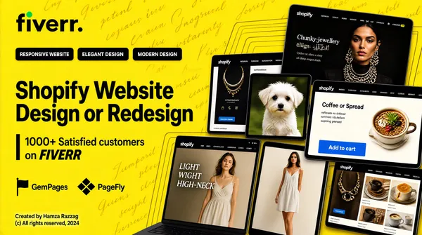
![[Format]
Professional Fiverr gig cover, landscape 16:9 banner. Bright portfolio-showcase style, flat and modern, dominated by one saturated background colour. No watermark, no personal names.
[Layout]
A solid vivid yellow full-bleed background, lightly overlaid with a repeating diagonal wallpaper of very faint darker-yellow script text. The upper-left quarter is left as clean negative space for the headline; the remaining three-quarters are packed with a tilted, overlapping cluster of device mockups that runs off the right and bottom edges.
[Subject]
No people. Generic abstract e-commerce thumbnails are shown on the mockup screens, including a chunky-jewellery fashion model, a small white dog photograph, a woman in a light summer dress, and assorted lifestyle product photography.
[Headline]
Upper left: the "fiverr." wordmark in black with its green dot. Beneath it, a row of three black rectangular pills with white caps: "RESPONSIVE WEBSITE", "ELEGANT DESIGN", "MODERN DESIGN". Then the main title in large heavy black sans-serif across two lines: "Shopify Website" and "Design or Redesign". Below the title, a short vertical black rule followed by two lines: "1000+ Satisfied customers" in black and "on FIVERR" with FIVERR in bold italic black caps. Under that, two small black partner logos side by side with their names in black: the GemPages flag mark, and the PageFly diamond-grid mark. In the bottom-left corner, very light grey small text: "Created by Hamza Razzag" over "(c) All rights reserved, 2024".
[Badges]
No badges. Instead a dense overlapping grid of tilted dark-framed laptop and tablet mockups fills the right and lower area. Each screen shows a different live-looking Shopify storefront with a top navigation bar and a hero section. One tablet near the top-right displays a dark artisanal brand page for jewellery; other screens show a coffee or spread product page with a bright blue Add-to-cart button, a fashion lookbook with a script overlay reading "LIGHT WEIGHT HIGH-NECK", and a further fashion banner. Thin faint darker-yellow concentric rectangles echo the frames behind the row.
[Mood]
Clean, contemporary, portfolio-forward; one confident flat colour with crisp black type, high visual density on the right against generous breathing room on the upper left.](https://files.posterlet.com/assets/generated/md/hugirucwvnkm.webp)
![[Format]
Professional Fiverr gig cover, landscape 16:9 banner, designed like a premium editorial magazine layout. Refined, high-end, minimal. Muted greyscale photography paired with warm cream typography. No watermark, no personal names.
[Layout]
Two-panel editorial split. The LEFT panel (about 32% width, running full height) is a full-bleed desaturated black-and-white photograph. The RIGHT panel (about 68%) is a clean warm cream background carrying all the typography, badges and the colour subject. A hard vertical edge divides the two panels.
[Subject]
In the left panel: a young white / Caucasian woman with long dark hair, seen in three-quarter view, sitting on a grey upholstered armchair with her legs crossed, a silver laptop open on her lap, wearing a plain black short-sleeved top and light loose trousers, working with her head tilted down toward the screen. Monochrome, natural window light, slight film grain.
In the lower-right corner of the right panel: a second white / Caucasian woman with long wavy light-brown hair, shown as a head-and-shoulders cut-out inside a large circular frame, smiling gently at the camera, wearing a light floral top - full colour, isolated on the cream background.
[Headline]
Occupying the upper right panel, three stacked lines of very large high-contrast serif display type in near-black: line 1 "SQUARESPACE", line 2 "WEB DESIGN", line 3 "& DEVELOPER". Tight leading, elegant editorial serif, the ampersand prominent.
[Badges]
Below the headline, left-aligned: a rounded rectangular badge with a soft pink fill and black border containing the stacked text "CERTIFIED" in small letterspaced caps above "STANDOUT" in a bold slab serif with a small circle motif in the middle. To its right, a solid black rectangular badge carrying the Squarespace circular logo mark in white, followed by "Squarespace" in white with "Circle Member" in smaller white text underneath. Beneath both badges, a single line of small grey caps: "DESIGN AND LAUNCH YOUR DREAM WEBSITE TODAY."
[Footer]
A solid black bar spanning the full width along the very bottom edge, filled with the word "SQUARESPACE" repeated continuously and separated by forward slashes, in small white caps.
[Mood]
Editorial, premium, understated luxury; monochrome reportage photography against warm paper-like cream, sharp magazine-grade typography, generous negative space.](https://files.posterlet.com/assets/generated/md/acjips1unif4.webp)
![[Format]
Professional Fiverr gig cover, landscape 16:9 banner, bold high-contrast commercial advertising style. Glossy, saturated, high-energy with heavy black display type. No watermark, no personal names.
[Layout]
Diagonal sliced background. The left two-thirds is a deep navy-blue with faint concentric circular line patterns bleeding in from the top-left and bottom-left corners; the right third is a bright grass-green slab, separated from the navy by a sharp diagonal edge cutting from top-right down to bottom-left. A second tilted white-and-black wedge sits behind the headline stack for depth.
[Subject]
On the right side, overlapping the diagonal seam: a confident young white / Caucasian man with a neat short beard, dark hair, black suit jacket, crisp white shirt and black tie, arms folded across his chest, waist-up cut-out, lit with a clean studio key light and smiling slightly at camera. No text or watermark on the subject.
[Headline]
Stacked on the left, centre-aligned: a line of small white italic script "Design/Redesign"; then "WORDPRESS" in heavy italic black condensed caps set on a bright yellow slab with a thick black outline, tilted a few degrees; then "WEBSITE" in heavy white italic condensed caps with a black outline on the navy; then "DEVELOPMENT" in heavy italic black condensed caps on a green slab; then a solid white rounded button with black bold caps "ORDER NOW".
[Badges]
A horizontal row of four round white-outlined badges below the headline, strung on a thin line: the WordPress circular logo on yellow, the Elementor pink mark, the WooCommerce purple mark, and the yellow Composer mark. Oversized WordPress circular logos in white are also placed semi-transparently in the top-centre, bottom-left and mid-right of the frame.
[Mood]
Loud, confident, agency-grade; saturated navy and green with yellow accents, glossy 3D type, strong red-free contrast, extremely readable at thumbnail size.](https://files.posterlet.com/assets/generated/md/smbio9vu4lpg.webp)