About app screenshots
An App Store listing gives you ten screenshot slots and a fraction of a second to be understood. Most apps fill them with unedited captures, which is why so many product pages read as grey mush at the size a phone actually displays them. These layouts treat the slot the way a store page should: one claim, one device, one colour, and the interface demoted to evidence.
The set covers both jobs a store screenshot has to do. Some layouts carry an announcement - a date, a version, a "we are live" - while others walk through a feature with the capture cropped inside a frame. Both keep the same grid, so a listing built from mixed pieces still looks deliberate rather than assembled by three different teams.
What size should an App Store screenshot be?
App Store Connect asks for a small set of fixed sizes: 1320 x 2868 for the 6.9-inch iPhone and 2064 x 2752 for the 13-inch iPad, plus 1242 x 2688 if you still ship a 6.5-inch set. Every layout here is designed at the ratio rather than at the pixel size, so a portrait piece regenerates at 9:16 without re-cropping the headline or moving the device.
Why do the first two screenshots matter more than the other eight?
In search results the store shows the first two or three images before anyone taps through. The remaining slots are only seen by people who already decided to look, which means slot one is doing the work of a landing-page hero. Put the single strongest claim there, and stop treating it as a gallery of everything the app can do.
How much text should one screenshot carry?
One headline of two to five words, plus at most one support line. Anything longer has to be read rather than scanned, and nobody reads a store listing. If the claim needs a subordinate clause to survive, it is the wrong claim.
Do these work for Google Play too?
Yes, with one addition. Play uses the same 9:16 and 16:9 phone ratios, but the listing also wants a 1024 x 500 feature graphic that appears in search and category pages. The landscape layouts here are built for that slot: the headline sits in the left third, so the graphic can be cropped from either side without cutting a word.
Portrait, square or landscape?
Portrait for the store itself, because the slot is portrait on both stores and the image is shown almost at full width. Landscape for the feature graphic, a press kit, a site hero or a launch gallery. Square for anywhere a listing also has to survive as a thumbnail: a social card, a partner's "available on" badge, an embed inside a review.
Can one set carry both a launch and a feature list?
Keep them as separate pieces. A launch screenshot is a moment: date, status, one line. A feature screenshot is an explanation: it needs the interface visible and legible. Mixing the two gives a slot that is neither loud enough to stop a scroll nor clear enough to explain anything, and that muddle is what makes a listing feel unfinished.
Should the device frame stay on?
Only while the frame is carrying information. A phone shape tells the reader the product is an app before they have read a word, which is worth a lot in a store grid. For a web tool, a changelog or a developer release, drop the frame and let the window be cropped by the edges of the poster - the same rule that keeps an announcement from looking like a software brochure.
Where does the headline go when the capture is busy?
Never on top of the interface. Captures have their own rhythm - toolbars, panes, gutters - and type laid over them fights every one of those lines. Put the headline in the empty third of the frame, or push the device down so it bleeds off the bottom edge. The best version of the pattern lets the frame be cropped by the poster, so the product reads as bigger than the image containing it.
All interface content in these layouts is abstracted on purpose: grey bars, soft blocks and blurred shapes instead of legible microcopy, so the poster survives thumbnail size and never ships someone else's UI text as decoration.
![[Format]
Landscape 4:3 poster split into a warm cream text panel on the left and a deep maroon gradient panel on the right holding a dark dashboard card. Editorial, no watermark.
[Layout]
The frame is split vertically at two fifths of the width. The left panel is flat warm cream; the right panel is a gradient that runs from near-black at its left edge through oxblood to a burnt orange glow at its upper right corner. A small lockup sits at the upper left of the cream panel, a sixteenth in from each edge. The headline fills the cream panel, four lines, left aligned to the same margin, starting at about a fifth of the height and ending just above the lower quarter, the last line short. The dashboard card sits on the right panel, its left edge a tenth in from the split, its right edge a tenth in from the frame, its top at a fifth of the height, its bottom at four fifths, with rounded corners and a thin rim of warmer light along its top edge.
[Subject]
the dashboard card. Its top band carries a short pale bar at the left with a thin grey line beneath it, and at the right a neat stack of three short grey bars of different lengths, no numeral and no digit anywhere in the frame. Below a hairline, a wide chart area holds a faint grid of horizontal rules and a row of twelve thin vertical bars standing on a baseline, most of them pale grey, three near the middle in bright emerald, all of them unfilled with no labels. Along the bottom of the card, four short legend rows, each a tiny circle and two grey bars. Nothing is legible.
[Headline]
"WHAT THE ANSWER ENGINES SAY ABOUT YOU" set in a high contrast serif in near-black, four lines, left aligned, tight leading, with a single orange full stop set after the last word.
[Labels]
the lockup reads ranklens in lower case orange sans beside a small ring mark; the card carries bars, a grid and one pale numeral only, never words
[Mood]
Cream #FAF5EA, near-black #14100E, oxblood #4A0F14, burnt orange #C4441C, emerald #3FBF7F. Editorial and restrained; the warm split makes a monitoring tool feel like a magazine spread.
[Rules]
Every line of text must be real, correctly spelled English - no placeholder, no lorem ipsum, no gibberish, no stray or scattered letters, no phone numbers, no email addresses, no QR codes, no bracketed placeholders. Never break or hyphenate a word across two lines: each word must stay whole on one line. Never print a colour code, hex value, CSS value or any string beginning with a hash mark as text. Do not print any telephone number, street address, URL or price. No human faces, no photographic people. All interface content inside any window, card or screen is abstracted: grey bars, soft blocks and blurred shapes only - no legible microcopy anywhere.](https://files.posterlet.com/assets/generated/md/a0ic1er40qd4.webp)
![[Format]
Landscape 16:9 poster, near-black sky easing into deep navy, a scatter of faint stars, two large pale ovals at the right and a three line headline at the left. Minimal, quiet, no watermark.
[Layout]
A field that runs from near-black along the top edge to a deep navy at the bottom, with a soft blue glow low in the lower left and a single faint curved line sweeping from the left edge across the lower third like the edge of an orbit. A fine scatter of small dots covers the whole frame, denser at the top, each dot faint and slightly varied in size. The headline occupies the left half, three lines, left aligned to a twelfth of the width, beginning at about a third of the height, the lines evenly stacked at generous leading. Two large ovals sit at the right of centre, side by side, their tops level with the first line of the headline, each about a seventh of the width across.
[Subject]
the two ovals and nothing else. Each is a soft off-white shape with a faint grainy texture, slightly egg-like rather than perfectly round, dimmer at its lower edge, casting a wide diffuse glow into the navy behind it. There is no device, no panel, no illustration of any other kind.
[Headline]
"HI, I'M NOD. I KEEP THE NIGHT." set in a clean humanist sans, exactly two lines, left aligned: line one reads HI, I'M NOD. with only the brand word NOD in pale rose, line two reads I KEEP THE NIGHT. entirely in warm white at the same weight; the second line appears once and is never repeated, and no third line follows it.
[Labels]
none; the frame carries only the headline, the two ovals, the star field and the orbit line
[Mood]
Near-black #06080C, deep navy #12233F, warm white #F3EDE4, pale rose #E9A79C, glow blue #2D5C8F. Still and slightly strange; the two pale shapes read as company rather than decoration.
[Rules]
Every line of text must be real, correctly spelled English - no placeholder, no lorem ipsum, no gibberish, no stray or scattered letters, no phone numbers, no email addresses, no QR codes, no bracketed placeholders. Never break or hyphenate a word across two lines: each word must stay whole on one line. Never print a colour code, hex value, CSS value or any string beginning with a hash mark as text. Do not print any telephone number, street address, URL or price. No human faces, no photographic people. All interface content inside any window, card or screen is abstracted: grey bars, soft blocks and blurred shapes only - no legible microcopy anywhere.](https://files.posterlet.com/assets/generated/md/ssptxo57550h.webp)
![[Format]
Landscape 16:9 poster built on a photograph: a person in warm orange light against a deep teal ground, blurred by motion, with a serif headline at the lower left. Cinematic, no watermark.
[Layout]
The photograph fills the entire frame. Its ground is a deep desaturated teal, darker at the left, with a broad diagonal shaft of warm amber light crossing from the upper right down through the centre. The person stands at the right of centre, cropped by the frame at the shoulder and the hip, moving so that the body and the raised hand carrying a phone smear into soft streaks while the fabrics keep their edges. A lockup sits at the upper left, a fourteenth of the width in and a tenth down, in pale lilac. The headline occupies the lower left, three lines, left aligned to the same margin, beginning at about half the height, the block ending a tenth above the bottom edge. A small block of two short lines sits at the lower right, right aligned to a fourteenth from the edge.
[Subject]
the person, described plainly so the frame reads as a stock photograph rather than a portrait of anyone in particular: a white woman in her late twenties, dark hair tied back, wearing a plain charcoal top with no print or logo, her face turned three quarters away from the camera and softened by the motion blur so no feature is sharply resolved, her right hand raised at chest height holding a dark phone whose screen is dark. The surrounding room falls away into the teal dark, with one soft out of focus highlight behind her shoulder.
[Headline]
"TALK. IT'S ALREADY written." set in a high contrast serif, three lines, left aligned, the first two lines in warm white roman and the final word in italic with a thin pale lilac rule drawn under it like a proofreader's mark.
[Labels]
the lockup at the upper left reads spoken in pale lilac lower case beside a small waveform mark; at the lower right two short pale lines, the first wider than the second, right aligned, carrying no numbers
[Mood]
Deep teal #10333A, amber #E08A3C, warm white #F6EFE6, pale lilac #C9B6E4, charcoal #23211F. Warm and human; the blur does the persuading, so the type can stay perfectly still.
[Rules]
Every line of text must be real, correctly spelled English - no placeholder, no lorem ipsum, no gibberish, no stray or scattered letters, no phone numbers, no email addresses, no QR codes, no bracketed placeholders. Never break or hyphenate a word across two lines: each word must stay whole on one line. Never print a colour code, hex value, CSS value or any string beginning with a hash mark as text. Do not print any telephone number, street address, URL or price. Exactly one person appears, the generic stock-photo adult described in [Subject]: a white person of relaxed everyday appearance, evenly lit, with a calm neutral expression and plain unbranded clothing. No second person, no crowd, no recognisable individual. All interface content inside any window, card or screen is abstracted: grey bars, soft blocks and blurred shapes only - no legible microcopy anywhere.](https://files.posterlet.com/assets/generated/md/jm8zqv0zpnh6.webp)
![[Format]
Landscape 16:9 poster, pale mint field with a huge two line headline centred in the upper half and two rows of white flow cards running off both edges below. Flat, generous, no watermark.
[Layout]
A flat pale mint field. A small lockup sits centred at the very top, a sixteenth of the height down, the wordmark followed by a tight outlined square holding two dark letters. The headline is centred, two lines, the block spanning four fifths of the width and sitting between a fifth and a half of the height, the first line heavier in near-black and the second line carrying its last two words in bright emerald. A small hand drawn four point sparkle sits above and right of the first line, and a second sparkle of the same family sits at the right end of the second line. Below the headline, two rows of white rounded cards fill the lower half, each row running past both side edges so the outer cards are cut, the rows separated by an even gap.
[Subject]
the two rows of cards. Each card is a wide white rounded rectangle with a thin pale mint outline, holding a small coloured round icon at its upper left, a thin horizontal line, a pale grey pill near its upper middle and a second pill at its upper right, then a row of short grey bars of varying length along its lower half. The icons are soft abstract dots in blue, green, amber and violet. Nothing inside any card is legible.
[Headline]
"BOOKKEEPING, ALREADY DONE" set in a heavy geometric sans, two lines, centred, with tight leading, the second line's final two words set in bright emerald so the promise lands in colour.
[Labels]
the lockup reads ledgerly in lower case dark sans, followed by a small outlined square holding the letters AI; the cards carry icon dots and grey bars only
[Mood]
Pale mint #E9F7EE, white #FFFFFF, near-black #10231A, emerald #12B76A, sky #4C8DF6. Calm and systematic; the rows do the work of showing volume without a single screenshot.
[Rules]
Every line of text must be real, correctly spelled English - no placeholder, no lorem ipsum, no gibberish, no stray or scattered letters, no phone numbers, no email addresses, no QR codes, no bracketed placeholders. Never break or hyphenate a word across two lines: each word must stay whole on one line. Never print a colour code, hex value, CSS value or any string beginning with a hash mark as text. Do not print any telephone number, street address, URL or price. No human faces, no photographic people. All interface content inside any window, card or screen is abstracted: grey bars, soft blocks and blurred shapes only - no legible microcopy anywhere.](https://files.posterlet.com/assets/generated/md/com0egsskwyf.webp)
![[Format]
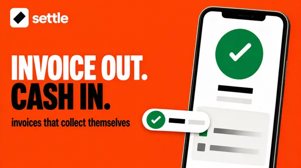
Landscape 16:9 poster, saturated orange field with a two line headline at the left and a phone standing at the right, its screen white. Bold, high contrast, no watermark.
[Layout]
A flat saturated orange field filling the whole frame. A lockup sits at the upper left, a fourteenth of the width in and a tenth down: a white rounded square tile holding a single dark angular mark, then the wordmark in white set beside it. The headline sits on the left, two lines, left aligned to the same margin, beginning at about a third of the height, the first line about four fifths of the left panel's width and the second line slightly wider. A phone stands at the right, tilted two degrees clockwise, its left edge at about three fifths of the width, its top at a twelfth of the height and its bottom cropped by the frame edge, its body near-black with a thin light rim. A white pill floats across the phone's lower left, overlapping the phone body, centred at about four fifths of the height.
[Subject]
the phone and the pill. The phone screen is white: a large emerald circle sits in its upper half holding one thick white tick, beneath the circle a short heavy dark bar, beneath that a thin pale bar, then a wide pale panel with two rows, each a small square thumb at the left and a grey bar beside it. The floating pill carries a small emerald circle with a white tick at its left, then one short dark bar, then a second pale bar at its right end. Nothing on the screen is legible and no numbers appear anywhere.
[Headline]
"INVOICE OUT. CASH IN." set in an extra bold grotesque, two lines, the first line in pure white and the second in near-black, tightly stacked so the two weights collide.
[Labels]
the lockup reads settle in white lower case beside the tile; beneath the headline one short line in deep umber sans: invoices that collect themselves
[Mood]
Orange #E85E0F, deep umber #3A1B08, white #FFFFFF, emerald #16A34A. Loud and friendly; the single warm field does all the shouting so the phone can stay quiet.
[Rules]
Every line of text must be real, correctly spelled English - no placeholder, no lorem ipsum, no gibberish, no stray or scattered letters, no phone numbers, no email addresses, no QR codes, no bracketed placeholders. Never break or hyphenate a word across two lines: each word must stay whole on one line. Never print a colour code, hex value, CSS value or any string beginning with a hash mark as text. Do not print any telephone number, street address, URL or price. No human faces, no photographic people. All interface content inside any window, card or screen is abstracted: grey bars, soft blocks and blurred shapes only - no legible microcopy anywhere.](https://files.posterlet.com/assets/generated/md/gmnwjfmcb9z4.webp)
![[Format]
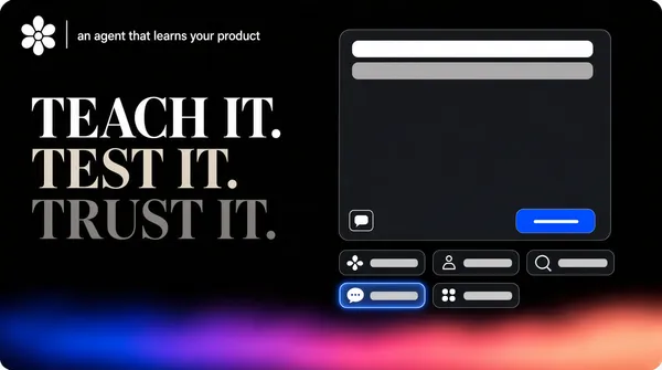
Landscape 16:9 poster, near-black field with a high contrast serif headline on the left, a dark chat panel on the right and a wide rainbow blur rising along the bottom edge. Cinematic, no watermark.
[Layout]
A near-black field, dead flat across the upper three quarters. A lockup sits at the upper left, a tenth of the width in and a twelfth down: a small white floral mark made of six rounded petals, then a thin vertical divider, then one short line of pale copy. The headline occupies the left half, three lines, left aligned to the same margin, starting at about a third of the height, the lines tightly stacked with the third line ending well short. The chat panel begins at two fifths of the width and a fifth of the height and runs off the right edge, its two left corners rounded generously, its fill a soft graphite barely lighter than the field. Under the panel's lower edge a row of four chips sits, and under that a second row of three chips, all left aligned to the panel. The bottom quarter of the frame is a wide horizontal blur of colour, deep blue at the left easing through violet into rose and warm peach at the right, soft edged and unfocused.
[Subject]
the chat panel and the chips. The panel is tall, holding at its top a single long pale grey bar and beneath it a shorter grey bar, then a wide empty band, and along its bottom edge a small square outlined tile at the left and a saturated blue rounded button at the right, the button carrying one short blank bar. The seven chips are dark rounded rectangles; the first chip in the lower row carries a soft blue glow inside it, and each chip holds one small pale glyph followed by a short grey bar. Every glyph is simple and abstract.
[Headline]
"TEACH IT. TEST IT. TRUST IT." set in a high contrast didone serif, three short lines, left aligned, the first line in pure white, the second in pale warm grey and the third in a deeper grey, so the block fades as it descends.
[Labels]
the divider line at the top left is followed by one short line of pale copy: an agent that learns your product; the chips carry glyphs and blank bars only, never words
[Mood]
Near-black #0A0A0C, graphite #2A2A2E, white #FFFFFF, electric blue #2F6BFF, rose #E86FA0. Confident and nocturnal; the colour never touches the type, it only glows along the floor.
[Rules]
Every line of text must be real, correctly spelled English - no placeholder, no lorem ipsum, no gibberish, no stray or scattered letters, no phone numbers, no email addresses, no QR codes, no bracketed placeholders. Never break or hyphenate a word across two lines: each word must stay whole on one line. Never print a colour code, hex value, CSS value or any string beginning with a hash mark as text. Do not print any telephone number, street address, URL or price. No human faces, no photographic people. All interface content inside any window, card or screen is abstracted: grey bars, soft blocks and blurred shapes only - no legible microcopy anywhere.](https://files.posterlet.com/assets/generated/md/9k1a5lcd0abx.webp)
![[Format]
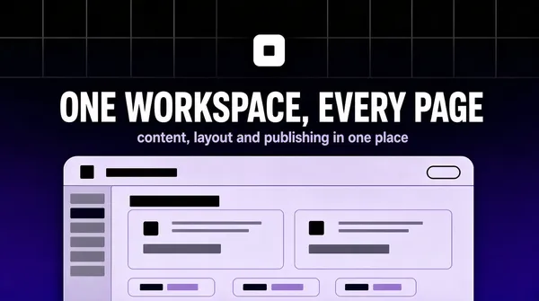
Landscape 4:3 poster, black field lifting to a deep indigo at the bottom, with a small white tile, a centred headline and a wide pale sheet rising from the bottom edge. Gradient wash with a faint grid, no watermark.
[Layout]
A field that runs from near-black at the top edge to a saturated indigo at the bottom edge, with a very faint pale grid of square lines visible only in the upper half. A small white rounded tile, about one sixteenth of the width, sits centred at about a seventh of the height, holding a single dark mark. The headline is centred at about a third of the height, one line, spanning four fifths of the width, with one shorter line of pale copy centred directly beneath it. A wide pale sheet begins just past the halfway mark, centred, its width seven eighths of the frame, with rounded top corners, cropped by the bottom edge.
[Subject]
the sheet. Its top bar carries a small square glyph at the left beside a short dark bar, and at the right a tiny outlined pill. Below, the sheet splits into a narrow left rail of six short grey rows with the second row filled darker, and a content area holding a bold bar at the top left, then two wide cards side by side, each with a small glyph and two grey bars, then a row of three short chips at the lower left. Nothing is legible.
[Headline]
"ONE WORKSPACE, EVERY PAGE" set in a bold grotesque in white, one line, centred, with slightly open tracking so it holds the width.
[Labels]
under the headline, one line in pale lavender sans: content, layout and publishing in one place
[Mood]
Near-black #09090E, indigo #1B1361, deep violet #3A2596, white #FFFFFF, pale lavender #CFC8F0. Focused and modern; the black to indigo fall gives the flat sheet somewhere to sit.
[Rules]
Every line of text must be real, correctly spelled English - no placeholder, no lorem ipsum, no gibberish, no stray or scattered letters, no phone numbers, no email addresses, no QR codes, no bracketed placeholders. Never break or hyphenate a word across two lines: each word must stay whole on one line. Never print a colour code, hex value, CSS value or any string beginning with a hash mark as text. Do not print any telephone number, street address, URL or price. No human faces, no photographic people. All interface content inside any window, card or screen is abstracted: grey bars, soft blocks and blurred shapes only - no legible microcopy anywhere.](https://files.posterlet.com/assets/generated/md/gnvao6jawzjd.webp)
![[Format]
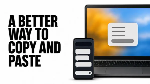
Landscape 16:9 poster, white field with an oversized black headline at the left and a laptop and phone on the right showing soft blurred colour. Bright, product-shop clean, no watermark.
[Layout]
A white field, completely flat. The headline occupies the left half, three lines, left aligned to a margin of a sixteenth of the width, starting a fifth down from the top, the lines tightly stacked so the block reads as a solid grey mass. On the right, a laptop screen is cropped by the right edge and the bottom edge: its lid occupies from about a third of the width to the frame edge and from a sixth of the height down. A phone stands in front of it, its left edge at about three quarters of the width, tilted one degree, cropped by the bottom edge, with a soft shadow.
[Subject]
the two devices, whose screens hold only soft colour. The laptop screen shows a wide blurred wallpaper of amber and blue with a single pale rounded card floating at its centre, the card holding three short grey lines and one rounded button bar. The phone screen shows a dark rounded header bar, then a column of three pale message bubbles of different widths, then a wide pale input bar with a small circular button at its right. No legible text, no faces, no photographs of people.
[Headline]
"A BETTER WAY TO COPY AND PASTE" set in an extra bold grotesque in near-black, three lines, left aligned, very tight leading, so it reads as one dense block rather than three sentences.
[Labels]
none; the devices carry blurred colour, pale cards and grey bars only
[Mood]
Pure white #FFFFFF, near-black #111111, amber #F2B24A, sky blue #7FB4E8, pale grey #EDEDED. Direct and practical; the flat white keeps all the weight on the type, the colour lives only inside the screens.
[Rules]
Every line of text must be real, correctly spelled English - no placeholder, no lorem ipsum, no gibberish, no stray or scattered letters, no phone numbers, no email addresses, no QR codes, no bracketed placeholders. Never break or hyphenate a word across two lines: each word must stay whole on one line. Never print a colour code, hex value, CSS value or any string beginning with a hash mark as text. Do not print any telephone number, street address, URL or price. No human faces, no photographic people. All interface content inside any window, card or screen is abstracted: grey bars, soft blocks and blurred shapes only - no legible microcopy anywhere.](https://files.posterlet.com/assets/generated/md/9ztcgq42x7pn.webp)
![[Format]
Landscape 16:9 poster, deep forest green field with a lighter centre wash, a centred lockup above a white settings card that is cropped by the bottom edge. Soft vignette, no watermark.
[Layout]
A deep forest green field, darkest at the four corners, lifting to a soft radial wash of lighter green behind the centre of the frame. The lockup sits centred at about a sixth of the height, the mark immediately left of the wordmark. The card begins at about a third of the height, centred, its width three quarters of the frame, with rounded top corners, and runs past the bottom edge. Everything above the card is empty.
[Subject]
one settings card. Its top section holds a bold dark bar at the left, a small green pill with a tick beside it, and at the right a toggle, half dark and half pale. Below a hairline, one grey line of small copy spans the width with a small outlined pill sitting at its right end. Below that, a short grey section heading, then four rows, each a small rounded square glyph holding a simple mark, a grey bar beside it, and a small dark pill at the right end of the row. Nothing is legible.
[Headline]
"DOCS THAT WRITE THEMSELVES" set in a clean geometric sans in warm white, one line, centred, sitting directly under the lockup as a continuation of it.
[Labels]
the lockup reads docgrove in lower case white sans beside a leaf shaped mark; the card carries bars, pills and glyphs only
[Mood]
Deep forest #0C2B1A, mid green #1E5C36, mint #8FE0B0, warm white #F6FAF4, dark slate #16211A. Grounded and calm; the green vignette makes the white card feel like a lit object in a dark room.
[Rules]
Every line of text must be real, correctly spelled English - no placeholder, no lorem ipsum, no gibberish, no stray or scattered letters, no phone numbers, no email addresses, no QR codes, no bracketed placeholders. Never break or hyphenate a word across two lines: each word must stay whole on one line. Never print a colour code, hex value, CSS value or any string beginning with a hash mark as text. Do not print any telephone number, street address, URL or price. No human faces, no photographic people. All interface content inside any window, card or screen is abstracted: grey bars, soft blocks and blurred shapes only - no legible microcopy anywhere.](https://files.posterlet.com/assets/generated/md/mf779mcrmuyx.webp)
![[Format]
Landscape 16:9 poster, pale lime field with two large soft white shapes behind a left text column and a stack of white pill rows down the right side. Flat and friendly, no watermark.
[Layout]
A pale lime field with two very large soft-edged white shapes, one rising from the lower left and one sinking from the upper right, both so pale they read as light rather than objects. The left column starts a sixteenth of the width in and a sixth down: a small lockup, then a three line headline in two weights, the third line in saturated green. The right column begins at about half the width and holds seven white pill rows stacked with even gaps, each row spanning to a sixteenth from the right edge, each with generous rounded ends.
[Subject]
the seven rows. Each row carries a small circular glyph at its left in a different accent colour, followed by one long grey bar of a length that varies from row to row, so the stack has a ragged right edge even though the pills are all the same width. There is nothing else in the frame - no device, no screenshot, no illustration.
[Headline]
"EVERY PAGE EDIT IN ONE ROW" set in a bold grotesque in deep forest green, three lines, left aligned, the first line heaviest and the third line set in brighter lime-green so it reads as the payoff.
[Labels]
the lockup reads rowstack in lower case bold sans beside a small square mark; the seven rows hold glyphs and grey bars only, never words
[Mood]
Pale lime #E6F7C4, light lime #F3FBDF, white #FFFFFF, forest green #14351C, bright green #4FA82A. Open and dependable; the stack of rows does the persuading without a single screenshot.
[Rules]
Every line of text must be real, correctly spelled English - no placeholder, no lorem ipsum, no gibberish, no stray or scattered letters, no phone numbers, no email addresses, no QR codes, no bracketed placeholders. Never break or hyphenate a word across two lines: each word must stay whole on one line. Never print a colour code, hex value, CSS value or any string beginning with a hash mark as text. Do not print any telephone number, street address, URL or price. No human faces, no photographic people. All interface content inside any window, card or screen is abstracted: grey bars, soft blocks and blurred shapes only - no legible microcopy anywhere.](https://files.posterlet.com/assets/generated/md/jlfg6kkamhie.webp)
![[Format]
Landscape 16:9 poster, pale blue field with a soft radial wash, a serif headline at the upper left and a wide white dashboard window rising from the bottom edge. Light, airy, no watermark.
[Layout]
A pale blue field carrying a faint radial texture of fine concentric rings centred just off the left edge, so the left side is slightly deeper in tone and the right side washes out to near white. The headline sits at the upper left, two lines, starting a twentieth of the width in and a twelfth down, the second line shorter than the first. A small lockup sits at the upper right, level with the top of the headline. A wide white dashboard window begins at about a third of the height, spans from a twentieth in on the left to a twentieth in on the right, has rounded corners at the top, and runs past the bottom edge.
[Subject]
the dashboard window. A thin title bar holds three small circular dots at its left, then a short dark bar, then a wide blank area. Below the bar the window splits into a narrow left rail holding seven short grey rows, and a content area holding a row of four small statistic blocks, each with a tiny glyph and two short bars, then a wide chart panel where two soft filled curves rise across a faint grid, then two bar chart panels below, one with tall thin bars, one with short wide bars. Nothing is legible and no numbers appear.
[Headline]
"EVERY PAGE, ANSWERING BACK" set in a high contrast serif in near-black, two lines, left aligned, the second line noticeably shorter, with generous leading.
[Labels]
the lockup at the upper right reads telemetra in lower case bold sans beside a small faceted cube glyph
[Mood]
Pale blue #DCEBF7, paper #F4F9FD, near-black #10161C, coral #F2A08C, mint #9FD8C0. Clean and observational; the ring texture keeps the pale field from reading as an empty artboard.
[Rules]
Every line of text must be real, correctly spelled English - no placeholder, no lorem ipsum, no gibberish, no stray or scattered letters, no phone numbers, no email addresses, no QR codes, no bracketed placeholders. Never break or hyphenate a word across two lines: each word must stay whole on one line. Never print a colour code, hex value, CSS value or any string beginning with a hash mark as text. Do not print any telephone number, street address, URL or price. No human faces, no photographic people. All interface content inside any window, card or screen is abstracted: grey bars, soft blocks and blurred shapes only - no legible microcopy anywhere.](https://files.posterlet.com/assets/generated/md/jhts2urxi4c9.webp)
![[Format]
Landscape 16:9 poster, near-black field with one editor panel rising from the lower left and a thin neon blue rim light along its edges. Cinematic glow, no watermark.
[Layout]
A near-black field, colder and darker at the top right, with a wide bloom of deep electric blue swelling behind the panel at the lower left. The panel enters from the lower left corner: its left edge and bottom edge run off the frame, its top edge sits at about a third of the height and its right edge at about two thirds of the width, with generous rounded corners on the two visible corners. A thin bright rim runs along its top and right edges, brightest at the top left corner and fading as it travels. The headline block occupies the right third, three lines, starting at about a third of the height, left aligned. A small lockup sits at the bottom right corner.
[Subject]
one editor panel. Inside it, a top row carries a pill holding a small diamond glyph followed by a blank bar, then four small square glyph marks spaced along the row. Below, a tab row holds three pills, the first filled brighter than the other two, each containing a single grey bar. Below that, a wide search field holds a tiny magnifier glyph and a long blank bar. Under the search, a short heading bar sits at the left above three list rows, each a small square glyph beside a grey bar of a different length. Every shape is abstract, nothing is legible.
[Headline]
"BUILD ANY PAGE IN AN AFTERNOON" set in a heavy grotesque in pure white, three lines, left aligned, tight leading, so the block reads as a stack of solid slabs.
[Labels]
the lockup at the bottom right reads slabkit in lower case white sans beside a small diamond glyph; the panel itself carries bars and glyphs only
[Mood]
Near-black #05070E, electric blue #2B6BFF, deep blue #0B2A6B, white #FFFFFF, slate #6E7A94. Nocturnal and confident; the single rim light draws the whole eye to the corner where the tool lives.
[Rules]
Every line of text must be real, correctly spelled English - no placeholder, no lorem ipsum, no gibberish, no stray or scattered letters, no phone numbers, no email addresses, no QR codes, no bracketed placeholders. Never break or hyphenate a word across two lines: each word must stay whole on one line. Never print a colour code, hex value, CSS value or any string beginning with a hash mark as text. Do not print any telephone number, street address, URL or price. No human faces, no photographic people. All interface content inside any window, card or screen is abstracted: grey bars, soft blocks and blurred shapes only - no legible microcopy anywhere.](https://files.posterlet.com/assets/generated/md/aibf3y81d0hz.webp)
![[Format]
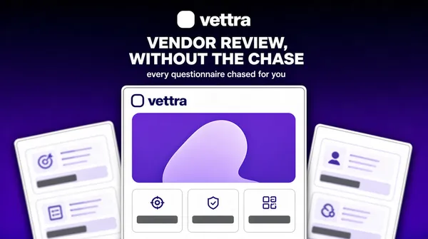
Landscape 16:9 poster, deep violet field with a small centred lockup, a centred headline and three pale app sheets overlapping along the bottom. Rich flat colour, soft sheet shadows, no watermark.
[Layout]
A violet field, almost black at the top edge and lifting to a saturated indigo near the lower third. A small lockup sits centred in the top tenth: a rounded square mark then the wordmark. The headline is centred at about a quarter down, two lines, the first line about twice the width of the second, and one short line of lighter copy sits directly beneath it. Three pale app sheets rise from below: the centre one is the largest, its top edge at about two fifths of the height, standing square to the frame and cropped by the bottom; the left one is a third shorter, tilted two degrees, its left edge running off the frame; the right one is a third shorter again, tilted two degrees the other way, its right edge running off the frame. All three are white with a hairline grey border and a soft shadow.
[Subject]
the three sheets. The centre sheet carries a small lockup at its top left, a two line dark headline block, then a wide preview panel holding a rounded violet rectangle with a pale shape inside, and beneath that three short cards in a row, each with a tiny glyph above one grey bar. The side sheets carry only pale cards and grey bars, softly out of focus at their cropped edges. No legible words anywhere inside the sheets.
[Headline]
"VENDOR REVIEW, WITHOUT THE CHASE" set in a bold geometric sans in white, two lines, centred, tight leading, the second line half the width of the first.
[Labels]
the lockup at the top reads vettra in lower case bold sans, set to the right of the rounded square mark; under the headline, one line in pale lavender sans: every questionnaire chased for you; the centre sheet repeats the same lockup at its top left, reading vettra
[Mood]
Deep violet #14032C, indigo #4B1FA8, white #FFFFFF, lavender #C9BCE8, pale grey #EDEBF2. Assured and premium; the stack of sheets gives the flat violet depth without any illustration.
[Rules]
Every line of text must be real, correctly spelled English - no placeholder, no lorem ipsum, no gibberish, no stray or scattered letters, no phone numbers, no email addresses, no QR codes, no bracketed placeholders. Never break or hyphenate a word across two lines: each word must stay whole on one line. Never print a colour code, hex value, CSS value or any string beginning with a hash mark as text. Do not print any telephone number, street address, URL or price. No human faces, no photographic people. All interface content inside any window, card or screen is abstracted: grey bars, soft blocks and blurred shapes only - no legible microcopy anywhere.](https://files.posterlet.com/assets/generated/md/d4v1qfpv9tu5.webp)
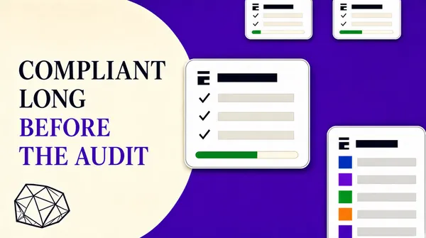
![[Format]
Landscape 4:3 poster, split between a cream panel on the left and a saturated violet field on the right, with white cards floating over the violet. Crisp flat vector, no watermark.
[Layout]
The frame splits around two fifths of the width: the left is flat cream, the right is saturated violet, and the boundary curves as a wide quarter circle near the top so the cream pushes slightly into the violet. The headline sits in the cream panel, four lines, left aligned to a margin of one twelfth, starting at about a fifth down, the last two lines set in violet so the sentence changes colour as it lands. A small line drawing sits at the bottom left of the cream panel, occupying about a tenth of the width. The violet side carries four white cards: two small ones side by side along the top edge, slightly cropped by it, one large one at the centre overlapping the split, and one tall one at the lower right cropped by both the right and bottom edges.
[Subject]
the white cards. Each has a generously rounded corner and a hairline grey border, and each holds a tiny glyph at its top left beside a bold grey bar, then two or three rows of a small grey tick glyph beside a short pale bar, and where space allows a thin pale progress track with a filled segment in green or violet. The tall card at the lower right holds a stack of five rows, each a small coloured square beside a grey bar. Nothing is legible.
[Headline]
"COMPLIANT LONG BEFORE THE AUDIT" set in a light serif in near-black, four lines, left aligned, generous leading, the third and fourth lines in saturated violet.
[Labels]
the bottom left of the cream panel holds a small abstract line drawing in near-black: a cluster of faceted planes like a cut stone, no text
[Mood]
Cream #F7F2E9, saturated violet #8B45F0, deep violet #6A28C9, near-black #1A1326, white #FFFFFF. Calm authority; the colour switch halfway through the headline does the work a second sentence usually does.
[Rules]
Every line of text must be real, correctly spelled English - no placeholder, no lorem ipsum, no gibberish, no stray or scattered letters, no phone numbers, no email addresses, no QR codes, no bracketed placeholders. Never break or hyphenate a word across two lines: each word must stay whole on one line. Never print a colour code, hex value, CSS value or any string beginning with a hash mark as text. Do not print any telephone number, street address, URL or price. No human faces, no photographic people. All interface content inside any window, card or screen is abstracted: grey bars, soft blocks and blurred shapes only - no legible microcopy anywhere.](https://files.posterlet.com/assets/generated/md/2b9ezvg6ecui.webp)
![[Format]
Landscape 16:9 poster, an almost empty pastel gradient field with a single small isometric mark and a wordmark at the centre. Soft atmospheric gradient with light grain, no watermark.
[Layout]
A full bleed pastel gradient running diagonally: violet at the upper left, lifting through pale blue in the middle and settling into mint green at the right edge, all blended with wide soft bands and a very fine grain. The mark and wordmark form one centred lockup at the middle of the frame, the mark sitting above the wordmark with a gap of about half the mark's height. Everything else in the frame is empty; there is no other object, no border and no small print.
[Subject]
one small isometric mark, about one tenth of the frame in width, built from two interlocking three dimensional blocks: a pale blue block at the left and a deep violet block at the right, each drawn with flat facets and no outline, so the pair reads as a letterform turned in space. It casts no shadow and sits directly on the gradient.
[Headline]
"CONSENTIA" set in a medium weight grotesque in white, upper and lower case with a capital C, one line, centred under the mark, neither bold nor tracked out.
[Labels]
none; the frame holds only the mark and the single word
[Mood]
Pale violet #B9B4E8, pale blue #A8C8E0, mint #A8D8C8, deep violet #3B12C4, white #FFFFFF. Quiet and confident; the refusal to say anything else is the message.
[Rules]
Every line of text must be real, correctly spelled English - no placeholder, no lorem ipsum, no gibberish, no stray or scattered letters, no phone numbers, no email addresses, no QR codes, no bracketed placeholders. Never break or hyphenate a word across two lines: each word must stay whole on one line. Never print a colour code, hex value, CSS value or any string beginning with a hash mark as text. Do not print any telephone number, street address, URL or price. No human faces, no photographic people. All interface content inside any window, card or screen is abstracted: grey bars, soft blocks and blurred shapes only - no legible microcopy anywhere.](https://files.posterlet.com/assets/generated/md/gsoiwjrvbfa7.webp)
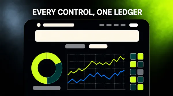
![[Format]
Landscape 16:9 poster, near-black field with a green bloom in the upper right, a centred white headline and a wide dark sheet below it. Soft internal glow, no watermark.
[Layout]
A near-black field with a wide diffuse bloom of acid green entering from the upper right corner and fading out at about three fifths of the width, and a colder grey-blue haze in the upper left. The headline sits centred at about one ninth down from the top, one line, spanning about three quarters of the width. A wide rounded sheet begins a quarter of the way down, centred, its width five sixths of the frame, and runs past the bottom edge so it is cropped. Inside the sheet, a single column of content is centred.
[Subject]
the sheet, which reads as an app screenshot seen from the front. Its top strip carries a small round mark at the left beside a short pale bar, then a row of four tiny grey bars at the centre right and one white pill at the far right. Below the strip a large pale headline bar sits centred, then one short grey bar, then two small pills side by side. The lower half of the sheet is filled by a dashboard: a ring chart in lime and deep teal at the left with a short grey bar beneath it, two overlapping line charts at the centre drawn in thin lime and blue strokes over a faint grid, and a narrow column of small square tiles at the right. Every shape is abstract and no numbers or words appear.
[Headline]
"EVERY CONTROL, ONE LEDGER" set in a medium weight grotesque in white, one line, centred, with slightly open tracking so it reads as a statement rather than a label.
[Labels]
none; the sheet carries pale bars, a ring chart and line charts only
[Mood]
Near-black #0B0C0A, acid green #A8E22F, deep teal #0F3B33, white #FFFFFF, slate #6B7070. Serious and quietly technical; the green bloom is the only colour and the dashboard does the persuading.
[Rules]
Every line of text must be real, correctly spelled English - no placeholder, no lorem ipsum, no gibberish, no stray or scattered letters, no phone numbers, no email addresses, no QR codes, no bracketed placeholders. Never break or hyphenate a word across two lines: each word must stay whole on one line. Never print a colour code, hex value, CSS value or any string beginning with a hash mark as text. Do not print any telephone number, street address, URL or price. No human faces, no photographic people. All interface content inside any window, card or screen is abstracted: grey bars, soft blocks and blurred shapes only - no legible microcopy anywhere.](https://files.posterlet.com/assets/generated/md/7jbn6p0dejqb.webp)
![[Format]
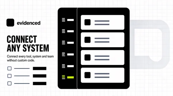
Landscape 16:9 poster, white field with a faint grid, a left text column and a dark interface panel overlapping the centre. Flat product-marketing look, crisp edges, no watermark.
[Layout]
A white field overlaid with an extremely faint pale grid of half-inch squares. A giant translucent mark sits in the background at the right third, so pale it reads as a watermark of a rounded square with a notch cut out of it, cropped by the right edge. The left column starts a twelfth of the width in and a sixth down: a small rounded square icon beside the wordmark, a three line paragraph of mid grey copy beneath it, then three rows spaced evenly, each a small line glyph followed by one short bold bar. The dark panel starts just left of centre and runs past the right edge, occupying the full height from a tenth down to a tenth up.
[Subject]
the dark panel. It is a near-black rounded rectangle split into a narrow dark rail at its left and a light content area at its right, with no visible border. The rail carries six rows, each a tiny pale glyph beside a short pale bar, the fifth row highlighted with a single lime dot. The content area holds four white cards stacked with even gaps, each card carrying a small square icon at its left and two short grey bars at its right. Nothing is legible.
[Headline]
"CONNECT ANY SYSTEM" set in a heavy grotesque in near-black, upper case, one line, left aligned, sitting just under the lockup and spanning two thirds of the left column.
[Labels]
the lockup reads evidenced in lower case bold sans beside the icon; the paragraph is three short lines of grey sans; the checklist rows carry bold bars only, never words
[Mood]
Pure white #FFFFFF, grid grey #EEF0F2, near-black #101418, mid grey #6E7480, lime #C6E63C. Precise and systematic; the pale grid and the watermark mark make the white feel engineered rather than empty.
[Rules]
Every line of text must be real, correctly spelled English - no placeholder, no lorem ipsum, no gibberish, no stray or scattered letters, no phone numbers, no email addresses, no QR codes, no bracketed placeholders. Never break or hyphenate a word across two lines: each word must stay whole on one line. Never print a colour code, hex value, CSS value or any string beginning with a hash mark as text. Do not print any telephone number, street address, URL or price. No human faces, no photographic people. All interface content inside any window, card or screen is abstracted: grey bars, soft blocks and blurred shapes only - no legible microcopy anywhere.](https://files.posterlet.com/assets/generated/md/2vf0h9f89km3.webp)
![[Format]
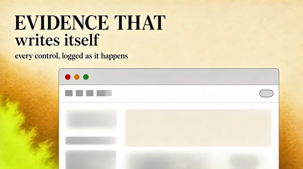
Landscape 16:9 poster, warm cream paper field with a serif headline at the upper left and a browser window rising from the bottom edge. Fine paper grain, printed feel, no watermark.
[Layout]
A cream field with a barely visible paper grain and a soft amber wash sinking toward the lower left corner, where a cloud of acid lime bleeds in from the edge and fades out before it reaches the middle. The headline occupies the upper left, two lines, starting a twentieth of the width in from the left and a tenth down from the top, the second line about half the size of the first. A browser window rises from the bottom edge, its top edge at about two fifths of the height, its left edge a sixth of the width in and its right edge running past the frame so it is cropped. The upper right quadrant stays empty.
[Subject]
one browser window only. Its title bar is pale grey with three circular dots at the left in red, amber and green, and no tab strip. The interior is white and holds a wide pale band across the top, below it a row of short grey bars at the left and a small rounded pill at the right, and below that a soft pale block filling the rest of the visible area. Nothing inside is legible.
[Headline]
"EVIDENCE THAT WRITES ITSELF" set in a large high contrast serif in near-black, upper and lower case, two lines, left aligned, the second line set in a lighter weight at half the size.
[Labels]
the second headline line reads in the same serif at half the size: every control, logged as it happens
[Mood]
Cream #F3EBDC, near-black #17201C, acid lime #D7F03B, pale grey #E6E6E2. Warm and editorial; the paper grain keeps a mostly empty frame from looking like a mockup.
[Rules]
Every line of text must be real, correctly spelled English - no placeholder, no lorem ipsum, no gibberish, no stray or scattered letters, no phone numbers, no email addresses, no QR codes, no bracketed placeholders. Never break or hyphenate a word across two lines: each word must stay whole on one line. Never print a colour code, hex value, CSS value or any string beginning with a hash mark as text. Do not print any telephone number, street address, URL or price. No human faces, no photographic people. All interface content inside any window, card or screen is abstracted: grey bars, soft blocks and blurred shapes only - no legible microcopy anywhere.](https://files.posterlet.com/assets/generated/md/368g0xhxk2sq.webp)
![[Format]
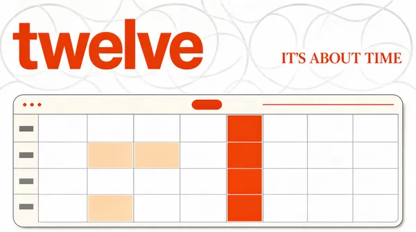
Landscape 16:9 poster, white paper field with a faint geometric line pattern, one giant orange wordmark cropped at the left and a complete calendar window rising from the bottom edge. Crisp print finish, no watermark.
[Layout]
A white field carrying an extremely faint pale grey pattern of interlocking circles and arcs across the upper half, like a technical print test sheet. The wordmark sits at the upper left, fully inside the frame with a small margin on both its left and top, set in lower case and very large - its height about one fifth of the frame. A single short orange sentence sits at the upper right, vertically level with the lower part of the wordmark. The calendar window occupies the bottom half: a wide pale sheet with a rounded top corner on each side, squared off by the bottom edge of the frame, spanning from one eighth in from the left to one eighth in from the right.
[Subject]
the calendar sheet only. Its top strip carries a row of three tiny dots at the left, a small pill at the centre and a thin search line at the right. Below that, seven even columns of pale cells fill the sheet, most cells empty white, a handful tinted pale apricot, and one narrow vertical column of cells in saturated orange to mark today. A thin left rail column sits outside the seven, holding short grey bars. Nothing inside is legible.
[Headline]
"IT'S ABOUT TIME" set in a medium weight serif in the same saturated orange as the wordmark, one line, right aligned to the right margin, letter spacing normal.
[Labels]
the wordmark at the upper left spells twelve in lower case heavy grotesque, complete and uncropped; no other words appear in the frame
[Mood]
Paper white #FCFCFA, pattern grey #E8E8E4, saturated orange #F5460A, apricot #F8D9C4. Editorial and restrained; the faint line pattern makes the white feel like a printed page rather than an empty screen.
[Rules]
Every line of text must be real, correctly spelled English - no placeholder, no lorem ipsum, no gibberish, no stray or scattered letters, no phone numbers, no email addresses, no QR codes, no bracketed placeholders. Never break or hyphenate a word across two lines: each word must stay whole on one line. Never print a colour code, hex value, CSS value or any string beginning with a hash mark as text. Do not print any telephone number, street address, URL or price. No human faces, no photographic people. All interface content inside any window, card or screen is abstracted: grey bars, soft blocks and blurred shapes only - no legible microcopy anywhere.](https://files.posterlet.com/assets/generated/md/2z0f0jvov14i.webp)
![[Format]
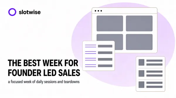
Landscape 16:9 poster, white field with a huge pale lilac ellipse behind a left text block and a cluster of floating UI fragments on the right. Clean flat vector, soft edges, no watermark.
[Layout]
A white field. A very pale lilac ellipse, about twice as wide as it is tall, fills the right two thirds of the frame behind everything and fades to white at its rim. The logo lockup sits at the left margin, a quarter of the way down: a small ring mark in violet then the wordmark. The headline starts below it at about two fifths of the height, three lines, left aligned to the same margin, the third line set in violet so it reads as the punchline. A cluster of fragments occupies the right half at three depths: one wide browser panel at the top right carrying a two by two grid of grey blocks, one small pale card overlapping its lower left corner with four short rows, and one narrow column card at the lower right holding three stacked rows.
[Subject]
the fragments only. The wide panel is a window with a thin pale border and a row of three tiny dots at its top left, its interior holding four soft grey rectangles in a two by two grid - no faces, no photographs, no screenshots. The overlapping card holds four rows, each a thin violet line above a short grey bar. The lower column card holds three rows of a small grey tile beside two grey bars. All interiors abstract.
[Headline]
"THE BEST WEEK FOR FOUNDER LED SALES" set in a large neo grotesque in near-black, three lines, left aligned, normal leading, the third line in saturated violet.
[Labels]
the lockup at the upper left reads slotwise in lower case bold sans, set to the right of the ring in near-black; under the third headline line, one short line in mid grey sans: a focused week of daily sessions and teardowns
[Mood]
Pure white #FFFFFF, pale lilac #EDE7FC, saturated violet #6B4BE0, near-black #15141A, mid grey #9A9AA5. Helpful and open; the washing of lilac keeps a lot of white while still giving the frame a shape.
[Rules]
Every line of text must be real, correctly spelled English - no placeholder, no lorem ipsum, no gibberish, no stray or scattered letters, no phone numbers, no email addresses, no QR codes, no bracketed placeholders. Never break or hyphenate a word across two lines: each word must stay whole on one line. Never print a colour code, hex value, CSS value or any string beginning with a hash mark as text. Do not print any telephone number, street address, URL or price. No human faces, no photographic people. All interface content inside any window, card or screen is abstracted: grey bars, soft blocks and blurred shapes only - no legible microcopy anywhere.](https://files.posterlet.com/assets/generated/md/u4wf9tfo5or4.webp)
![[Format]
Landscape 16:9 poster, plain warm cream field with one centred typographic statement and nothing else. Flat, printed, absolutely no gradients or shadows.
[Layout]
A single flat cream field covering the whole frame. A small solid red square mark sits centred in the top eighth of the height, about one fortieth of the width. The statement occupies the middle band, three centred lines stacked with tight leading, the block spanning about four fifths of the width and vertically centred a little above the middle of the frame. One short line of small type sits centred under the block. Both side margins and the bottom fifth of the frame stay completely empty.
[Subject]
type only. There is no illustration, no device, no interface, no icon other than the small red square. Nothing is drawn behind the words and nothing overlaps them.
[Headline]
"THE WEEK PLANS ITSELF" set in an extra bold grotesque in near-black, three centred lines with tight leading, the first line widest and the last line breaking short so the block ends on a stub.
[Labels]
under the block, one centred line in near-black at a third the size: daymark, set in lower case bold sans, nothing else anywhere in the frame
[Mood]
Warm cream #FBF6E9, near-black #111111, signal red #E52521. Blunt and confident; the emptiness above and below the statement is what makes it feel expensive.
[Rules]
Every line of text must be real, correctly spelled English - no placeholder, no lorem ipsum, no gibberish, no stray or scattered letters, no phone numbers, no email addresses, no QR codes, no bracketed placeholders. Never break or hyphenate a word across two lines: each word must stay whole on one line. Never print a colour code, hex value, CSS value or any string beginning with a hash mark as text. Do not print any telephone number, street address, URL or price. No human faces, no photographic people. All interface content inside any window, card or screen is abstracted: grey bars, soft blocks and blurred shapes only - no legible microcopy anywhere.](https://files.posterlet.com/assets/generated/md/6h43e7l4w7m4.webp)
![[Format]
Landscape 4:3 poster, bright lime field split by a wide white panel down the right third and a dark green headline block at the left. Flat, high key, no watermark.
[Layout]
A lime green field with a faint diagonal wash lighter at the centre left. The white panel occupies the right third, running from the top edge to the bottom edge, with a single hairline separating it from the lime. In the lime area, a small logo lockup sits at the upper left, a quarter of the way down from the top. The headline starts at about two fifths of the height, three lines, left aligned to a margin of one twelfth, the block reaching two thirds of the way across the lime area. One short subcopy line sits under it, then three small pill marks spread horizontally far below near the lower left. The panel holds a narrow hairline bar across its top, then a short column of chat rows.
[Subject]
the panel contents. Three rows sit at the left, each a pale rounded rectangle holding one short grey bar; between them, two small dark pills with a thin waveform of vertical bars stand at the right, and one wider pale row at the bottom of the column carries a small dark green square icon beside two grey bars. Nothing is legible, no faces, no photographs.
[Headline]
"YOUR WEEK ON AUTOPILOT" set in a medium weight grotesque in deep forest green, three lines, left aligned, generous leading, the third line breaking short.
[Labels]
under the headline, one line in dark green sans at half the size; near the lower left, three short lines separated by small dots, all in dark green, no numbers
[Mood]
Lime #C6F24B, light lime #E3FA9A, white #FFFFFF, forest green #10321A, pale grey #E8ECE6. Bright and optimistic; the split panel gives the lime somewhere to stop instead of washing across the whole frame.
[Rules]
Every line of text must be real, correctly spelled English - no placeholder, no lorem ipsum, no gibberish, no stray or scattered letters, no phone numbers, no email addresses, no QR codes, no bracketed placeholders. Never break or hyphenate a word across two lines: each word must stay whole on one line. Never print a colour code, hex value, CSS value or any string beginning with a hash mark as text. Do not print any telephone number, street address, URL or price. No human faces, no photographic people. All interface content inside any window, card or screen is abstracted: grey bars, soft blocks and blurred shapes only - no legible microcopy anywhere.](https://files.posterlet.com/assets/generated/md/5bc3cvrlx4i1.webp)
![[Format]
Landscape 16:9 poster, soft peach gradient field with a heavy red serif wordmark at the upper left, white task cards drifting across the middle and a pale phone frame cropped at the right. Soft and rounded, no watermark.
[Layout]
A peach field that is palest at the centre and deepens to a warm rose at the upper left and lower right, with a large soft diagonal band of lighter peach crossing behind the middle. The wordmark sits at the upper left, two lines, very large, starting at about one twentieth of the height. Three white cards float across the middle at different depths and angles: one small, tilted three degrees, at the left and lower; one wide, level, at the centre; one small at the upper centre, overlapping the phone. The phone sits at the right, its left edge at about three fifths of the width, cropped by the bottom edge, tilted two degrees.
[Subject]
the cards and the phone. Each card is pure white with generously rounded corners and a soft shadow, holding on its left a ring outline in a single accent colour and to its right one bold grey bar plus one thinner accent bar underneath - no readable text, no tick marks. The phone is a pale silver slab with a rounded body and a thin darker inner border, its screen holding a short column of pale rows and, low in the screen, a small dark circle flanked by a row of vertical audio bars in warm red.
[Headline]
"MEET YOUR WEEK" set in a heavy serif in warm red, upper and lower case, two lines, left aligned, tight leading, the second line set slightly right of the first.
[Labels]
none; the cards and the phone screen carry bold grey bars and coloured pills only, never words
[Mood]
Peach #FBDCCB, rose #F2B39B, warm red #D8452F, white #FFFFFF, slate #4A4A52. Soft and friendly; the red serif stops the peach from turning saccharine.
[Rules]
Every line of text must be real, correctly spelled English - no placeholder, no lorem ipsum, no gibberish, no stray or scattered letters, no phone numbers, no email addresses, no QR codes, no bracketed placeholders. Never break or hyphenate a word across two lines: each word must stay whole on one line. Never print a colour code, hex value, CSS value or any string beginning with a hash mark as text. Do not print any telephone number, street address, URL or price. No human faces, no photographic people. All interface content inside any window, card or screen is abstracted: grey bars, soft blocks and blurred shapes only - no legible microcopy anywhere.](https://files.posterlet.com/assets/generated/md/61g2wqmica58.webp)
![[Format]
Landscape 16:9 poster, a soft blurred gradient field in amber, blue and plum with one crisp white app window floating in the centre. Photographic gradient, sharp window, no watermark.
[Layout]
The background is a full bleed blurred gradient: warm amber sweeping from the top left, a band of deep blue crossing the lower left, and plum rising from the right edge, all heavily out of focus with soft wide bands rather than hard edges. One white window floats over it, centred, its top edge at about one twelfth of the height and its bottom edge at about fifteen sixteenths, its width four fifths of the frame, with a soft shadow beneath it so it reads as lifted off the gradient. Below the window's bottom edge, a single line of small pale type sits centred on the gradient.
[Subject]
one app window. The window has rounded corners, a thin grey title bar with a row of three tiny dots at its left, a narrow icon rail down its left side, and a wide content area split into two columns: the left column holds a stack of pale cards with short grey bars, the right column holds a vertical thread of alternating pale bars of two widths. A thin vertical divider separates the columns. Nothing inside is legible, there are no photographs and no faces.
[Headline]
"YOUR WEEK IN ONE WINDOW" set in small caps sans in white, one line, centred on the gradient just under the window, wide letter spacing.
[Labels]
none; the window interiors are grey bars and blocks only
[Mood]
Amber #E9A24B, deep blue #2C4FA8, plum #7B3E6B, white #FFFFFF, pale grey #E7E7EA. Warm and tactile; the blurred colour does the emotional work while the window stays completely sharp.
[Rules]
Every line of text must be real, correctly spelled English - no placeholder, no lorem ipsum, no gibberish, no stray or scattered letters, no phone numbers, no email addresses, no QR codes, no bracketed placeholders. Never break or hyphenate a word across two lines: each word must stay whole on one line. Never print a colour code, hex value, CSS value or any string beginning with a hash mark as text. Do not print any telephone number, street address, URL or price. No human faces, no photographic people. All interface content inside any window, card or screen is abstracted: grey bars, soft blocks and blurred shapes only - no legible microcopy anywhere.](https://files.posterlet.com/assets/generated/md/2qv9gc50v1qt.webp)