
About app screenshots
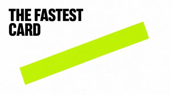
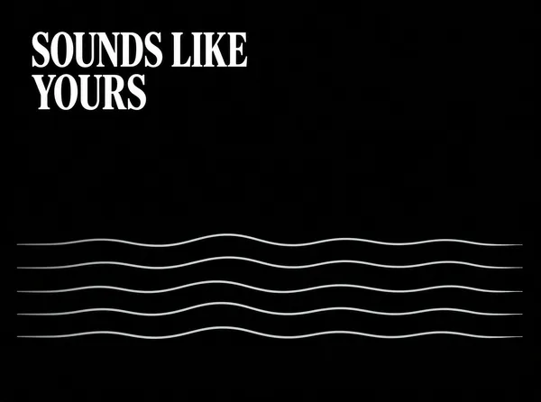
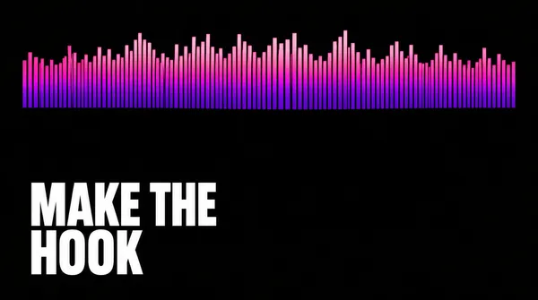
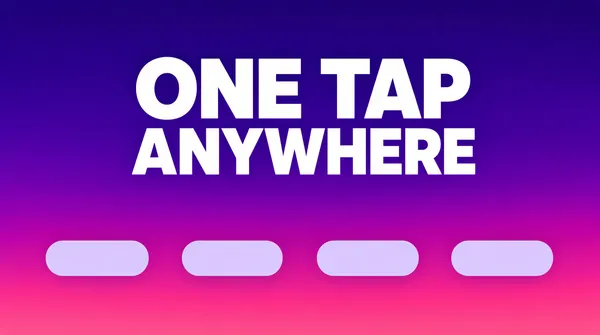
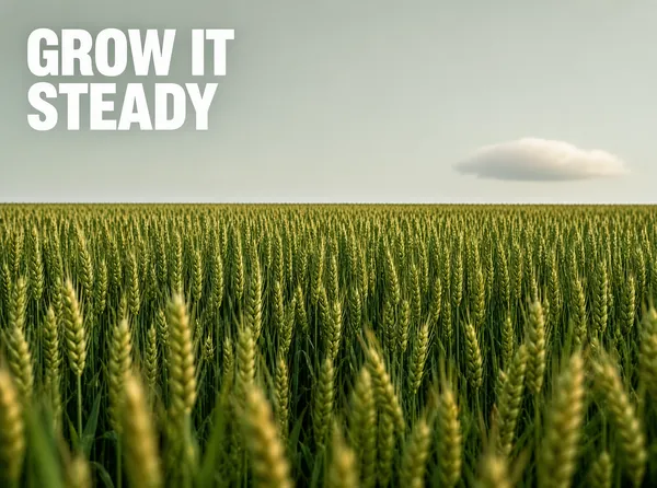
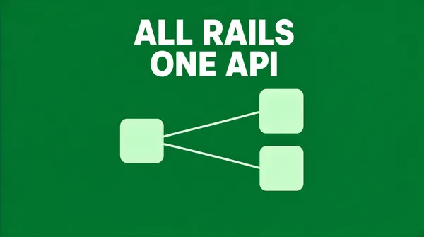
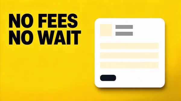
An App Store listing gives you ten screenshot slots and a fraction of a second to be understood. Most apps fill them with unedited captures, which is why so many product pages read as grey mush at the size a phone actually displays them. These layouts treat the slot the way a store page should: one claim, one device, one colour, and the interface demoted to evidence.
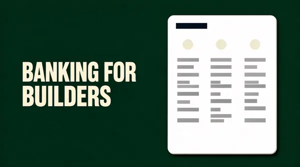
The set covers both jobs a store screenshot has to do. Some layouts carry an announcement - a date, a version, a "we are live" - while others walk through a feature with the capture cropped inside a frame. Both keep the same grid, so a listing built from mixed pieces still looks deliberate rather than assembled by three different teams.
What size should an App Store screenshot be?
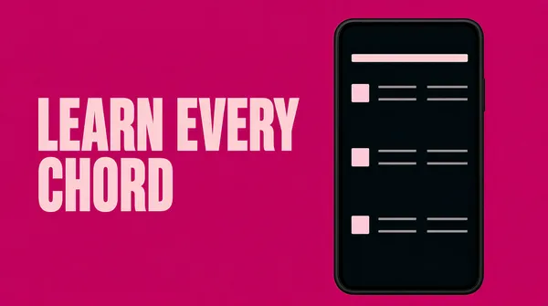
App Store Connect asks for a small set of fixed sizes: 1320 x 2868 for the 6.9-inch iPhone and 2064 x 2752 for the 13-inch iPad, plus 1242 x 2688 if you still ship a 6.5-inch set. Every layout here is designed at the ratio rather than at the pixel size, so a portrait piece regenerates at 9:16 without re-cropping the headline or moving the device.
Why do the first two screenshots matter more than the other eight?
In search results the store shows the first two or three images before anyone taps through. The remaining slots are only seen by people who already decided to look, which means slot one is doing the work of a landing-page hero. Put the single strongest claim there, and stop treating it as a gallery of everything the app can do.
How much text should one screenshot carry?
One headline of two to five words, plus at most one support line. Anything longer has to be read rather than scanned, and nobody reads a store listing. If the claim needs a subordinate clause to survive, it is the wrong claim.
Do these work for Google Play too?
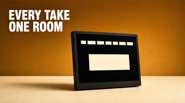
Yes, with one addition. Play uses the same 9:16 and 16:9 phone ratios, but the listing also wants a 1024 x 500 feature graphic that appears in search and category pages. The landscape layouts here are built for that slot: the headline sits in the left third, so the graphic can be cropped from either side without cutting a word.
Portrait, square or landscape?
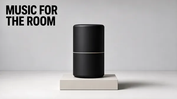
Portrait for the store itself, because the slot is portrait on both stores and the image is shown almost at full width. Landscape for the feature graphic, a press kit, a site hero or a launch gallery. Square for anywhere a listing also has to survive as a thumbnail: a social card, a partner's "available on" badge, an embed inside a review.
Can one set carry both a launch and a feature list?
Keep them as separate pieces. A launch screenshot is a moment: date, status, one line. A feature screenshot is an explanation: it needs the interface visible and legible. Mixing the two gives a slot that is neither loud enough to stop a scroll nor clear enough to explain anything, and that muddle is what makes a listing feel unfinished.
Should the device frame stay on?
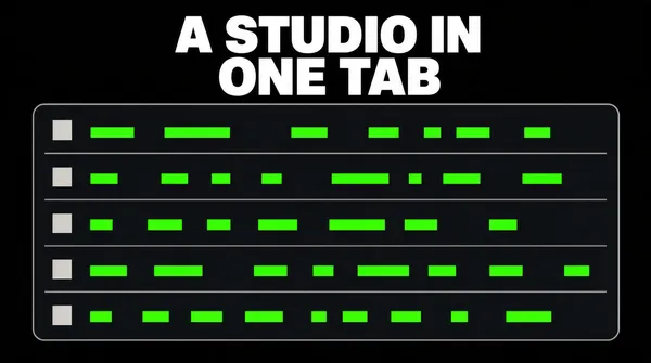
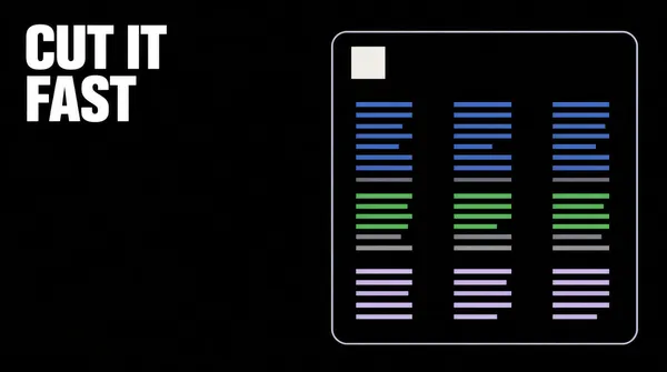
Only while the frame is carrying information. A phone shape tells the reader the product is an app before they have read a word, which is worth a lot in a store grid. For a web tool, a changelog or a developer release, drop the frame and let the window be cropped by the edges of the poster - the same rule that keeps an announcement from looking like a software brochure.
Where does the headline go when the capture is busy?
Never on top of the interface. Captures have their own rhythm - toolbars, panes, gutters - and type laid over them fights every one of those lines. Put the headline in the empty third of the frame, or push the device down so it bleeds off the bottom edge. The best version of the pattern lets the frame be cropped by the poster, so the product reads as bigger than the image containing it.
All interface content in these layouts is abstracted on purpose: grey bars, soft blocks and blurred shapes instead of legible microcopy, so the poster survives thumbnail size and never ships someone else's UI text as decoration.