About app screenshots
An App Store listing gives you ten screenshot slots and a fraction of a second to be understood. Most apps fill them with unedited captures, which is why so many product pages read as grey mush at the size a phone actually displays them. These layouts treat the slot the way a store page should: one claim, one device, one colour, and the interface demoted to evidence.
The set covers both jobs a store screenshot has to do. Some layouts carry an announcement - a date, a version, a "we are live" - while others walk through a feature with the capture cropped inside a frame. Both keep the same grid, so a listing built from mixed pieces still looks deliberate rather than assembled by three different teams.
What size should an App Store screenshot be?
App Store Connect asks for a small set of fixed sizes: 1320 x 2868 for the 6.9-inch iPhone and 2064 x 2752 for the 13-inch iPad, plus 1242 x 2688 if you still ship a 6.5-inch set. Every layout here is designed at the ratio rather than at the pixel size, so a portrait piece regenerates at 9:16 without re-cropping the headline or moving the device.
Why do the first two screenshots matter more than the other eight?
In search results the store shows the first two or three images before anyone taps through. The remaining slots are only seen by people who already decided to look, which means slot one is doing the work of a landing-page hero. Put the single strongest claim there, and stop treating it as a gallery of everything the app can do.
How much text should one screenshot carry?
One headline of two to five words, plus at most one support line. Anything longer has to be read rather than scanned, and nobody reads a store listing. If the claim needs a subordinate clause to survive, it is the wrong claim.
Do these work for Google Play too?
Yes, with one addition. Play uses the same 9:16 and 16:9 phone ratios, but the listing also wants a 1024 x 500 feature graphic that appears in search and category pages. The landscape layouts here are built for that slot: the headline sits in the left third, so the graphic can be cropped from either side without cutting a word.
Portrait, square or landscape?
Portrait for the store itself, because the slot is portrait on both stores and the image is shown almost at full width. Landscape for the feature graphic, a press kit, a site hero or a launch gallery. Square for anywhere a listing also has to survive as a thumbnail: a social card, a partner's "available on" badge, an embed inside a review.
Can one set carry both a launch and a feature list?
Keep them as separate pieces. A launch screenshot is a moment: date, status, one line. A feature screenshot is an explanation: it needs the interface visible and legible. Mixing the two gives a slot that is neither loud enough to stop a scroll nor clear enough to explain anything, and that muddle is what makes a listing feel unfinished.
Should the device frame stay on?
Only while the frame is carrying information. A phone shape tells the reader the product is an app before they have read a word, which is worth a lot in a store grid. For a web tool, a changelog or a developer release, drop the frame and let the window be cropped by the edges of the poster - the same rule that keeps an announcement from looking like a software brochure.
Where does the headline go when the capture is busy?
Never on top of the interface. Captures have their own rhythm - toolbars, panes, gutters - and type laid over them fights every one of those lines. Put the headline in the empty third of the frame, or push the device down so it bleeds off the bottom edge. The best version of the pattern lets the frame be cropped by the poster, so the product reads as bigger than the image containing it.
All interface content in these layouts is abstracted on purpose: grey bars, soft blocks and blurred shapes instead of legible microcopy, so the poster survives thumbnail size and never ships someone else's UI text as decoration.
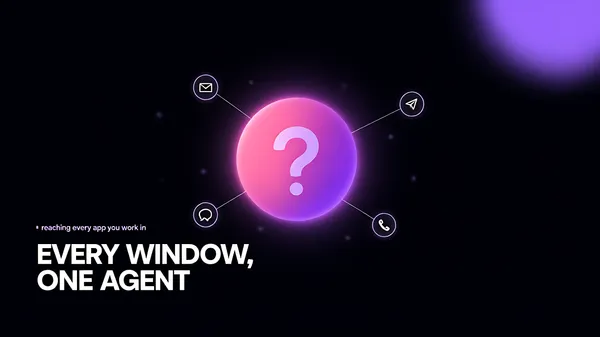
![[Format]
Landscape 16:9 poster, near-black field with one large glowing orb and hairline connections, plus a text block in the lower left. Soft light bloom, no watermark.
[Layout]
A near-black field with a faint violet bloom in the upper right. A large orb sits right of centre at about three fifths of the width, its diameter about a third of the frame width, glowing from within with a magenta core fading to violet then to nothing. Hairline connectors leave the orb at five angles and terminate in small circular chips of about one sixteenth the frame width, scattered around it at different distances. The top left corner stays completely empty. In the lower left, an eyebrow line of four short words sits above a four line headline block that runs to just past the middle of the width.
[Subject]
the orb and the chips. The orb is a soft radial gradient with a bright hot centre and a wide diffuse halo, and it holds one abstract mark inside: a thick curved stroke, like a question mark without its dot, rendered in pale violet. Each chip is a dark disc with a one pixel violet ring, glowing faintly, holding a simple white glyph - an envelope, a speech bubble, a paper plane, a puzzle piece, a phone handset - all drawn as plain line icons, none resembling a real company logo. Tiny out-of-focus particles float between them.
[Headline]
"EVERY WINDOW, ONE AGENT" set in a bold grotesque in white, four short lines, left aligned, the second line indented slightly and the last line running past the others so the block has a ragged right edge.
[Labels]
above the headline, one small line in violet sans with a tiny square bullet before it: reaching every app you work in
[Mood]
Near-black #08070C, magenta #D6338C, violet #7B3FE4, hot pink #F26FB2, white #FFFFFF. Nocturnal and electric; the bloom is the whole image and the type block keeps it grounded.
[Rules]
Every line of text must be real, correctly spelled English - no placeholder, no lorem ipsum, no gibberish, no stray or scattered letters, no phone numbers, no email addresses, no QR codes, no bracketed placeholders. Never break or hyphenate a word across two lines: each word must stay whole on one line. Never print a colour code, hex value, CSS value or any string beginning with a hash mark as text. Do not print any telephone number, street address, URL or price. No human faces, no photographic people. All interface content inside any window, card or screen is abstracted: grey bars, soft blocks and blurred shapes only - no legible microcopy anywhere.](https://files.posterlet.com/assets/generated/md/813qd3dtenaf.webp)
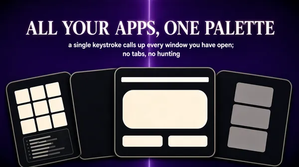
![[Format]
Landscape 16:9 poster, deep violet field with a centred serif headline and a fan of dark cards along the bottom edge. Matte, poster-flat, no watermark.
[Layout]
A violet field that is lighter just above the centre and sinks to a near-black purple at the four corners, with a faint vertical seam of light running down the middle. The headline sits centred in the upper fifth, one line, spanning about two thirds of the width. Two short lines of centred subcopy sit directly beneath it. From the lower third down, four dark rounded cards overlap in a loose fan: the leftmost is tilted ten degrees and pushed partly off the left edge, the next is tilted four degrees, the middle one stands almost square and sits nearest the viewer, and the rightmost is tilted eight degrees the other way and pushed off the right edge. Each card is cropped by the other, so the fan reads as one mass of dark panels rather than four separate objects.
[Subject]
four charcoal cards with rounded corners and thin lighter borders, arranged as a fanned pile. The middle card carries a small bright header strip near its top edge. Inside the cards: the left one holds a six-cell grid of pale square tiles, the middle one holds a pale inset panel with a wide rounded block above two short bars, the right one holds a tall column of three stacked grey blocks, and the far-left one holds a small dark code block of eight short lines in three tones of grey. All interiors are abstract - no readable text, no real photographs, no logos.
[Headline]
"ALL YOUR APPS, ONE PALETTE" set in a heavy transitional serif in warm white, one line, centred, with generous letter spacing and a very slight glow so it lifts off the violet.
[Labels]
beneath the headline, two centred lines in pale lilac sans, the second line shorter than the first and set tighter: a single keystroke calls up every window you have open; no tabs, no hunting
[Mood]
Deep violet #2E0F52, lighter violet #5B2A8C, warm white #FDF6EC, charcoal #17141C, lilac #C9B6E4. Confident and slightly theatrical; the violet does the branding and the fan of dark cards gives the emptiness a floor.
[Rules]
Every line of text must be real, correctly spelled English - no placeholder, no lorem ipsum, no gibberish, no stray or scattered letters, no phone numbers, no email addresses, no QR codes, no bracketed placeholders. Never break or hyphenate a word across two lines: each word must stay whole on one line. Never print a colour code, hex value, CSS value or any string beginning with a hash mark as text. Do not print any telephone number, street address, URL or price. No human faces, no photographic people. All interface content inside any window, card or screen is abstracted: grey bars, soft blocks and blurred shapes only - no legible microcopy anywhere.](https://files.posterlet.com/assets/generated/md/hgx3vwli33hf.webp)
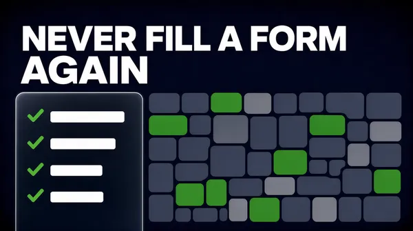
![[Format]
Landscape 4:3 poster, near-black navy field with an oversized white headline and a translucent checklist card over a mosaic of regions. Crisp flat vector look, no watermark.
[Layout]
A navy field that is almost black, with a barely visible vignette darker at the corners. The headline occupies the top third, two lines, left aligned to a margin of about one twelfth of the width, breaking so the first line is shorter than the second. The lower two thirds are filled edge to edge by a mosaic of small rounded rectangles in two greys, with roughly one in six of them filled in a saturated green. One rounded translucent card sits over the mosaic at the left, its top edge level with the top of the mosaic and its bottom reaching a little past the frame, about two fifths of the width. Inside the card, four rows are stacked with equal spacing, each a small green check glyph followed by a short white bar.
[Subject]
the mosaic and the card, nothing else. The mosaic is about forty small rounded rectangles of uneven size laid out like administrative regions, each separated by a hairline of the background colour, all in flat matt grey except the green ones which are the same shape and size. The card is a dark glass panel with a one pixel lighter edge, holding no icons other than the four check marks.
[Headline]
"NEVER FILL A FORM AGAIN" set in an extra bold geometric sans in pure white, two lines, left aligned, so large that the second line nearly reaches the right margin, with tight leading and flat terminals.
[Labels]
none; the four rows inside the card are short white bars of differing lengths, and the mosaic carries no labels at all
[Mood]
Midnight navy #0A0E28, slate grey #2B3149, grass green #1E9E6A, pure white #FFFFFF. Authoritative and quiet; the massed grey regions make the green ones read as work already done.
[Rules]
Every line of text must be real, correctly spelled English - no placeholder, no lorem ipsum, no gibberish, no stray or scattered letters, no phone numbers, no email addresses, no QR codes, no bracketed placeholders. Never break or hyphenate a word across two lines: each word must stay whole on one line. Never print a colour code, hex value, CSS value or any string beginning with a hash mark as text. Do not print any telephone number, street address, URL or price. No human faces, no photographic people. All interface content inside any window, card or screen is abstracted: grey bars, soft blocks and blurred shapes only - no legible microcopy anywhere.](https://files.posterlet.com/assets/generated/md/f81elhy7qwdn.webp)
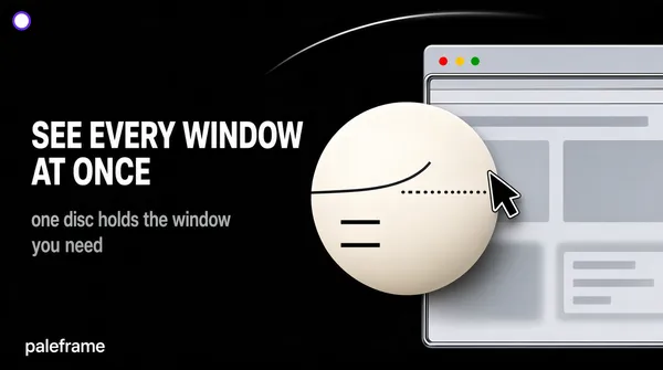
![[Format]
Landscape 16:9 poster, pure black field with a bright white disc on the right and a text block on the left. High contrast, minimal, no watermark.
[Layout]
A black field, absolutely flat except for one thin curved arc sweeping through the upper right quadrant and fading before it reaches the middle. A circular purple mark sits at the top left corner, small. The text block occupies the left half: a two line headline starting at about two fifths of the height, then four lines of grey copy beneath it, all left aligned to the same margin. A small wordmark-like line sits at the bottom left corner. On the right, a large pale interface window is cropped by the right edge, and a bright white disc sits over it, overlapping its left half and reaching almost to the centre of the frame.
[Subject]
the disc and the window behind it. The disc is a smooth sphere in warm white, lit from the upper left so it has a soft gradient and a faint shadow at its lower right, and it carries two thin dark curve segments and a short dotted line across its face, plus two small dark bars of text at its lower left. The window behind is a pale grey browser sheet with a row of tiny traffic-light dots at its top left corner, thin chrome lines, and a few blocks of pale grey content that blur into the disc. A black arrow cursor with a white outline sits on the disc's right edge, pointing up-left.
[Headline]
"SEE EVERY WINDOW AT ONCE" set in a bold neutral sans in white, two lines, left aligned, the second line noticeably shorter, with normal leading and no tracking.
[Labels]
under the headline, four short lines in mid grey sans, the last line only half as long as the first: one disc holds the window you need; bottom left, one small line in white: paleframe
[Mood]
Pure black #000000, warm white #F7F4EE, pale grey #D6D6D8, mid grey #8E8E93, violet #6C4BE8. Clinical and precise; the single bright disc is the only light source and everything else is deliberately dark.
[Rules]
Every line of text must be real, correctly spelled English - no placeholder, no lorem ipsum, no gibberish, no stray or scattered letters, no phone numbers, no email addresses, no QR codes, no bracketed placeholders. Never break or hyphenate a word across two lines: each word must stay whole on one line. Never print a colour code, hex value, CSS value or any string beginning with a hash mark as text. Do not print any telephone number, street address, URL or price. No human faces, no photographic people. All interface content inside any window, card or screen is abstracted: grey bars, soft blocks and blurred shapes only - no legible microcopy anywhere.](https://files.posterlet.com/assets/generated/md/bjql0bmysm0o.webp)
![[Format]
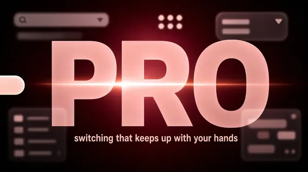
Landscape 16:9 poster, dark wine field with three giant translucent letters across the middle and faint interface panels behind them. Heavy vignette, no watermark.
[Layout]
A wine-red field, brightest at the centre and dropping to near black at all four edges. Behind everything, four or five pale interface panels float out of focus at different depths: one long search bar in the upper left, one rounded dropdown in the upper right, one list panel at the lower left, one chat panel at the lower right, a small grid of pale dots near the top centre. Everything behind is blurred and low contrast. The three giant letters sit on one baseline across the middle of the frame, each about a third of the frame height, spaced so the first and third are cropped slightly by the side edges.
[Subject]
three enormous letters reading as one word, rendered in translucent pale rose so the panels behind show through them, with a bright horizontal lens flare crossing the centre of the middle letter and a soft radial glow behind the whole group. A small pill-shaped toggle float sits at the left edge, half cropped. No other objects.
[Headline]
"PRO" set in an ultra heavy grotesque in translucent pale rose at roughly a third of the frame height, one word, centred, tracking tight, each letter showing the blurred panels through it.
[Labels]
beneath the word, one short line in muted rose sans, centred: switching that keeps up with your hands
[Mood]
Wine #3A0A16, deep maroon #1A0508, pale rose #F2C6C9, ember orange #E2603C, near-black #0C0305. Fast and slightly dangerous; the giant half-transparent word feels like looking through a red filter.
[Rules]
Every line of text must be real, correctly spelled English - no placeholder, no lorem ipsum, no gibberish, no stray or scattered letters, no phone numbers, no email addresses, no QR codes, no bracketed placeholders. Never break or hyphenate a word across two lines: each word must stay whole on one line. Never print a colour code, hex value, CSS value or any string beginning with a hash mark as text. Do not print any telephone number, street address, URL or price. No human faces, no photographic people. All interface content inside any window, card or screen is abstracted: grey bars, soft blocks and blurred shapes only - no legible microcopy anywhere.](https://files.posterlet.com/assets/generated/md/vgwalbca7chn.webp)
![[Format]
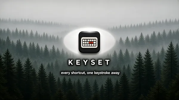
Landscape 16:9 poster, a full bleed misty conifer forest photograph with a small dark app tile floating in the centre. Photographic depth, soft haze, no watermark.
[Layout]
The photograph fills the entire frame: layered ridges of conifer forest receding into pale mist, densest and darkest at the bottom edge, dissolving into a flat milky grey at the top. The app tile sits centred horizontally at about two fifths of the height, small - roughly one twelfth of the frame width - with a soft drop shadow. Two lines of type are centred beneath it: a short wordmark-like line at the middle of the height, and a longer line just under it.
[Subject]
one dark rounded square app tile with a glossy bevel and a hard highlight along its top edge, holding a simplified keyboard glyph in off-white: a rounded rectangle divided into a few rows of tiny keys, with two keys near the centre picked out in a single warm red. A wide ellipse of soft white glow sits behind the tile, like mist catching light. No device, no interface, no people.
[Headline]
"KEYSET" set in a clean geometric sans in white, upper and lower case, centred, with wide tracking and a soft dark halo so it stays legible against the mist.
[Labels]
under the wordmark, one centred line in white sans at about half its size: every shortcut, one keystroke away
[Mood]
Mist grey #D7DCD8, forest green #2F4A3C, deep shadow #16211B, tile charcoal #23262A, signal red #C0392B. Calm and analogue; the fog does the storytelling and the single red key is the only punctuation.
[Rules]
Every line of text must be real, correctly spelled English - no placeholder, no lorem ipsum, no gibberish, no stray or scattered letters, no phone numbers, no email addresses, no QR codes, no bracketed placeholders. Never break or hyphenate a word across two lines: each word must stay whole on one line. Never print a colour code, hex value, CSS value or any string beginning with a hash mark as text. Do not print any telephone number, street address, URL or price. No human faces, no photographic people. All interface content inside any window, card or screen is abstracted: grey bars, soft blocks and blurred shapes only - no legible microcopy anywhere.](https://files.posterlet.com/assets/generated/md/yfp4kxhmztlx.webp)
![[Format]
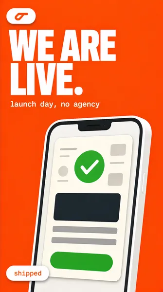
Vertical 9:16 launch poster, saturated orange ground with a phone mockup. Bold commercial render, no watermark, no brand logos.
[Layout]
Flat orange #FF5A1F fills the frame. A small white pill badge with an abstract mark sits in the upper left. The headline sits in the upper third, left aligned, two lines, very heavy and very large. A phone mockup rises from the bottom edge, centred slightly right, cropped by the bottom so only its upper two thirds show. A small white pill status chip overlaps the phone's lower left corner, and one monospace line sits under the headline.
[Subject]
a white phone mockup with a thin dark bezel, screen showing a pale card with a circular green check mark, a bold dark amount-free layout (a large dark bar, two thin grey bars) and a single green button shape at the bottom. No legible text on the screen.
[Headline]
"WE ARE LIVE." in a heavy grotesque, all caps, white #FFFFFF, two lines: "WE ARE" then "LIVE." - the period stays. Extremely tight leading so the two lines almost touch.
[Labels]
one monospace line beneath the headline in #FFE7DB: "launch day, no agency". On the phone's corner, a white pill with small orange monospace text inside: "shipped".
[Mood]
Hot orange, white, one green check. Loud and friendly, built for a phone screen; reads at thumbnail as a launch announcement rather than a discount.
Every line of text must be real, correctly spelled English - no placeholder, no lorem ipsum, no gibberish, no phone numbers, no email addresses, no QR codes, no bracketed placeholders. Never break or hyphenate a word across two lines: each word must stay whole on one line. Do not print any telephone number, street address, URL or price. All interface content inside any window, card or screen is abstracted: grey bars, soft blocks and blurred shapes only - no legible microcopy anywhere.](https://files.posterlet.com/assets/generated/md/kwpo7ildzh8f.webp)
![[Format]
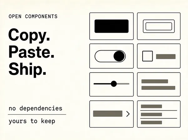
Landscape 4:3 software launch poster, print-editorial layout on off-white paper. Precise, documentation-like, no watermark, no brand logos.
[Layout]
Off-white paper #F5F4F1 fills the frame. The layout is a two-column grid with generous outer margins. The left column, about 45% wide, is a text stack aligned to a baseline: a small monospace eyebrow, then a large headline block, then two short monospace lines at the bottom of the column separated by a thin rule. The right column holds a tight grid of abstract interface components arranged on a 2x4 lattice with equal gutters, each component a thin outlined tile on paper.
[Subject]
eight component tiles, each one a small outlined UI fragment drawn in 1px ink lines: a filled dark button, an outline button, a toggle switch, a checkbox row, a slider, a small card with two text bars, a dropdown with a chevron, and a table with three rows. No legible text inside any tile - bars and shapes only.
[Headline]
"Copy. Paste. Ship." in a tight neo-grotesque, sentence case, near-black #101010, three short lines stacked left, large but not filling the column.
[Labels]
an eyebrow in monospace, small caps, #8A8880, above the headline: "OPEN COMPONENTS". Two lines at the column foot in #8A8880 monospace: "no dependencies" and "yours to keep".
[Mood]
Paper, ink, one warm grey. Editorial and confident; the grid of outlined components carries the visual interest so the type can stay plain.
Every line of text must be real, correctly spelled English - no placeholder, no lorem ipsum, no gibberish, no phone numbers, no email addresses, no QR codes, no bracketed placeholders. Never break or hyphenate a word across two lines: each word must stay whole on one line. Do not print any telephone number, street address, URL or price. All interface content inside any window, card or screen is abstracted: grey bars, soft blocks and blurred shapes only - no legible microcopy anywhere.](https://files.posterlet.com/assets/generated/md/hltyth20w86o.webp)
![[Format]
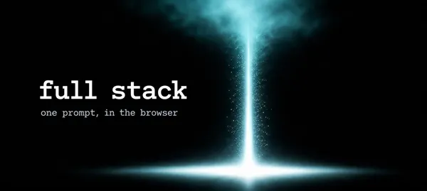
Wide 21:9 software launch banner, pure black with a single beam of light. Photographic light rendering, no watermark, no brand logos.
[Layout]
Solid black #050506 across the whole frame. A narrow vertical shaft of white-cyan light rises from the bottom edge slightly right of centre, tapering as it goes up and dissolving into haze around the upper third; a soft horizontal lens bloom spreads from its base. The headline is centred vertically in the left half, with a lowercase monospace logotype feel, and one small line beneath it. The right half is left almost empty, holding only the haze from the beam.
[Subject]
no objects: only the light shaft, its haze, and a faint dust particle scatter inside the beam.
[Headline]
"full stack" in a lowercase monospace, very large, letterspaced slightly, in white #FFFFFF, sitting left of the beam on one line. Beneath it, a much smaller monospace line in #7E838C: "one prompt, in the browser".
[Labels]
the second line is the only label; keep it small, monospace and quiet.
[Mood]
Black, white, cyan haze. Stark, cinematic, developer-native; the beam does all the work and the typography stays lowercase and understated.
Every line of text must be real, correctly spelled English - no placeholder, no lorem ipsum, no gibberish, no phone numbers, no email addresses, no QR codes, no bracketed placeholders. Never break or hyphenate a word across two lines: each word must stay whole on one line. Do not print any telephone number, street address, URL or price. All interface content inside any window, card or screen is abstracted: grey bars, soft blocks and blurred shapes only - no legible microcopy anywhere.](https://files.posterlet.com/assets/generated/md/qrakunz69znl.webp)
![[Format]
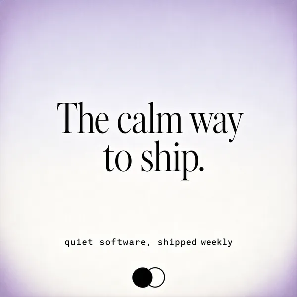
Square 1:1 software launch poster, near-white gradient with centred serif typography. Restrained, gallery-like, no watermark, no brand logos.
[Layout]
A soft vertical gradient from #EDEBF6 at the top to #FDFDFC at the bottom, with a barely visible lavender vignette in the corners. The headline is centred on the optical centre with very generous empty margins on all four sides - at least a quarter of the frame stays empty above and below the text block. A tiny monospace line sits far below the headline, and an abstract mark sits at the very bottom centre.
[Subject]
no objects beyond the gradient and a faint grain: no UI, no product, no people. The emptiness is the subject.
[Headline]
"The calm way to ship." in a high-contrast serif with fine hairlines, sentence case, in ink #171719, on two centred lines: "The calm way" then "to ship." - large, but with enough air that it reads as a book cover rather than an ad.
[Labels]
one monospace line centred far below in #8C8A93: "quiet software, shipped weekly". At the very bottom centre, a small abstract mark: two overlapping circles, one filled #1B1B1D and one outlined, 26px.
[Mood]
Lavender white, ink, high-contrast serif. Still, literary, almost silent; the whole design is a pause between two loud announcements.
Every line of text must be real, correctly spelled English - no placeholder, no lorem ipsum, no gibberish, no phone numbers, no email addresses, no QR codes, no bracketed placeholders. Never break or hyphenate a word across two lines: each word must stay whole on one line. Do not print any telephone number, street address, URL or price. All interface content inside any window, card or screen is abstracted: grey bars, soft blocks and blurred shapes only - no legible microcopy anywhere.](https://files.posterlet.com/assets/generated/md/jopadglr9d89.webp)
![[Format]
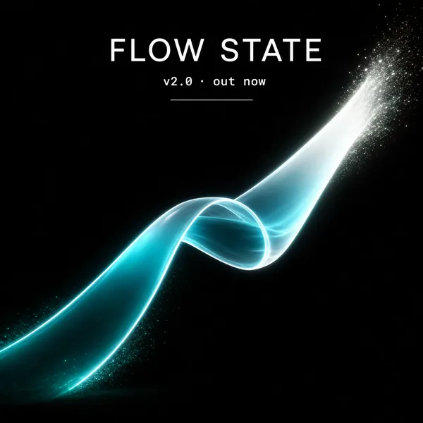
Square 1:1 software launch poster, black ground with one translucent 3D ribbon. Cinematic render, no watermark, no brand logos.
[Layout]
Pure black #060708. A wide translucent ribbon of light sweeps in from the lower left and rises toward the upper right, twisting once in the middle so its underside faces the viewer; it fades from deep teal at its base through cyan to near-white at its crest. The headline is centred, sitting above the ribbon's crest with clear space on all sides; a small monospace line sits beneath it, and a thin horizontal rule closes the block below.
[Subject]
the ribbon only: semi-transparent, glass-like, with a soft internal glow, thin bright edge highlights running along its length, and fine particle dust where it fades. No objects, no UI, no people.
[Headline]
"FLOW STATE" in a light-weight geometric grotesque, all caps, wide letterspacing (about 0.18em), white #F4F7F8, centred on one line.
[Labels]
beneath the headline, monospace in #6F7A80: "v2.0 · out now". Below that, a thin 1px rule of #232829 about 120px wide, centred.
[Mood]
Black, teal, cyan, white. Calm, premium, slightly futuristic; the ribbon supplies all the motion while the type stays thin and spaced out.
Every line of text must be real, correctly spelled English - no placeholder, no lorem ipsum, no gibberish, no phone numbers, no email addresses, no QR codes, no bracketed placeholders. Never break or hyphenate a word across two lines: each word must stay whole on one line. Do not print any telephone number, street address, URL or price. All interface content inside any window, card or screen is abstracted: grey bars, soft blocks and blurred shapes only - no legible microcopy anywhere.](https://files.posterlet.com/assets/generated/md/6m6chn895f01.webp)
![[Format]
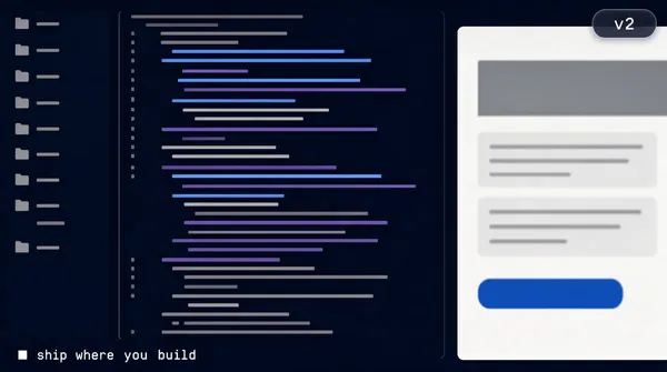
Landscape 16:9 software launch poster built as a full-bleed dark application screenshot, cropped. Photographic UI render, no watermark, no brand logos.
[Layout]
A dark navy #101722 application fills the entire frame, running past all four edges so it reads as a window we are standing inside. The interface is split: a narrow file tree column on the left, a code pane in the middle, a live preview pane on the right showing a pale page. A thin white monospace caption sits in the lower left corner with a small square bullet before it, and a small rounded pill badge sits in the upper right.
[Subject]
the split interface: file tree rows as short grey bars with tiny folder glyphs; a code pane of forty or so thin code lines abstracted into bars of three tones (grey, pale blue, muted violet) with indentation; a preview pane holding a white page with a grey header block, two text bars and a blue button shape. All content abstracted, nothing legible.
[Headline]
"ship where you build" in a lowercase monospace, small to medium, white #F0F2F5, single line in the lower left corner. It is a caption, not a display headline - keep it modest.
[Labels]
one pill badge upper right: "v2" in white monospace on a translucent #2A3547 rounded pill.
[Mood]
Deep navy, slate, thin white type, one blue button accent. Immersive and technical; the frame feels like a screen rather than a poster.
Every line of text must be real, correctly spelled English - no placeholder, no lorem ipsum, no gibberish, no phone numbers, no email addresses, no QR codes, no bracketed placeholders. Never break or hyphenate a word across two lines: each word must stay whole on one line. Do not print any telephone number, street address, URL or price. All interface content inside any window, card or screen is abstracted: grey bars, soft blocks and blurred shapes only - no legible microcopy anywhere.](https://files.posterlet.com/assets/generated/md/yfkikz8rjyr1.webp)
![[Format]
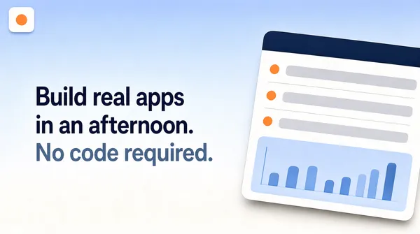
Landscape 16:9 no-code launch poster, soft gradient ground with restrained editorial typography. Clean, airy, no watermark, no brand logos.
[Layout]
A vertical gradient from pale periwinkle #DCE3F2 at the top to warm white #FBFAF7 at the bottom. A small abstract mark - a rounded square with a soft orange dot - sits in the top left corner. The headline occupies the left half, three lines, left aligned, sitting on the vertical centre with a lot of air above and below. The right half holds a single tilted application card, cropped by the right and bottom edges, floating well below the top margin.
[Subject]
one light application card, tilted about four degrees, showing an abstract list view: a header strip, four rows of grey bars with one orange dot at the left of each row, and a pale blue chart block at the bottom of the card. Soft shadow, no legible text.
[Headline]
Sentence case, not all caps, in a clean neo-grotesque at a comfortable weight, three lines, left aligned: "Build real apps" in deep navy #1B2740; "in an afternoon." in the same navy on the second line; "No code required." on the third line in muted slate #7C8798, same size. Nothing is bold or stretched - the hierarchy comes from colour alone.
[Labels]
none.
[Mood]
Pale periwinkle into white, deep navy type, one soft orange accent from the mark and the row dots. Quiet, credible, enterprise-friendly; reads as a product page rather than an ad.
Every line of text must be real, correctly spelled English - no placeholder, no lorem ipsum, no gibberish, no phone numbers, no email addresses, no QR codes, no bracketed placeholders. Never break or hyphenate a word across two lines: each word must stay whole on one line. Do not print any telephone number, street address, URL or price. All interface content inside any window, card or screen is abstracted: grey bars, soft blocks and blurred shapes only - no legible microcopy anywhere.](https://files.posterlet.com/assets/generated/md/1p0w5itl577n.webp)
![[Format]
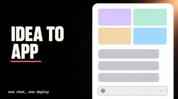
Landscape 16:9 software launch poster, dark interface aesthetic with one white product card. Crisp UI render, no watermark, no brand logos.
[Layout]
Near-black ground #0B0A0D with a very slight warm bloom in the upper right. The frame splits about 45/55: a left-aligned headline stack sits on the left with two lines and a single accent stroke, while a white application card occupies the right half, cropped by the right edge and the bottom edge so it feels larger than the frame. A small monospace caption runs along the bottom left corner, well below the headline.
[Subject]
a white rounded application card, top edge and right edge running off frame, showing an abstract chat thread: a pale grey input row at the bottom, three message blocks above it rendered as soft grey rounded bars, and a thumbnail grid of four small colour blocks (pale violet, mint, sand, sky) in the upper area. A single thin pink line underlines the second headline line, extending slightly past the text.
[Headline]
"IDEA TO APP" in a heavy grotesque, two lines, left aligned, in off-white #F5F3EF: "IDEA TO" on the first line, "APP" on the second, with the pink #FF7AB6 stroke sitting under "APP".
[Labels]
monospace, small, #8B8794, one line bottom left: "one chat, one deploy".
[Mood]
Near-black, off-white type, one pink accent and four pale pastel blocks on the card. Focused, modern, maker-led; the single white card is the only bright object in the frame.
Every line of text must be real, correctly spelled English - no placeholder, no lorem ipsum, no gibberish, no phone numbers, no email addresses, no QR codes, no bracketed placeholders. Never break or hyphenate a word across two lines: each word must stay whole on one line. Do not print any telephone number, street address, URL or price. All interface content inside any window, card or screen is abstracted: grey bars, soft blocks and blurred shapes only - no legible microcopy anywhere.](https://files.posterlet.com/assets/generated/md/c1zpp4cokoo0.webp)
![[Format]
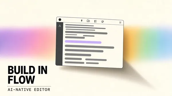
Landscape 16:9 software launch poster, light editorial finish with a soft light wash. Clean studio rendering, wide margins, no watermark, no brand logos.
[Layout]
Warm paper-white ground. A single application window floats just above the centre, roughly 62% of the frame width, slightly rotated on the horizontal axis, casting a long soft shadow. Behind it, and much wider than the window, a diffuse rainbow wash runs horizontally - violet, pink, amber, mint, pale blue - so blurred that it reads as light rather than colour. The headline sits in the lower left quadrant with a wide gap above it; a thin rule and a monospace label sit directly beneath the headline. The upper left holds nothing but paper.
[Subject]
one floating editor window: a slim toolbar strip across the top with a small round window control at the left, a narrow sidebar column, and a main pane of abstract code lines rendered as rounded grey bars of varying length, one bar highlighted in pale violet. Nothing in the window is legible as words.
[Headline]
"BUILD IN FLOW" in a tight geometric grotesque, white space generous, large, sentence-weight heavy, in near-black #14120F, on two lines: "BUILD IN" then "FLOW". Directly beneath, a thin 1px rule of #D8D2C6 and a monospace label in small caps: "AI-NATIVE EDITOR".
[Labels]
one monospace line only: "AI-NATIVE EDITOR", letterspaced, 11px equivalent, colour #6B655C.
[Mood]
Paper white #F7F4EE, ink #14120F, pastel rainbow wash as the only colour. Calm, precise, premium developer tooling; the light wash does all the decoration and the frame stays quiet around it.
Every line of text must be real, correctly spelled English - no placeholder, no lorem ipsum, no gibberish, no phone numbers, no email addresses, no QR codes, no bracketed placeholders. Never break or hyphenate a word across two lines: each word must stay whole on one line. Do not print any telephone number, street address, URL or price. All interface content inside any window, card or screen is abstracted: grey bars, soft blocks and blurred shapes only - no legible microcopy anywhere.](https://files.posterlet.com/assets/generated/md/fef09rc0qrcs.webp)
![[Format]
Wide 21:9 software launch banner, near-black terminal aesthetic. Minimal, high contrast, no watermark, no brand logos.
[Layout]
Almost entirely black ground #08090A. A small terminal card sits in the upper left, about a quarter of the frame width, with a thin #24262B border and a rounded corner. The headline block occupies the left half of the lower two thirds, stacked in three lines with tight leading and a wide gap before the terminal card. Everything on the right half is empty black except for a faint vertical gradient falloff.
[Subject]
a compact code panel: a slim title bar with three small dots at the left, and inside it six short abstract command lines as rounded grey bars, the first bar brighter than the rest, one thin caret mark at the end of the last line. No legible text inside the panel.
[Headline]
Three stacked lines in a heavy geometric grotesque, left aligned, tight leading, all caps: "THINK IT." in #F2F2F0; "BUILD IT." in #F2F2F0; "SHIP IT." in electric cyan #35E0F0. The third line is the same size as the others - the colour change is the only emphasis.
[Labels]
none.
[Mood]
Black, off-white, one cyan line. Austere and confident, like a terminal that just finished a build; the cyan last line is the single point of colour.
Every line of text must be real, correctly spelled English - no placeholder, no lorem ipsum, no gibberish, no phone numbers, no email addresses, no QR codes, no bracketed placeholders. Never break or hyphenate a word across two lines: each word must stay whole on one line. Do not print any telephone number, street address, URL or price. All interface content inside any window, card or screen is abstracted: grey bars, soft blocks and blurred shapes only - no legible microcopy anywhere.](https://files.posterlet.com/assets/generated/md/hwjhn695u9v3.webp)