About app screenshots
An App Store listing gives you ten screenshot slots and a fraction of a second to be understood. Most apps fill them with unedited captures, which is why so many product pages read as grey mush at the size a phone actually displays them. These layouts treat the slot the way a store page should: one claim, one device, one colour, and the interface demoted to evidence.
The set covers both jobs a store screenshot has to do. Some layouts carry an announcement - a date, a version, a "we are live" - while others walk through a feature with the capture cropped inside a frame. Both keep the same grid, so a listing built from mixed pieces still looks deliberate rather than assembled by three different teams.
What size should an App Store screenshot be?
App Store Connect asks for a small set of fixed sizes: 1320 x 2868 for the 6.9-inch iPhone and 2064 x 2752 for the 13-inch iPad, plus 1242 x 2688 if you still ship a 6.5-inch set. Every layout here is designed at the ratio rather than at the pixel size, so a portrait piece regenerates at 9:16 without re-cropping the headline or moving the device.
Why do the first two screenshots matter more than the other eight?
In search results the store shows the first two or three images before anyone taps through. The remaining slots are only seen by people who already decided to look, which means slot one is doing the work of a landing-page hero. Put the single strongest claim there, and stop treating it as a gallery of everything the app can do.
How much text should one screenshot carry?
One headline of two to five words, plus at most one support line. Anything longer has to be read rather than scanned, and nobody reads a store listing. If the claim needs a subordinate clause to survive, it is the wrong claim.
Do these work for Google Play too?
Yes, with one addition. Play uses the same 9:16 and 16:9 phone ratios, but the listing also wants a 1024 x 500 feature graphic that appears in search and category pages. The landscape layouts here are built for that slot: the headline sits in the left third, so the graphic can be cropped from either side without cutting a word.
Portrait, square or landscape?
Portrait for the store itself, because the slot is portrait on both stores and the image is shown almost at full width. Landscape for the feature graphic, a press kit, a site hero or a launch gallery. Square for anywhere a listing also has to survive as a thumbnail: a social card, a partner's "available on" badge, an embed inside a review.
Can one set carry both a launch and a feature list?
Keep them as separate pieces. A launch screenshot is a moment: date, status, one line. A feature screenshot is an explanation: it needs the interface visible and legible. Mixing the two gives a slot that is neither loud enough to stop a scroll nor clear enough to explain anything, and that muddle is what makes a listing feel unfinished.
Should the device frame stay on?
Only while the frame is carrying information. A phone shape tells the reader the product is an app before they have read a word, which is worth a lot in a store grid. For a web tool, a changelog or a developer release, drop the frame and let the window be cropped by the edges of the poster - the same rule that keeps an announcement from looking like a software brochure.
Where does the headline go when the capture is busy?
Never on top of the interface. Captures have their own rhythm - toolbars, panes, gutters - and type laid over them fights every one of those lines. Put the headline in the empty third of the frame, or push the device down so it bleeds off the bottom edge. The best version of the pattern lets the frame be cropped by the poster, so the product reads as bigger than the image containing it.
All interface content in these layouts is abstracted on purpose: grey bars, soft blocks and blurred shapes instead of legible microcopy, so the poster survives thumbnail size and never ships someone else's UI text as decoration.
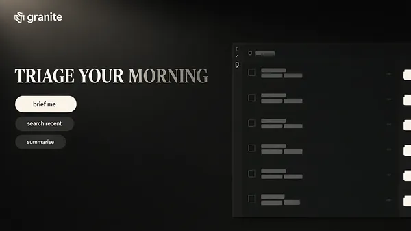
![[Format]
Landscape 16:9 poster, a dark granite field with a heavy serif headline at the left in two tones, one grey line of copy beneath it, three pill controls below that and a tall dark task window at the right. Quiet, expensive, no watermark.
[Layout]
A dark charcoal field carrying a fine speckled granite texture across the whole frame, with a soft light falling from the upper left so the top corners are a shade lighter than the bottom. A small angular glyph and wordmark sit at the upper left, a twelfth in from each edge. The headline begins beneath them at about a quarter of the height: two words on one line, left aligned, its block about two fifths of the width. Nothing is written between the headline and the three pills: no subtitle, no caption and no line of small type. Three pill controls stack beneath that, the upper one wider and brighter, the two below narrower and dimmer. The task window occupies the right half: its left edge at about two fifths of the width, its top at a seventh, its right edge off the frame, its bottom off the frame.
[Subject]
the task window. It is a very dark panel with a narrow left rail of small outline glyphs, a header row carrying one small icon and a short grey bar, then a column of six task rows separated by hairlines, each row holding a small empty tick square at its left, two short grey bars of different length, and at its right one small dim mark. At the far right a second narrow column of pale time-shaped blocks is cropped by the frame. No letters, no numbers, no times and no dates.
[Headline]
"TRIAGE YOUR MORNING" set in a heavy serif in two tones on a single line: TRIAGE in warm off-white and YOUR MORNING in a dimmer grey directly after it, the pair set as one phrase so the sentence fades as it travels.
[Labels]
the wordmark at the upper left reads granite in pale sans beside a small angular mark; the three pills read brief me, search recent and summarise, one lower case phrase each, in dim grey sans; the window carries ticks, bars and glyphs only, never words
[Mood]
Charcoal #1C1C1B, granite fleck #2A2A28, warm off-white #F4EFE6, dim grey #7A7672, amber #E8703A. Quiet and expensive; granite under thin serif type makes a task list feel like a hotel lobby.
[Rules]
Every line of text must be real, correctly spelled English - no placeholder, no lorem ipsum, no gibberish, no stray or scattered letters, no phone numbers, no email addresses, no QR codes, no bracketed placeholders. Never break or hyphenate a word across two lines: each word must stay whole on one line. Never print a colour code, hex value, CSS value or any string beginning with a hash mark as text. Do not print any telephone number, street address, URL or price. No human faces, no photographic people. All interface content inside any window, card or screen is abstracted: grey bars, soft blocks and blurred shapes only - no legible microcopy anywhere.](https://files.posterlet.com/assets/generated/md/atoabuo4e9a2.webp)
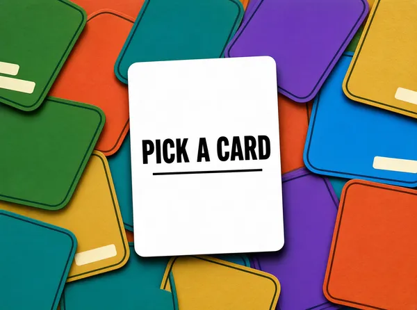
![[Format]
Landscape 4:3 poster, a field of overlapping coloured cards spread edge to edge, one plain white card lying flat on top of them at the centre, slightly tilted, carrying a single line of type. Playful, printed, no watermark.
[Layout]
The frame is filled entirely by a spread of cards: about twenty rounded rectangles of different sizes, layered in every direction, each rotated between five and forty degrees, overlapping so no field colour is visible anywhere between them. The cards are flat coloured - green, orange, teal, violet, yellow, sky blue - each with a thin darker keyline. One plain white card lies on top at the centre, upright and tilted only two degrees, its size about a third of the frame width, its long side vertical, a soft shadow beneath it. It is the only card in the frame with no colour and the only one with words.
[Subject]
the white card and nothing else distinct. The white card is clean and empty except for one line of type across its middle and a short rule beneath it. Every other card is plain colour with at most two short pale bars near one edge, and none of them carries a letter, a glyph or an illustration.
[Headline]
"PICK A CARD" set in a bold grotesque in near-black, one line, centred on the white card, with a short thin black rule beneath it of the same width as the line.
[Labels]
the white card carries only the headline and its rule; every coloured card carries plain bars at most, never words
[Mood]
Forest green #2E6B3E, orange #E8703A, teal #2E8B8B, violet #6A4BC4, yellow #D8B03C, sky blue #3E9BD8, white #FFFFFF. Playful and physical; a spread of cards turns a component library into something you could shuffle.
[Rules]
Every line of text must be real, correctly spelled English - no placeholder, no lorem ipsum, no gibberish, no stray or scattered letters, no phone numbers, no email addresses, no QR codes, no bracketed placeholders. Never break or hyphenate a word across two lines: each word must stay whole on one line. Never print a colour code, hex value, CSS value or any string beginning with a hash mark as text. Do not print any telephone number, street address, URL or price. No human faces, no photographic people. All interface content inside any window, card or screen is abstracted: grey bars, soft blocks and blurred shapes only - no legible microcopy anywhere.](https://files.posterlet.com/assets/generated/md/wp47qyj2zh6n.webp)
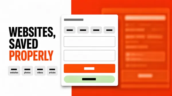
![[Format]
Landscape 16:9 poster, a frame split hard down the middle into a white left half and a saturated orange right half, with a three line headline and a row of grey chips at the left and one white card overlapping the seam. Graphic, decisive, no watermark.
[Layout]
A frame split by a single hard vertical edge at two fifths of the width: the left side is white, the right side is saturated orange, no gradient and no blending. The headline sits in the white half: three lines, left aligned, its left edge at a tenth of the width, its block from a quarter to two thirds of the height, the third line the longest and in orange. A row of four small pale grey chips sits beneath it, each a rounded rectangle holding one short dark bar. A white card floats across the seam: its left edge at about a third of the width, its top at a quarter of the height, its right edge at four fifths, its bottom running off the frame, with a soft shadow.
[Subject]
the white card. It carries a small grey bar at its top, then a row of six small pale chips, each holding one short bar, then two wide empty fields with hairline borders, then a solid orange button holding one short pale bar, and at its bottom a pale green pill with one short bar inside. The orange half of the frame carries nothing but a dim interface far out of focus behind the card, its panels barely lighter than the orange. Nothing is legible.
[Headline]
"WEBSITES, SAVED PROPERLY" set in a bold grotesque in near-black, three lines, left aligned, tight leading, the third line in the same orange as the right half so the block bridges the split.
[Labels]
the four chips under the headline read websites, photos, videos and articles, one lower case word each, in dark sans; the card carries bars, chips and one button only, never words
[Mood]
White #FFFFFF, orange #E24B1A, pale grey #EDEDED, dark grey #3A3A3A, pale green #DFF3E4. Decisive and graphic; one hard edge does the work a gradient usually does.
[Rules]
Every line of text must be real, correctly spelled English - no placeholder, no lorem ipsum, no gibberish, no stray or scattered letters, no phone numbers, no email addresses, no QR codes, no bracketed placeholders. Never break or hyphenate a word across two lines: each word must stay whole on one line. Never print a colour code, hex value, CSS value or any string beginning with a hash mark as text. Do not print any telephone number, street address, URL or price. No human faces, no photographic people. All interface content inside any window, card or screen is abstracted: grey bars, soft blocks and blurred shapes only - no legible microcopy anywhere.](https://files.posterlet.com/assets/generated/md/v3ikhi4o4jb6.webp)
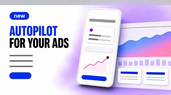
![[Format]
Landscape 16:9 poster, a white field with a lavender glow spreading from the right, a small blue tag at the upper left, a heavy two line headline, three grey lines and one blue pill, with a phone overlapping a pale dashboard at the right. Bright, product-led, no watermark.
[Layout]
A white field with a broad soft lavender haze blooming from the right two thirds and fading into white at the left, and a pale grey band along the top edge. A small blue capsule tag sits at the upper left, a tenth in from each edge, holding one short pale bar. The headline begins beneath it at about a quarter of the height, two lines, left aligned, its block about two fifths of the width. Three short grey lines of copy follow, then a blue pill button. The phone stands at the centre right, tilted a few degrees, its top at a sixth of the height and its bottom at four fifths, and behind it a wide pale dashboard panel runs off the right edge.
[Subject]
the phone and the panel. The phone is a white slab with rounded corners, heavy soft shadow and a thick pale border, its screen bright white and holding: a small grey bar at its top, then a narrow card with a small violet dot and two grey bars, a second narrower card, then a small pale chart with a rising pink line and one dark dot at its end, and a blue pill at its bottom. The panel behind it carries a wide area chart in a soft blue and rose gradient under a hairline, with a row of small pale bars beneath and two small white cards at its lower left, each holding a short bold bar over two thin lines. Nothing is legible.
[Headline]
"AUTOPILOT FOR YOUR ADS" set in a heavy grotesque in near-black, two lines, left aligned, tight leading, the word AUTOPILOT set in saturated blue so the second line carries the colour.
[Labels]
the tag at the upper left reads new in white sans; the phone and the panel carry bars, dots and a chart line only, never words and never numbers
[Mood]
White #FFFFFF, lavender #DCD6F5, blue #4B4BE8, rose #E88FA8, near-black #16161C. Bright and product-led; the haze behind the device does the selling that a screenshot cannot.
[Rules]
Every line of text must be real, correctly spelled English - no placeholder, no lorem ipsum, no gibberish, no stray or scattered letters, no phone numbers, no email addresses, no QR codes, no bracketed placeholders. Never break or hyphenate a word across two lines: each word must stay whole on one line. Never print a colour code, hex value, CSS value or any string beginning with a hash mark as text. Do not print any telephone number, street address, URL or price. No human faces, no photographic people. All interface content inside any window, card or screen is abstracted: grey bars, soft blocks and blurred shapes only - no legible microcopy anywhere.](https://files.posterlet.com/assets/generated/md/bqguh2a7wlf8.webp)
![[Format]
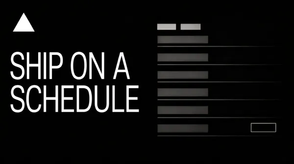
Landscape 16:9 poster, a pure black field with one white triangular glyph at the upper left and a two line white headline in the left half, a dim interface fading out of the black at the right. Severe, silent, no watermark.
[Layout]
A pure black field, absolutely flat. One white triangular glyph sits at the upper left, a tenth in from each edge, about a twelfth of the width and pointing upward. The headline begins at the left below it, its left edge at the same margin, its block from a quarter to three fifths of the height, two lines, the second longer than the first. The right half holds an interface that is barely there: it starts at about half the width, dims as it travels right and vanishes into the black before it reaches the edge, and its top and bottom edges are lost in the dark.
[Subject]
the dim interface. It is a list of rows, each row a thin grey line under a short grey bar, with two small tabs of slightly brighter grey near its top and one small outlined button. Everything sits at about a tenth of full brightness so it reads as a reflection rather than a screen. No numbers, no status words, no timestamps and no icons with letters.
[Headline]
"SHIP ON A SCHEDULE" set in a light grotesque in white, two lines, left aligned, very large, the letters thin enough that the black shows through, the block sitting as the only bright mass in the frame.
[Labels]
the only words in the frame are the two headline lines; the interface carries grey bars and one outline button only
[Mood]
Black #000000, white #FFFFFF, dim grey #2A2A2A, mid grey #4A4A4A. Severe and silent; an interface that fades into black says the tool is infrastructure, not decoration.
[Rules]
Every line of text must be real, correctly spelled English - no placeholder, no lorem ipsum, no gibberish, no stray or scattered letters, no phone numbers, no email addresses, no QR codes, no bracketed placeholders. Never break or hyphenate a word across two lines: each word must stay whole on one line. Never print a colour code, hex value, CSS value or any string beginning with a hash mark as text. Do not print any telephone number, street address, URL or price. No human faces, no photographic people. All interface content inside any window, card or screen is abstracted: grey bars, soft blocks and blurred shapes only - no legible microcopy anywhere.](https://files.posterlet.com/assets/generated/md/an6i7qwouel9.webp)
![[Format]
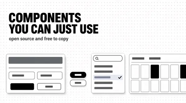
Landscape 16:9 poster, a white field dusted with a faint dot grid, a heavy two line headline at the upper left with one grey line beneath it, and four small interface cards scattered across the lower half. Neat, typographic, no watermark.
[Layout]
A white field covered edge to edge with a regular grid of tiny pale grey dots. The headline begins at the upper left, a twelfth in from the left edge and a tenth down: two lines, left aligned, its block running to about two thirds of the width. One line of mid grey type sits directly beneath it. Four cards occupy the lower half, all with soft shadows and hairline borders: a wide card at the left lower, a pair of tiny elements stacked at the centre, a narrow card with a list at the centre right, and a wide calendar card at the right whose right edge runs off the frame.
[Subject]
the four cards. The left card carries a bold grey title bar, two thin grey lines, then two small labelled fields, each a rounded outline box holding a short grey bar, and at its bottom a pair of buttons, one dark and one outlined. The centre pair is a dark pill button with a short pale bar inside and, beside it, a white outlined button carrying a thin grey bar. The centre right card is a search field with a small magnifier glyph, above a list of five rows each holding one short grey bar, the third row tinted and marked with a small tick. The calendar card holds a header row of two small grey bars and seven columns of day cells, every cell an empty pale square with a hairline border and a handful of them filled dark.
[Headline]
"COMPONENTS YOU CAN JUST USE" set in a heavy grotesque in near-black, two lines, left aligned, tight leading, the second line a little shorter so the block sits square against the cards below.
[Labels]
the line beneath the headline reads open source and free to copy in mid grey sans; the cards carry bars, buttons, ticks and empty squares only, never words and never numerals — the calendar shows no dates at all
[Mood]
White #FFFFFF, dot grey #E4E4E6, near-black #131316, mid grey #6E6E74, pale grey #F1F1F3. Orderly and practical; a shelf of loose parts reads as a toolbox rather than a product.
[Rules]
Every line of text must be real, correctly spelled English - no placeholder, no lorem ipsum, no gibberish, no stray or scattered letters, no phone numbers, no email addresses, no QR codes, no bracketed placeholders. Never break or hyphenate a word across two lines: each word must stay whole on one line. Never print a colour code, hex value, CSS value or any string beginning with a hash mark as text. Do not print any telephone number, street address, URL or price. No human faces, no photographic people. All interface content inside any window, card or screen is abstracted: grey bars, soft blocks and blurred shapes only - no legible microcopy anywhere.](https://files.posterlet.com/assets/generated/md/31nphio7c2d4.webp)
![[Format]
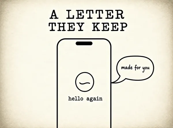
Landscape 4:3 poster, a warm paper white field with a centred two line typewriter headline and one phone drawn as a thin outline rising from the bottom edge, with a speech bubble pinned to its side. Quiet, hand-set, no watermark.
[Layout]
A warm paper white field with a faint grain, slightly deeper at the corners. The headline is centred at about a fifth of the height and consists of exactly two lines, the block about four fifths of the width. Nothing is written between the headline and the phone: no subtitle, no caption, no line of small type and no second sentence. A phone outline stands at the centre, its top at about two fifths of the height, its bottom running off the frame, its sides at about a fifth and four fifths of the width, its corners rounded generously and its outline a single even black stroke of about a thumbnail's thickness. A speech bubble is pinned to the phone's right side, its tail pointing back at the screen, sitting at about half the height.
[Subject]
the phone outline and the bubble. The phone is drawn as line art only - a single stroke rounded rectangle with a small pill cut-out at its top centre - and its interior is left as bare paper except for one small circular mark at its centre, drawn as an outlined circle with a single curved line inside, like a simplified face with eyes closed. The bubble is an outlined rounded shape with a tail, holding two short hand-lettered lines of small black type. Nothing is filled, nothing is shaded, no keyboard and no icons appear.
[Headline]
"A LETTER THEY KEEP" set in a typewriter serif in black, two lines, centred, generous leading, each letter carrying the slight unevenness of a struck key: line one reads A LETTER, line two reads THEY KEEP, both at the same size.
[Labels]
the speech bubble reads made for you in small hand-lettered black type on two lines; inside the phone, beneath the circular mark, one short line reads hello again in the same typewriter face; nothing else carries words
[Mood]
Paper white #FBF8F0, black #14120E, warm grey #D8D2C4. Patient and personal; an outline phone on paper reads as a drawing of a product rather than a photo of one.
[Rules]
Every line of text must be real, correctly spelled English - no placeholder, no lorem ipsum, no gibberish, no stray or scattered letters, no phone numbers, no email addresses, no QR codes, no bracketed placeholders. Never break or hyphenate a word across two lines: each word must stay whole on one line. Never print a colour code, hex value, CSS value or any string beginning with a hash mark as text. Do not print any telephone number, street address, URL or price. No human faces, no photographic people. All interface content inside any window, card or screen is abstracted: grey bars, soft blocks and blurred shapes only - no legible microcopy anywhere.](https://files.posterlet.com/assets/generated/md/zkc1wljbo85m.webp)
![[Format]
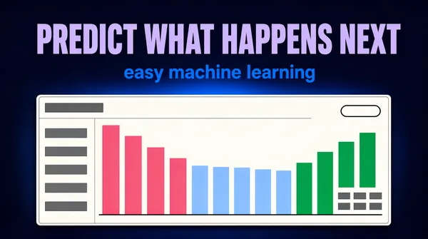
Landscape 16:9 poster, a deep navy field with a faint blue glow behind the middle, a big lavender headline centred across the top, one blue line beneath it and a wide pale panel rising from the bottom edge. Calm, analytical, no watermark.
[Layout]
A deep navy field with a broad soft blue glow behind the centre of the frame, fading to near-black at the edges. The headline is centred at about an eighth of the height, one line, the block about four fifths of the width. One shorter line of blue type sits centred directly beneath it. A wide pale panel rises from the bottom: its left edge a twelfth in from the left, its right edge a twelfth in from the right, its top at about a third of the height, running off the lower edge, with a thin border and a soft shadow above it so it floats clear of the field.
[Subject]
the panel and its chart. The panel is off-white with a narrow top bar holding a short grey bar at its left, and beneath it the page is split into a narrow left column of six short grey rows and a wide chart area. The chart holds a row of tall vertical bars across its left half in a rose colour stepping down in height, then a long run of shorter bars in pale blue and, at the right end, four bars in green that step back up. A flat baseline runs under all of them. At the chart's upper right a small outlined pill and, at its lower right, three short grey bars stacked. No axis labels, no numbers and no legend text anywhere.
[Headline]
"PREDICT WHAT HAPPENS NEXT" set in a heavy grotesque in pale lavender, one line, centred, tight tracking, the block reading as a single wide band across the dark field.
[Labels]
the line beneath the headline reads easy machine learning in saturated blue sans; the panel carries bars and grey rows only, never words and never numbers
[Mood]
Deep navy #101B33, mid navy #1A2A4A, pale lavender #B9B4E8, blue #3E7BE0, rose #E88FA8, green #4FBF7A. Analytical and calm; the glow behind the panel keeps a dark chart from looking like a console.
[Rules]
Every line of text must be real, correctly spelled English - no placeholder, no lorem ipsum, no gibberish, no stray or scattered letters, no phone numbers, no email addresses, no QR codes, no bracketed placeholders. Never break or hyphenate a word across two lines: each word must stay whole on one line. Never print a colour code, hex value, CSS value or any string beginning with a hash mark as text. Do not print any telephone number, street address, URL or price. No human faces, no photographic people. All interface content inside any window, card or screen is abstracted: grey bars, soft blocks and blurred shapes only - no legible microcopy anywhere.](https://files.posterlet.com/assets/generated/md/eurf6x6iqmyo.webp)
![[Format]
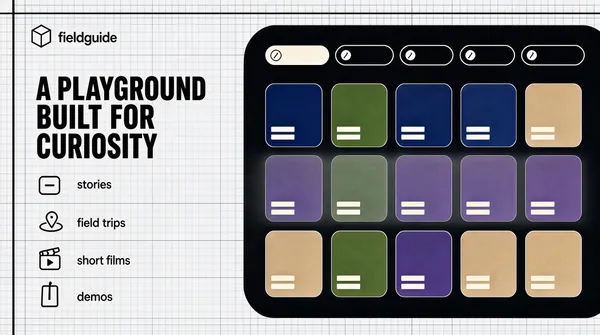
Landscape 16:9 poster, a pale grey field ruled with a blueprint grid, a heavy four line headline at the upper left, a short list of icon rows beneath it and one dark rounded panel at the right holding a grid of cards. Precise, editorial, no watermark.
[Layout]
A pale grey field carrying a fine blueprint grid across the whole frame, drawn in hairlines a shade darker than the field, with a heavier rule running down the left inside edge and another across the top. A small lockup sits at the upper left, a tenth in from each edge. The headline begins beneath it at about a fifth of the height: four lines, left aligned, the block about a third of the width. Four icon rows sit beneath the headline, evenly spaced down to the lower fifth, each a small outline glyph followed by two short lines of grey type. The dark panel occupies the right half: its left edge at about two fifths of the width, its top at a fifth of the height, its right edge off the frame, its bottom at four fifths, with heavily rounded corners.
[Subject]
the dark panel. It is a near-black rounded slab holding, at its top, a row of small rounded chips of different lengths, each with a tiny glyph at its left, the first chip filled pale. Beneath the chips a grid of cards fills the panel: three rows of five, each card a small rounded rectangle filled with a flat abstract colour field - a deep blue, a plant green, a violet dusk, a warm sand - and each card carrying two short pale bars stacked at its lower left. The second row of cards is dimmed under a pale haze. Nothing on any card is legible and no card holds a photograph.
[Headline]
"A PLAYGROUND BUILT FOR CURIOSITY" set in a bold grotesque in near-black, four lines, left aligned, tight leading, the last line the shortest so the block tapers towards the list below.
[Labels]
the lockup reads fieldguide in near-black sans beside a small outlined cube; the four rows read stories, field trips, short films and demos, one lower case word each, in grey sans beside a small outline icon; the panel carry chips and bars only, never words
[Mood]
Pale grey #EDEFF0, grid line #D2D6D8, near-black #16181A, deep blue #24345C, plant green #3E5B33, warm sand #C9B48C. Precise and curious; a drafting grid makes a browsing app look like a reference book.
[Rules]
Every line of text must be real, correctly spelled English - no placeholder, no lorem ipsum, no gibberish, no stray or scattered letters, no phone numbers, no email addresses, no QR codes, no bracketed placeholders. Never break or hyphenate a word across two lines: each word must stay whole on one line. Never print a colour code, hex value, CSS value or any string beginning with a hash mark as text. Do not print any telephone number, street address, URL or price. No human faces, no photographic people. All interface content inside any window, card or screen is abstracted: grey bars, soft blocks and blurred shapes only - no legible microcopy anywhere.](https://files.posterlet.com/assets/generated/md/51o9hw4wsvkr.webp)
![[Format]
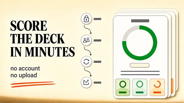
Landscape 16:9 poster, a warm cream field with a three line headline at the left, an orange rule beneath it, a vertical four step flow down the middle and a stack of pale cards at the right carrying a big ring gauge. Editorial, warm, no watermark.
[Layout]
A warm cream field, flat, with a faint warm shadow along the lower edge. The headline sits at the left: three lines, left aligned, its left edge at a tenth of the width, its block from a fifth to two thirds of the height, the third line the shortest. Two lines of smaller grey type sit under it, then an orange rule drawn as two quick strokes beneath those. A vertical flow runs down the centre of the frame: four small white circular badges, evenly spaced from a fifth to four fifths of the height, each joined to the next by a thin curved arrow, with a short grey bar to the right of each badge. A stack of three pale cards sits at the right, the front one perfectly upright and the two behind it offset a few pixels up and left, their tops at a tenth of the height and their bottoms at four fifths.
[Subject]
the front card and its badges. The card is warm white with generous rounded corners and a thin border, and holds: a small grey bar at its top centre, then a large ring gauge occupying the upper half, its track pale grey and its fill a vivid green sweeping three quarters of the way round, the ring's centre left completely empty; beneath the ring one small pale pill; then two thin grey lines of copy; then a row of three small pale cards, each holding a circular glyph above a bold grey bar and beneath it one short bar on a pale tinted disc, the three tints a green, a mint and an orange. No number, no digit and no percentage is printed anywhere.
[Headline]
"SCORE THE DECK IN MINUTES" set in a heavy serif in near-black, three lines, left aligned, tight leading, the third line set in saturated orange at the same size so the block falls from black into colour.
[Labels]
the badges in the flow carry small outline icons only; the two lines under the headline read no account and no upload in mid grey sans; nothing else in the frame carries words
[Mood]
Cream #FBF6EF, near-black #1A1512, orange #E2502C, green #3FA845, pale grey #DCD6CE. Warm and editorial; a scored deck reads like a page from a printed report.
[Rules]
Every line of text must be real, correctly spelled English - no placeholder, no lorem ipsum, no gibberish, no stray or scattered letters, no phone numbers, no email addresses, no QR codes, no bracketed placeholders. Never break or hyphenate a word across two lines: each word must stay whole on one line. Never print a colour code, hex value, CSS value or any string beginning with a hash mark as text. Do not print any telephone number, street address, URL or price. No human faces, no photographic people. All interface content inside any window, card or screen is abstracted: grey bars, soft blocks and blurred shapes only - no legible microcopy anywhere.](https://files.posterlet.com/assets/generated/md/1jssco3hjjpc.webp)
![[Format]
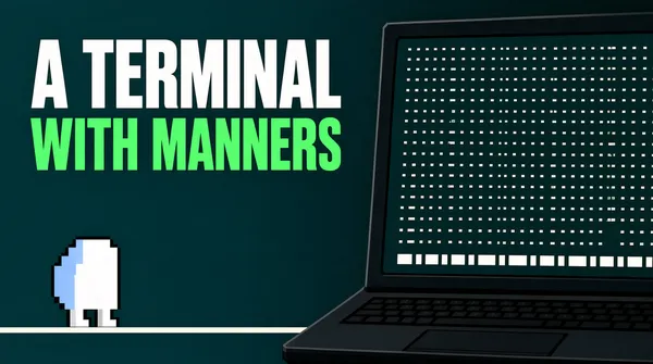
Landscape 16:9 poster, a deep teal field with one enormous two colour headline at the upper left, a small pixel-art creature at the lower left and one dark laptop at the right showing an abstract grid. Retro computing, no watermark.
[Layout]
A deep teal field that darkens towards the right. The headline occupies the upper left: two lines, left aligned, its left edge at a twelfth of the width and its first line beginning at a tenth of the height, the block running to about three fifths of the width and the second line shorter. A small pixel creature stands at the lower left, a tenth in from the left edge and a tenth above the bottom, drawn on a pale horizontal rule that runs under it. The laptop enters from the right: its screen leaning back, its top corner at about a twelfth of the height, its body running off the right edge and off the bottom, leaving only the keyboard's near edge visible.
[Subject]
the laptop screen. It is a dense field of tiny pale marks arranged in even rows and columns like a readout - dots, short dashes and tiny brackets, all the same weight, no letters, no digits and no words. Across the bottom of the screen a strip of small pale rectangles sits in a row, each empty, with one slightly brighter than the rest. The creature is drawn in chunky square pixels on a white grid, each pixel a small block, its body white with a pale blue fringe on one side and two short legs, about the size of a thumb.
[Headline]
"A TERMINAL WITH MANNERS" set in a heavy grotesque in two colours, two lines, left aligned, tight leading: A TERMINAL in white capitals, WITH MANNERS in bright green capitals directly beneath at the same size.
[Labels]
the only words in the frame are the two headline lines; the screen carries abstract marks only and the creature carries no letters
[Mood]
Deep teal #12403E, darker teal #0A2A2A, white #F2FBF8, bright green #2FE58C, pale blue #9FD8E8. Nostalgic and a little wry; a pixel creature and a wall of marks make a tool feel handmade.
[Rules]
Every line of text must be real, correctly spelled English - no placeholder, no lorem ipsum, no gibberish, no stray or scattered letters, no phone numbers, no email addresses, no QR codes, no bracketed placeholders. Never break or hyphenate a word across two lines: each word must stay whole on one line. Never print a colour code, hex value, CSS value or any string beginning with a hash mark as text. Do not print any telephone number, street address, URL or price. No human faces, no photographic people. All interface content inside any window, card or screen is abstracted: grey bars, soft blocks and blurred shapes only - no legible microcopy anywhere.](https://files.posterlet.com/assets/generated/md/ae2e3968kmca.webp)
![[Format]
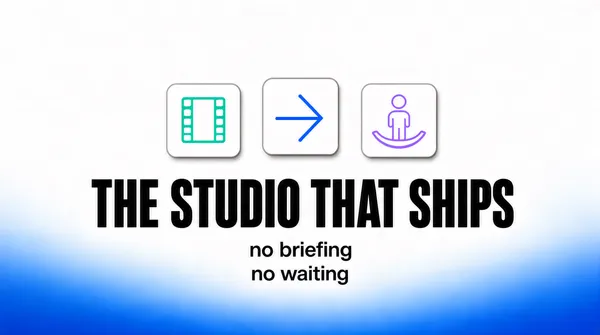
Landscape 16:9 poster, an almost white field blushing into blue along the bottom edge, three small rounded tiles in a row above one big dark title and two short lines beneath it. Bare, confident, no watermark.
[Layout]
A white field with a broad blue wash rising from the very bottom edge and fading out before it reaches the middle, so the lower third glows and the upper two thirds stay paper white. Three rounded tiles sit centred in a row at about a third of the height, each the size of a thumbnail, separated by a gap equal to half a tile, the middle one raised a few pixels above the others. The title is centred beneath them at about half the height, one line, its block about three fifths of the width. Two short lines of smaller type are centred directly under it, the second shorter than the first. Nothing else appears in the frame.
[Subject]
the three tiles and nothing more. Each is a soft white rounded square with a faint grey edge and a very soft shadow, and each holds one thin outline glyph in a single pastel colour: a strip of film in mint, an arrow head in blue, a small figure with a curved base in lilac. No letters, no numbers, no second row of tiles, no device.
[Headline]
"THE STUDIO THAT SHIPS" set in a heavy grotesque in near-black at a large size, one line, centred, tight tracking so the block reads as one dark bar of type.
[Labels]
the two lines beneath the title read no briefing and no waiting, stacked, centred, in mid grey sans at a third of the title size; nothing else in the frame carries words
[Mood]
White #FFFFFF, blue wash #2E6BD6, mint #A8E3C2, blue #3E6BE0, lilac #B8A6E8, near-black #16181C. Bare and sure; three icons and one line carry a studio's whole claim.
[Rules]
Every line of text must be real, correctly spelled English - no placeholder, no lorem ipsum, no gibberish, no stray or scattered letters, no phone numbers, no email addresses, no QR codes, no bracketed placeholders. Never break or hyphenate a word across two lines: each word must stay whole on one line. Never print a colour code, hex value, CSS value or any string beginning with a hash mark as text. Do not print any telephone number, street address, URL or price. No human faces, no photographic people. All interface content inside any window, card or screen is abstracted: grey bars, soft blocks and blurred shapes only - no legible microcopy anywhere.](https://files.posterlet.com/assets/generated/md/pxlgdhpf65kr.webp)
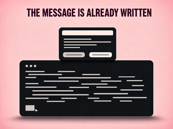
![[Format]
Landscape 4:3 poster, a pale pink field holding one dark terminal window dead centre and a small charcoal dialog floating above its top edge. Two objects, nothing else, no watermark.
[Layout]
A flat pale pink field, slightly deeper at the corners than in the middle. A wide dark window sits centred and low: its left edge at a seventh of the width, its right edge at six sevenths, its top at two fifths of the height, its bottom at four fifths, with rounded corners and a long soft shadow beneath it. A small charcoal dialog floats above it, overlapping the window's top edge: centred horizontally, its width about a third of the frame, its height about a fifth, with a tighter shadow. The whole upper third of the frame stays empty.
[Subject]
the window and the dialog. The window has three small dots at its upper left and a long body of thin pale grey lines of varying length, grouped in loose blocks, all of them abstracted into bars so no command is legible; a single pale cursor block sits at the lower left of the body. The dialog has a bold pale title bar at its top, then two lines of thin pale bars, then a footer holding two wide buttons side by side, each a pale rounded rectangle with one short bar inside, the right one very slightly brighter. No letters, no numbers, no file paths.
[Headline]
"THE MESSAGE IS ALREADY WRITTEN" set in a heavy grotesque in deep plum, one line, centred, set small at the top of the frame a tenth down from the upper edge, so the two windows own the poster.
[Labels]
the window and the dialog carry bars, dots and buttons only, never words; the only words in the frame are the headline
[Mood]
Pale pink #F6DFE4, deep plum #3A1B2A, charcoal #1A1A1C, pale grey #C9C6C8. Quiet and slightly clinical; a pastel field makes a developer tool feel like stationery.
[Rules]
Every line of text must be real, correctly spelled English - no placeholder, no lorem ipsum, no gibberish, no stray or scattered letters, no phone numbers, no email addresses, no QR codes, no bracketed placeholders. Never break or hyphenate a word across two lines: each word must stay whole on one line. Never print a colour code, hex value, CSS value or any string beginning with a hash mark as text. Do not print any telephone number, street address, URL or price. No human faces, no photographic people. All interface content inside any window, card or screen is abstracted: grey bars, soft blocks and blurred shapes only - no legible microcopy anywhere.](https://files.posterlet.com/assets/generated/md/8q71d4d7faye.webp)
![[Format]
Landscape 16:9 poster, a soft violet to blush gradient field with a fine grain, one white rounded app tile at the left of centre holding a camera mark, and a single large script word at the right. Minimal, warm, no watermark.
[Layout]
A field that blends rose pink in the middle into violet at the upper left and lavender at the lower right, with a broad pale glow behind the tile, and a very fine film grain over everything. The tile sits left of centre: a white rounded square, its side about a quarter of the frame height, centred at about two fifths of the width and half the height, casting a soft shadow down and to the right. The script word begins just right of it at about half the width, its baseline a little below the middle, its letters slanting upward to the right and running to about nine tenths of the width. Empty gradient survives above and below both elements.
[Subject]
the tile and nothing else. The tile is plain white with heavily rounded corners and carries one mark: a simple camera shape built from a rounded body, a raised viewfinder bump and one circle at its centre, the body filled with a soft orange to violet gradient and the rest left white. No letters on the tile, no second object, no phone, no card.
[Headline]
"PARTY" set in a single script word in white, lower case, drawn with a continuous flowing stroke and a light weight, set large at the right so its tail sweeps toward the frame edge without being cropped.
[Labels]
the only word in the frame is the script headline; the tile carries a camera mark and no letters
[Mood]
Rose #EF8E9E, violet #6E5BC0, lavender #C9B8E8, white #FFFFFF, warm orange #F08A3C. Soft and celebratory; one gradient and one word are enough when the word is drawn rather than set.
[Rules]
Every line of text must be real, correctly spelled English - no placeholder, no lorem ipsum, no gibberish, no stray or scattered letters, no phone numbers, no email addresses, no QR codes, no bracketed placeholders. Never break or hyphenate a word across two lines: each word must stay whole on one line. Never print a colour code, hex value, CSS value or any string beginning with a hash mark as text. Do not print any telephone number, street address, URL or price. No human faces, no photographic people. All interface content inside any window, card or screen is abstracted: grey bars, soft blocks and blurred shapes only - no legible microcopy anywhere.](https://files.posterlet.com/assets/generated/md/7m7lmsm0m3d6.webp)
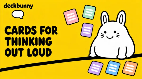
![[Format]
Landscape 16:9 poster, a butter yellow field with a thick rounded black headline in three lines at the left, a white cartoon creature drawn in heavy outline at the right and small cards tumbling around it. Playful, hand-drawn, no watermark.
[Layout]
A flat butter yellow field, untextured, with nothing behind the elements. A small lockup sits at the upper left, a tenth in from each edge. The headline begins beneath it at about a third of the height: three lines, left aligned, the block about half the width, its lines generously spaced. A heavy black ground line runs across the lower third from the middle of the frame to the right edge, slightly tilted. The creature sits on that line at the right, its body filling the right third and cropped at its right side by the frame. Five small cards tumble around it: two above its head at the left, one at its shoulder, three along the ground line at the lower right, each rotated a different way.
[Subject]
the creature and the cards. The creature is drawn as a fat white blob with a very thick black outline: two long upright ears, two dot eyes, a tiny open grin, three whisker strokes on each side, and two stubby arms resting on the ground line. It is entirely flat white with black line work and no shading. The cards are small rounded rectangles in pale pink, mint, lavender, sky blue and peach, each tilted, each carrying two or three short white bars - no letters, no icons, no numbers.
[Headline]
"CARDS FOR THINKING OUT LOUD" set in a heavy rounded grotesque in near-black, three lines, left aligned, wide leading, the letters thick and soft-cornered so the block reads as hand lettering rather than a system font.
[Labels]
the lockup reads deckbunny in near-black rounded sans beside a small speech bubble outline; the cards carry plain bars only, never words
[Mood]
Butter yellow #F5C93A, near-black #15130E, white #FFFFFF, pale pink #F6B8C4, mint #A8E3C2. Cheerful and unpretentious; a drawn creature keeps a note-taking tool from feeling like an office product.
[Rules]
Every line of text must be real, correctly spelled English - no placeholder, no lorem ipsum, no gibberish, no stray or scattered letters, no phone numbers, no email addresses, no QR codes, no bracketed placeholders. Never break or hyphenate a word across two lines: each word must stay whole on one line. Never print a colour code, hex value, CSS value or any string beginning with a hash mark as text. Do not print any telephone number, street address, URL or price. No human faces, no photographic people. All interface content inside any window, card or screen is abstracted: grey bars, soft blocks and blurred shapes only - no legible microcopy anywhere.](https://files.posterlet.com/assets/generated/md/ryfn2jnq77qp.webp)
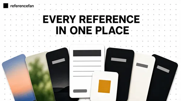
![[Format]
Landscape 16:9 poster, a white field dusted with a faint dot grid, a two line headline centred at the top and a fan of overlapping cards spread across the lower half. Collected, tactile, no watermark.
[Layout]
A white field covered edge to edge with a regular grid of tiny pale grey dots, widely spaced. A small lockup sits at the upper left, a twelfth in from each edge. The headline is centred at about a seventh of the height, two lines, the block about two thirds of the width. A fan of cards spreads across the lower half: about nine cards, each a rounded rectangle of a different size, overlapping one another and rotated between ten degrees one way and ten the other, their tops between two fifths and three fifths of the height, their bottoms running past the lower edge so the fan is cropped. The outermost cards at each end tip the furthest.
[Subject]
the fan of cards. Three of them are soft abstract images - a wash of evening sky in peach and blue, a blurred green garden shape, a strip of dark landscape - built from smooth colour gradients with no recognisable subject, no people and no faces. Two are documents: a white page with a bold grey bar at its upper left and four thin grey lines beneath it, and a smaller white card carrying one solid mark in warm amber at its centre. The rest are dark or pale rectangles with a single short grey bar, and two of them carry a tiny label pill at their lower left holding one short grey bar. Nothing is legible.
[Headline]
"EVERY REFERENCE IN ONE PLACE" set in a light grotesque in near-black, two lines, centred, roomy leading, the block calm and narrow so the fan below carries the weight.
[Labels]
the lockup reads referencefan in near-black sans beside a small solid square; the cards carry bars, gradients and one amber mark only, never words
[Mood]
White #FFFFFF, dot grey #E2E2E4, near-black #121316, amber #E8A33C, peach #F2C6B0. Tactile and collected; a pile of cards says more about a reference tool than any screenshot.
[Rules]
Every line of text must be real, correctly spelled English - no placeholder, no lorem ipsum, no gibberish, no stray or scattered letters, no phone numbers, no email addresses, no QR codes, no bracketed placeholders. Never break or hyphenate a word across two lines: each word must stay whole on one line. Never print a colour code, hex value, CSS value or any string beginning with a hash mark as text. Do not print any telephone number, street address, URL or price. No human faces, no photographic people. All interface content inside any window, card or screen is abstracted: grey bars, soft blocks and blurred shapes only - no legible microcopy anywhere.](https://files.posterlet.com/assets/generated/md/dpqav5yxjth1.webp)
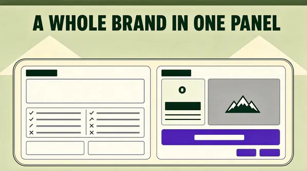
![[Format]
Landscape 16:9 poster, a sage cream field with a single dark green headline centred across the top and one huge rounded panel filling the lower two thirds, its interior split into pale tool columns. Calm, warm, no watermark.
[Layout]
A flat field of pale sage cream, untextured, with a very faint darker band along the top edge. Two soft triangular humps in a slightly deeper cream sit behind the panel at the left and right, like hills, their peaks just above the panel's upper edge. The headline is centred at about a tenth of the height, one line, the block about three quarters of the width. The panel begins at about a third of the height, spans from a twentieth in on the left to a twentieth in on the right, and runs off the bottom edge; its top corners are heavily rounded, its border a slightly darker cream, a hairline outline inset just inside it.
[Subject]
the panel interior. Two pale cards sit inside it side by side, each with a small bold title bar at its upper left and generous padding: the left card holds a wide blank field, then a two column list of tiny rows each with a small tick or cross glyph at its left, then a second block with two more short fields; the right card holds a preview area split into a pale block at its left carrying a small glyph, a bold bar and two thin bars, and at its right a grey image placeholder with a small mountain glyph in its centre, then below it a wide violet button holding one short pale bar, then a footer row of two small buttons at the right. Every field is empty of words.
[Headline]
"A WHOLE BRAND IN ONE PANEL" set in a heavy grotesque in deep forest green, one line, centred, the block wide enough to feel architectural but never touching either margin.
[Labels]
the panel and its cards carry glyphs, bars and buttons only; the only words in the frame are the headline
[Mood]
Sage cream #E7E7D5, deep forest #1E3A1B, pale card #F4F4EC, violet #6A4BE0. Warm and settled; the cream palette makes software look like paper stock.
[Rules]
Every line of text must be real, correctly spelled English - no placeholder, no lorem ipsum, no gibberish, no stray or scattered letters, no phone numbers, no email addresses, no QR codes, no bracketed placeholders. Never break or hyphenate a word across two lines: each word must stay whole on one line. Never print a colour code, hex value, CSS value or any string beginning with a hash mark as text. Do not print any telephone number, street address, URL or price. No human faces, no photographic people. All interface content inside any window, card or screen is abstracted: grey bars, soft blocks and blurred shapes only - no legible microcopy anywhere.](https://files.posterlet.com/assets/generated/md/a0a45d5yifhs.webp)
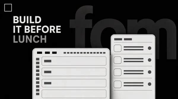
![[Format]
Landscape 16:9 poster, a near-black field with an enormous wordmark drawn in barely lighter grey behind the type, a four line pale headline at the upper left and two pale panels rising from the lower edge. Dark studio look, no watermark.
[Layout]
A near-black field. Behind everything, an enormous lowercase wordmark is set in a grey only a shade lighter than the field, cropped on all four sides so only the middle of the letters survives - it fills the frame from edge to edge and reads as a shadow rather than text. A small outlined square sits at the upper left, a twelfth in from each edge. The headline begins beneath it at about a seventh of the height: four lines, left aligned, the block about half the width, the fourth line the shortest. Two pale panels rise from the bottom edge, side by side and slightly overlapping: the left panel wider, its top at about three fifths of the height, its left edge a sixth in from the frame; the right panel narrower, its top a little higher, running off the right edge.
[Subject]
the two panels. Each is a pale grey-white card with rounded top corners, a hairline border and a soft shadow. The left panel carries a thin toolbar across its top holding three small tabs and a row of tiny grey bars, then a body of stacked pale fields, each with a short grey bar at its left, and a narrow column of small grey bars down its left side. The right panel carries a title bar of two short grey bars and beneath it five rows, each with a small rounded tile at its left, two thin grey bars beside it, and a small circle at its right. Nothing is legible, no numerals, no dates.
[Headline]
"BUILD IT BEFORE LUNCH" set in a light grotesque in pale grey, four lines, left aligned, generous leading, the last line set in a dimmer grey so the block fades downward.
[Labels]
the outlined square at the upper left holds no letters; the panels carry tabs, fields and bars only, never words; the ghost wordmark behind is illegible by design and must not resolve into readable letters
[Mood]
Near-black #0A0A0B, shadow grey #1C1C1E, pale grey #C9C9CC, panel #E8E8EA. Dark and confident; type that is almost invisible makes the frame feel deep rather than empty.
[Rules]
Every line of text must be real, correctly spelled English - no placeholder, no lorem ipsum, no gibberish, no stray or scattered letters, no phone numbers, no email addresses, no QR codes, no bracketed placeholders. Never break or hyphenate a word across two lines: each word must stay whole on one line. Never print a colour code, hex value, CSS value or any string beginning with a hash mark as text. Do not print any telephone number, street address, URL or price. No human faces, no photographic people. All interface content inside any window, card or screen is abstracted: grey bars, soft blocks and blurred shapes only - no legible microcopy anywhere.](https://files.posterlet.com/assets/generated/md/dft73uy1d4gq.webp)
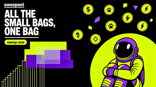
![[Format]
Landscape 16:9 poster, a black field collaged with neon lime and violet geometry, an astronaut figure rendered in flat acid colour at the lower right, coins tumbling around them and a three line white headline at the upper left. Loud, screen-printed, no watermark.
[Layout]
A black field carrying a loose collage. The headline sits at the upper left, a tenth in from the left edge and a tenth from the top: three lines, left aligned, the block about half the width. Beneath it a single short line of pale type, then one small lime capsule button. The collage fills the rest: a stack of flat rectangles in lime and violet at the middle left, a stair of thin vertical lines rising from the lower left, a huge lime circle cropped by the lower right corner, and small coins and geometric chips scattered through the upper right. The astronaut sits inside the big circle at the lower right, cropped by the bottom edge.
[Subject]
the astronaut and the coins. The figure is a flat screen-printed illustration in two acid colours, drawn with thick outlines and no shading, seated with knees up and both arms across them, its helmet a plain reflective dome with two small oval reflections and no visor lettering. Around it, seven coins tumble at different angles, each a fat disc with a rim of tiny ticks and one small mark at its centre, chosen from only four: a dollar sign, a paw print, a lightning bolt, a rhombus. Nothing on any coin looks like a numeral - no digit, no price, no ticker, no count - every coin carries its mark alone and nothing else. The flat rectangles at the middle left are plain blocks, some solid lime, some violet, with a translucent one overlapping them. No screens, no text inside the collage.
[Headline]
"ALL THE SMALL BAGS, ONE BAG" set in a heavy grotesque in white, three lines, left aligned, tight leading, no line wider than the half of the frame it occupies.
[Labels]
a small wordmark at the upper left reads sweepset in white capitals with a thin slab underline; the capsule button reads sweep now in near-black lower case on lime; the coins carry single glyphs only, never words
[Mood]
Black #060606, acid lime #D8F230, violet #7B5CF0, off-white #F4F4EC, grey #3A3A3A. Loud and a little reckless; acid colour on black makes a swap tool feel like a flyer.
[Rules]
Every line of text must be real, correctly spelled English - no placeholder, no lorem ipsum, no gibberish, no stray or scattered letters, no phone numbers, no email addresses, no QR codes, no bracketed placeholders. Never break or hyphenate a word across two lines: each word must stay whole on one line. Never print a colour code, hex value, CSS value or any string beginning with a hash mark as text. Do not print any telephone number, street address, URL or price. No human faces, no photographic people. All interface content inside any window, card or screen is abstracted: grey bars, soft blocks and blurred shapes only - no legible microcopy anywhere.](https://files.posterlet.com/assets/generated/md/r6zu545ay0e8.webp)
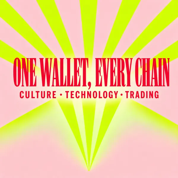
![[Format]
Square 1:1 poster, a pale pink field with a lime sunburst of broad rays rising from below the centre, a heavy red display headline across the upper middle and one line of tracked capitals beneath it. Retro print, no watermark.
[Layout]
A flat pale pink field. A sunburst radiates from a point just below the lower edge at the centre: twelve broad lime rays fan outward and upward, widening as they travel, washing out to pale green where they meet the pink, and reaching the left, right and upper edges so they are cropped by the frame. The headline sits across the middle at about two fifths of the height, one line, centred, the block about nine tenths of the width. One line of small tracked type sits centred directly beneath it, and the lower quarter of the frame stays quiet, its rays fading almost to nothing.
[Subject]
type and rays only. No object, no device, no illustration, no coin, no logo mark and no card appears anywhere in the frame.
[Headline]
"ONE WALLET, EVERY CHAIN" set in a fat display serif in saturated red, one line, centred, ultra tight tracking so the letters almost touch, the block spanning nearly the full width with margins on both sides so no letter is ever cropped.
[Labels]
the line beneath the headline reads culture, technology, trading in small red capitals with wide tracking and a mid dot between the words; nothing else in the frame carries words
[Mood]
Pale pink #FBD9DC, lime #D6F53C, pale green #EDF8C8, red #E23A45. Retro and cheerful; a single sunburst turns a chain wallet into a poster you would tear off a wall.
[Rules]
Every line of text must be real, correctly spelled English - no placeholder, no lorem ipsum, no gibberish, no stray or scattered letters, no phone numbers, no email addresses, no QR codes, no bracketed placeholders. Never break or hyphenate a word across two lines: each word must stay whole on one line. Never print a colour code, hex value, CSS value or any string beginning with a hash mark as text. Do not print any telephone number, street address, URL or price. No human faces, no photographic people. All interface content inside any window, card or screen is abstracted: grey bars, soft blocks and blurred shapes only - no legible microcopy anywhere.](https://files.posterlet.com/assets/generated/md/q4lgkkdwxrie.webp)
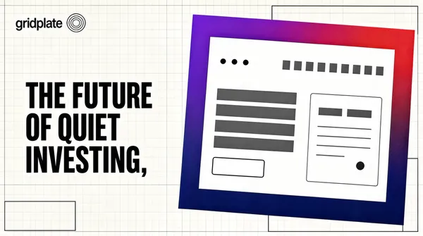
![[Format]
Landscape 16:9 poster, an off-white field ruled with a faint technical grid, a small lockup at the upper left, a heavy dark headline in the left half and one window in a gradient frame at the right. Clean, engineered, no watermark.
[Layout]
An off-white field covered edge to edge with a very faint grid of thin grey lines, and beyond it a few larger rectangles drawn in hairlines like a drafting layout, some of them only partly visible at the corners. The lockup sits at the upper left, a twelfth in from each edge. The headline begins beneath it at about a third of the height: three lines, left aligned, the block filling the left half and ending at about four fifths. The window occupies the right half: its left edge at about half the width, its top at a sixth of the height, its right edge off the frame, its bottom at four fifths, tilted a degree anti-clockwise.
[Subject]
the window and its frame. The frame is a thick border running from violet at its upper left corner through red at its upper right and down into deep indigo, drawn as a solid band about the thickness of a thumbnail. Inside sits a plain white page with three small dots at its upper left, a row of short grey bars across its top right, a block of four bold grey bars at its left, a small outlined button below them, and at its right a white card with two short grey bars and beneath them a field holding three thin grey lines and a small mark. Nothing inside is legible.
[Headline]
"THE FUTURE OF QUIET INVESTING" set in a heavy grotesque in near-black, three lines, left aligned, tight leading, the last line indented slightly so the block steps inward towards the window.
[Labels]
the lockup at the upper left reads gridplate in near-black sans beside a small circular mark of thin rings; the window carries bars, dots and one outline button only, never words
[Mood]
Off-white #F6F5F1, near-black #14140F, violet #8A4BE0, red #E0453C, indigo #2A2E8F. Precise and unhurried; the drafting grid makes a finance product look like an engineering drawing.
[Rules]
Every line of text must be real, correctly spelled English - no placeholder, no lorem ipsum, no gibberish, no stray or scattered letters, no phone numbers, no email addresses, no QR codes, no bracketed placeholders. Never break or hyphenate a word across two lines: each word must stay whole on one line. Never print a colour code, hex value, CSS value or any string beginning with a hash mark as text. Do not print any telephone number, street address, URL or price. No human faces, no photographic people. All interface content inside any window, card or screen is abstracted: grey bars, soft blocks and blurred shapes only - no legible microcopy anywhere.](https://files.posterlet.com/assets/generated/md/5997uvsylsdg.webp)
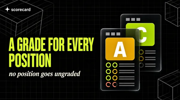
![[Format]
Landscape 16:9 poster, a near-black field with faint wireframe cubes in two corners, a two line lime headline at the left with one smaller line under it, and two stacked glass cards at the right carrying grade tiles and ring gauges. Technical, nocturnal, no watermark.
[Layout]
A near-black field. Two wireframe cubes sit in opposite corners: one large, its top face cropped by the upper left corner, drawn in thin grey lines over a faint grid; the other smaller at the lower right, cropped the same way, with a third partially visible at the upper right. A small lockup sits at the upper left, a twelfth in from each edge. The headline begins beneath it at about two fifths of the height: two lines, left aligned, the block filling the left half. One shorter line of type sits directly under it in a second colour. Two glass cards overlap at the right: the front card's left edge at about three fifths of the width, its top at a third, its right edge off the frame, its bottom at four fifths; the back card sits behind and slightly up and to the left, peeking out at its upper left.
[Subject]
the two cards. Each is a dark translucent panel with a hairline border, a soft blur behind it and a gentle glow along its top edge. Each carries a small title bar of short grey bars, then a wide rounded square grade tile - one in amber, one in lime, each holding a single white capital letter - then a column of six tiny ring gauges, three filled almost closed in lime, two three quarters closed in amber and one barely closed in coral, each ring beside two thin grey bars. The interior text is all bars; nothing is legible, no numerals appear and no score is printed.
[Headline]
"A GRADE FOR EVERY POSITION" set in a heavy grotesque in lime, two lines, left aligned, tight leading, with one shorter line beneath in warm off-white italic serif at half the size.
[Labels]
the lockup at the upper left reads scorecard in white sans beside a small four point star; the cards carry two capital letters, one A and one C, in their grade tiles, and grey bars everywhere else, never words
[Mood]
Near-black #0B0C0B, glass #1A1D1A, lime #B8F03C, amber #F5C542, coral #F0614C, off-white #F2F0E8. Analytical and slightly cold; the wireframe corners keep the dark field from reading as empty.
[Rules]
Every line of text must be real, correctly spelled English - no placeholder, no lorem ipsum, no gibberish, no stray or scattered letters, no phone numbers, no email addresses, no QR codes, no bracketed placeholders. Never break or hyphenate a word across two lines: each word must stay whole on one line. Never print a colour code, hex value, CSS value or any string beginning with a hash mark as text. Do not print any telephone number, street address, URL or price. No human faces, no photographic people. All interface content inside any window, card or screen is abstracted: grey bars, soft blocks and blurred shapes only - no legible microcopy anywhere.](https://files.posterlet.com/assets/generated/md/ug4ddm5ijpuy.webp)
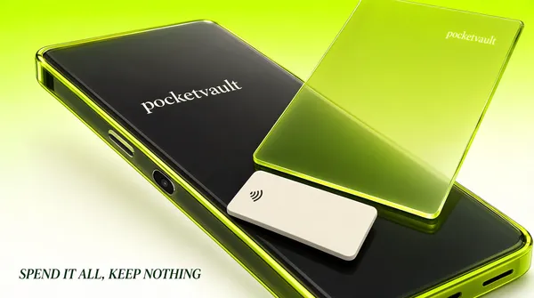
![[Format]
Landscape 16:9 poster, a lime to white gradient field holding one large translucent glass phone tilted in space with a lime card sliding across its face. Product render, studio light, no watermark.
[Layout]
A field that runs from strong lime at the top edge to almost white along the bottom, perfectly smooth. The phone floats across the centre, tilted about twenty degrees clockwise, its top left corner near the upper left third and its bottom right corner running past the lower right of the frame, so both ends are cropped. A translucent lime card slides across the phone's face at a steeper angle, its lower edge crossing the middle of the screen and its upper right corner lifted off the frame. A small pale card sits in front of the card at the lower middle, tilted with it. A wordmark sits at the top right of the phone's face, and a second, larger one sits on the phone's dark back at the left of centre.
[Subject]
the phone and the two cards. The phone is a thick slab of smoked glass with a polished lime rim glowing along its edges, its back dark grey and slightly reflective, a small camera island and a speaker slot visible near its lower end. The lime card is a pane of tinted glass with a bright edge and a faint inner gradient, completely blank. The pale card is a solid off-white rectangle with a soft grey edge holding one small contactless wave glyph at its left and nothing else. No screen content, no letters on the glass.
[Headline]
"SPEND IT ALL, KEEP NOTHING" set in a light serif in deep green, italic, one line, set small at the lower left, a twelfth in from the left edge and a tenth above the bottom edge, so the object carries the poster and the type only signs it.
[Labels]
the wordmark on the phone's dark back reads pocketvault in a pale italic serif, and the same word appears smaller in italic serif at the top right of the glass face; nothing else in the frame carries words
[Mood]
Lime #C8F23C, acid green #9BD400, off-white #F7FBF0, smoked grey #2A2E28, deep green #14310E. Slippery and expensive; a single rendered object on a gradient does the work of a whole interface.
[Rules]
Every line of text must be real, correctly spelled English - no placeholder, no lorem ipsum, no gibberish, no stray or scattered letters, no phone numbers, no email addresses, no QR codes, no bracketed placeholders. Never break or hyphenate a word across two lines: each word must stay whole on one line. Never print a colour code, hex value, CSS value or any string beginning with a hash mark as text. Do not print any telephone number, street address, URL or price. No human faces, no photographic people. All interface content inside any window, card or screen is abstracted: grey bars, soft blocks and blurred shapes only - no legible microcopy anywhere.](https://files.posterlet.com/assets/generated/md/zz105mypblab.webp)
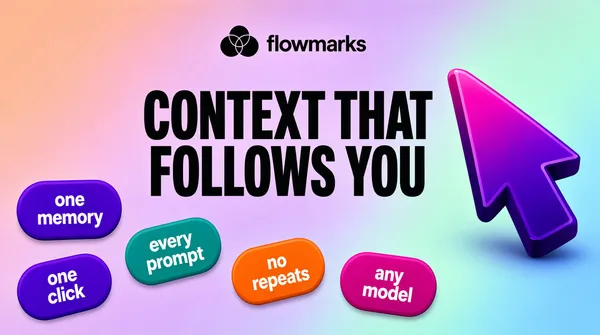
![[Format]
Landscape 16:9 poster, a soft iridescent gradient field in peach, lilac and mint, a centred lockup, one enormous dark headline, a glossy gradient arrow at the right and five floating capsules at the lower left. Airy, generative, no watermark.
[Layout]
A smooth field that blends peach at the upper left through lilac in the middle into pale mint and blue at the right, without any visible seam or texture. The lockup sits centred at a tenth of the height. The headline is centred beneath it at about a third of the height, two lines, the block spanning three quarters of the width. A large arrow floats at the right, its tip pointing up and to the left, its body about a quarter of the frame wide, spanning from a third of the height down to three quarters. Five rounded capsules scatter across the lower left and lower middle, each tilted a few degrees in a different direction, none overlapping the headline, the largest about a fifth of the width and the smallest about a tenth.
[Subject]
the arrow and the capsules. The arrow is a thick three dimensional cursor shape with a rounded bevelled edge, its face a gradient from deep violet at its base to magenta at its tip, its side faces darker, casting a soft shadow. The capsules are flat lozenges in saturated violet, teal, orange and magenta, each holding two short lines of white type and nothing else. No window, no card, no screenshot, no person.
[Headline]
"CONTEXT THAT FOLLOWS YOU" set in a heavy grotesque in near-black, two lines, centred, very large, tight leading, the block reading as one solid dark mass against the pastel field.
[Labels]
the lockup reads flowmarks in near-black sans beside a small mark of three overlapping circles; the capsules read one memory, every prompt, no repeats, any model and one click, one short phrase each on two lines in white, tracked wide, lower case; nothing else carries words
[Mood]
Peach #F6C6B0, lilac #C9BCF0, mint #BFEBD8, sky #BBD9F2, near-black #121216, violet #6A2BE0. Soft and buoyant; the hard dark type is the only weight on an otherwise weightless field.
[Rules]
Every line of text must be real, correctly spelled English - no placeholder, no lorem ipsum, no gibberish, no stray or scattered letters, no phone numbers, no email addresses, no QR codes, no bracketed placeholders. Never break or hyphenate a word across two lines: each word must stay whole on one line. Never print a colour code, hex value, CSS value or any string beginning with a hash mark as text. Do not print any telephone number, street address, URL or price. No human faces, no photographic people. All interface content inside any window, card or screen is abstracted: grey bars, soft blocks and blurred shapes only - no legible microcopy anywhere.](https://files.posterlet.com/assets/generated/md/9ec395hs9ss8.webp)