Generate
Create images with AI
Urban Construction Waste Outcomes City Comparison
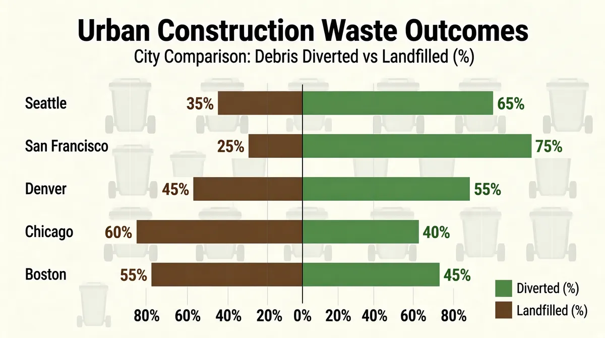
Create an infographic featuring the title 'Urban Construction Waste Outcomes' and the subtitle 'City Comparison: Debris Diverted vs Landfilled (%)' at the top center. The main visualization is a horizontal diverging bar chart with a central vertical axis at 0%. Cities are listed vertically: 'Seattle', 'San Francisco', 'Denver', 'Chicago', and 'Boston'. For each city, two bars extend from the center: a muted green bar to the right representing 'Diverted (%)' and a muted brown bar to the left representing 'Landfilled (%)'. Each bar features its corresponding percentage value label at the tip. A legend in the bottom right corner displays the colors for 'Diverted (%)' and 'Landfilled (%)'. The chart background features a faint, patterned watermark of trash bin silhouettes. The horizontal axis at the bottom shows percentages ranging from 80% to 0% to 80%. The given data is : [{"category": "Diverted (%)", "city": "Seattle", "value": 65}, {"category": "Landfilled (%)", "city": "Seattle", "value": 35}, {"category": "Diverted (%)", "city": "San Francisco", "value": 75}, {"category": "Landfilled (%)", "city": "San Francisco", "value": 25}, {"category": "Diverted (%)", "city": "Denver", "value": 55}, {"category": "Landfilled (%)", "city": "Denver", "value": 45}, {"category": "Diverted (%)", "city": "Chicago", "value": 40}, {"category": "Landfilled (%)", "city": "Chicago", "value": 60}, {"category": "Diverted (%)", "city": "Boston", "value": 45}, {"category": "Landfilled (%)", "city": "Boston", "value": 55}]
Tags
More Images