Generate
Create images with AI
The Vanishing Night: Urban Light Pollution Infographic
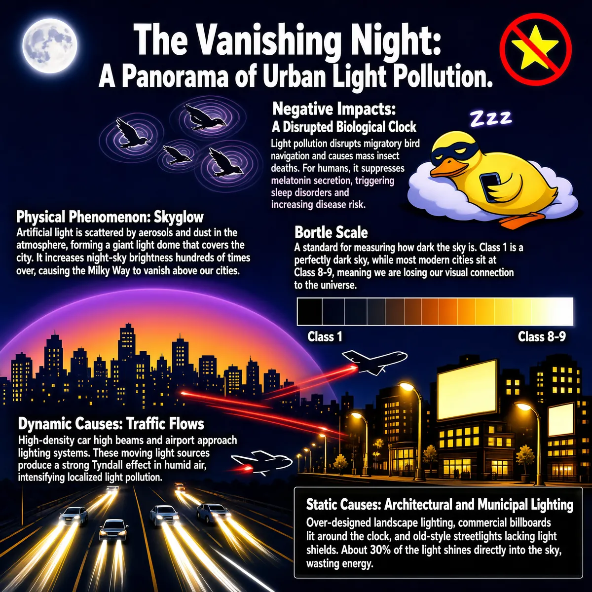
This infographic is titled "The Vanishing Night: A Panorama of Urban Light Pollution." Set against a deep blue night sky, it uses an illustrated style to present the problem of urban nighttime light pollution. The overall layout is a vertically layered structure that presents, from top to bottom, the negative impacts of light pollution, its physical phenomena, and its dynamic and static causes, supplemented with visual symbols and data explanations; image and text combine with clear logic. The title sits at the top center in large white lettering: "The Vanishing Night: A Panorama of Urban Light Pollution." On the left is a glowing moon icon; on the right is a red prohibition symbol containing a yellow star, symbolizing the disappearance of the starry sky. The first section, "Negative Impacts: A Disrupted Biological Clock," is located in the upper-right area of the image. The text states: "Light pollution disrupts migratory bird navigation and causes mass insect deaths. For humans, it suppresses melatonin secretion, triggering sleep disorders and increasing disease risk." Beside it are illustrations: three flying birds losing their way within distorted light halos, and a cartoon duck wearing an eye mask and holding a phone, lying on a cloud-like pillow with a weary expression and a "Zzz" symbol above its head, suggesting disturbed sleep. The second section, "Physical Phenomenon: Skyglow," is located in the middle-left. The text explains: "Artificial light is scattered by aerosols and dust in the atmosphere, forming a giant light dome that covers the city. It increases night-sky brightness hundreds of times over, causing the Milky Way to vanish above our cities." Below this area is the silhouette of a city skyline veiled under a purple-to-orange gradient glow, directly depicting the skyglow phenomenon. The third section, "Bortle Scale," is located in the middle-right, next to the skyglow explanation. It includes a horizontal color-band legend whose colors grade from black through deep blue, purple, red, orange, and yellow to white, left to right, representing different levels of darkness. The text explains: "A standard for measuring how dark the sky is. Class 1 is a perfectly dark sky, while most modern cities sit at Class 8-9, meaning we are losing our visual connection to the universe." The fourth section, "Dynamic Causes: Traffic Flows," is located in the lower-middle. The text reads: "High-density car high beams and airport approach lighting systems. These moving light sources produce a strong Tyndall effect in humid air, intensifying localized light pollution." The accompanying illustration shows multiple glowing trails weaving across the sky above the city, simulating headlight beams and aircraft flight paths; two planes fly past from the left and right respectively, trailing red light streaks, while vehicles on the ground roads emit bright beams. The fifth section, "Static Causes: Architectural and Municipal Lighting," is located at the bottom right inside a dark, semi-transparent rectangular box. The text reads: "Over-designed landscape lighting, commercial billboards lit around the clock, and old-style streetlights lacking light shields. About 30% of the light shines directly into the sky, wasting energy." The background is a cluster of city buildings, with warm yellow light glowing from windows, streetlights lined up neatly on both sides of the streets, and some billboards lit, showing the distribution of static light sources. The overall visual style uses flat illustration with strong color contrast, dominated by deep blue and purple, accented with orange-yellow and white light effects to highlight the pollution sources. Through its block-based structure, supporting icons, and cited data, the infographic comprehensively presents the causes, mechanisms, and consequences of urban light pollution, emphasizing its far-reaching impact on ecology, health, and astronomical observation.
Tags
More Images