Generate
Create images with AI
Public Service Efficiency and Integrity Comic Infographic
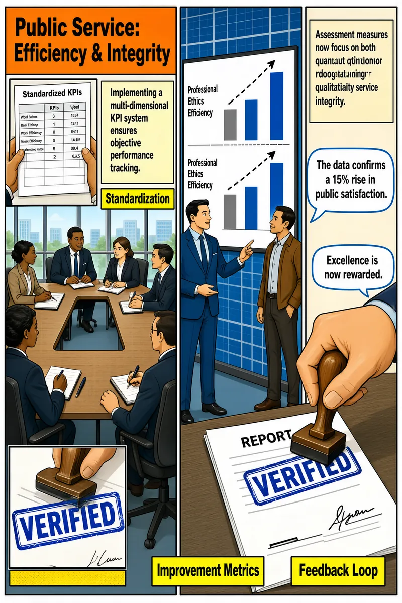
The infographic, titled "Public Service: Efficiency & Integrity," is structured as a three-panel comic-style visual narrative, using clean, professional illustrations with a corporate aesthetic. Each panel highlights a distinct phase in implementing a performance management system for public service, emphasizing objectivity, measurable outcomes, and accountability. **Panel 1: Standardization** - **Title/Heading**: "Public Service: Efficiency & Integrity" appears in bold black text on an orange rectangular banner at the top left. - **Visual Layout**: A meeting room scene shows six professionals seated around a U-shaped conference table, engaged in discussion. One person holds papers, while others take notes or listen attentively. The setting includes large windows with grid patterns, suggesting a modern office environment. - **Inset Image**: A close-up inset on the left shows hands holding a document labeled "Standardized KPIs," featuring a table with rows and columns (though content is not legible). - **Text Content**: - A yellow box in the upper right contains the statement: "Implementing a multi-dimensional KPI system ensures objective performance tracking." - Below this, a highlighted yellow label reads: "Standardization." - This panel introduces the foundational step of establishing uniform Key Performance Indicators (KPIs) to ensure consistent, objective evaluation across public service roles. **Panel 2: Improvement Metrics** - **Visual Layout**: A presentation scene where one man in a blue suit points at a large screen displaying a bar chart. Another man in a brown jacket observes from the side. The background features a blue grid pattern. - **Chart Type**: A vertical bar chart with two categories on the y-axis: "Professional Ethics" and "Work Efficiency." Each category has two bars — a lighter blue bar representing a baseline and a darker blue bar showing improvement. Dashed lines indicate growth between the two bars. - **Data Encoding**: While exact numerical values are not labeled on the axes, the visual height difference suggests significant improvement. The chart visually communicates increased performance in both qualitative and quantitative dimensions. - **Text Content**: - A beige box on the left states: "Assessment measures now focus on both quantitative results and qualitative service integrity." - A yellow label below it reads: "Improvement Metrics." - A speech bubble from the presenter says: "The data confirms a 15% rise in public satisfaction." - This panel emphasizes that assessments now combine hard metrics (quantitative) with ethical standards (qualitative), resulting in tangible improvements reflected in public satisfaction. **Panel 3: Feedback Loop** - **Visual Layout**: A close-up of a hand stamping a document with a rubber stamp that reads "VERIFIED" in blue ink. The document is titled "REPORT" and includes a signature line. An inset image on the lower left shows a zoomed-in view of the stamped "VERIFIED" seal. - **Text Content**: - A beige box at the top left states: "Final results are linked to promotion and training, closing the accountability loop." - A yellow label below it reads: "Feedback Loop." - A speech bubble from the hand-stamping figure says: "Excellence is now rewarded." - This final panel demonstrates the closure of the performance cycle, where verified results directly influence career development and training opportunities, reinforcing a culture of excellence and accountability. **Overall Style and Structure**: The infographic uses a sequential, story-driven format with clear visual metaphors (meeting, presentation, stamping) to convey a process. Color coding is used consistently: orange for the main title, yellow for section labels, and blue for data visualization and official seals. Text is presented in clean, sans-serif fonts for readability. The combination of narrative panels, charts, and symbolic actions effectively communicates a comprehensive framework for improving public service through structured performance management.
More Images