Generate
Create images with AI
Evolution of Peak Power Density
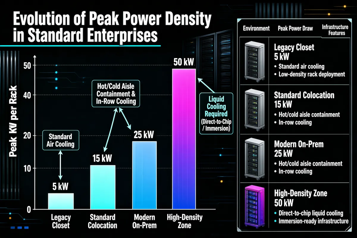
Create an infographic featuring a vertical bar chart titled 'Evolution of Peak Power Density in Standard Enterprises' at the top left, set against a dark, technical background with abstract server rack motifs. The chart tracks 'Peak kW per Rack' on the y-axis, with four categories on the x-axis: 'Legacy Closet', 'Standard Colocation', 'Modern On-Prem', and 'High-Density Zone'. Each bar has a gradient fill and is labeled at the top with its specific power value (5 kW, 15 kW, 25 kW, 50 kW). Annotations with arrows point to the bars, indicating cooling requirements: 'Standard Air Cooling' for 5 kW, 'Hot/Cold Aisle Containment & In-Row Cooling' for 15-25 kW, and 'Liquid Cooling Required (Direct-to-Chip / Immersion)' for 50 kW. To the right, a detailed legend uses server rack icons to list each environment, its specific peak power draw, and a bulleted list of infrastructure features. The given data is : [{"environment": "Legacy Closet", "peak_kw": 5}, {"environment": "Standard Colocation", "peak_kw": 15}, {"environment": "Modern On-Prem", "peak_kw": 25}, {"environment": "High-Density Zone", "peak_kw": 50}]
Tags
More Images