Generate
Create images with AI
Cruise Holiday BI Dashboard Mockup
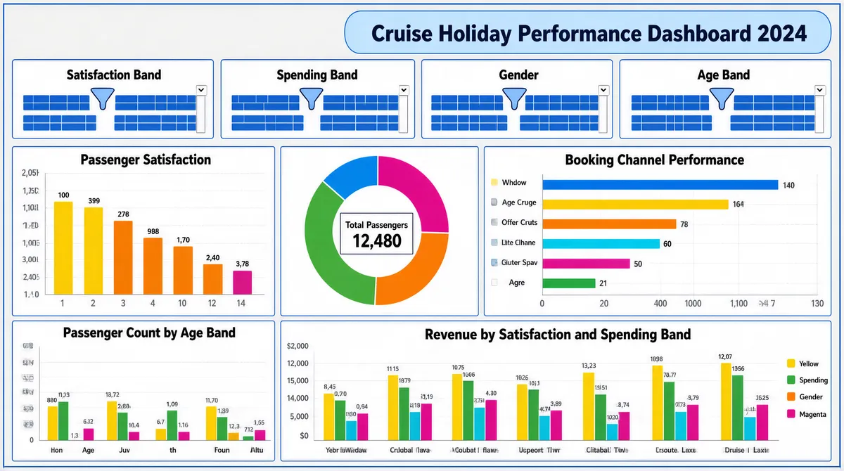
[Format] Landscape 16:9 gig cover, full-bleed business-intelligence dashboard screenshot mockup. Flat vector UI, crisp hairline borders, pale page-grey canvas. No watermark, no personal names. [Layout] The entire frame is a single dashboard page: a pale grey sheet inside a thin blue outer rule, divided into a header strip and a chart grid below. Top centre-right sits a light-blue rounded capsule banner, about 60 percent of the width, holding the dashboard title. Directly under it a single row of four equal filter panels, each a bordered white box with a small header line and two rows of tiny blue segmented chips and dropdowns. Below that the grid splits into two bands: the upper band carries three panels — a tall bar chart on the left about 30 percent wide, a square donut chart in the centre about 30 percent, and a wide horizontal bar chart on the right about 37 percent; the lower band carries two panels — a narrow grouped bar chart on the left about 30 percent and a wide grouped bar chart filling the rest. Thin blue hairlines separate every panel and the bands, and small white gutters separate the columns. [Subject] None — dashboard mockup only, no people and no photographic cut-out. [Headline] In the blue capsule banner, a bold dark-blue sans title in title case naming a cruise-holiday performance dashboard followed by a four-digit year, about one-eighteenth of frame height, centred. Each filter panel carries a small bold black label in its header strip (satisfaction band, spending band, gender, age band) with a blue filter glyph at the right of the line. Each chart panel has a centred bold black chart title above its plot. Axis ticks, legend entries and small value labels sit in tiny grey sans, and the bar panels carry tiny numeric data labels above each bar, with a small boxed total-passenger figure floating inside the donut panel. [Badges] None — the only marks are UI affordances: small funnel filter glyphs in each slicer header and dropdown carets inside the segmented chips. [Mood] Pale grey, cornflower blue and a candy chart palette of yellow, green, orange, cyan and magenta; analytical, flat and spreadsheet-credible. At thumbnail size it reads as a dense real dashboard rather than a poster, with the blue banner and the coloured bars carrying recognition.
More Images