Generate
Create images with Super Intelligence
Be There First Early Launch Minimalist Poster
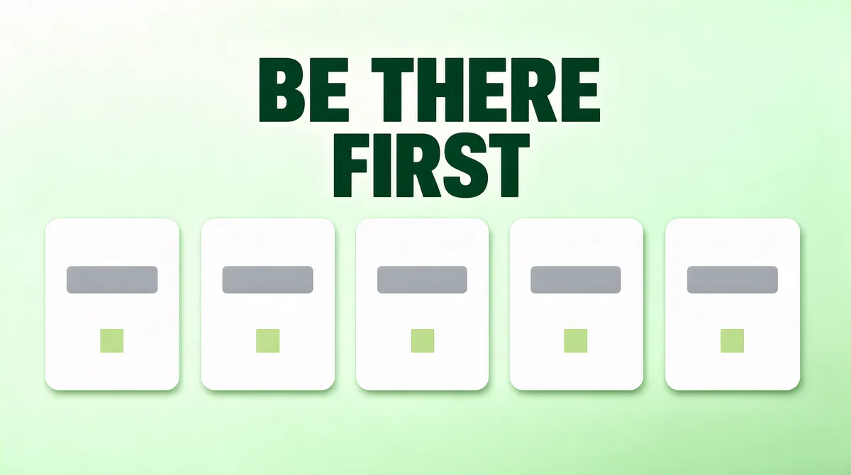
[Format] Landscape 16:9 poster reading BE THERE FIRST, a pale mint field with one horizontal row of small white cards across the middle and a two line deep green headline above. Quiet mint, no watermark. [Layout] A pale mint field, easing from near-white at the upper left to a faint green at the lower right with no hard band, even to all four edges. One horizontal row of five small white cards runs across the middle of the frame at about a half of the height: each a wide rounded rectangle with a soft shadow, each holding one short grey bar and one tiny pale green square, nothing legible. The first card's left edge sits a twelfth of the width in from the left frame edge and the last card's right edge a twelfth in from the right frame edge, with even mint gaps between the five, so the first and last cards are complete with mint visible outside them and the row never runs off the left or right side of the frame. The headline sits above the row: centred on the frame, its block from a tenth to a third of the height, two lines of equal size, the second line sitting directly under the first. [Subject] the row of five cards. Each is one flat white rounded rectangle holding only one grey bar and one plain square: no letter, no number, no face, no icon and no photograph anywhere inside any of them. Nothing else is in the field: no sixth card, no arrow, no connector, no dot between cards and no lettering anywhere in the frame beyond the headline. [Headline] "BE THERE FIRST" set in a heavy grotesque in deep green #173F32, all letters in block capitals and not in lowercase and not in title case, set with no punctuation of any kind after or between the words, that is no full stop, no period, no comma, no colon, no semicolon and no dash, exactly two lines, centred: line one is the words BE THERE and line two is the single word FIRST, so the second line is different from the first and must never repeat the first line, spelled exactly like that with each word printed once only, all three words must appear and none may be left out, line two is never dropped and never merged into line one, the headline appearing exactly once in the frame and never set as the same line twice, with tight leading so the pair sits as a compact block above the row, these three words being the only readable text anywhere in the frame: no other sentence, no other line of words, no paraphrase of them and no substitute wording. [Labels] the frame carries the two headline lines and nothing else: no subtitle, no caption, no small print and no wordmark anywhere [Mood] Pale mint #EAF6EE, near-white #FBFDFB, deep green #173F32, soft grey #B4C4BC, pale green #BFDFC8. Mint quiet; five small cards in a row are five chances lined up early. [Rules] Every line of text must be real, correctly spelled English - no placeholder, no lorem ipsum, no gibberish, no stray or scattered letters, no phone numbers, no email addresses, no QR codes, no bracketed placeholders. Never break or hyphenate a word across two lines: each word must stay whole on one line. Never print a colour code, hex value, CSS value or any string beginning with a hash mark as text. Do not print any telephone number, street address, URL or price. No human faces, no photographic people. All interface content inside any window, card or screen is abstracted: grey bars, soft blocks and blurred shapes only - no legible microcopy anywhere.
Tags
More Images